
A fresh coat of paint can completely transform how your bedroom feels and functions. These 28 bedroom paint color ideas are airy, soothing, and space-enhancing perfect for opening up your room, adding light, and creating a calm, inviting atmosphere before it ever feels closed in.
28 Bedroom Paint Color Ideas That Make Your Space Feel Bigger, Brighter, and Perfect for 2026
In 2026, bedroom color trends are all about creating light, airy spaces that feel open and calming from the moment you walk in. From soft neutrals and warm whites to muted pastels and nature-inspired tones, the right paint color can completely transform how spacious your room feels.
Whether you’re working with a small bedroom or just want a more breathable, relaxed atmosphere, color choice makes all the difference. Ahead, discover bedroom paint color ideas that enhance light, visually expand your space, and bring a fresh, modern feel before your room ever starts to feel closed in.
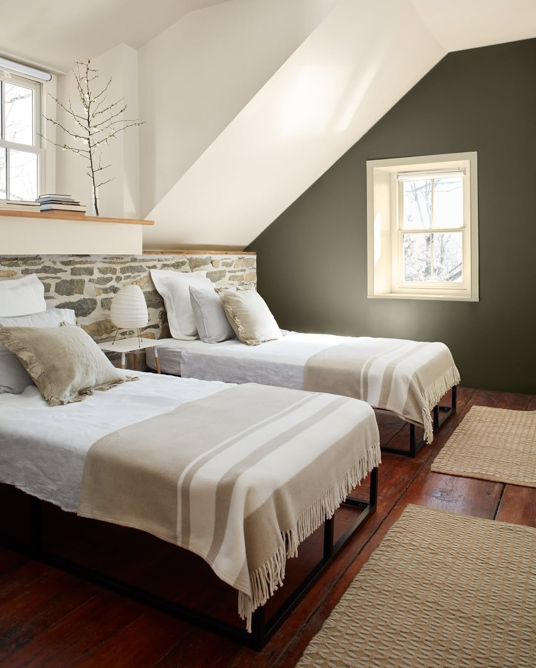
1. Muted Olive Calm
There’s something about this deep olive tone that instantly slows the room down. It wraps around the space like a soft exhale, grounding everything from the textured headboard to the layered brown and taupe bedding. Nothing feels rushed here, not even the morning light filtering through those heavy drapes.
And the palette leans into restraint in the best way. If you’re drawn to earthy tones but want to keep things refined, this is your blueprint. Pair deeper greens with warm neutrals and tactile fabrics, boucle, linen, wool, to keep it rich without feeling heavy.
2. Cotton Candy Contrast
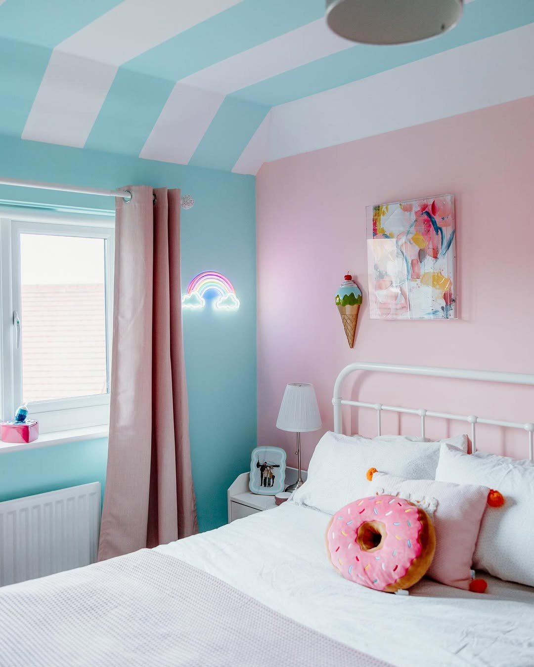
This room feels like stepping into a daydream. Powder blue meets soft pink in a way that’s playful but still pulled together, especially with the striped ceiling adding that unexpected twist. It’s cheerful, but not chaotic.
What makes it work is the balance. The white bed and simple furnishings keep the palette from tipping too sweet. If you’re experimenting with pastels, anchor them with clean whites and just one or two statement accents so the room feels curated, not themed.
3. Moody Teal Drama
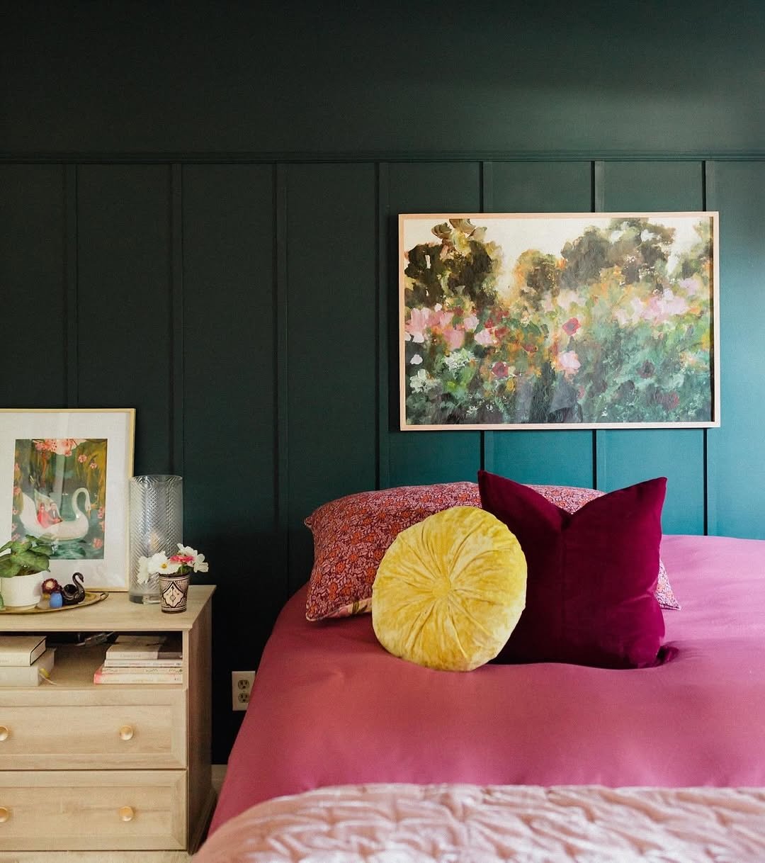
Now this is a color that commits. That deep teal paneling creates instant depth, making the artwork and warm-toned bedding feel almost luminous against it. It’s cozy, but with a bit of drama, like a boutique hotel you never want to leave.
The trick here is contrast. Rich wall colors love company, especially in the form of velvet cushions, warm woods, and soft lighting. Let the walls be bold, then layer in warmth so the space feels inviting rather than intense.
4. Soft Blue Simplicity
Light blue walls have a way of opening up a space, and this room leans fully into that airy, lifted feeling. Paired with pale wood and soft textiles, it feels calm in a very quiet, unforced way.
There’s a Scandinavian ease here that works beautifully for smaller rooms. Keep the palette light, introduce natural materials, and let the color breathe. It’s the kind of space that feels fresh every single morning.
5. Classic Sky Elegance
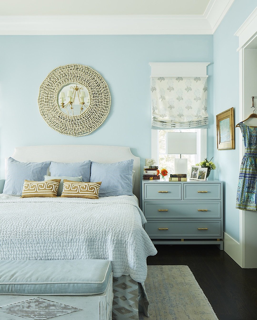
This shade of blue feels timeless, almost tailored. The symmetry of the furniture, the crisp bedding, and that statement mirror all play into a polished, traditional look that still feels approachable.
And it’s the layering that elevates it. Mixing subtle patterns, like the striped pillows and soft roman shade, keeps the room from feeling flat. When working with classic colors, texture and pattern become your quiet statement pieces.
6. Playful Color Blocking
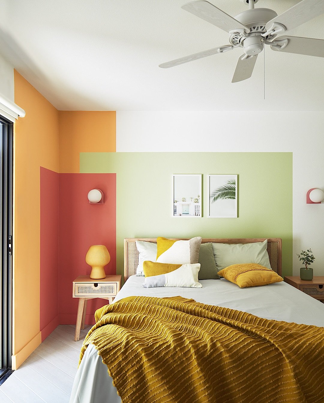
This room doesn’t hold back, and that’s exactly why it works. Warm coral, soft green, and buttery yellow come together in a way that feels fresh and confident. It’s bold, but there’s intention behind every line.
If you’ve ever wanted to try color blocking, this is your sign. Keep the shapes clean and the palette cohesive, then let the furniture stay simple. The walls do the talking, everything else just supports the story.
7. Rustic Neutral Retreat
There’s a quiet charm in this space that feels almost nostalgic. The slanted ceiling, the mix of white and soft olive tones, and those woven textures create a room that feels tucked away from everything.
It’s a reminder that neutral doesn’t mean boring. When you layer stone, wood, and linen, even the softest palette gains depth. Think of it as building warmth through texture rather than color.
8. Breezy Mint Escape
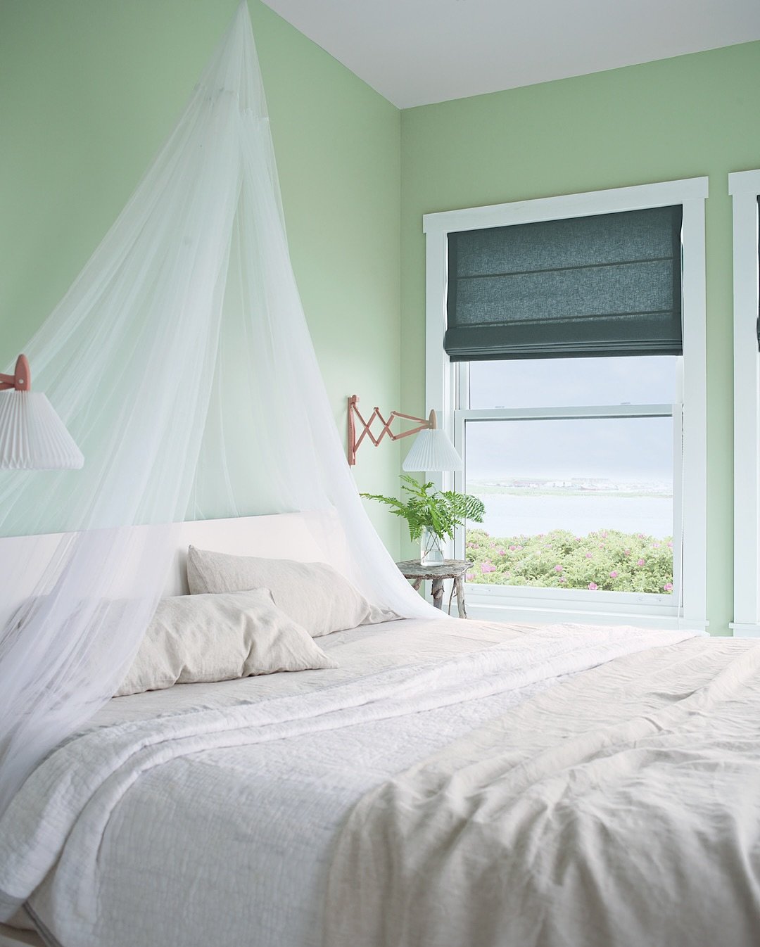
This pale green feels like fresh air in paint form. Light, clean, and just a little coastal, it pairs beautifully with the sheer canopy and soft bedding for a space that feels almost weightless.
And it’s perfect for rooms with a view. Let soft greens echo what’s outside your window, then keep everything else minimal. The result feels effortless, like a summer morning that lingers a little longer.
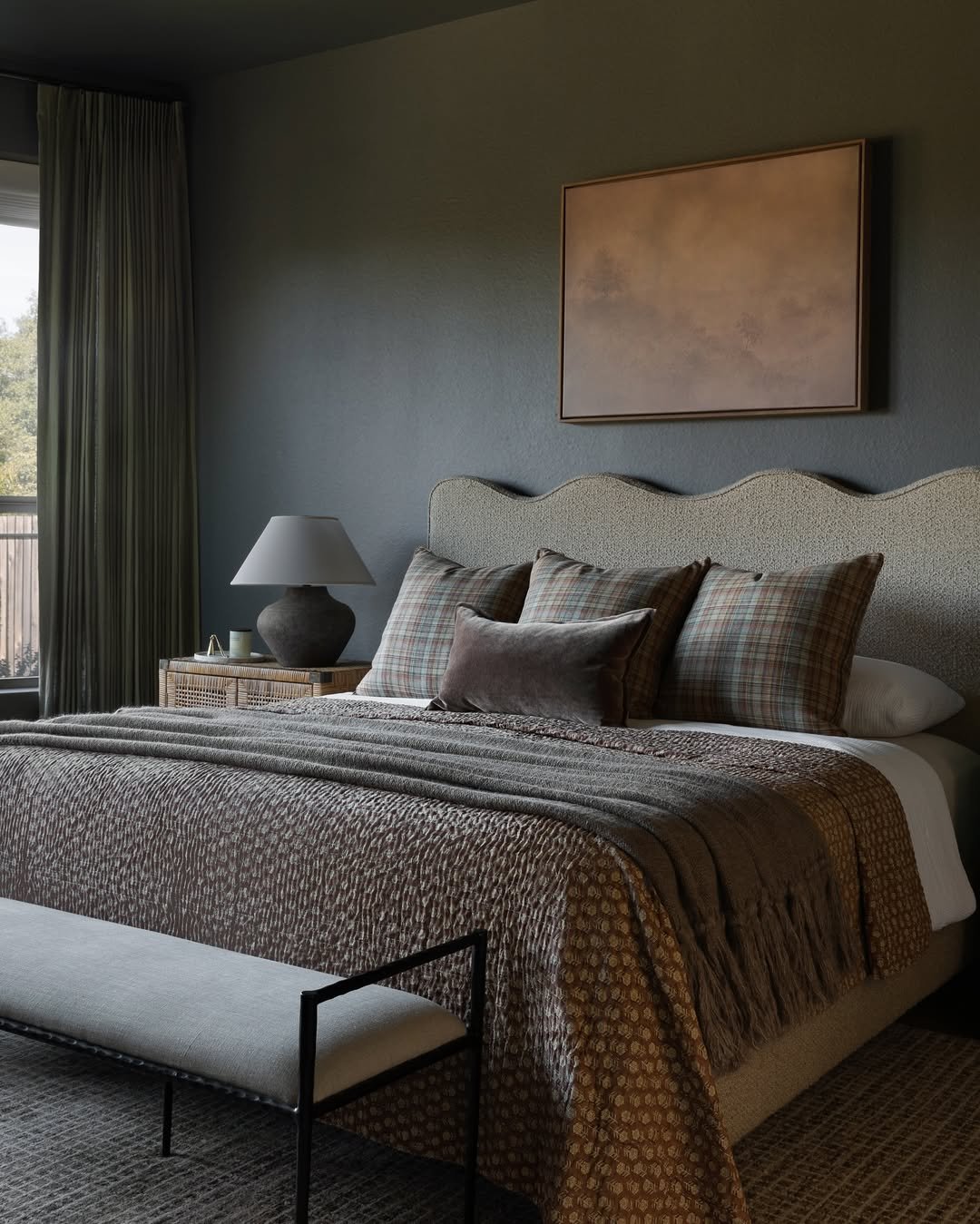
9. Deep Cocoa Luxe
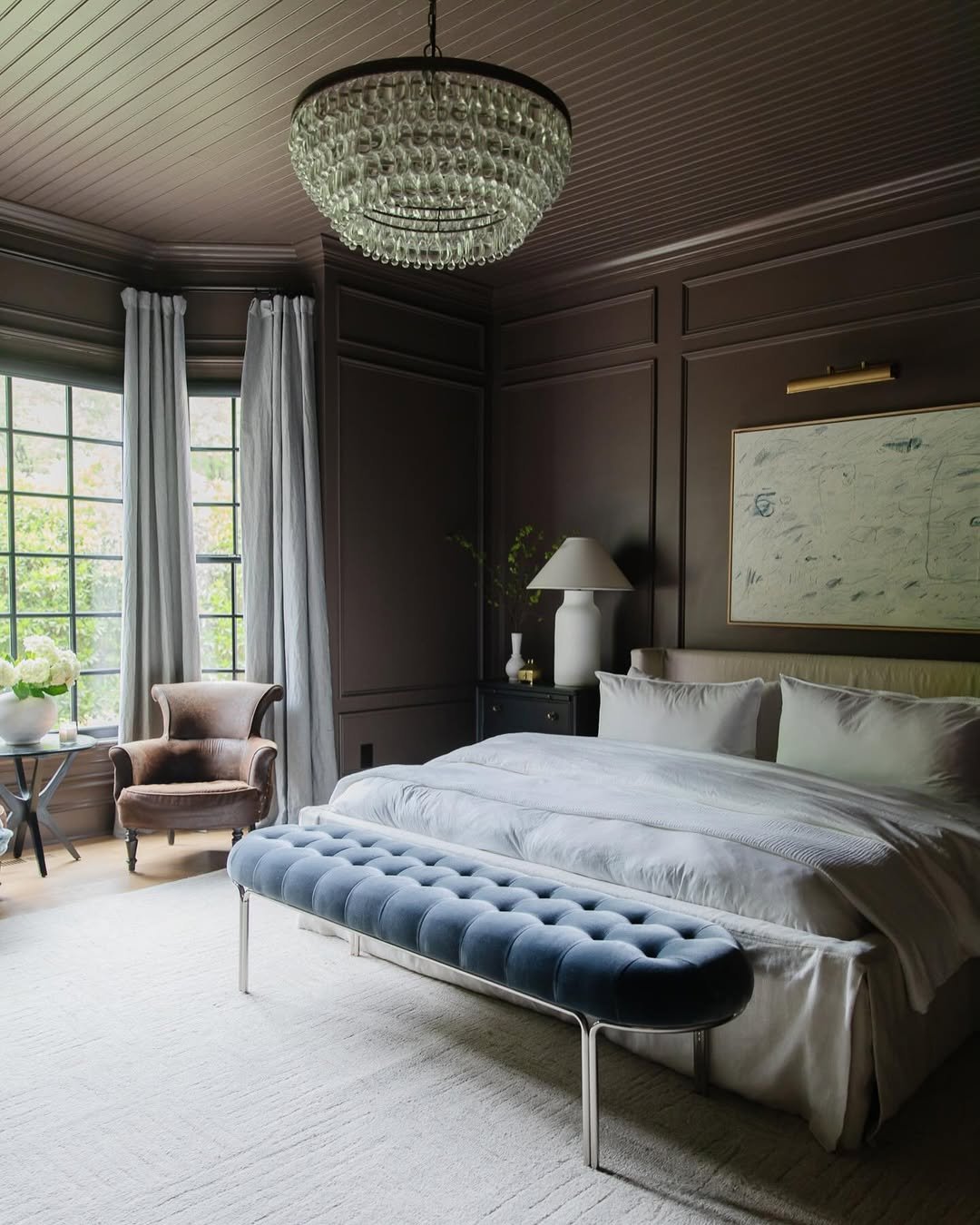
This room leans into richness, and it shows. The dark brown walls, layered paneling, and soft cream bedding create a contrast that feels both dramatic and comforting. It’s bold, but incredibly livable.
What stands out is the balance between dark and light. If you’re going for a moody palette, bring in lighter textiles and metallic accents to soften the edges. It keeps the room feeling elevated rather than heavy.
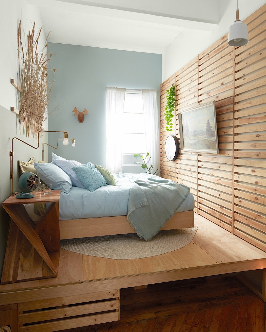
10. Warm Wood Statement
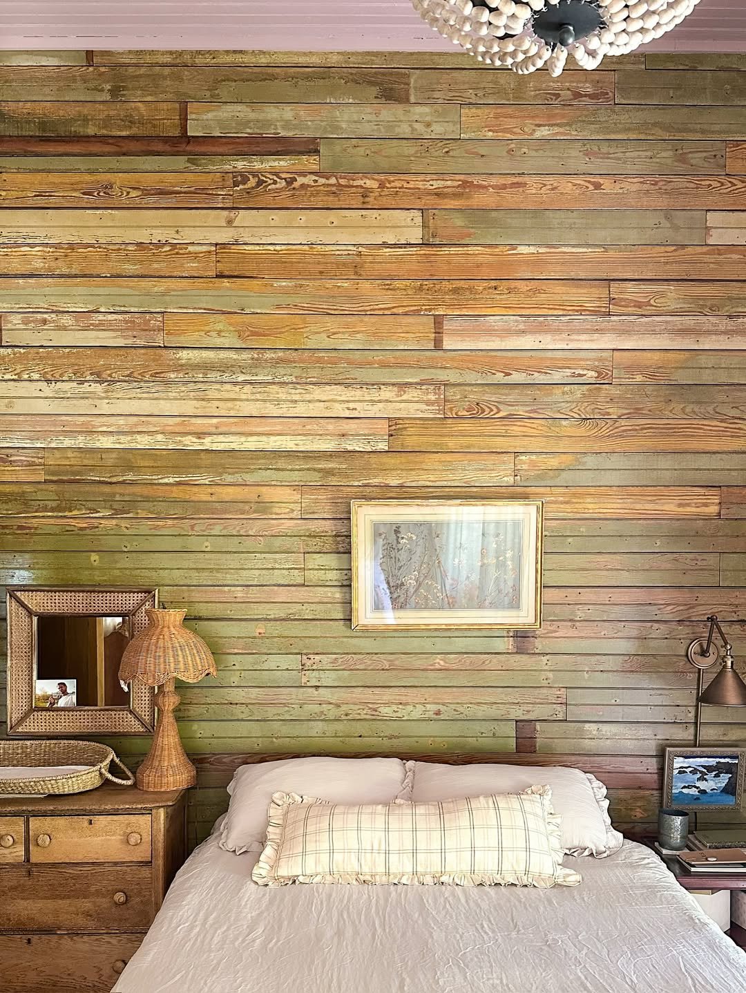
Technically not paint, but this wood wall brings a color story all its own. The mix of tones, honey, amber, and soft green undertones, creates a layered backdrop that feels organic and full of character.
It’s proof that color doesn’t have to come from a paint can. When you work with natural materials, you get variation and depth that feels completely unique. Pair it with simple bedding and vintage accents, and the whole room settles into that perfectly imperfect charm.
11. Espresso Depth
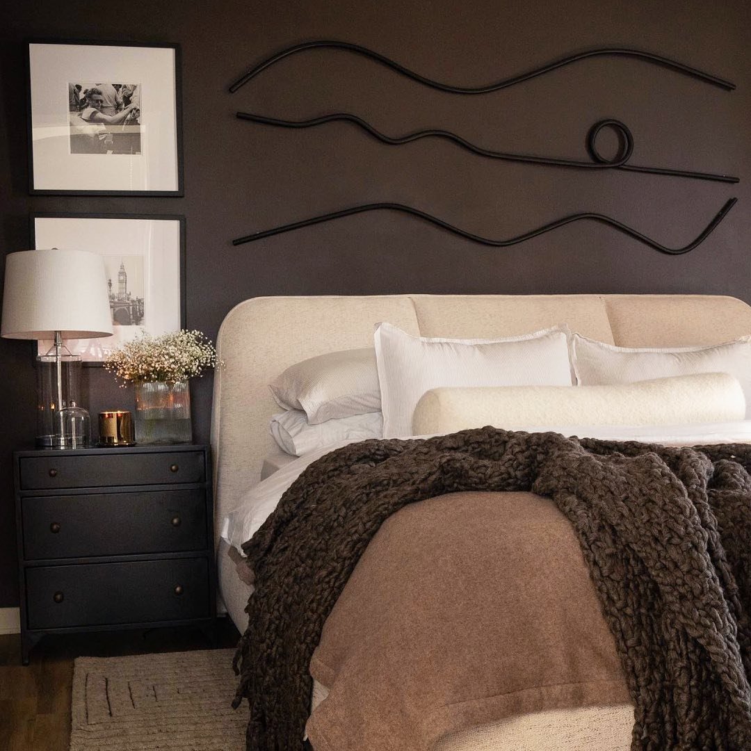
This shade leans rich, grounded, and just a little indulgent. That deep espresso wall wraps around the bed like a cocoon, making the creamy upholstery and layered neutrals feel even softer by contrast. It’s the kind of space that invites slow evenings, a book, maybe a candle flickering somewhere in the corner.
What makes it work is the restraint. The palette stays tight, browns, ivories, a touch of black, so nothing competes. If you’re going dark, commit fully and keep your textures plush and tonal. It creates that quiet, enveloping luxury that feels instantly elevated.
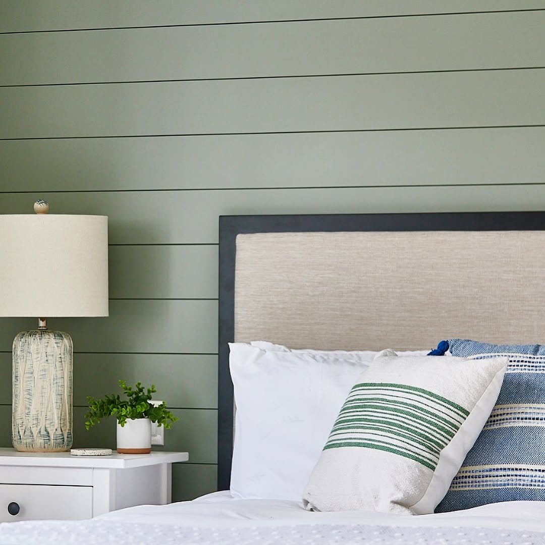
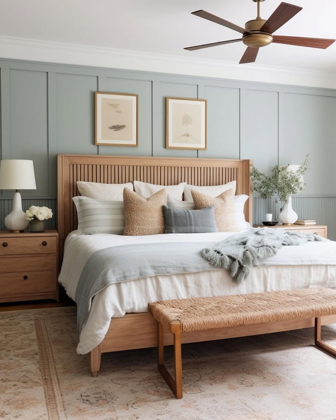
12. Fresh Sage Ease
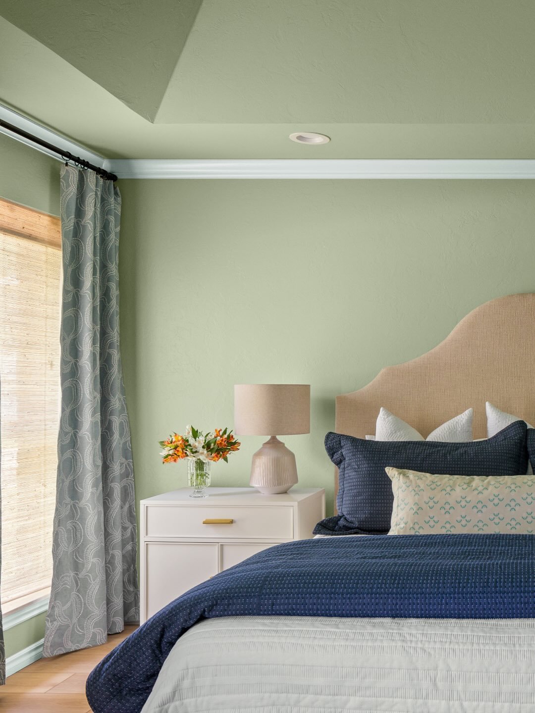
This soft sage feels like a breath of fresh air. Light enough to brighten the room but grounded enough to feel calm, it pairs beautifully with the navy bedding and warm wood tones tucked throughout the space.
There’s a subtle balance happening here that’s easy to love. Cooler greens with warmer accents keep things from feeling flat. If you’re unsure about color, this is a safe, stylish entry point that still feels intentional.
13. Blush & Green Contrast
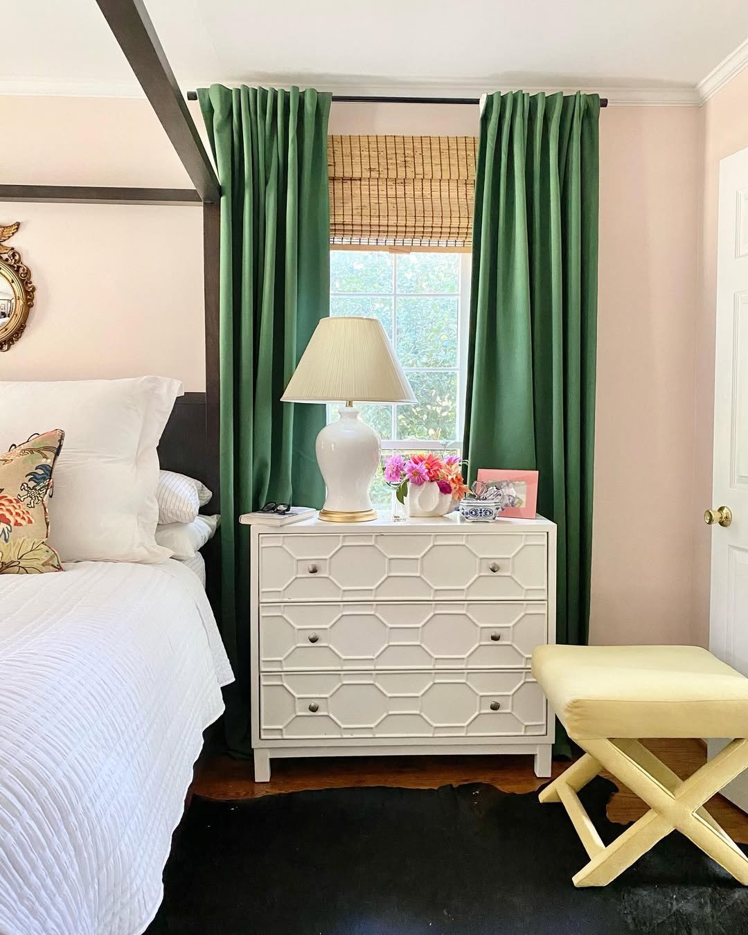
This room plays with contrast in the most charming way. Soft blush walls set a warm backdrop, while those deep green curtains cut through with just enough drama. It feels classic, but not predictable.
And the layering tells the story. Mixing traditional pieces with fresh color pairings keeps the room from feeling too formal. Try pairing muted pinks with deeper greens if you want something timeless with a twist.
14. Patterned Whimsy
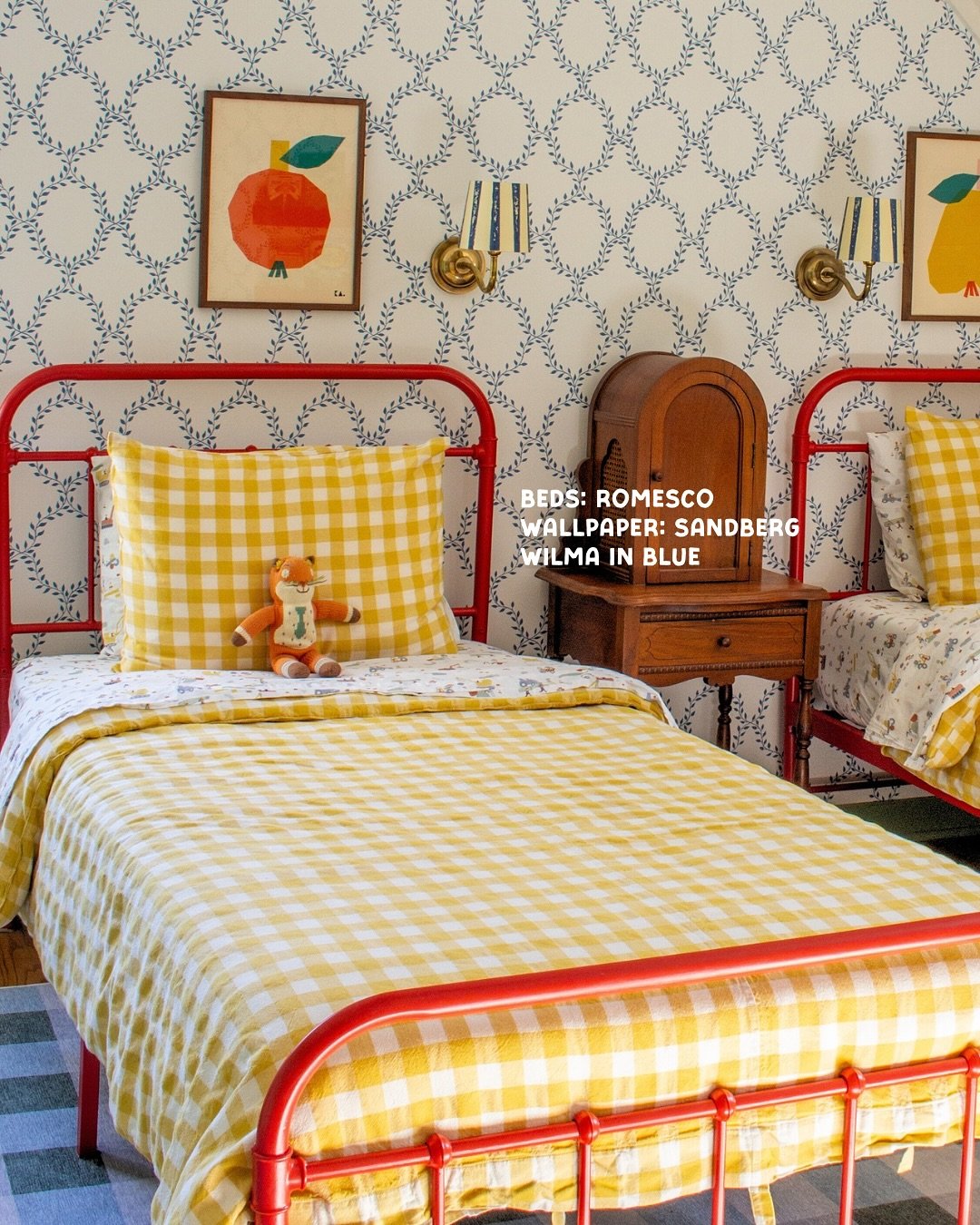
There’s a playful rhythm to this space that instantly pulls you in. The delicate blue wallpaper pattern sets the tone, while those bright red bed frames and gingham bedding bring in that cheerful, almost storybook energy.
It’s bold, but thoughtfully so. When working with pattern, let one element lead and keep the rest supportive. Here, the wallpaper anchors everything, while the colors echo just enough to tie it all together.
15. Cabin-Inspired Neutrals
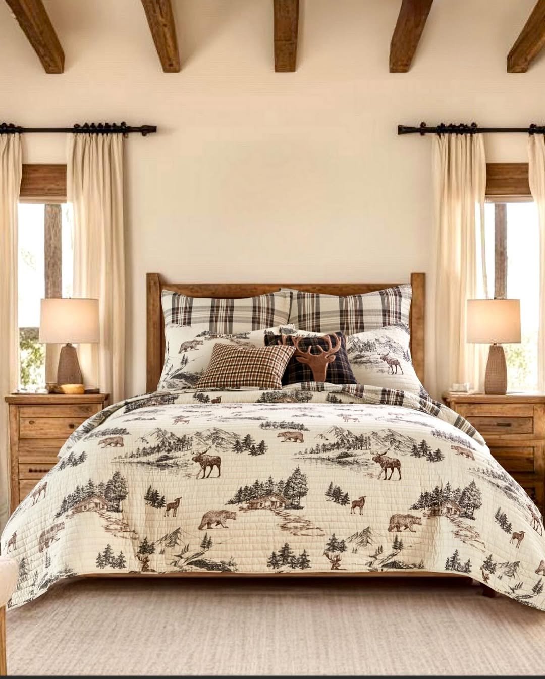
This room feels like a weekend getaway you never quite leave. Warm woods, soft creams, and those nature-inspired prints create a palette that feels rooted and comforting without trying too hard.
The paint fades into the background here, and that’s the point. When your materials and textiles carry this much character, a soft neutral wall lets everything breathe. It’s calm, collected, and quietly cozy.
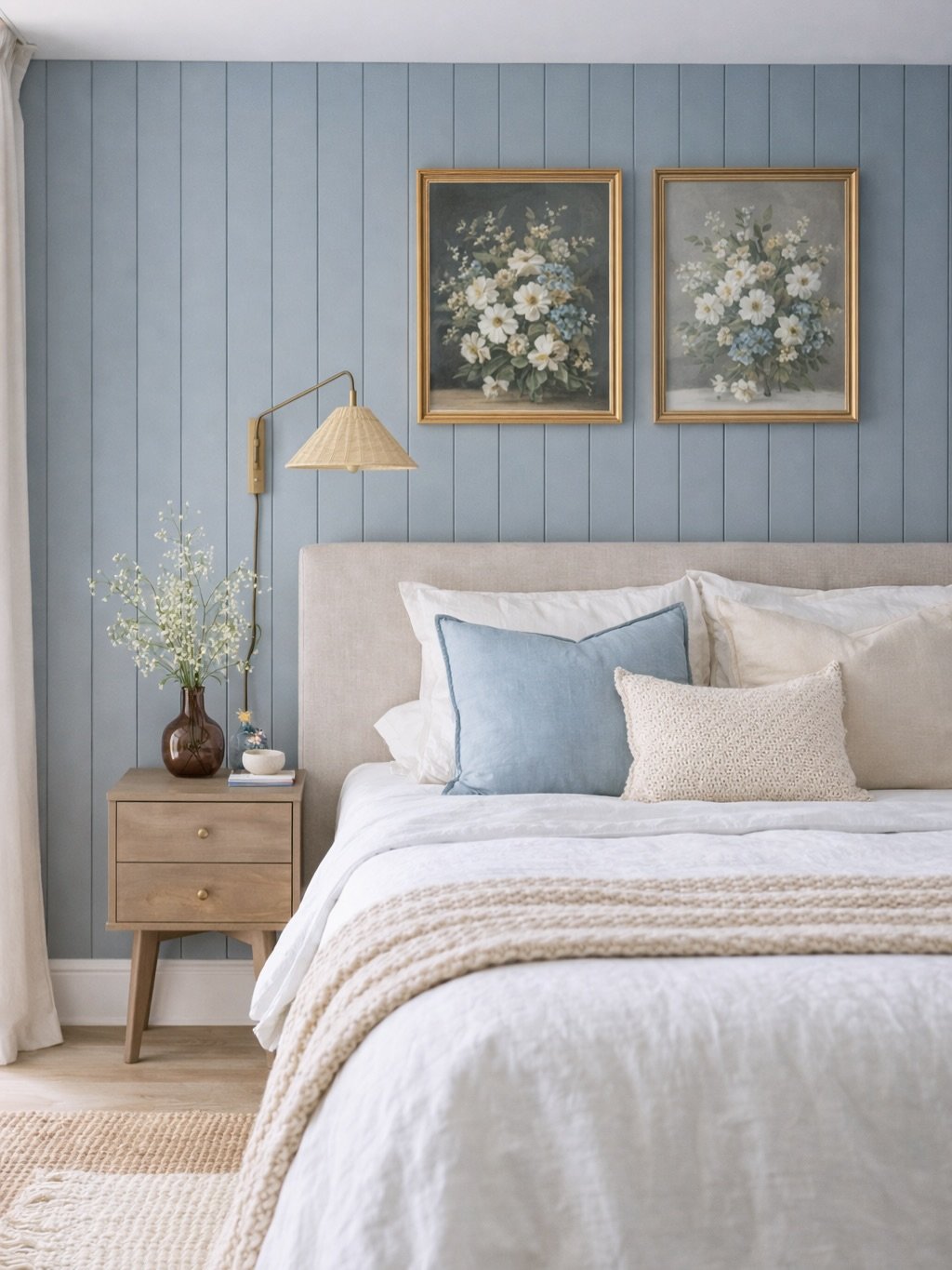
16. Heritage Blue Calm
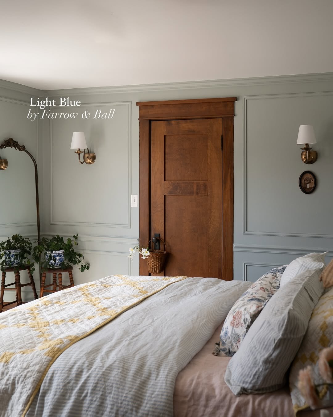
That muted blue-gray paneling feels both historic and fresh. It has a softness that keeps the room serene, but enough depth to make the layered whites and subtle patterns feel intentional.
There’s a quiet elegance here that comes from simplicity. Stick to a limited palette, mix in a few vintage-inspired details, and let the color do the heavy lifting. It’s understated, but never boring.
17. Warm Greige Comfort
Greige done right always feels like a warm welcome. This tone sits perfectly between beige and gray, creating a backdrop that adapts to everything around it, from crisp white bedding to darker accents.
And it’s incredibly versatile. If you’re someone who loves to switch out decor seasonally, this kind of color holds space for it all. Think of it as your foundation piece, quiet, reliable, and always in style.
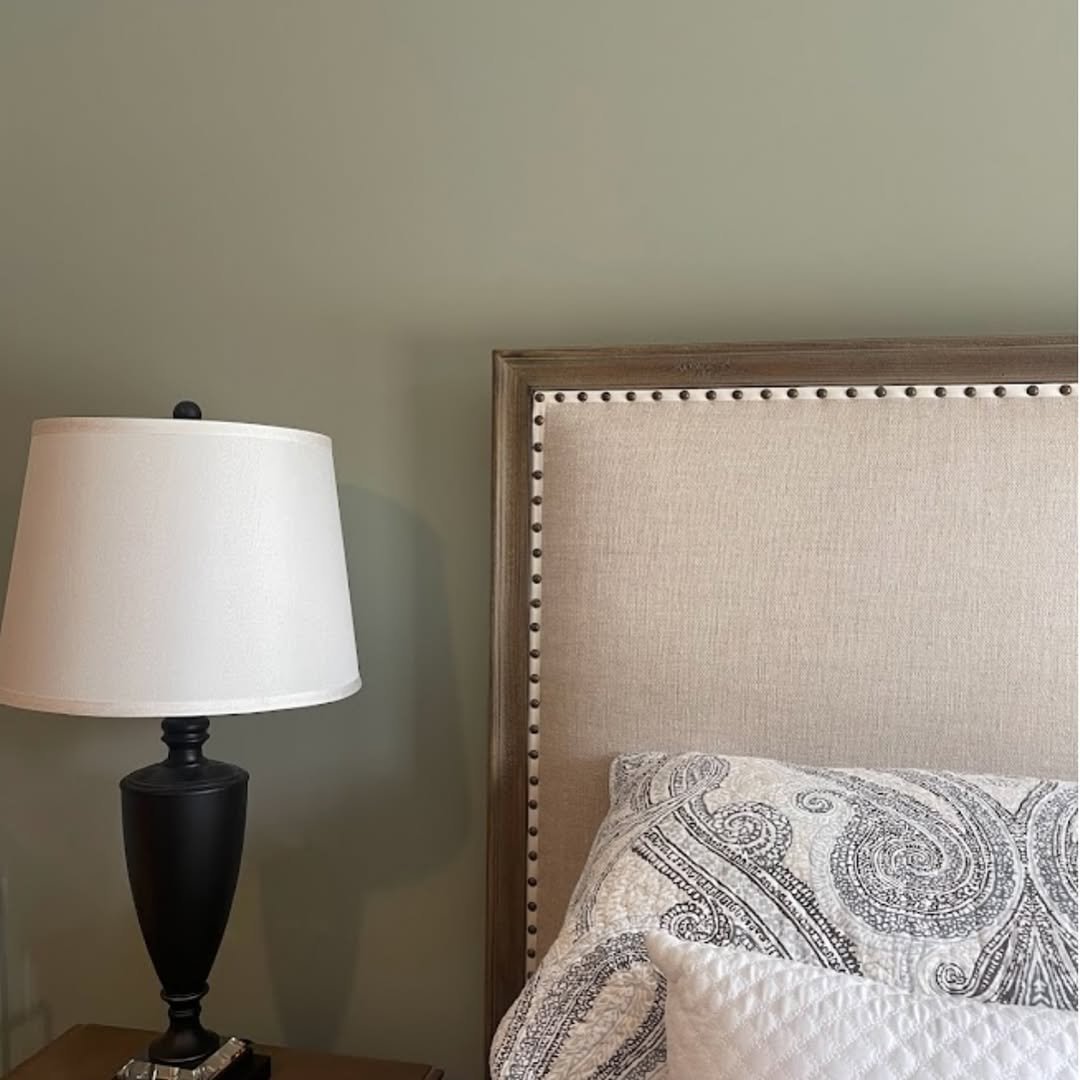
18. Olive Undertone Neutral
This one leans just slightly green, and that subtle shift changes everything. It gives the room a grounded, organic feel while still reading as a neutral at first glance.
It’s the kind of color that reveals itself over time. Pair it with natural woods, woven textures, and soft whites to bring out its depth. It’s understated, but far from plain.
19. Soft Coastal Blue
There’s a gentle calm to this pale blue that feels almost weightless. It reflects light beautifully, making the room feel open, airy, and just a little coastal without leaning too literal.
What I love is how it pairs with clean lines and minimal decor. Keep things simple, light woods, soft fabrics, and let the color set the tone. It’s easy, breezy, and endlessly relaxing.
20. Airy Sky Retreat
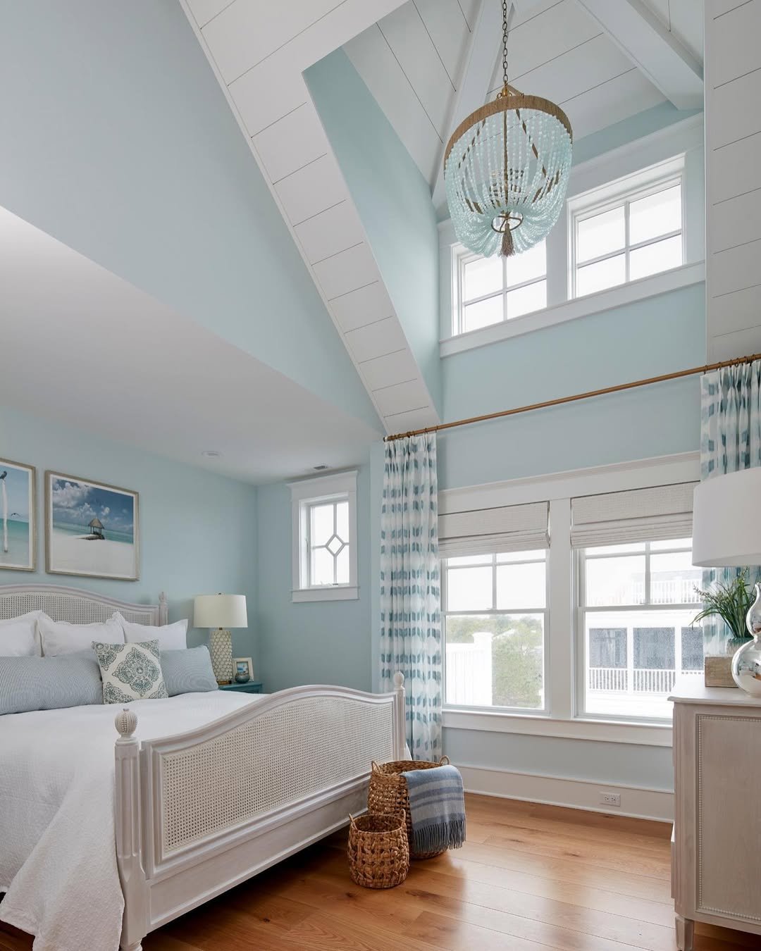
This space feels like it’s floating. The pale blue walls stretch upward into those vaulted ceilings, catching light from every angle and making the entire room feel expansive and serene.
And yet, it still feels grounded. The white furniture and woven accents keep things warm and approachable. If you have height to play with, lean into lighter tones to amplify that sense of space. It turns your bedroom into something that feels almost like an escape.
21. Soft Rose Wash
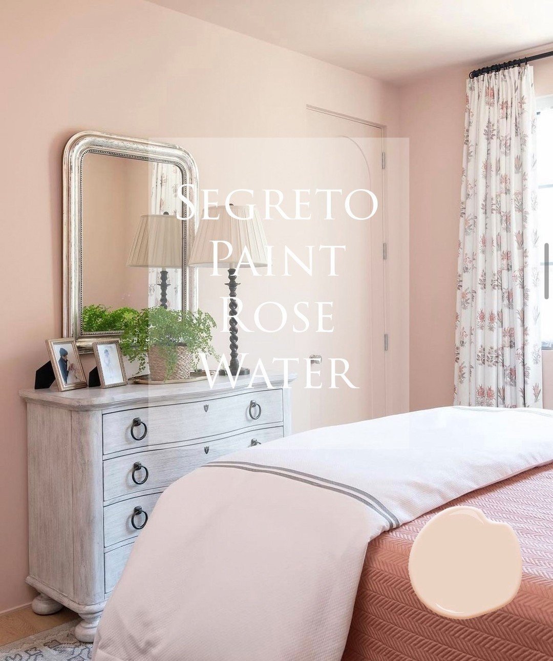
There’s something about this barely-there blush that feels like morning light caught on the walls. It wraps the room in a gentle warmth, softening the edges of the vintage dresser and those floral drapes without ever feeling too sweet.
What makes it special is how grown-up it feels. Pairing blush with weathered wood and classic silhouettes keeps it grounded. It’s romantic, yes, but in a quiet, collected way that feels timeless rather than trendy.
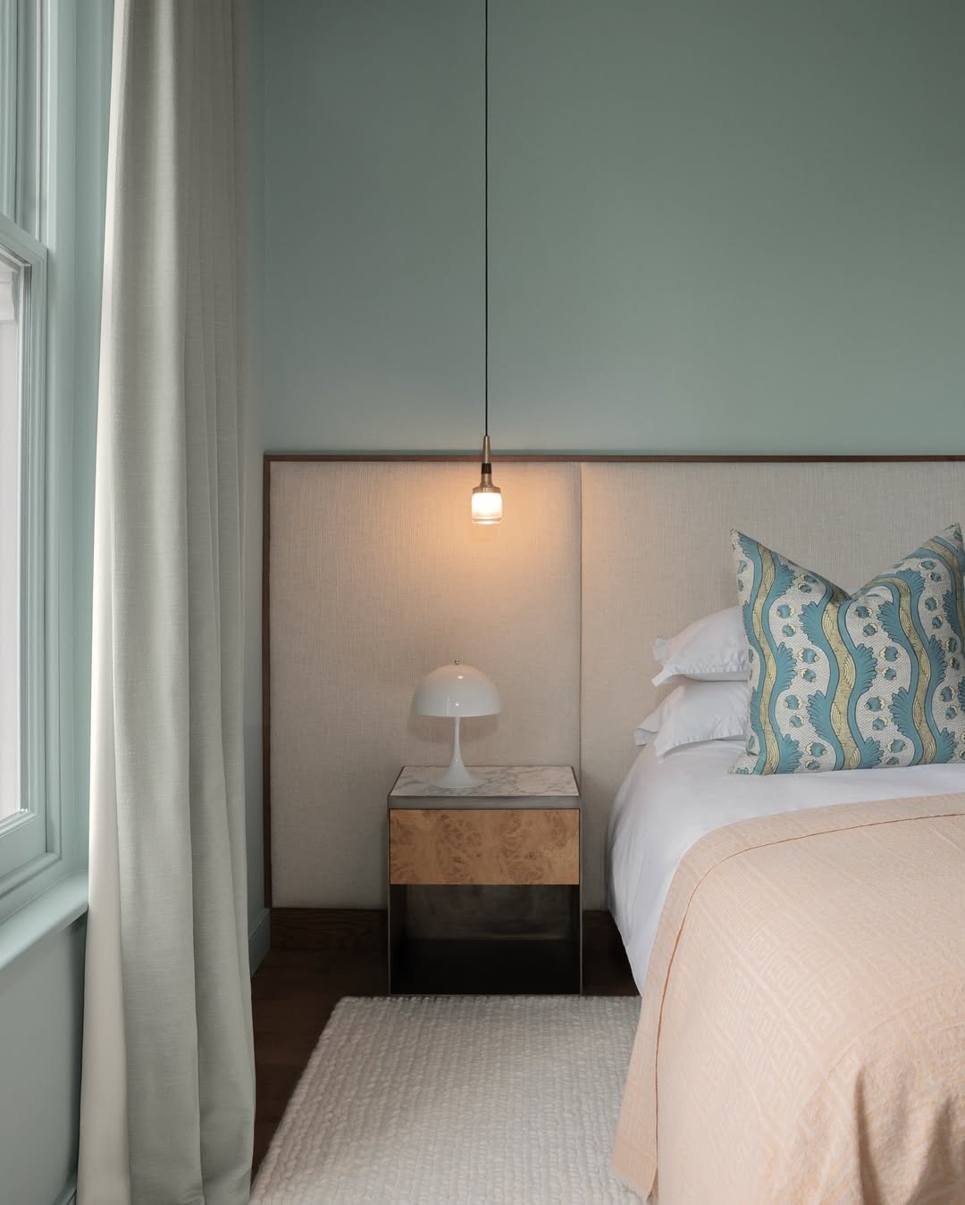
22. Muted Blue Panel Calm
This space leans into that clean, paneled backdrop and lets the color do the talking. The dusty blue reads calm and steady, especially against the warm wood bed and woven textures layered throughout.
It’s the kind of room that feels put together without trying too hard. If you’re working with paneling, keep your palette soft and your materials natural. It lets the architecture shine while still feeling relaxed and livable.
23. Peachy Minimal Glow
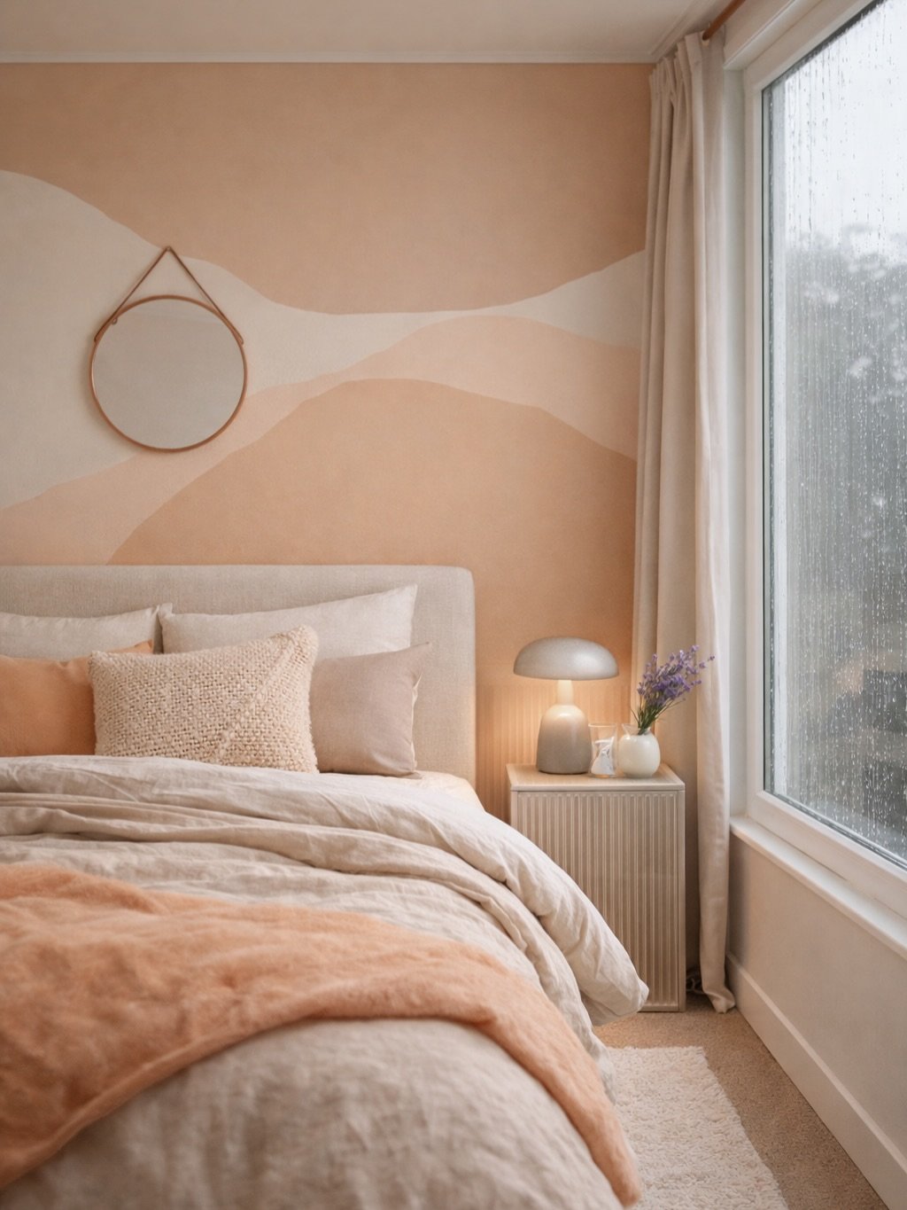
This room feels like a slow, rainy afternoon. The peach-toned walls carry a soft glow that shifts with the light, while the tonal bedding keeps everything feeling cohesive and calm.
There’s a simplicity here that’s easy to fall into. Stick to one color family and layer it in different textures, linen, boucle, soft cotton. It creates depth without clutter, which is exactly what makes it feel so serene.
24. Sculpted Neutral Layers
Here, color becomes almost sculptural. The soft, wavy wall treatment blends creams and warm beiges in a way that feels fluid, almost like painted light moving across the room.
It’s subtle, but it has presence. When working with neutrals, introducing movement like this keeps things interesting. It turns a simple palette into something that feels thoughtful and quietly artistic.
25. Classic Blue Paneling
This shade of blue feels rooted in tradition, but still fresh. The vertical paneling adds structure, while the soft bedding and floral artwork bring in that gentle, lived-in charm.
It’s a reminder that classic doesn’t have to mean predictable. Mixing tailored details with soft layers keeps the space balanced. Think crisp lines softened by texture, that’s where the magic happens.
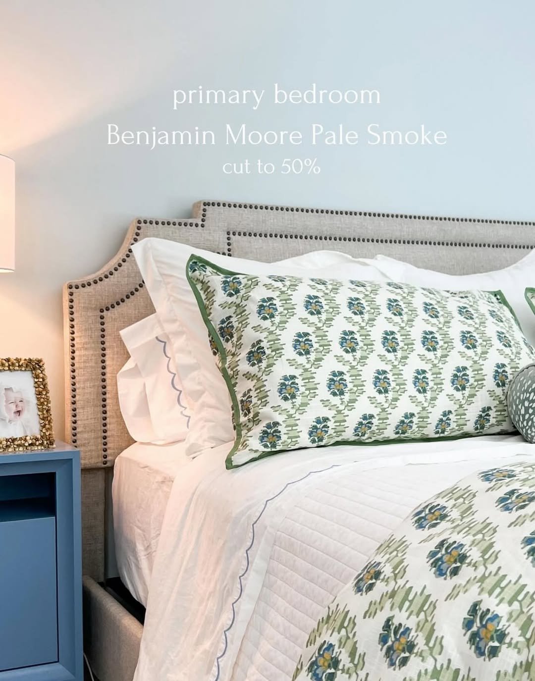
26. Pale Smoke Serenity
This pale, airy blue almost disappears into the light, and that’s exactly why it works. It creates a clean, calm backdrop that lets the patterned textiles and tailored headboard stand out.
There’s an ease to this kind of color. It doesn’t demand attention, but it quietly elevates everything around it. Perfect for anyone who wants color without committing to something bold.
27. Warm Clay Accent
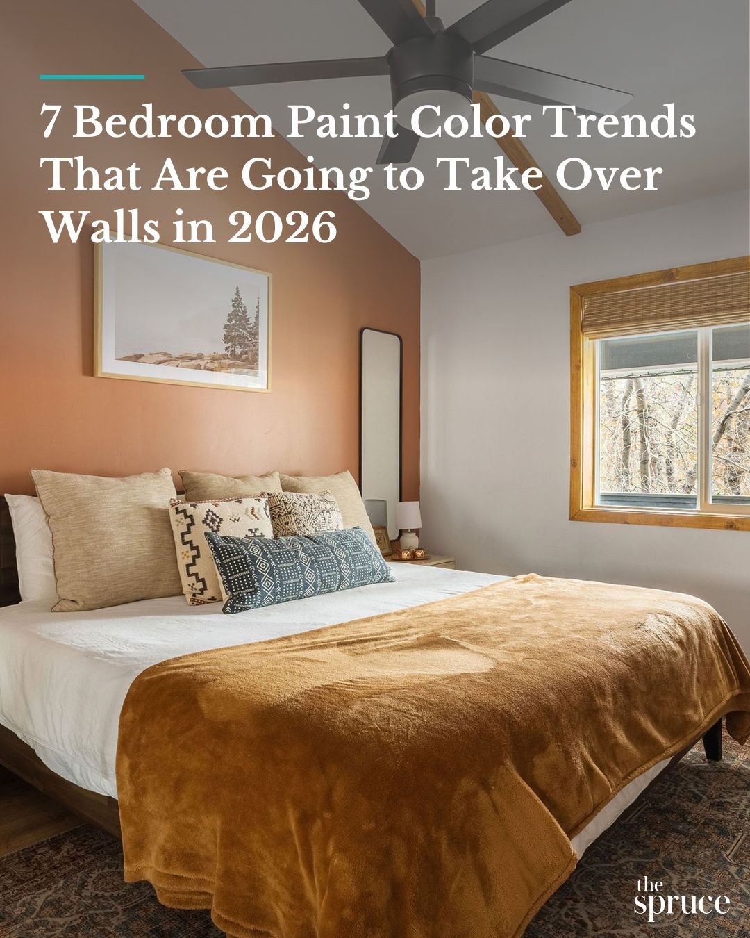
This earthy clay tone brings just enough depth to anchor the room. Paired with creamy bedding and those patterned pillows, it feels layered, warm, and slightly rustic in the best way.
Accent walls like this work when they feel intentional. Keep the surrounding palette soft and let the color ground the space. It creates contrast, but still feels cohesive.
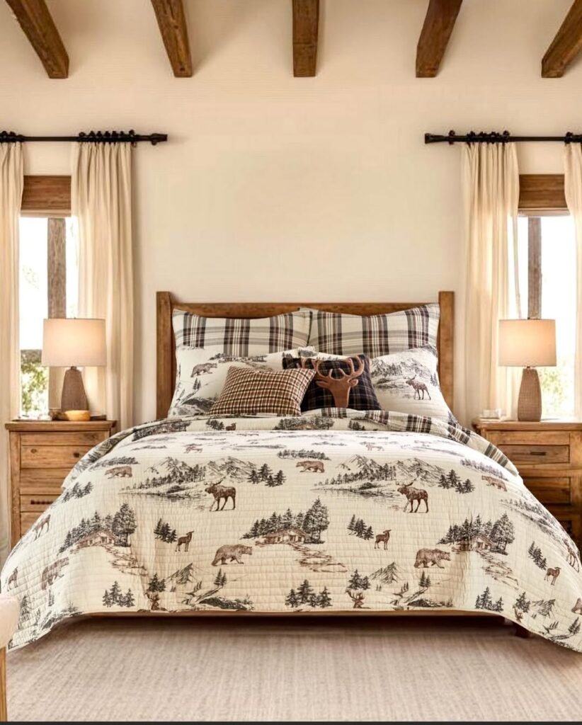
28. Light Neutral Ease
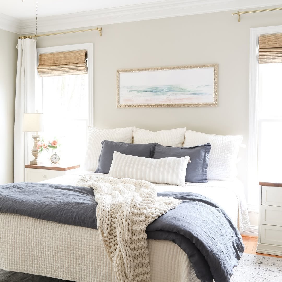
This room leans into light, and it shows. Soft neutral walls bounce natural light around, making everything feel open and quietly polished. The layered whites and muted blues add just enough contrast to keep it from feeling flat.
It’s the kind of space that always feels fresh. When in doubt, go lighter and build your depth through textiles. A chunky knit, a striped pillow, a hint of wood, it all comes together without overwhelming the room.
