
Feeling like your bathroom could use a fresh burst of personality? These 26 bathroom color scheme ideas are vibrant, balanced, and mood boosting perfect for bringing new life into dull spaces while creating a look that feels cohesive, stylish, and uniquely yours.
26 Bathroom Color Scheme Ideas That Instantly Refresh and Revive Your Space in 2026
In 2026, bathroom color schemes are taking center stage with bold contrasts, soothing neutrals, and nature inspired tones that breathe new life into tired spaces. It’s all about using color to create mood whether that’s a calming spa-like escape or a vibrant, personality-filled statement.
From subtle palettes to eye-catching combinations, these ideas are packed with inspiration to help you reimagine your bathroom with confidence. Get ready to explore fresh color pairings that elevate your space and turn even the dullest bathroom into a stylish standout.
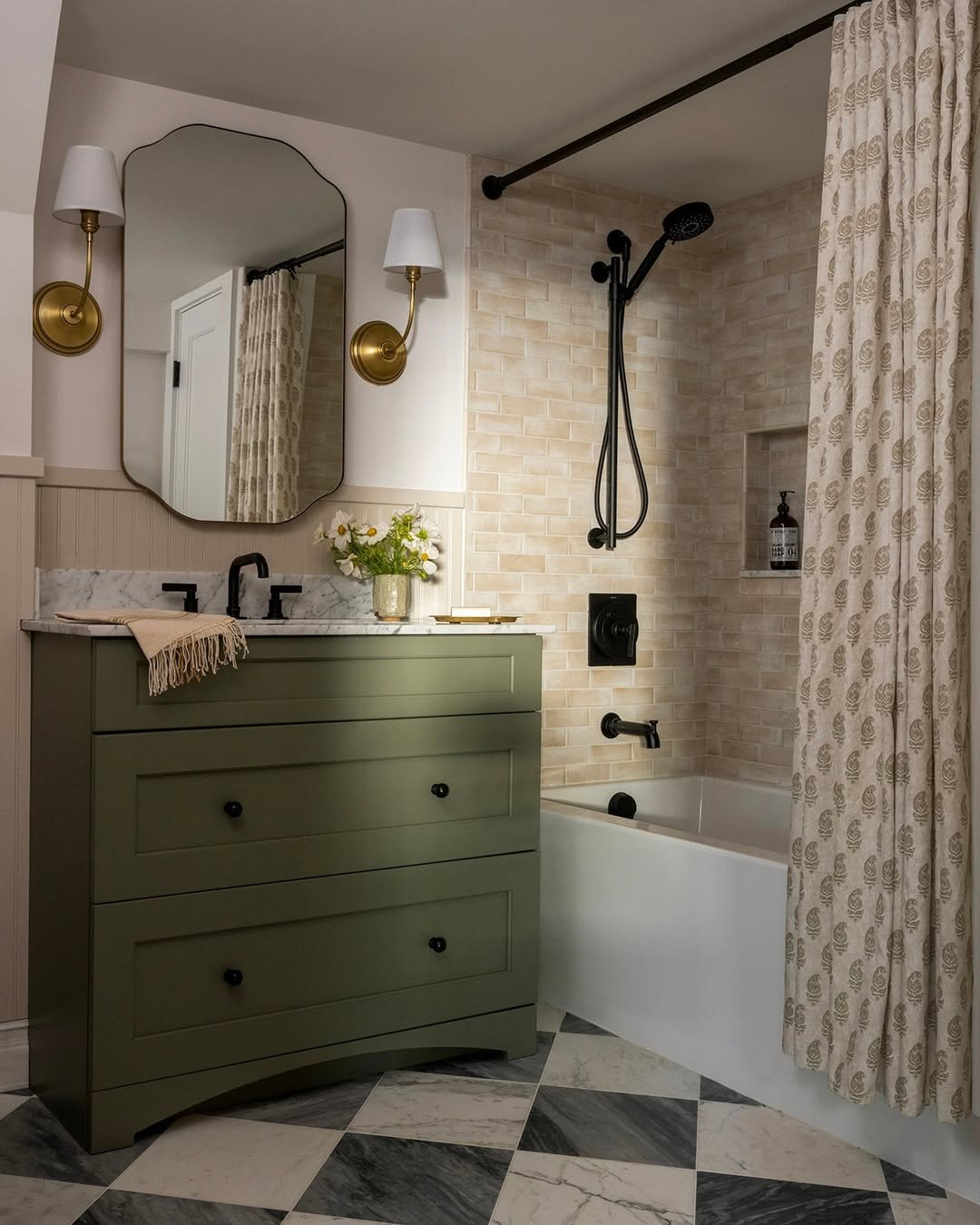
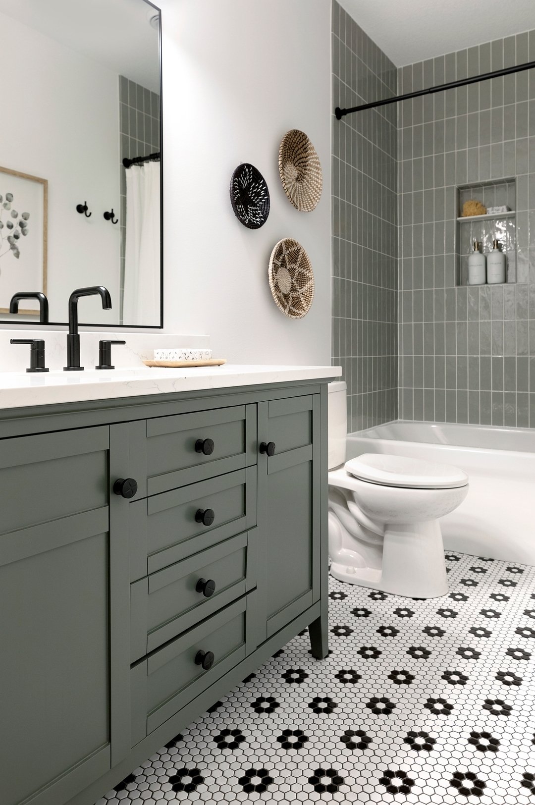
1. Soft Olive & Monochrome Mix
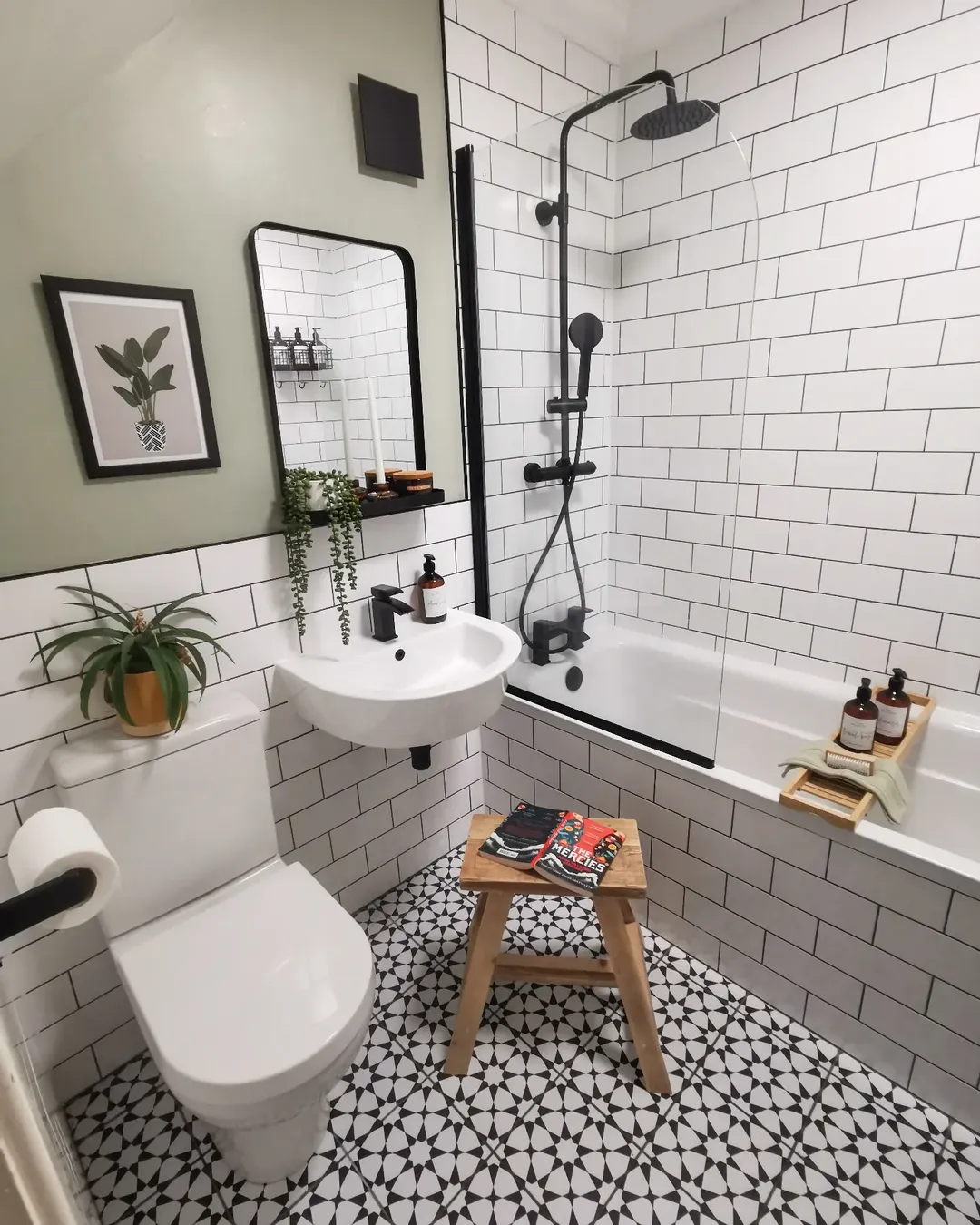
This little bathroom proves you don’t need a ton of space to make a big statement. The crisp white subway tiles paired with that muted olive wall instantly create contrast, but it’s the black fixtures that really tie everything together. It’s clean, graphic, and just a little bit edgy.
And then your eye drops to that patterned floor—suddenly the whole space feels playful. It’s like a classic base outfit with one bold accessory that changes everything. Effortless, but definitely not boring.
2. Moody Black & Natural Wood
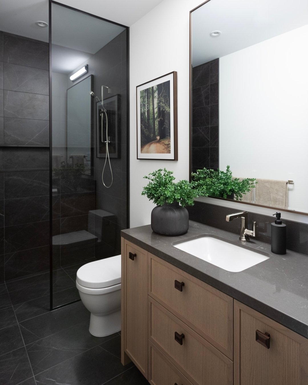
This one leans into that dark, spa-like mood and does it so well. The deep charcoal tiles in the shower feel grounding and dramatic, while the warm wood vanity softens everything just enough to keep it inviting.
It’s that perfect balance between sleek and cozy. The greenery adds a fresh pop, almost like a breath of air in an otherwise moody palette—proof that dark bathrooms can still feel alive and welcoming.
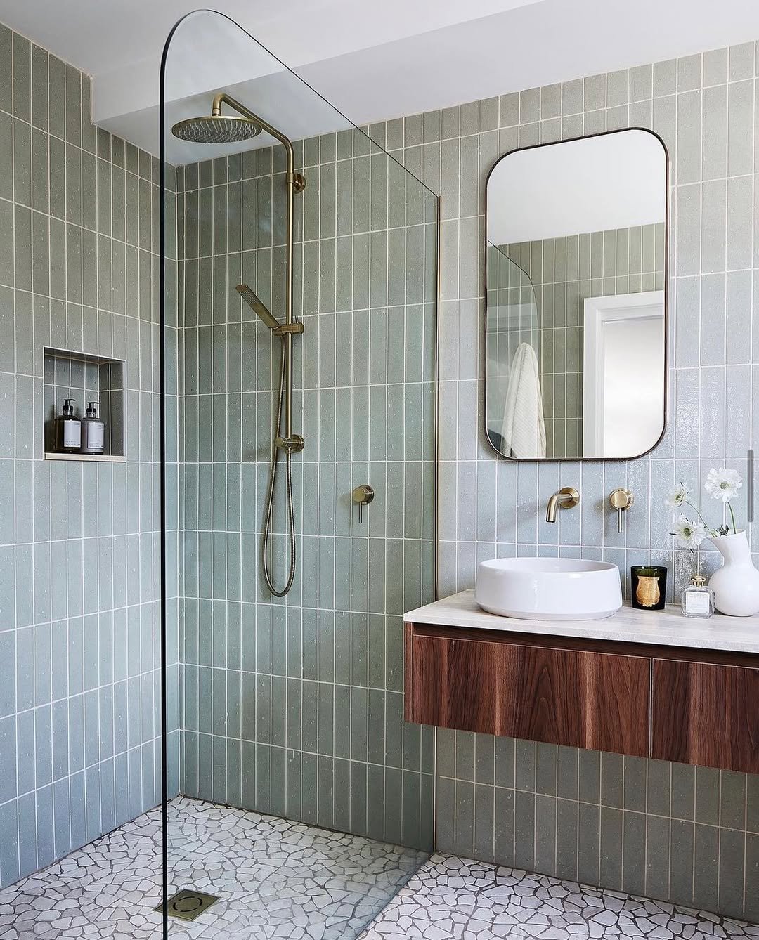
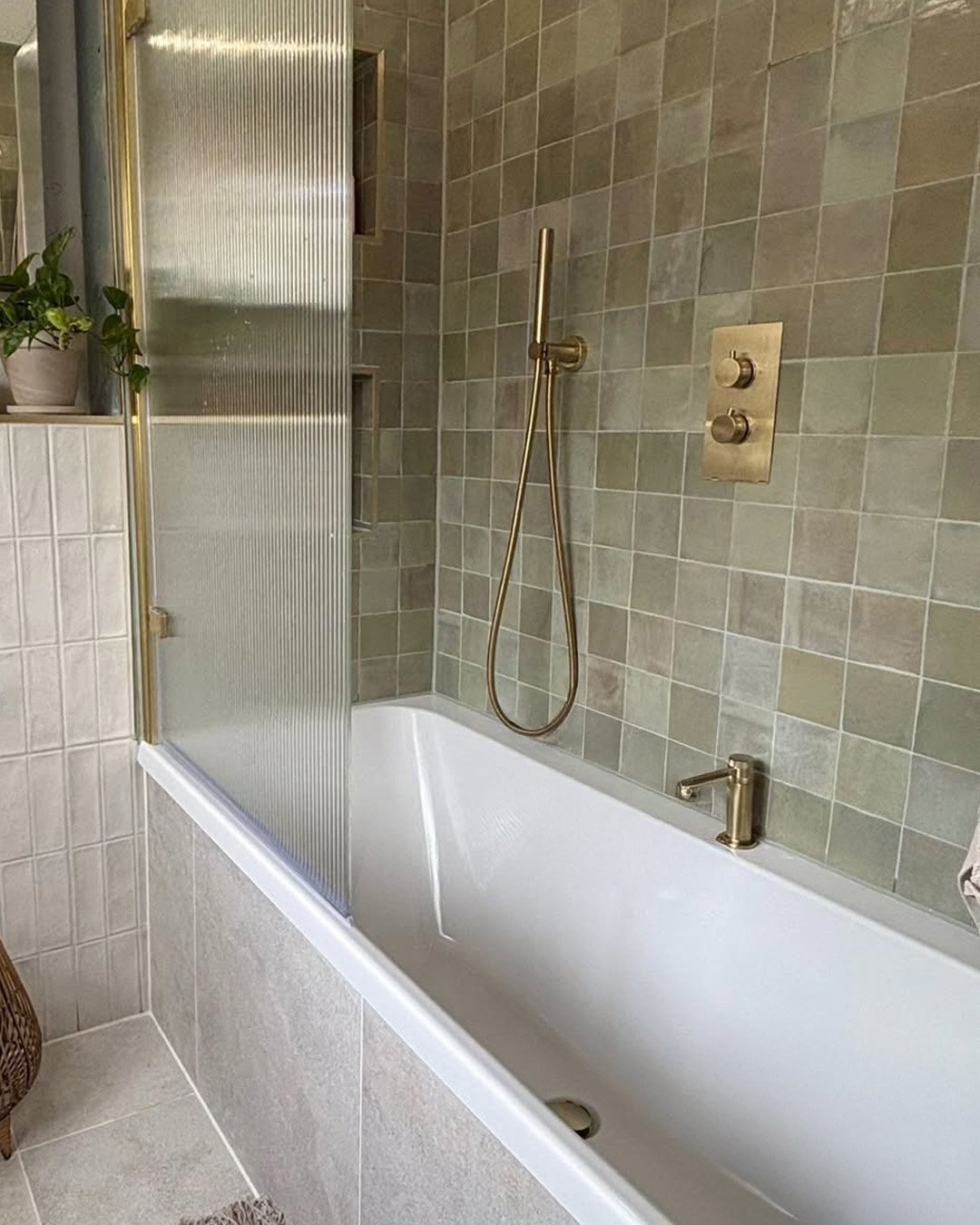
3. Sage Green & Warm Neutrals
There’s something instantly calming about this palette. The muted sage vanity feels earthy and relaxed, while the creamy tiles and soft brass lighting add warmth without overwhelming the space.
It’s giving “quiet luxury” but in a very livable way. Nothing feels too precious—it’s just a well-layered mix that feels like it belongs, like it’s been there forever in the best way.
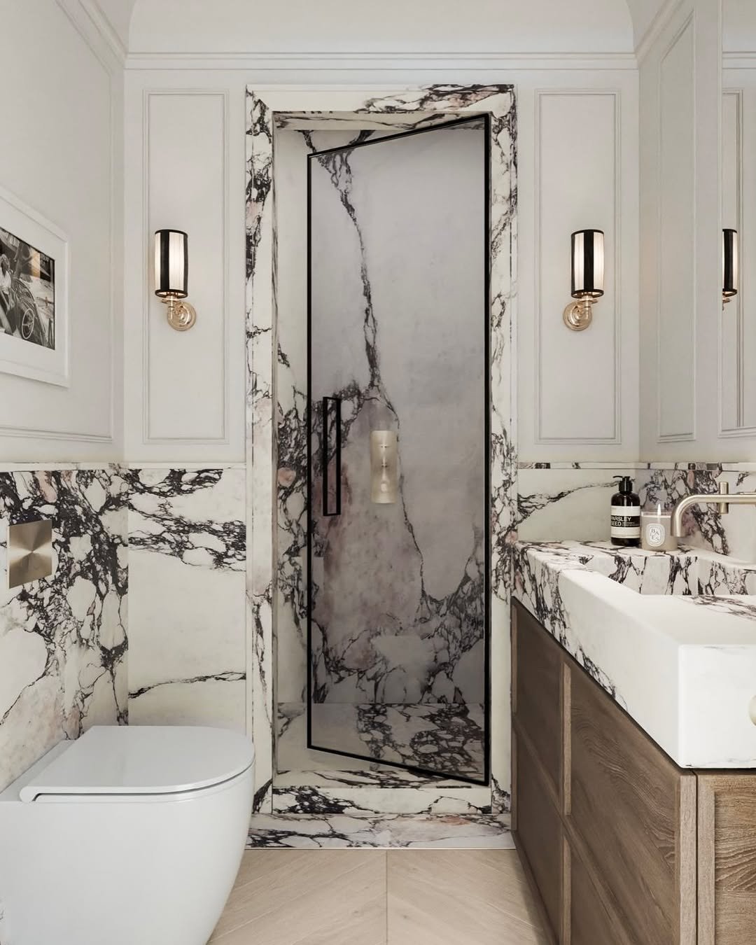
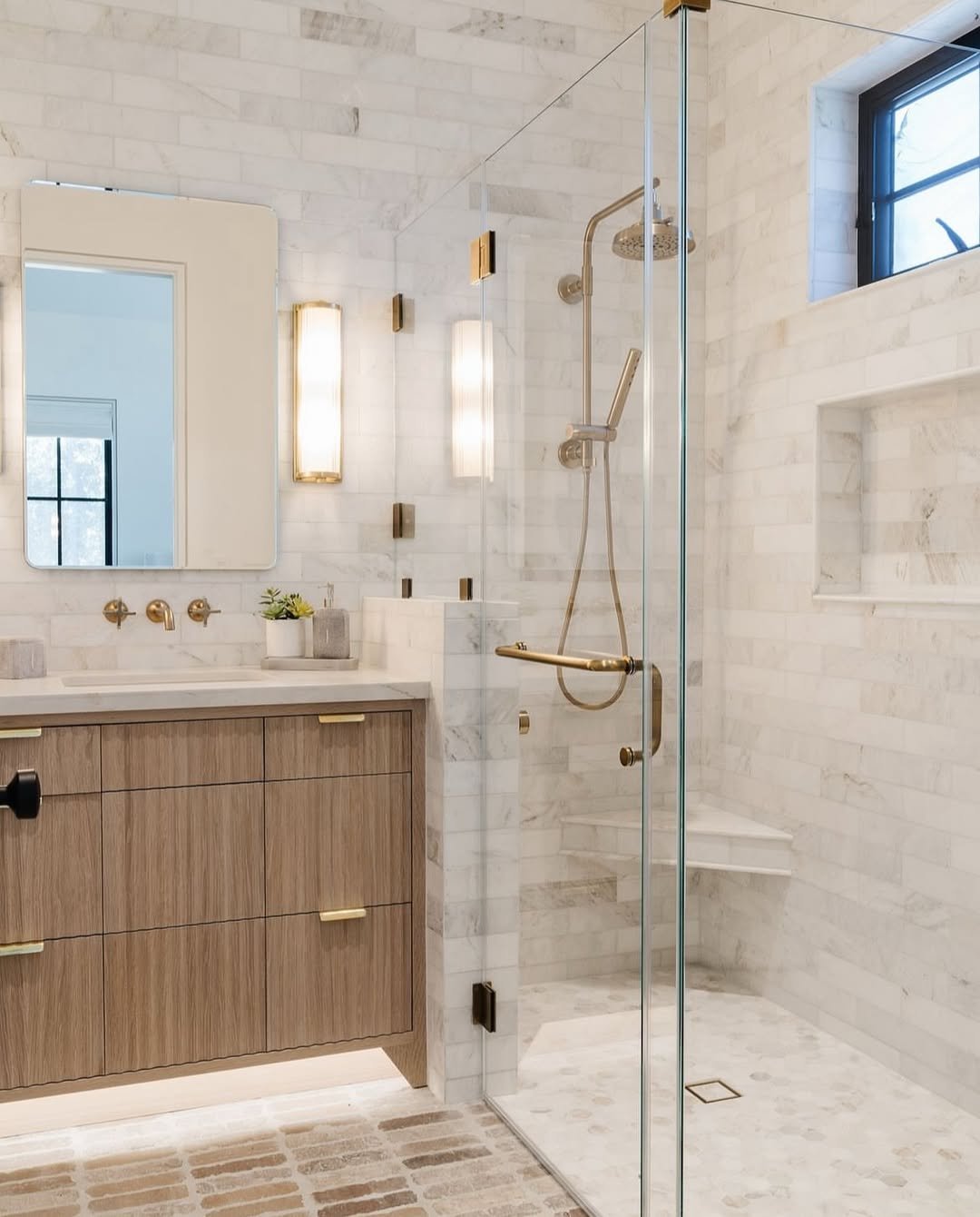
4. Classic Marble & Gold Elegance
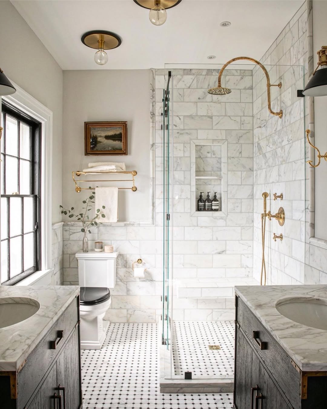
This is one of those timeless looks that never really goes out of style. The marble walls bring in that soft veining and texture, while the gold fixtures elevate everything into something a little more luxe.
But what makes it work is how balanced it feels. It’s not flashy—it’s refined. Like a tailored outfit that doesn’t need trends to look good.
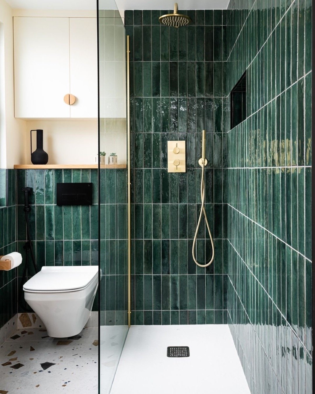
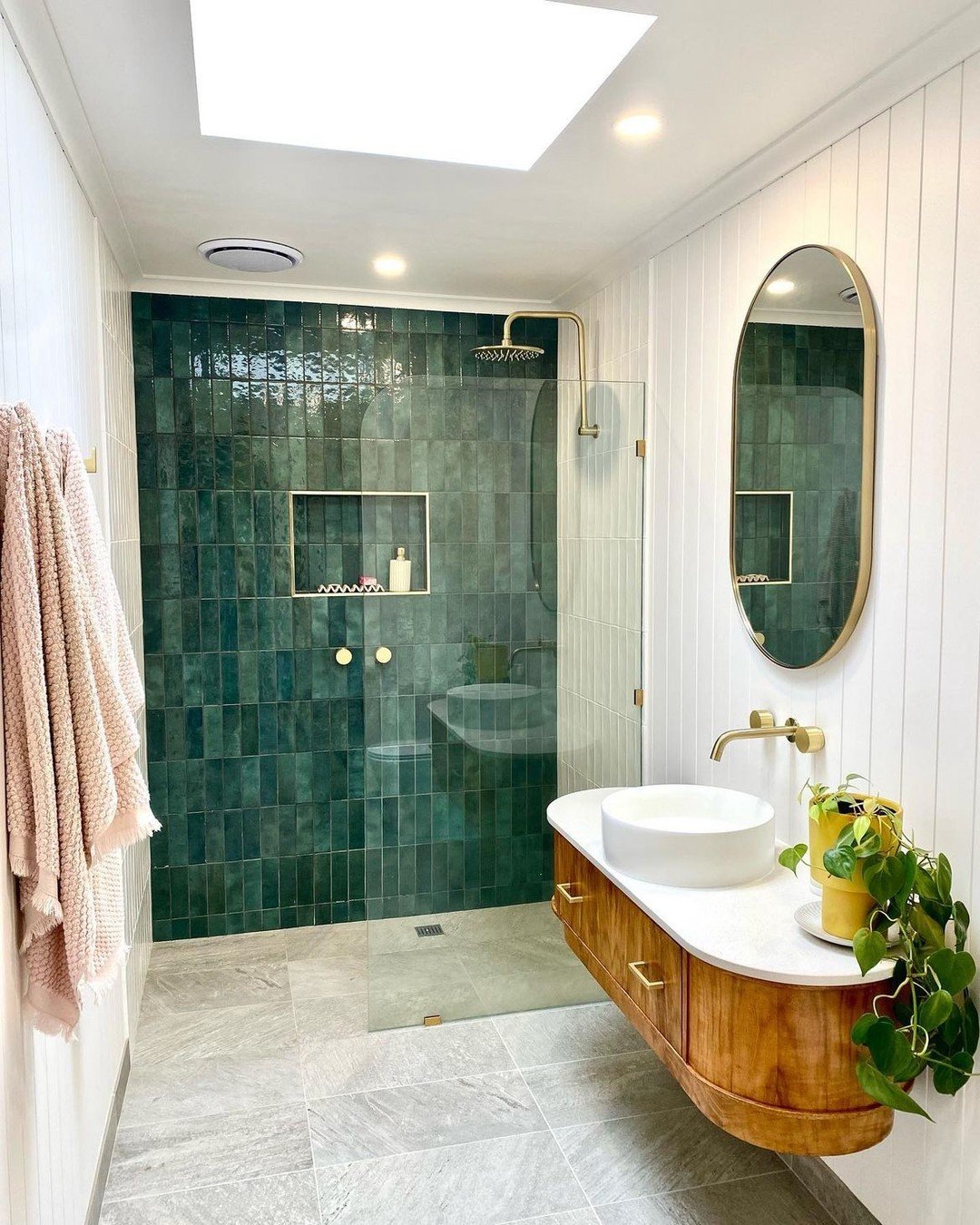
5. Deep Green & Soft Brass Combo
This space leans into rich color in such a confident way. The deep green tiles wrap the room, creating a cocoon-like feel, while the brass accents cut through with just the right amount of shine.
It’s bold, but still grounded. The contrast between glossy tiles and matte finishes adds depth, making the whole space feel layered and intentionally designed.
6. Soft Blue-Green Serenity
If calm had a color palette, this would be it. The pale blue-green tiles feel airy and light, almost like they’re reflecting natural light even when there isn’t much.
Paired with soft whites and subtle brass details, it creates a spa-like vibe without trying too hard. It’s the kind of bathroom that makes you slow down a little.
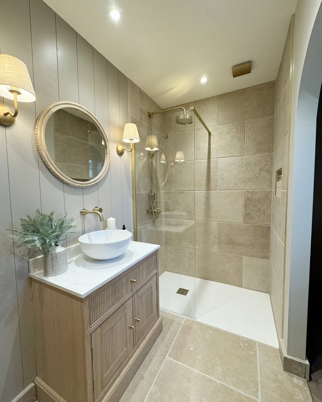
7. Neutral Stone & Vintage Brass
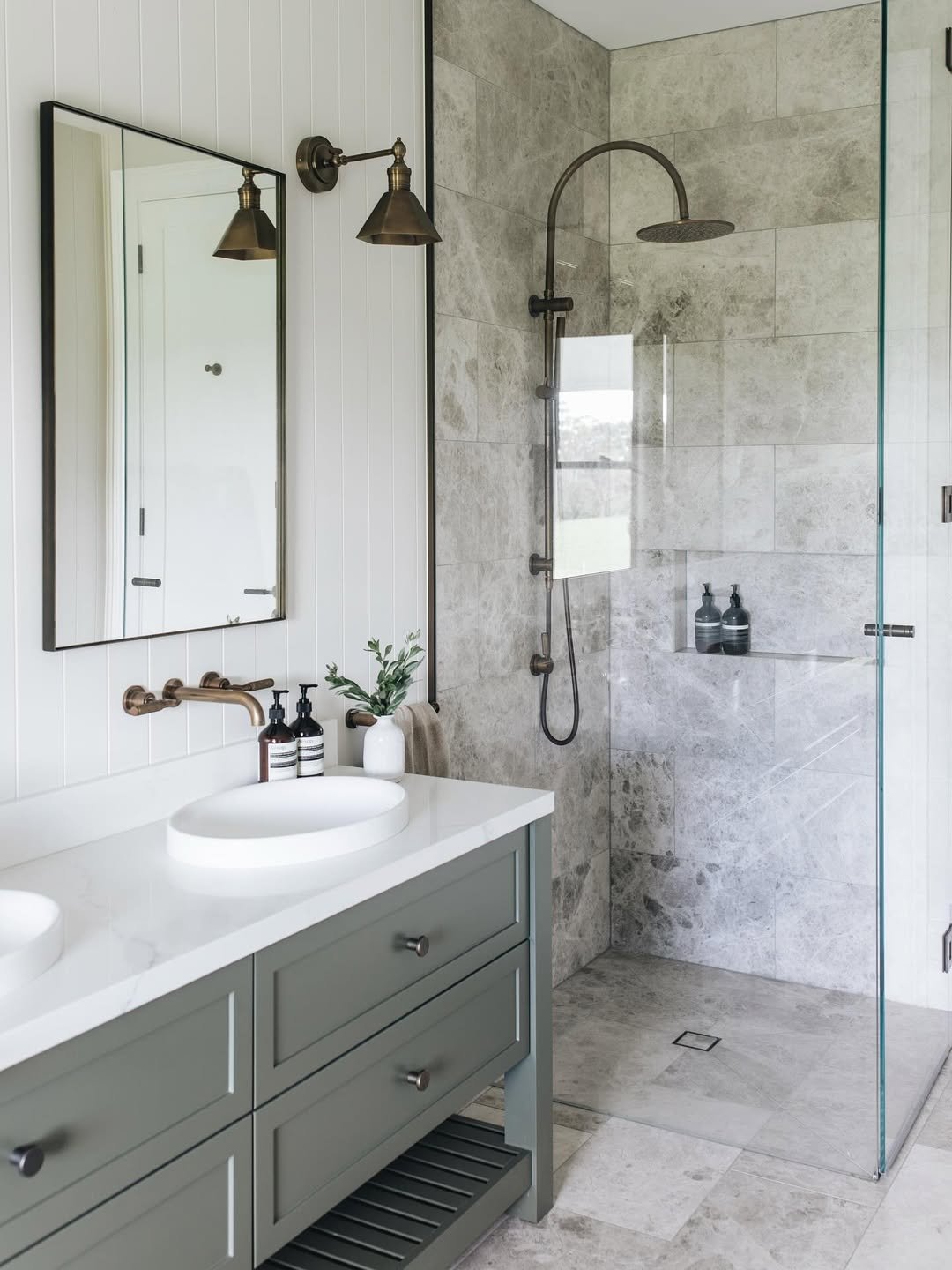
This one is all about understated elegance. The stone tiles bring texture and a slightly rustic feel, while the vintage-style brass fixtures add warmth and character.
It feels collected rather than designed—like each element was chosen over time. And that’s what gives it charm. It doesn’t shout, it just quietly impresses.
8. Marble Drama & Warm Wood
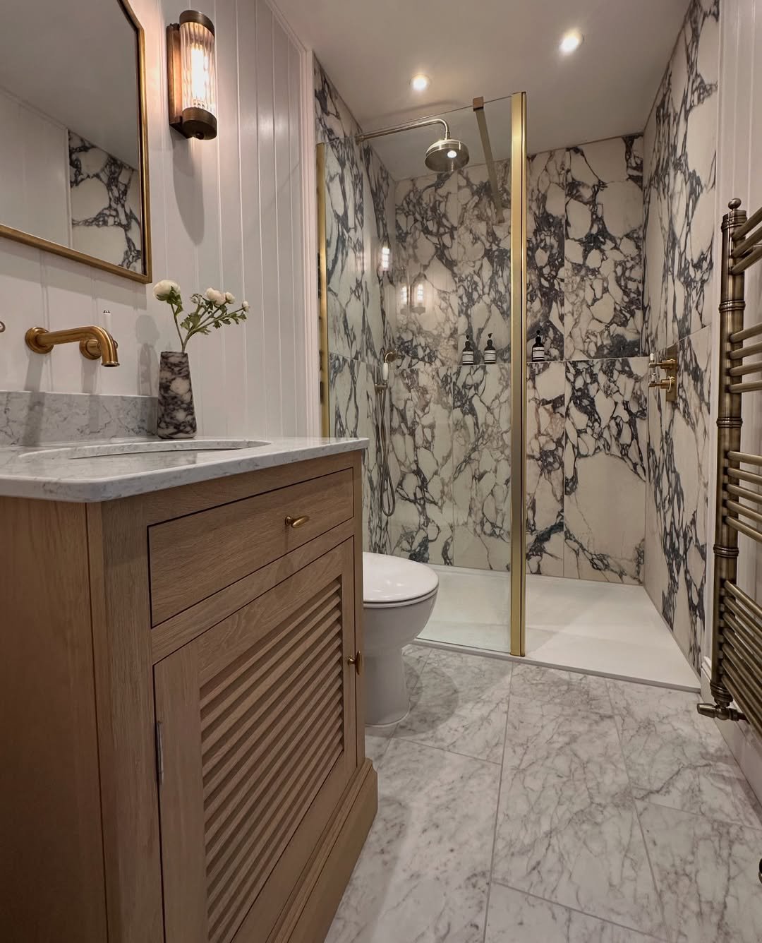
Here’s where things get a little dramatic—in the best way. The bold marble veining creates instant impact, while the wood vanity grounds the whole look so it doesn’t feel too cold.
It’s a high-contrast combo that still feels cohesive. Like mixing something classic with something a bit daring and realizing they actually work perfectly together.
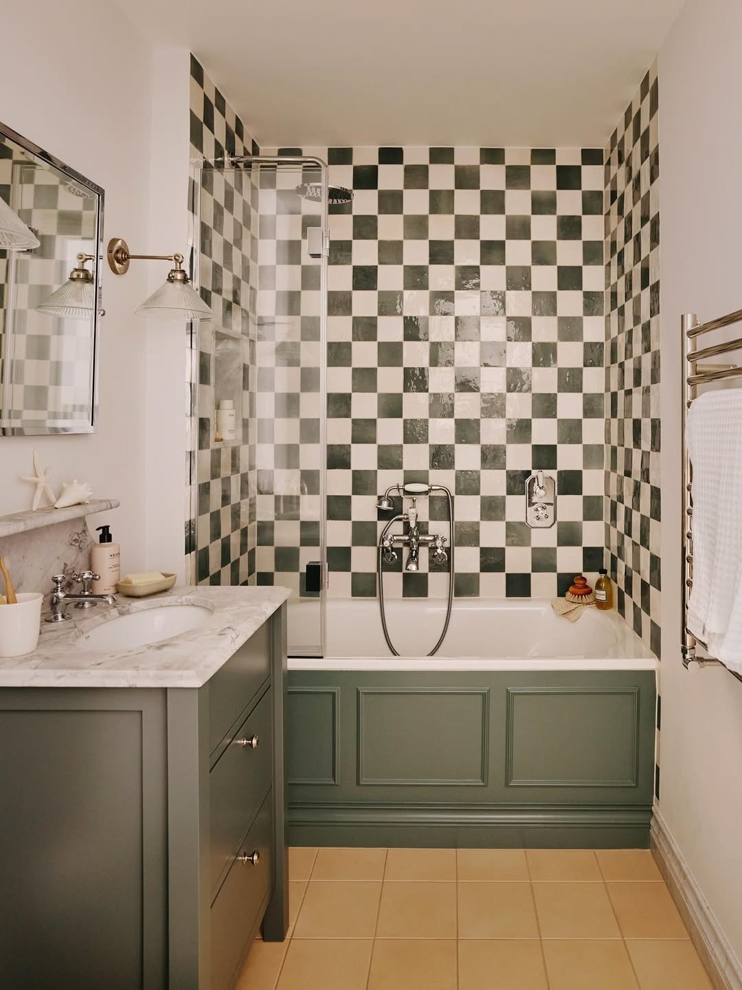
9. Checkerboard Green & Cream
This one is playful and nostalgic, but still super chic. The checkerboard tiles bring that vintage energy, while the muted green tones keep it from feeling too loud.
Paired with soft cream elements and classic fixtures, it feels like a modern twist on a retro idea. Fun, but still grown-up.
10. Minimal Pastel & Clean White
This space keeps things light, airy, and super minimal. The soft pastel tiles add just a hint of color, while the crisp white surroundings keep everything feeling fresh and uncluttered.
It’s simple, but not plain. The beauty here is in the restraint—nothing extra, nothing forced. Just a clean, calming palette that does exactly what it needs to do.
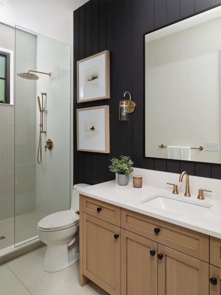
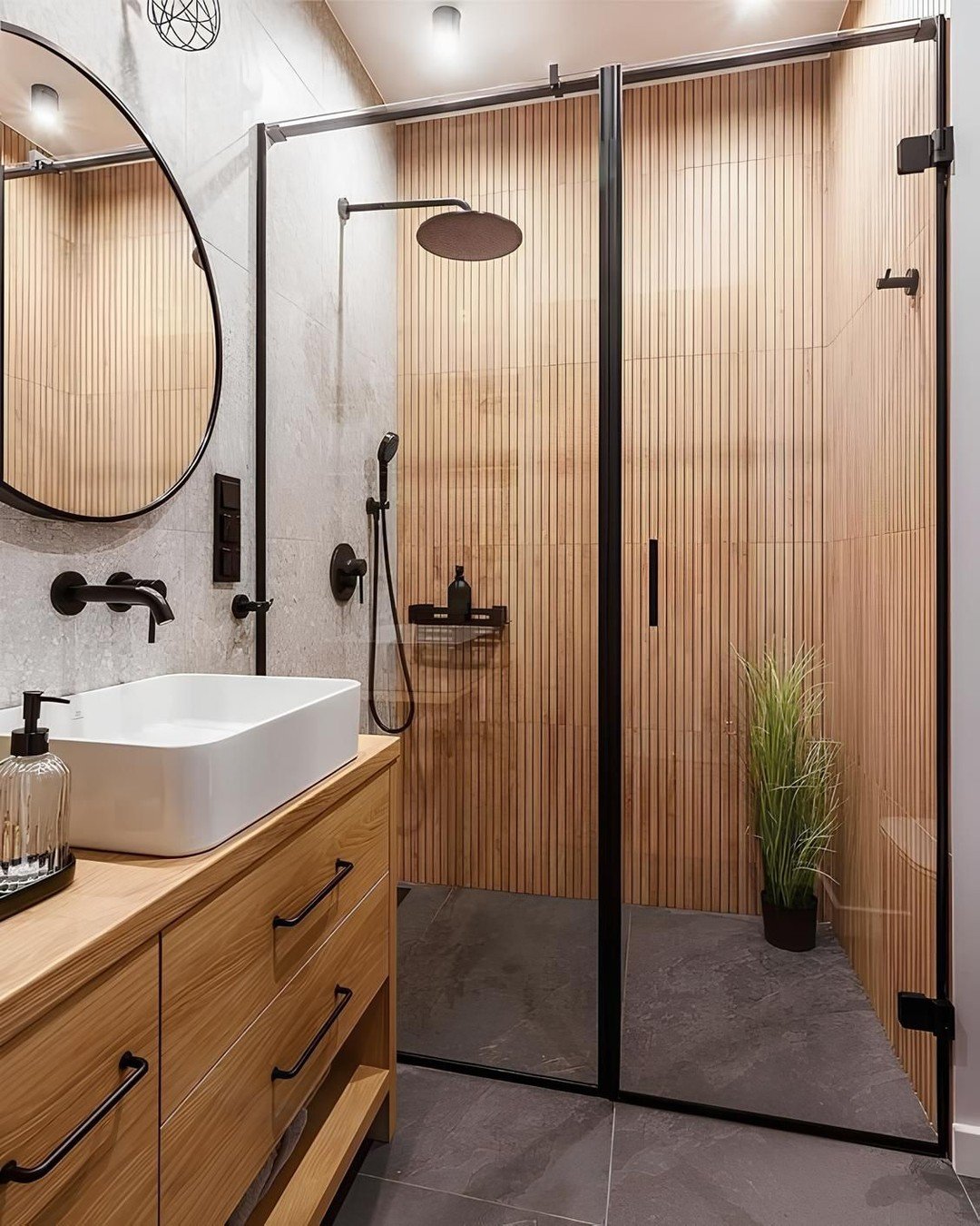
11. Black Paneling & Warm Wood

This one is all about contrast done right. That deep black vertical paneling instantly adds drama, but it’s softened beautifully by the light wood vanity and crisp white surfaces. It feels bold, but still super livable.
And those brass fixtures? They’re the quiet hero here. They warm up the palette just enough, giving the whole space that polished, “put-together without trying too hard” energy.
12. Soft Sage & Walnut Warmth
There’s something so effortlessly calming about this color combo. The soft sage tiles wrap the space in a gentle, muted tone, while the walnut vanity brings in that rich, grounded warmth.
It’s giving spa vibes, but not in a cliché way. Everything feels intentional yet relaxed—like a space you’d actually want to linger in, not just pass through.
13. Dusty Blue & Brushed Gold
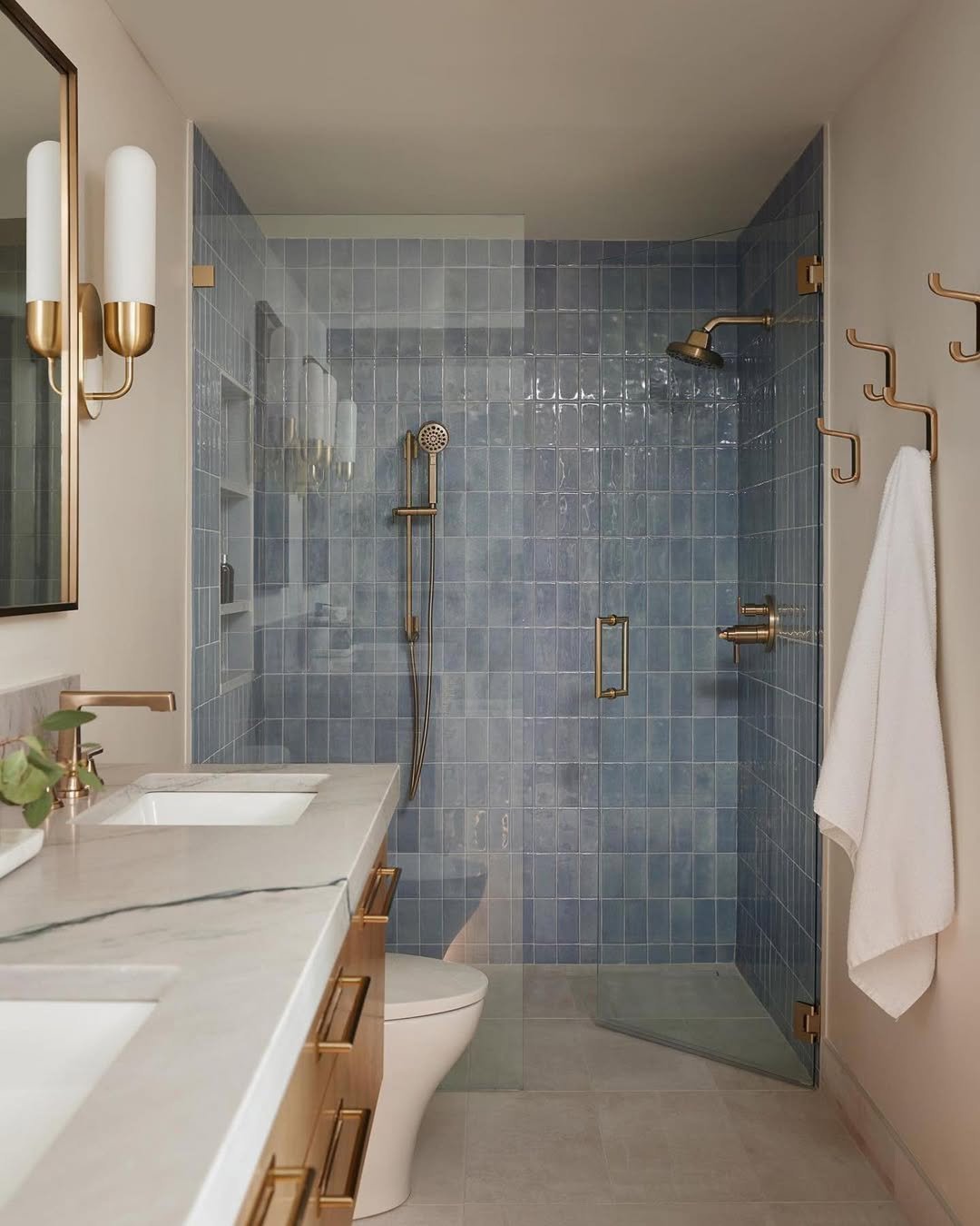
This bathroom leans into color in such a soothing way. The dusty blue tiles create a cool, tranquil base, while the brushed gold fixtures add just enough glow to keep things from feeling cold.
It’s a subtle kind of luxury—nothing flashy, just a really thoughtful pairing. Like a soft color palette that still knows how to make an impression.
14. Layered Neutrals & Glossy Texture
This space plays with tone-on-tone in the best way. The mix of light and deeper neutrals, paired with those glossy tiles, adds depth without relying on bold color.
It’s all about texture here. The shine, the subtle shifts in shade—it keeps your eye moving without overwhelming the space. Quiet, but definitely not boring.
15. Vintage Green & Cream Charm
This one feels like stepping into a storybook. The deep green tones paired with soft cream tiles create that classic, slightly nostalgic vibe that just works.
And then you’ve got those little details—the mix of finishes, the styling—it all feels collected over time. It’s charming in a way that feels personal, not staged.
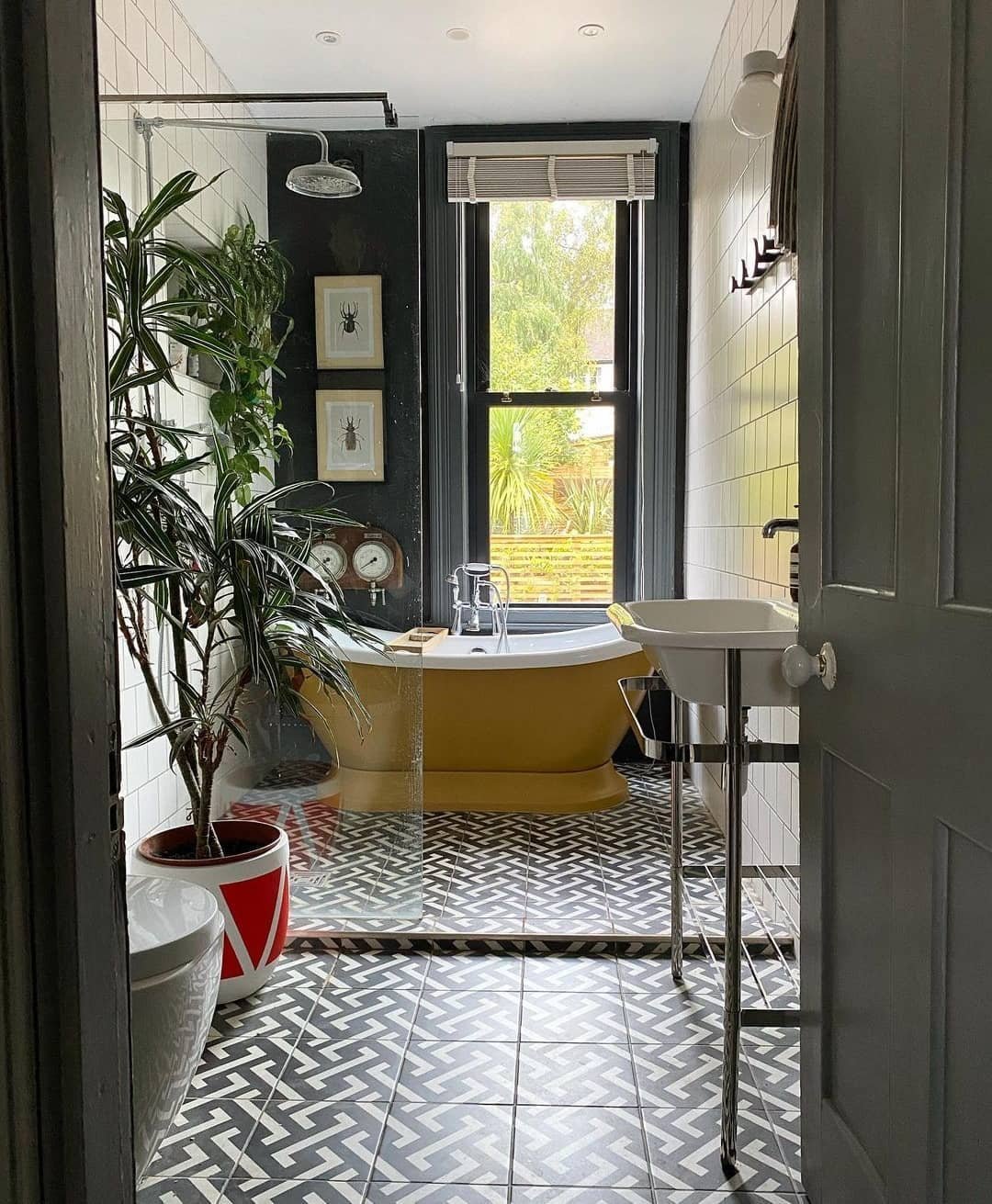
16. Bold Pattern & Eclectic Color
This bathroom doesn’t hold back, and that’s exactly why it works. The patterned floor immediately grabs attention, while the mix of colors keeps things playful and full of personality.
It’s one of those spaces that feels creative and fearless. Like someone had fun designing it—and that energy really comes through.
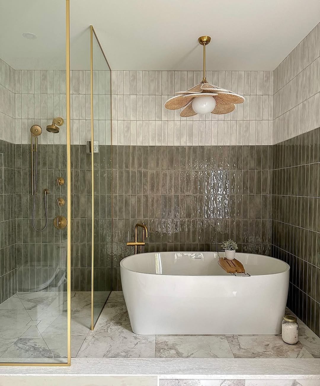
17. Deep Green Tiles & Soft Stone
Here’s a more grounded take on green. The deep, glossy tiles bring richness and depth, while the soft stone flooring balances everything out with a lighter, natural feel.
It’s a really satisfying contrast—dark meets light, glossy meets matte. The result feels modern, but still warm and inviting.
18. Monochrome Contrast & Botanical Touch
This space plays with black and white in a way that feels fresh, not stark. The contrast is strong, but the addition of greenery softens everything instantly.
It’s that mix of structure and life that makes it work. Clean lines, bold tones, and just enough organic detail to keep it from feeling too rigid.
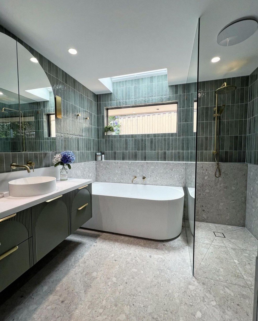
19. Green Tile & Terrazzo Blend
This one is such a good example of mixing materials. The green tiles bring that rich color moment, while the terrazzo flooring adds texture and a bit of playful variation.
It feels modern, slightly retro, and totally cohesive. Like every element is doing its own thing—but somehow still working together perfectly.
20. Emerald Feature Wall & Clean White
Ending strong with this bold yet balanced look. The emerald tiles create a striking focal point, while the surrounding white keeps everything feeling fresh and open.
It’s a classic formula—statement wall, neutral base—but done with just enough polish to feel elevated. Simple, yes, but definitely not forgettable.
21. Luxe Marble Glow
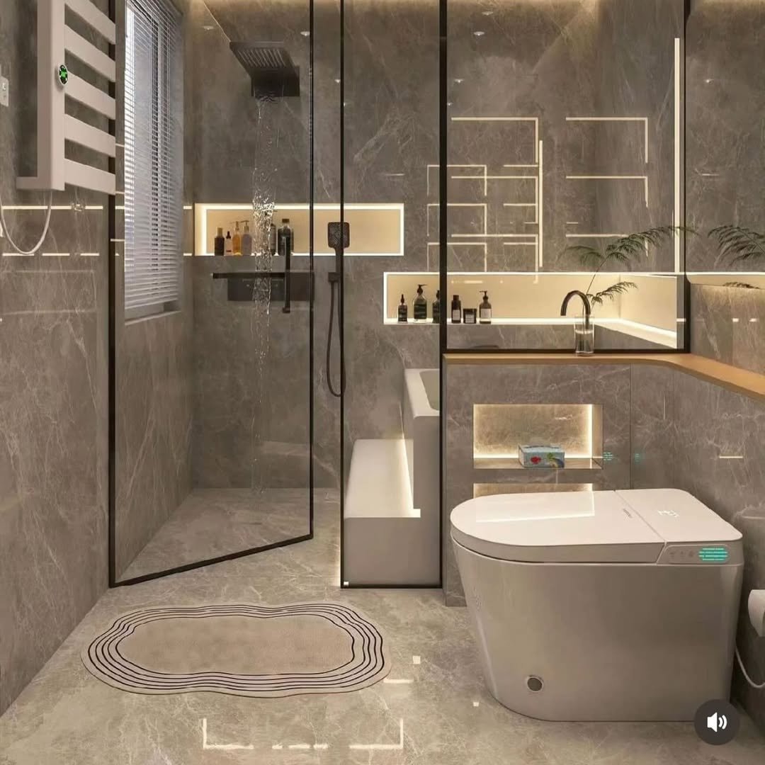
This one leans straight into that high-end, hotel-style drama. The marble-look walls paired with those clean glass partitions already feel elevated, but it’s the built-in lighting that really sets the tone. Everything glows—softly, intentionally, almost like the space is lit from within.
And then you notice the details: the recessed niches, the seamless lines, the modern toilet design—it all feels ultra considered. It’s giving “spa, but make it futuristic,” and honestly, it’s hard not to love that level of polish.
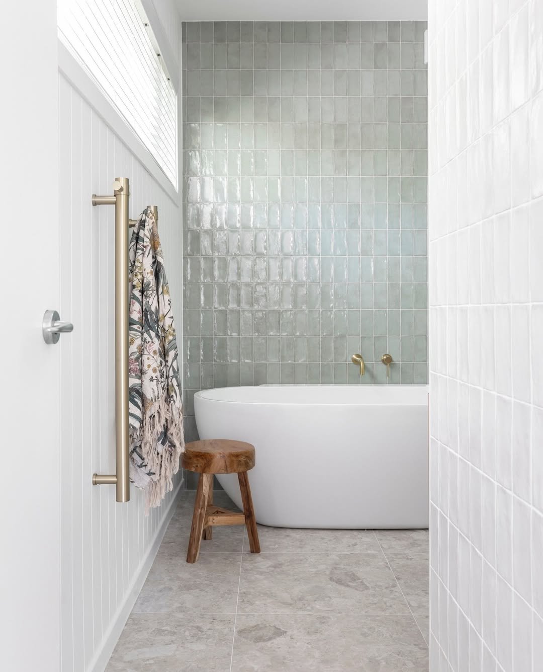
22. Muted Green & Soft Texture
This bathroom is proof that subtle can still be stunning. The muted green tiles bring in a gentle wash of color, while the soft, almost chalky texture keeps things from feeling too sharp or glossy.
It’s calm, cozy, and just a little bit earthy. The brass fixtures add that quiet warmth again—like a recurring theme that always works—making the whole space feel balanced and easy to live with.
23. Airy Green & Natural Wood
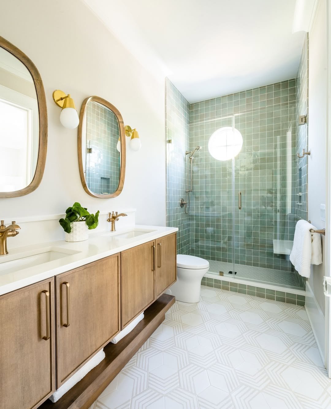
This space feels fresh the second you look at it. The pale green tiles combined with all that natural light create a super airy, open vibe, while the wood vanity grounds everything beautifully.
And those rounded mirrors? They soften the whole look just enough. It’s modern, but still warm—like a space that feels styled, but never overdone.
24. Classic Marble & Clean Lines
You really can’t go wrong with this kind of timeless palette. The soft marble walls, paired with warm wood cabinetry, strike that perfect balance between classic and contemporary.
It’s one of those bathrooms that will age well—nothing too trendy, nothing too safe either. Just clean lines, good materials, and a layout that quietly does its job.
25. Cottage Calm with a Green Twist
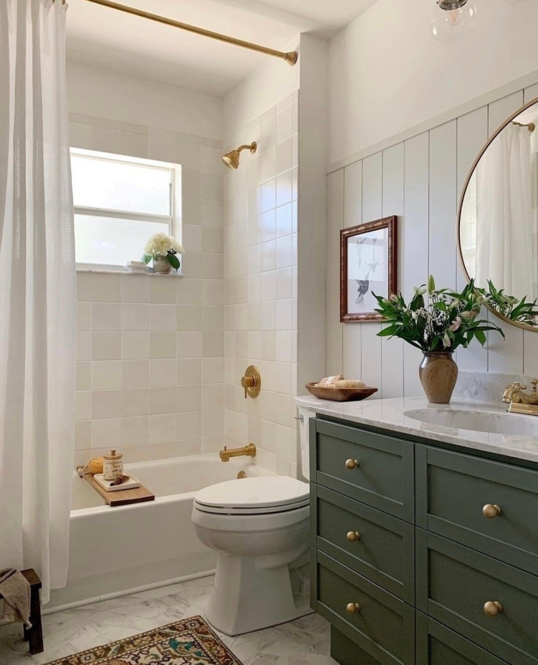
This one feels like a breath of fresh air. The soft white tiles keep things light, while that muted green vanity adds just enough color to give the space personality.
And I love the styling—it feels lived-in, not staged. The little rug, the florals, the textures… it’s cozy in a way that makes you want to slow down and stay a while.
26. Deep Teal Feature & Sleek Brass
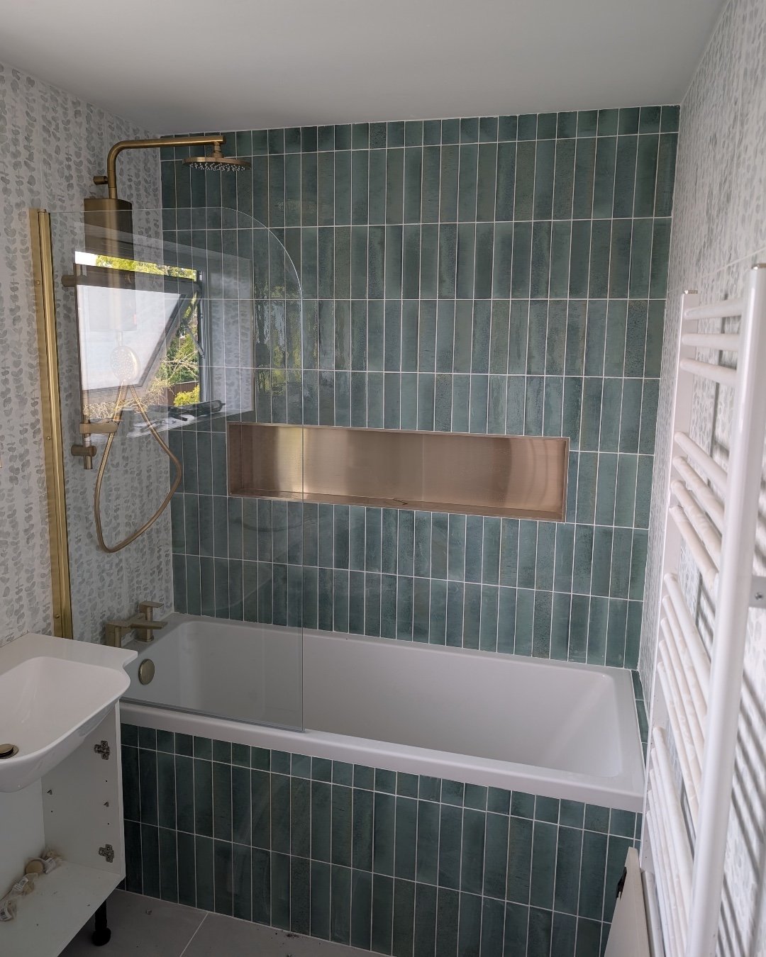
Ending with a bold one. That deep teal tiled wall instantly draws you in, especially with the elongated vertical layout—it adds height and drama without overwhelming the space.
The brass niche detail is such a smart touch too. It breaks up the wall just enough while adding a bit of shine. Overall, it’s modern, confident, and knows exactly what it’s doing.
