

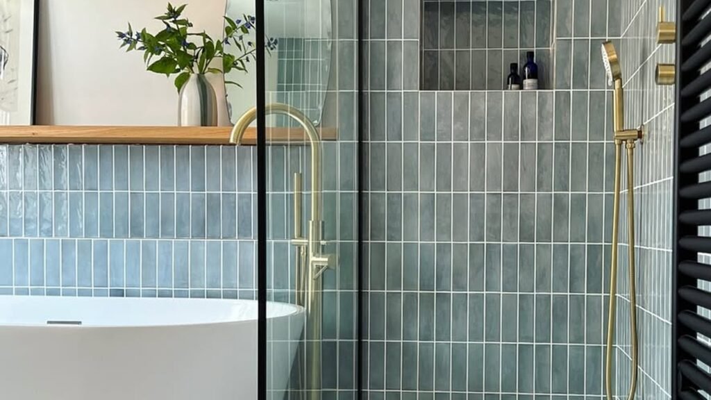
Nobody misses stepping over a tub wall at 6 a.m. That’s the whole pitch here: a shower you just walk straight into, no lip to trip on, no bulky rod, no shower curtain sticking to your arm. These 20 walk-in shower ideas show how a flat step-in and a clean glass panel make even a small bathroom feel bigger and way easier to use.
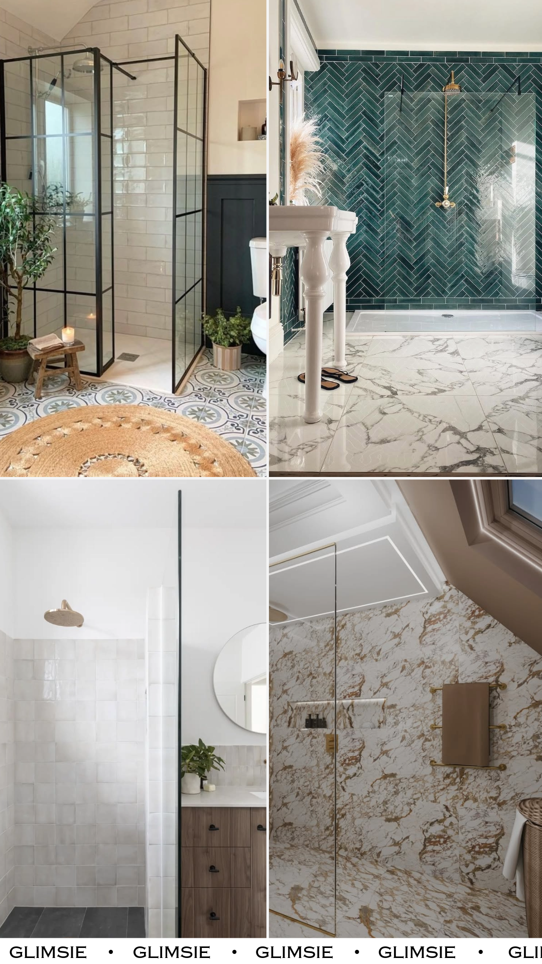
20 Walk-In Shower Ideas for Curbless Step-Ins and Open, Easy-Clean Layouts
A walk-in shower is exactly what it sounds like: no tub to climb over, no curb to step across, just a flat floor you walk right onto. That flat entry is what makes these bathrooms feel open, and it’s a real help if anyone in the house has bad knees or you’re just tired of the tub-over-shower shuffle.
The looks below run from bright white and simple to bold green and marble. Some lean spa-quiet, some make a statement, but they all share the same easy bones: a clear glass panel instead of a curtain, and a floor that flows in without a step.
Classic Grid Elegance
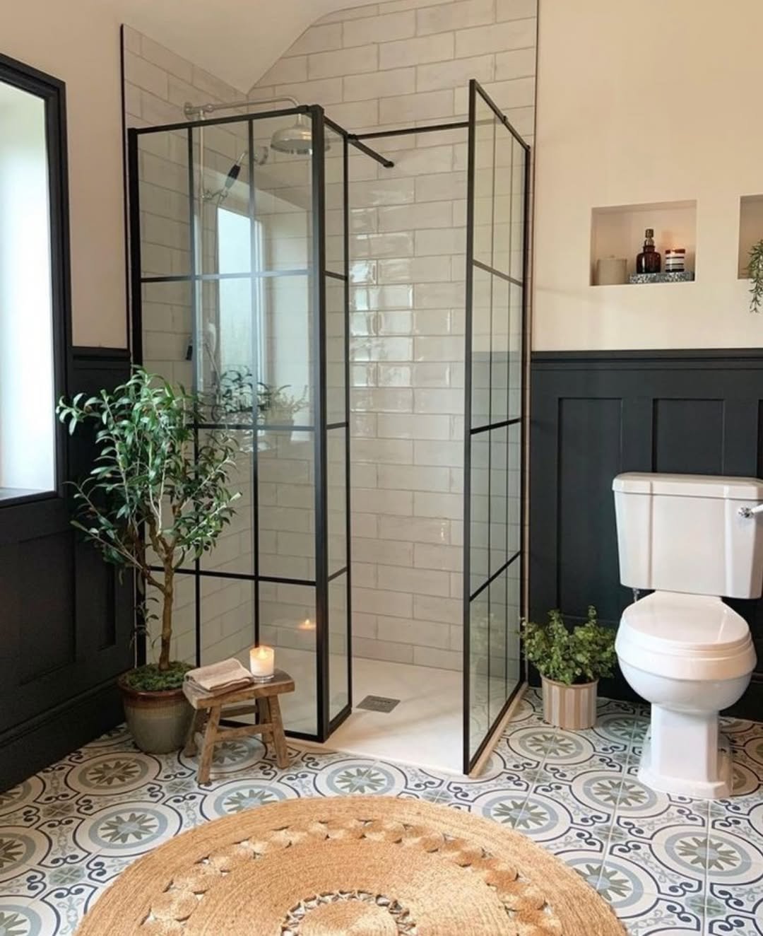
Black-framed glass panels give this shower a clean grid outline, so the space reads sharp instead of plain white-on-white. The move to copy: pair that black frame with simple subway tile, then break up all the straight lines with softer stuff, a patterned floor, a couple of plants, a little wood stool. The hard lines and the soft textures together are what keep it from feeling cold.
Emerald Herringbone Luxe
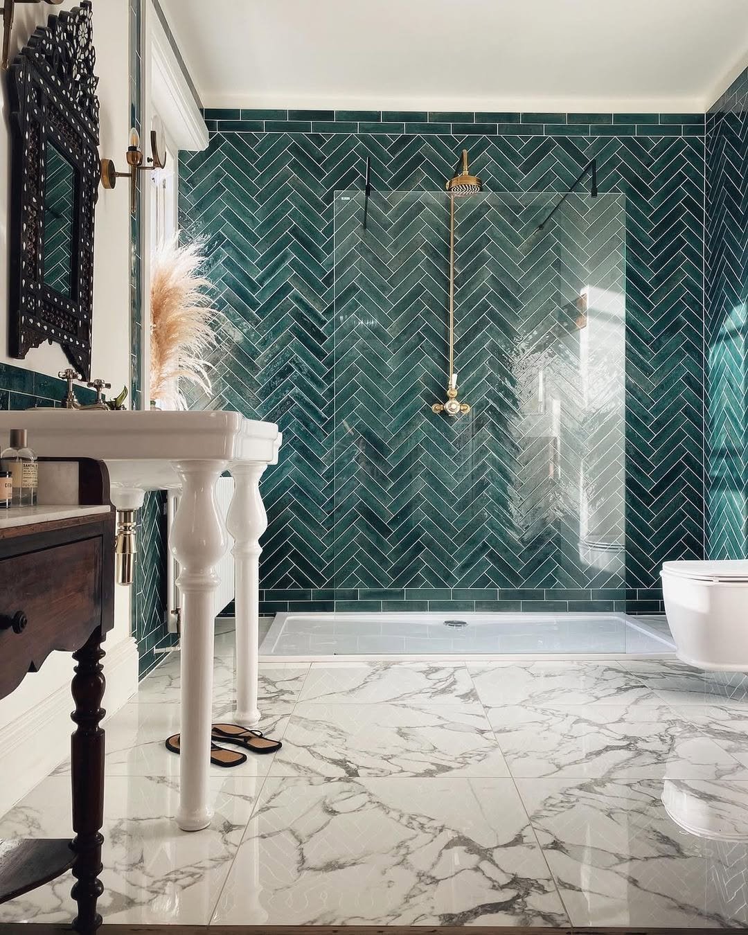
Deep green tile laid in a herringbone pattern (that’s the little zig-zag, angled-brick layout) pulls your eye straight to the wall. It works because the marble floor cools it back down, so the green feels like a choice, not a takeover. If you want one wall to carry the whole room, this is how: go rich on color in one spot, keep everything under it calm.
Soft Minimal Retreat
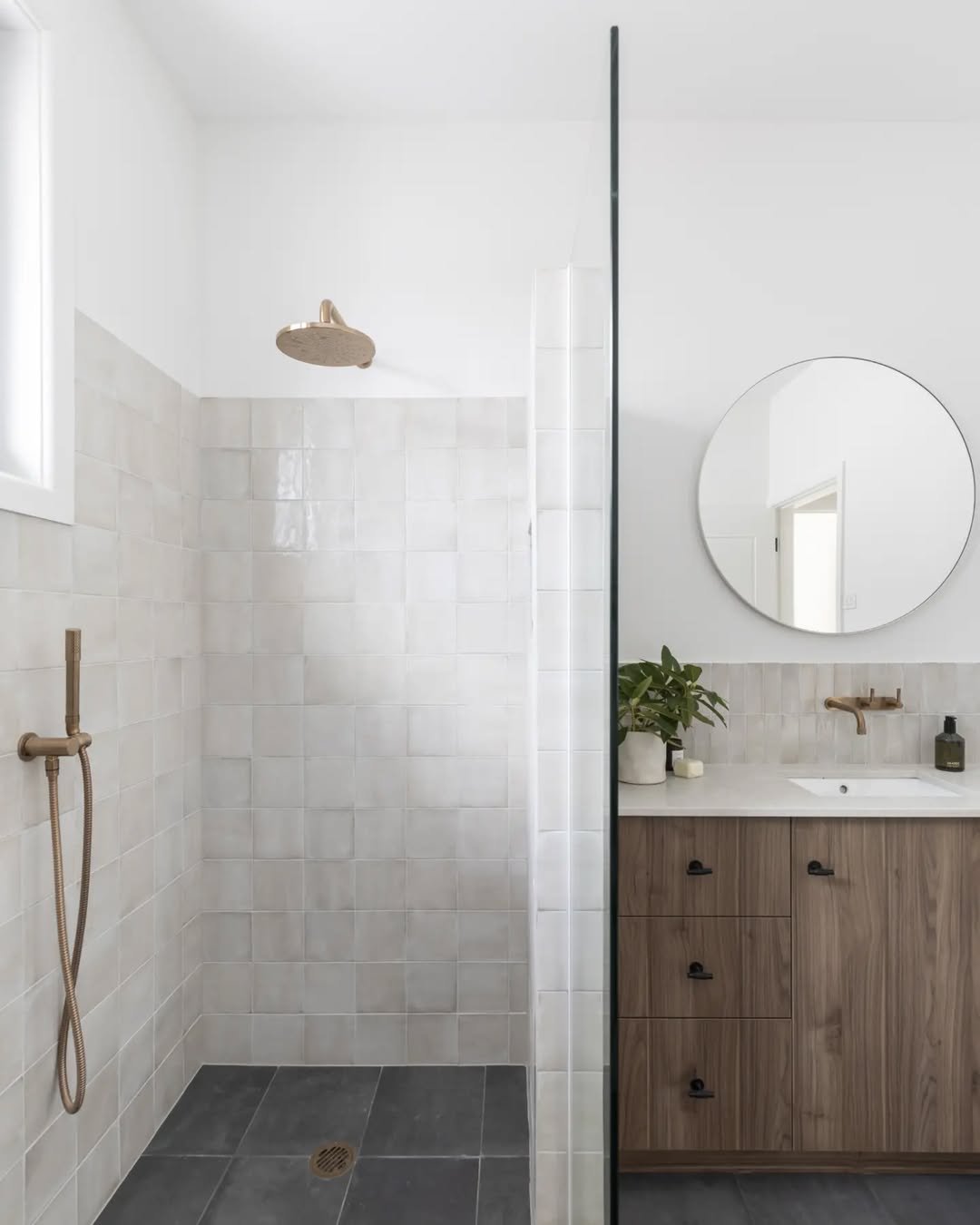
This space feels like a deep breath. Pale tiles, warm wood, and that barely-there glass panel—it’s minimal, but still warm and lived-in.
There’s something about the simplicity here that just works. Nothing fights for attention, and that’s exactly why everything feels so calm and effortless.
Open Spa Serenity
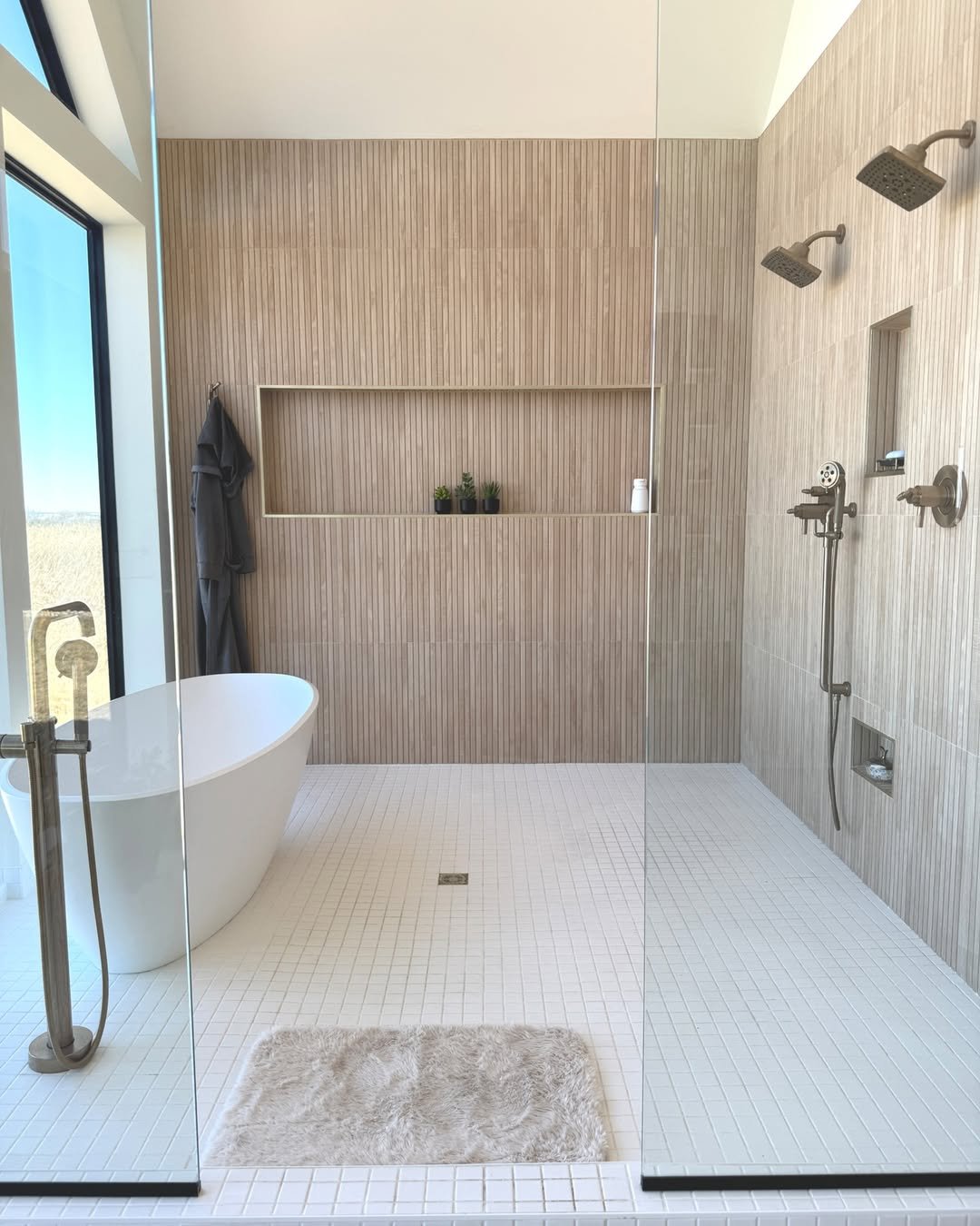
There’s something so peaceful about this layout. The open walk-in design, freestanding tub, and that soft neutral palette make it feel like a private spa.
And I love how the textures do the talking here—subtle wall detailing, matte finishes, and just enough greenery to keep it from feeling too sterile.
Clean-Line Contemporary
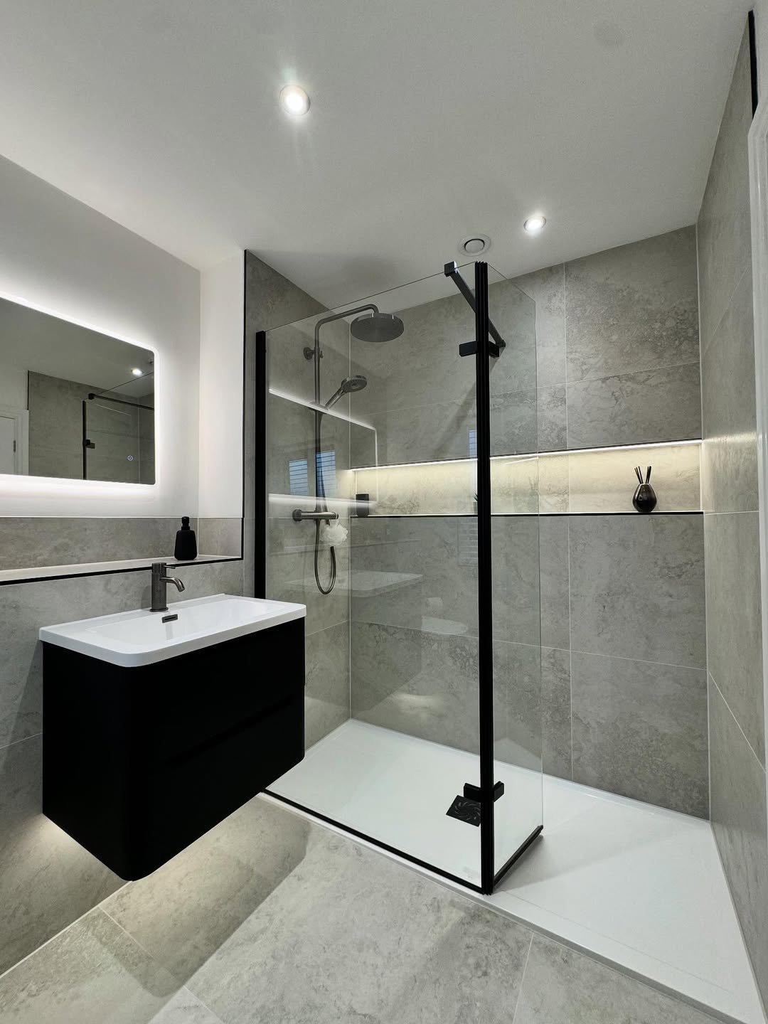
This one is all about precision. Clean lines, soft grey tones, and that floating vanity create a look that feels super polished.
It’s minimal, but not boring. The lighting details and built-in niche add just enough interest without breaking the calm, streamlined vibe.
Textured Blue Calm
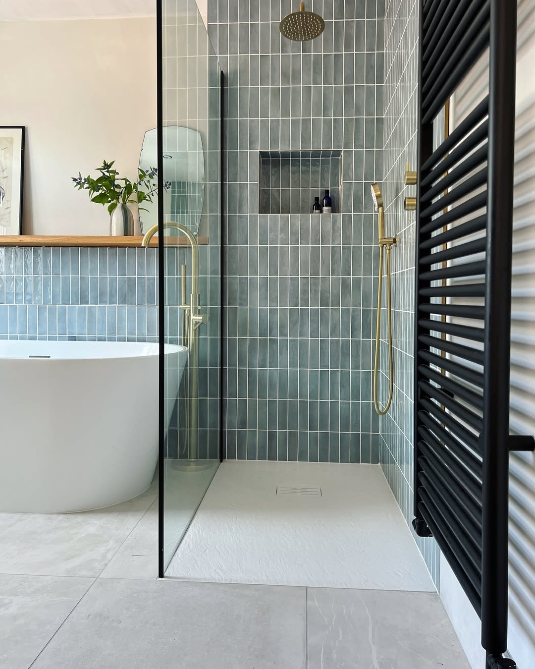
That soft blue tile brings such a soothing energy. It’s not loud, not too trendy—just quietly beautiful and easy on the eyes.
And paired with the freestanding tub and black accents, it creates that perfect balance of soft and structured. A little modern, a little relaxed.
Polished Marble Simplicity
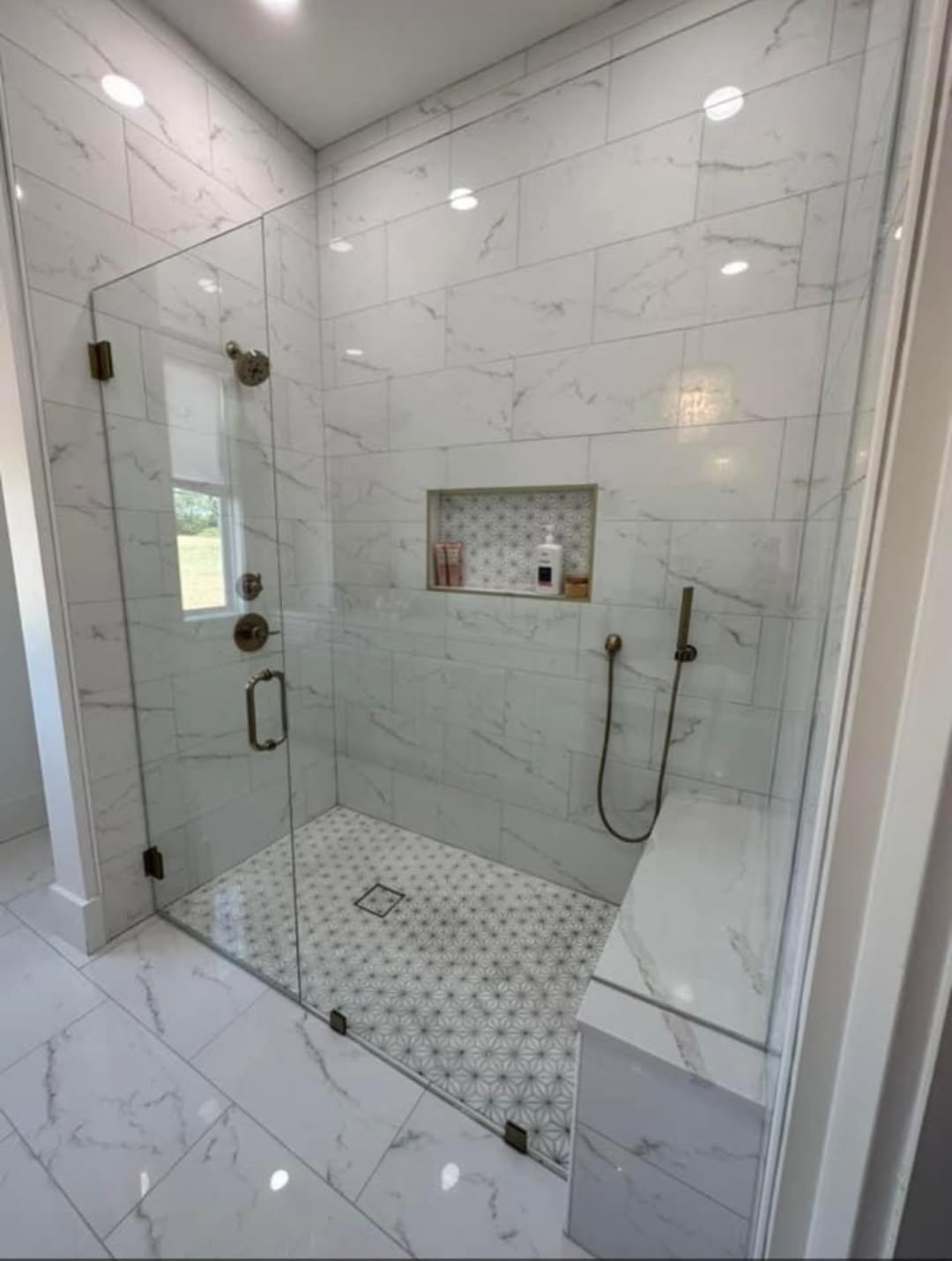
This is clean, classic, and done right. The marble walls, simple glass enclosure, and built-in niche keep everything feeling bright and open.
It’s the kind of design that won’t age. No fuss, no overstyling—just a solid, timeless setup that always looks good.
Sleek Compact Glow
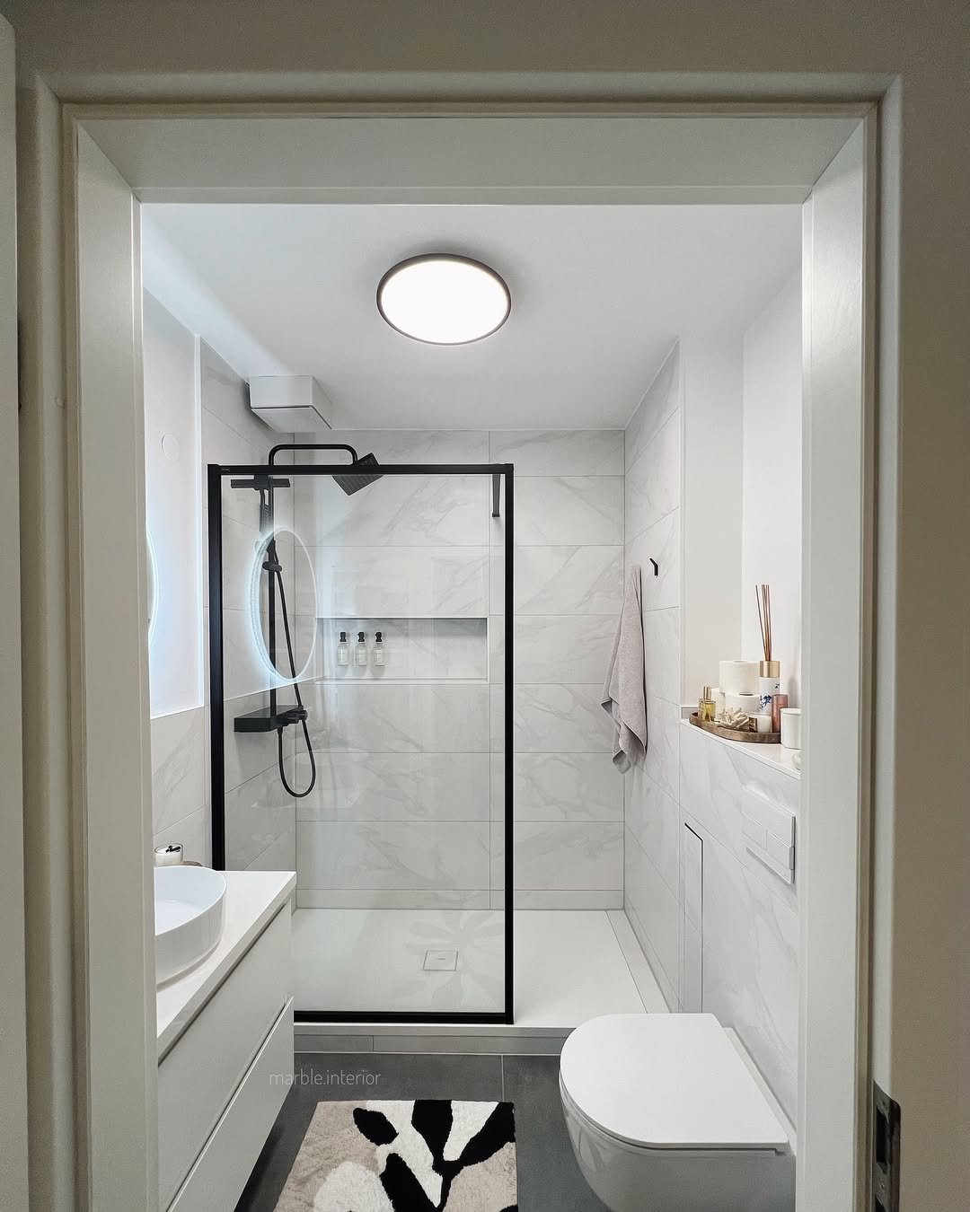
Black-framed glass carves out the shower zone while an all-white palette keeps the whole small space feeling open and uncluttered. The soft glow off the mirror adds a little mood without crowding anything. The lesson for tight bathrooms: define the shower with one strong black outline, then keep every other surface pale so the room doesn’t close in on you. If you’re working with an even trickier layout, these attic bathroom ideas lean hard into the same open-it-up thinking.
Seamless Marble Wrap
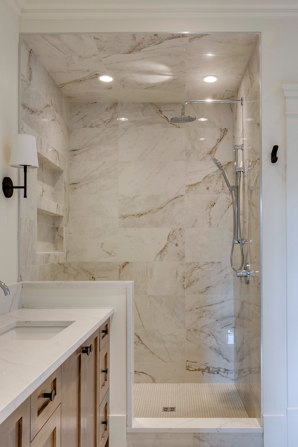
There’s something about full marble coverage that just feels elevated. Walls, ceiling, even the niche—it all flows together like one continuous surface.
It’s polished, but not flashy. The simplicity is doing the heavy lifting here, and it lands perfectly in that “quiet luxury” zone.
Frosted Frame Detail
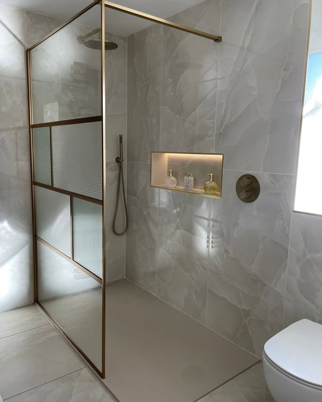
Now this is a subtle twist. The mix of clear and frosted glass panels adds privacy without closing things off completely.
Paired with soft stone textures and that lit niche, it feels modern but still warm. Like a space designed for real life, not just for show.
Classic Meets Functional
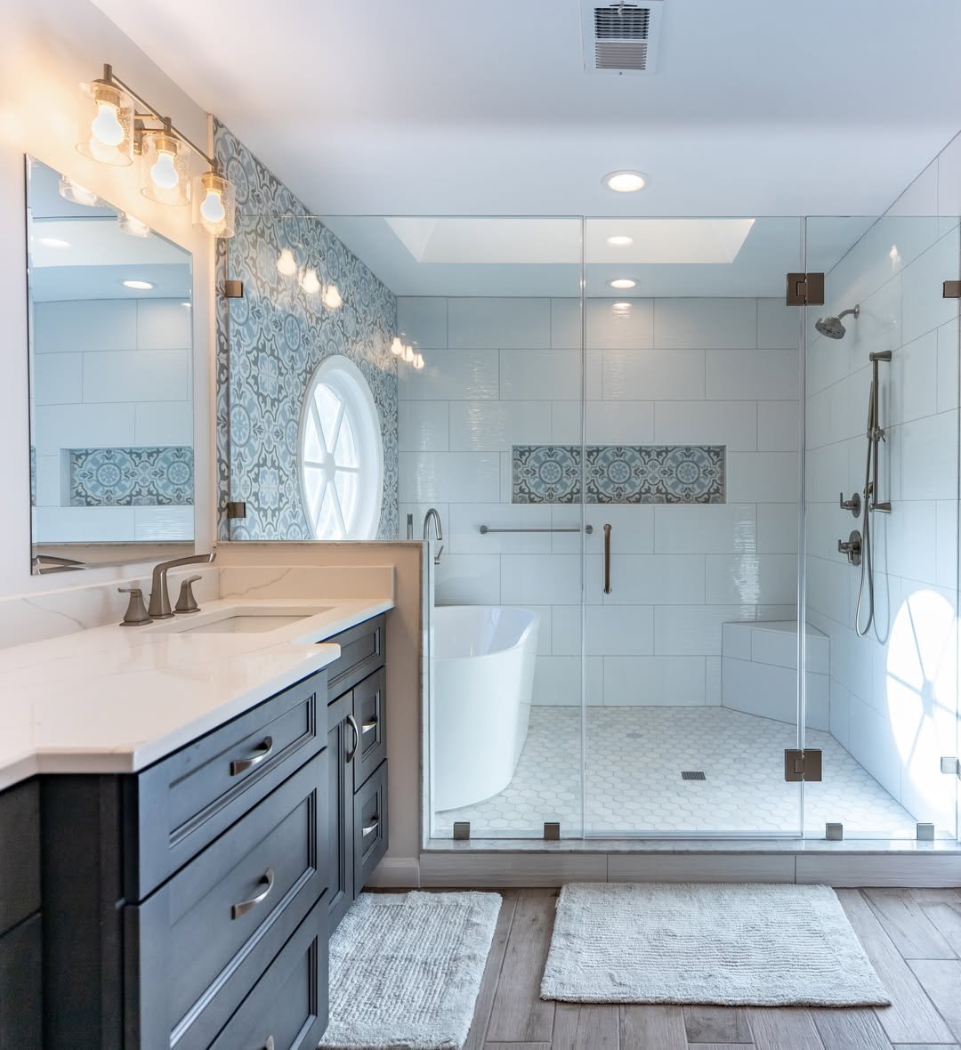
You’ve got that traditional base—clean tiles, glass enclosure—but then those little details take it up a notch. The patterned accent wall and built-in seating add personality without overwhelming the space.
It’s practical, yes, but also thoughtfully styled. The kind of bathroom that actually feels nice to use every day.
Everyday Modern Simplicity
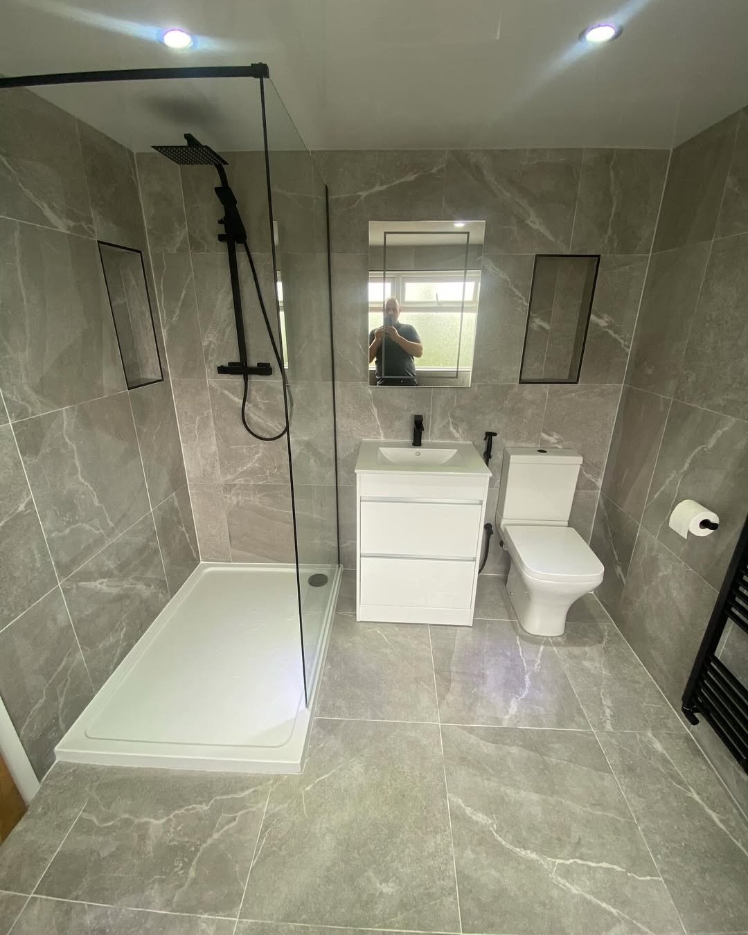
This one keeps it real. No over-designing, no unnecessary extras—just clean grey tiles, a simple glass panel, and a layout that works.
And honestly, that’s the charm. It’s easy, functional, and still manages to look polished without trying too hard.
Sharp Minimal Geometry
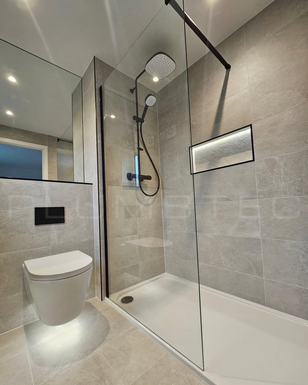
Everything here feels crisp. The black fixtures, sharp glass edges, and neutral palette create that super clean, almost architectural vibe.
It’s minimal done right—nothing extra, but nothing missing either. Just a solid, modern setup that feels fresh and precise.
Warm Light Layers
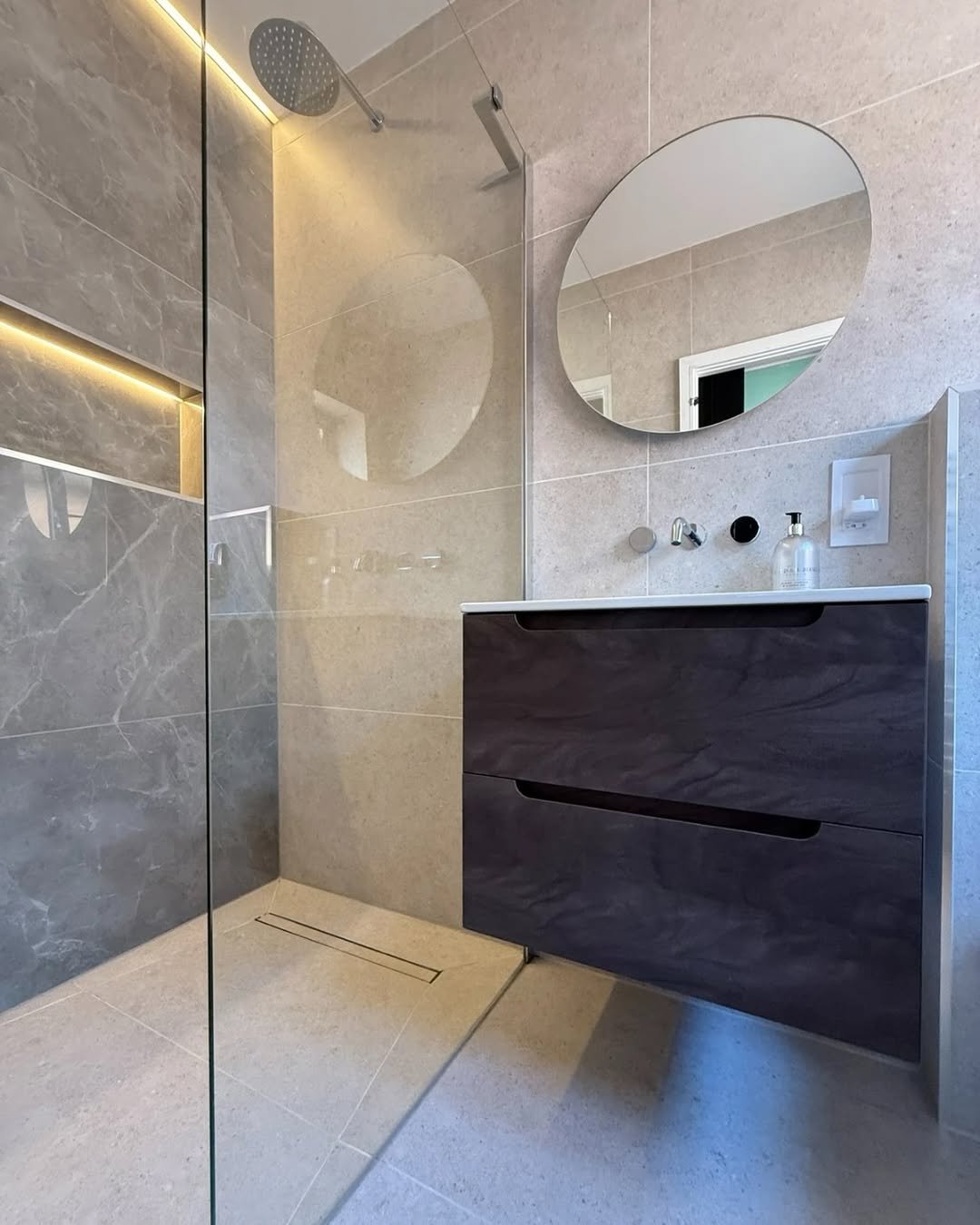
This one is all about lighting. That soft strip glow running through the wall instantly makes the space feel more elevated and a little bit luxe.
Combined with the warm tones and floating vanity, it creates a cozy, almost hotel-like atmosphere. Subtle, but really effective.
Sculpted Marble Drama
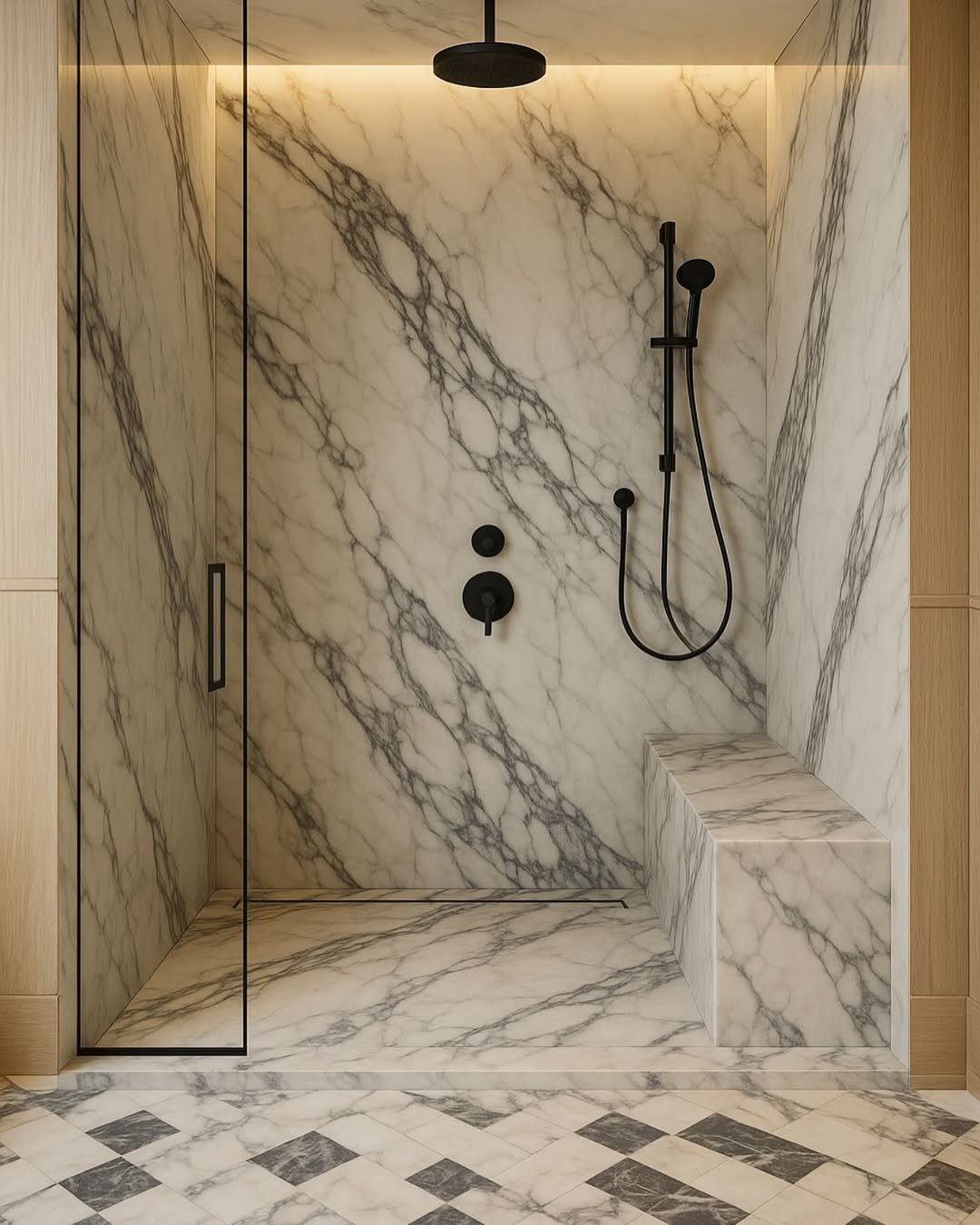
This is where marble becomes art. The bold veining, the built-in bench, the soft backlighting—it all feels curated and intentional.
And yet, it doesn’t feel overwhelming. It’s dramatic, yes, but still balanced in a way that feels calm and refined.
Soft Sage Serenity
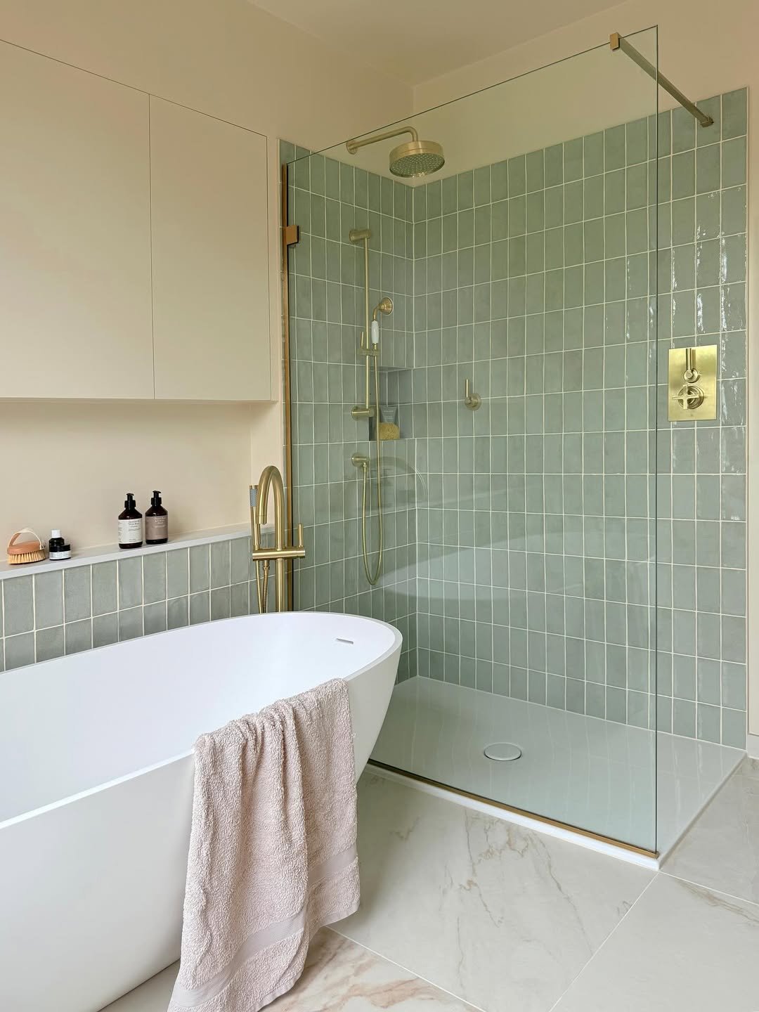
This one feels like a breath of fresh air. Those muted sage tiles paired with warm brass fixtures create that calm, spa-like mood without even trying.
And the freestanding tub sitting right next to the shower? It’s giving effortless luxury. Nothing loud, just soft tones and clean lines doing their thing beautifully.
Clean Gold Accents
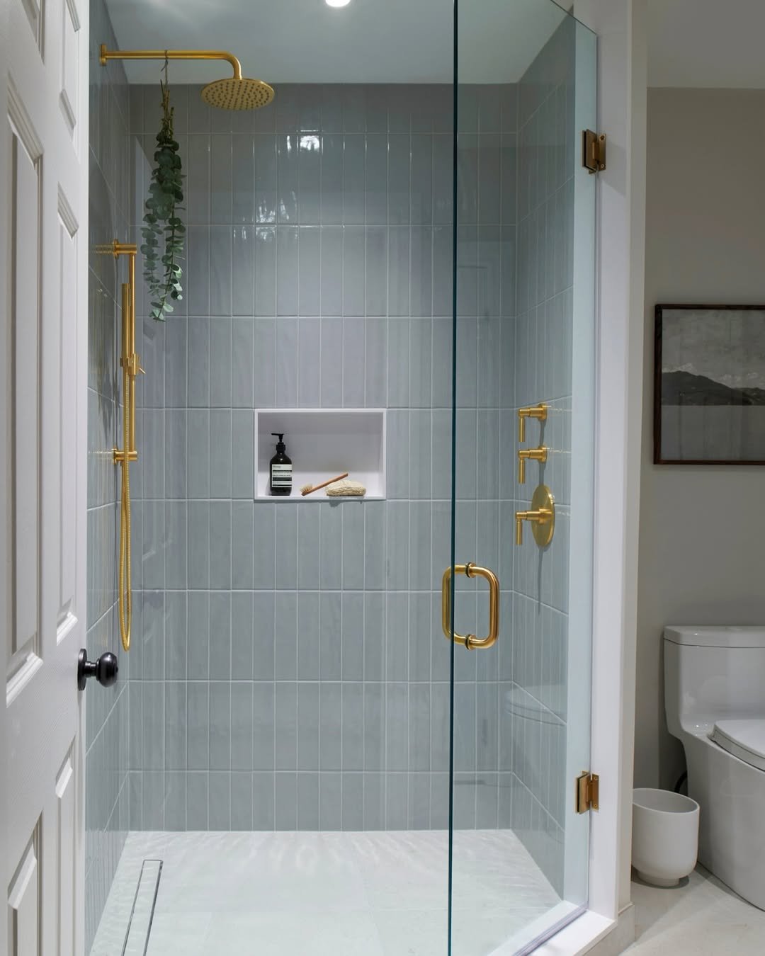
This one is all about balance. Cool-toned tiles meet warm gold hardware, and somehow it just clicks perfectly.
The glass door keeps everything feeling open, while those brass details quietly elevate the whole space. Simple, but very put-together.
Warm Minimal Glow
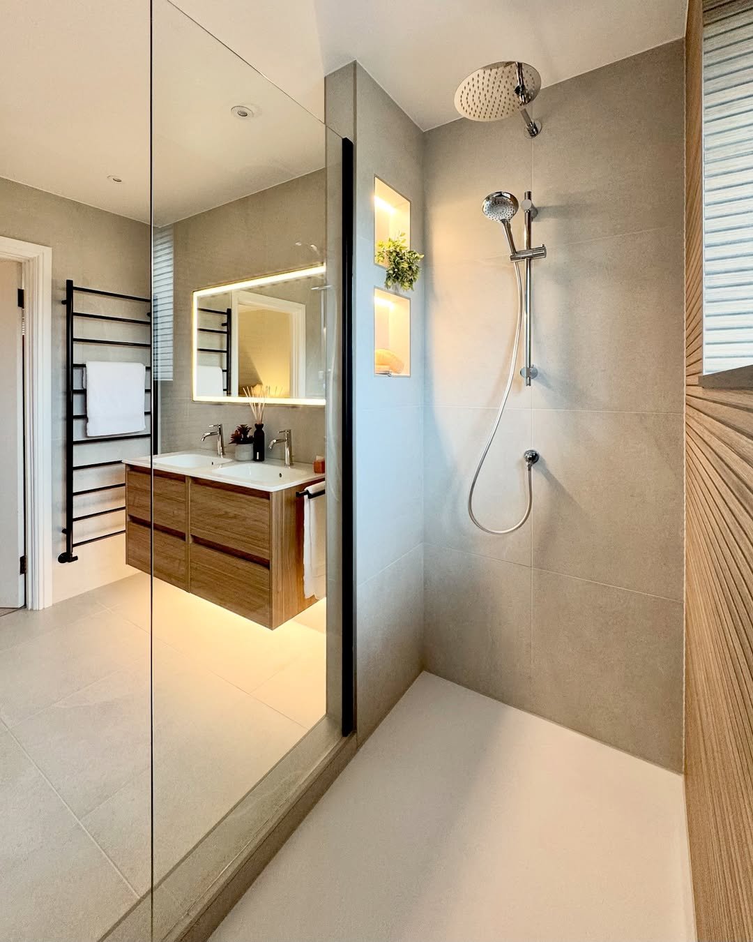
This one leans into that soft, modern warmth. Clean beige tones, floating vanity, and subtle lighting that just glows instead of shines.
It’s minimal, but not cold. The kind of space that feels calm the second you step into it.
Bright Marble Classic
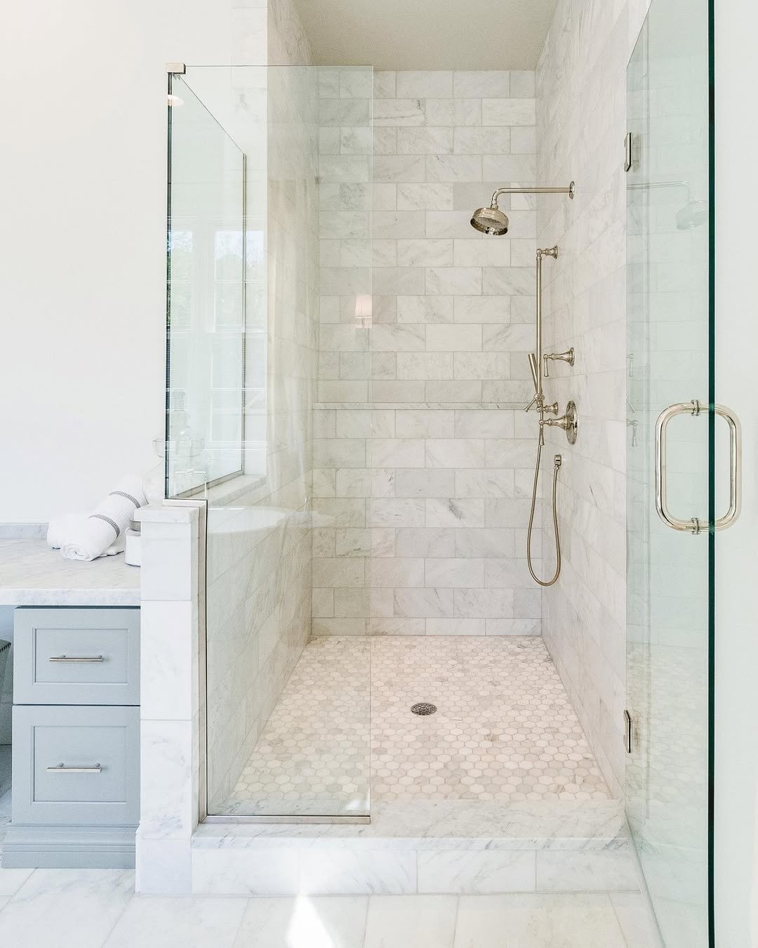
Light bounces off every marble surface here, and that’s what makes the whole bathroom feel bigger and brighter. The layout is dead simple, which is the point, classic done right doesn’t need tricks. For a shower that reads clean and expensive with no second-guessing, go light marble and keep the layout straightforward. It’s the pick you won’t regret. If you’re styling the rest of the room too, these bathroom shelf ideas pair nicely with a look this bright.
Deep Green Statement
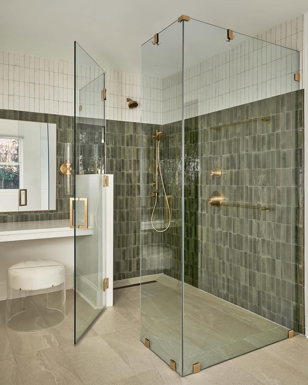
Deep green tile with brass fixtures brings real presence, bold, but still refined. The glass enclosure is what saves it, letting the dark color show off without making the space feel heavy or shut-in. That’s the rule for any dark tile in a shower: pair it with clear glass so the color reads dramatic instead of cramped. Want more storage-side inspiration to finish the space? The bathroom ladder shelf edit is worth a look.
