
Struggling to make the most of an awkward bathroom corner? These 25 corner shower ideas are smart, space savvy, and stylishly streamlined perfect for creating efficient layouts while turning tricky angles into functional, beautiful design features.
25 Corner Shower Ideas That Maximize Space With Smart, Angular Design in 2026
Corner showers are becoming a go-to solution in 2026 for making the most of every inch without sacrificing style. By utilizing often overlooked angles, these designs open up the layout, improve flow, and create a more efficient, visually balanced bathroom.
In this list, you’ll discover clever ideas that combine functionality with modern aesthetics, from sleek glass enclosures to space-saving layouts. Scroll on for inspiration that transforms tight corners into stylish, practical shower spaces.
1. Bold Grid Glass Moment
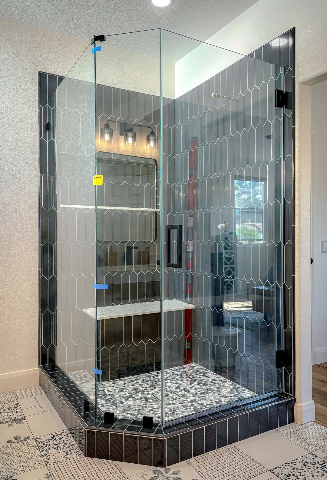
This one’s got attitude—in the best way. The geometric glass detailing layered over those deep charcoal tiles gives the whole shower a slightly industrial, slightly custom-art vibe.
And then you notice the built-in bench and shelving quietly doing their thing. It’s not just about looks here—it’s designed to actually be used, and used well.
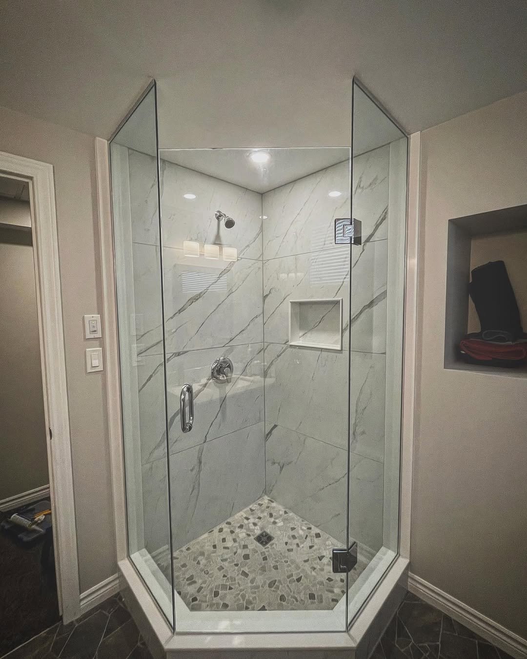
2. Marble Light & Air
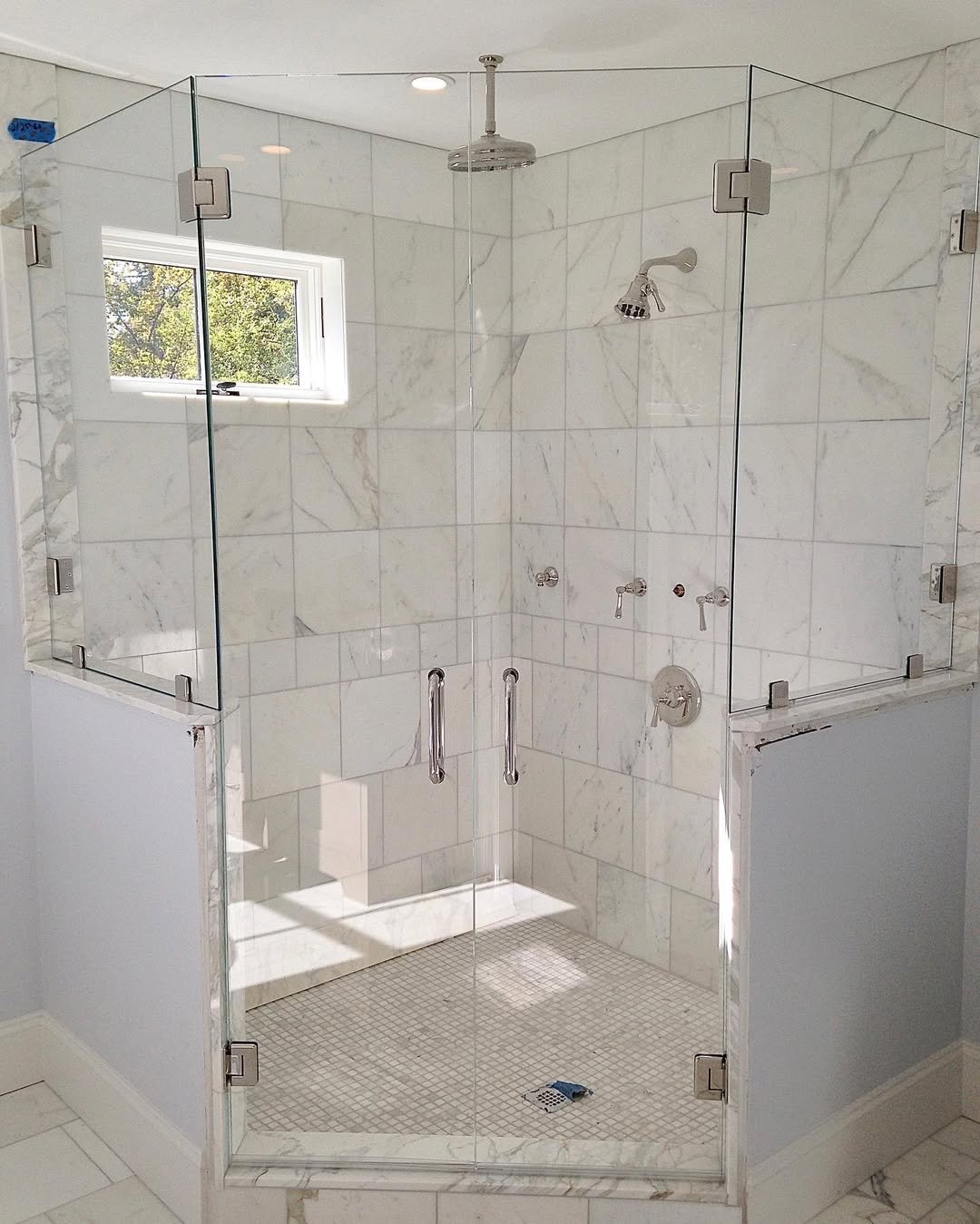
Everything here feels open, clean, and almost spa-like. The frameless glass lets that soft marble pattern shine without interruption, making the whole corner feel bigger than it is.
It’s the kind of design that doesn’t try too hard. Just light, balance, and a little bit of that “I have my life together” energy.
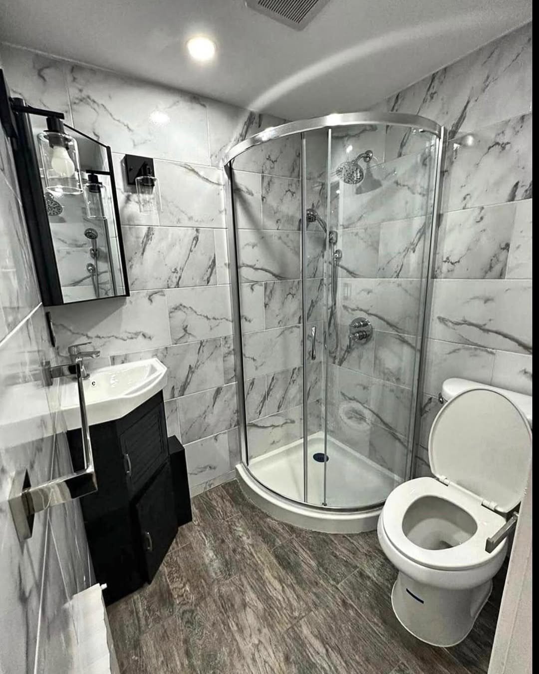
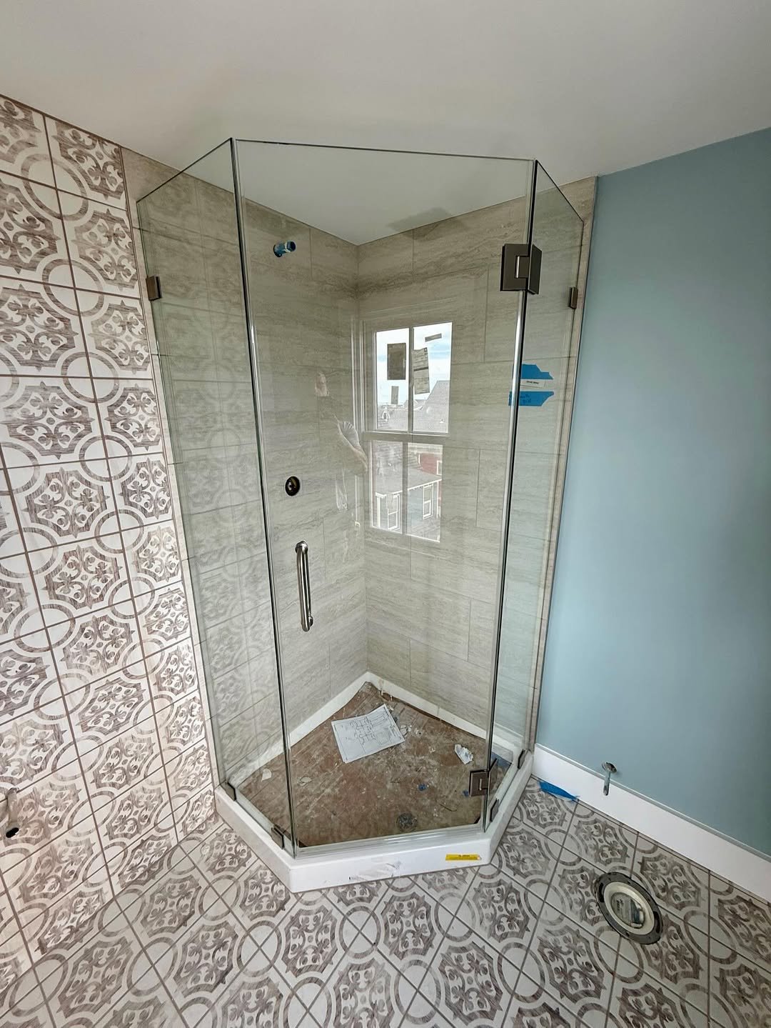
3. Compact Curve Solution
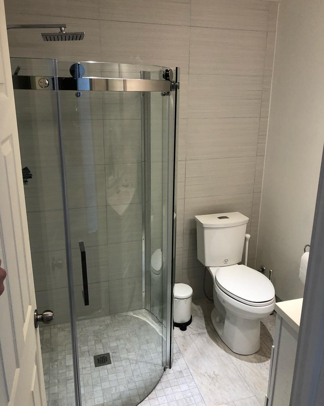
Small bathroom? No problem. That curved glass corner shower is basically the MVP of tight layouts—saving space while still feeling modern.
It’s practical, but not boring. You still get that clean, polished look without sacrificing precious floor space.
4. Warm Minimal Zen
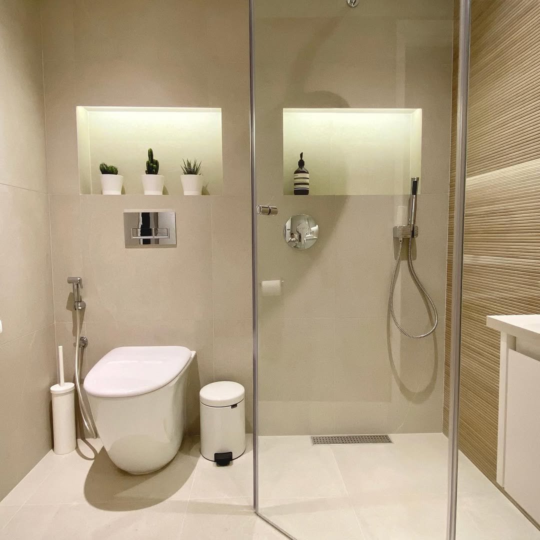
This space leans into that soft, calming neutral palette—and honestly, it works. The clean lines, subtle lighting niches, and minimal fixtures make everything feel intentional.
It’s giving quiet luxury. Like a boutique hotel bathroom where everything is perfectly placed and nothing feels extra.
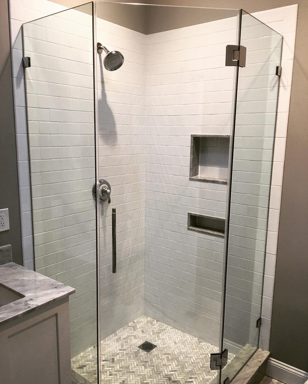
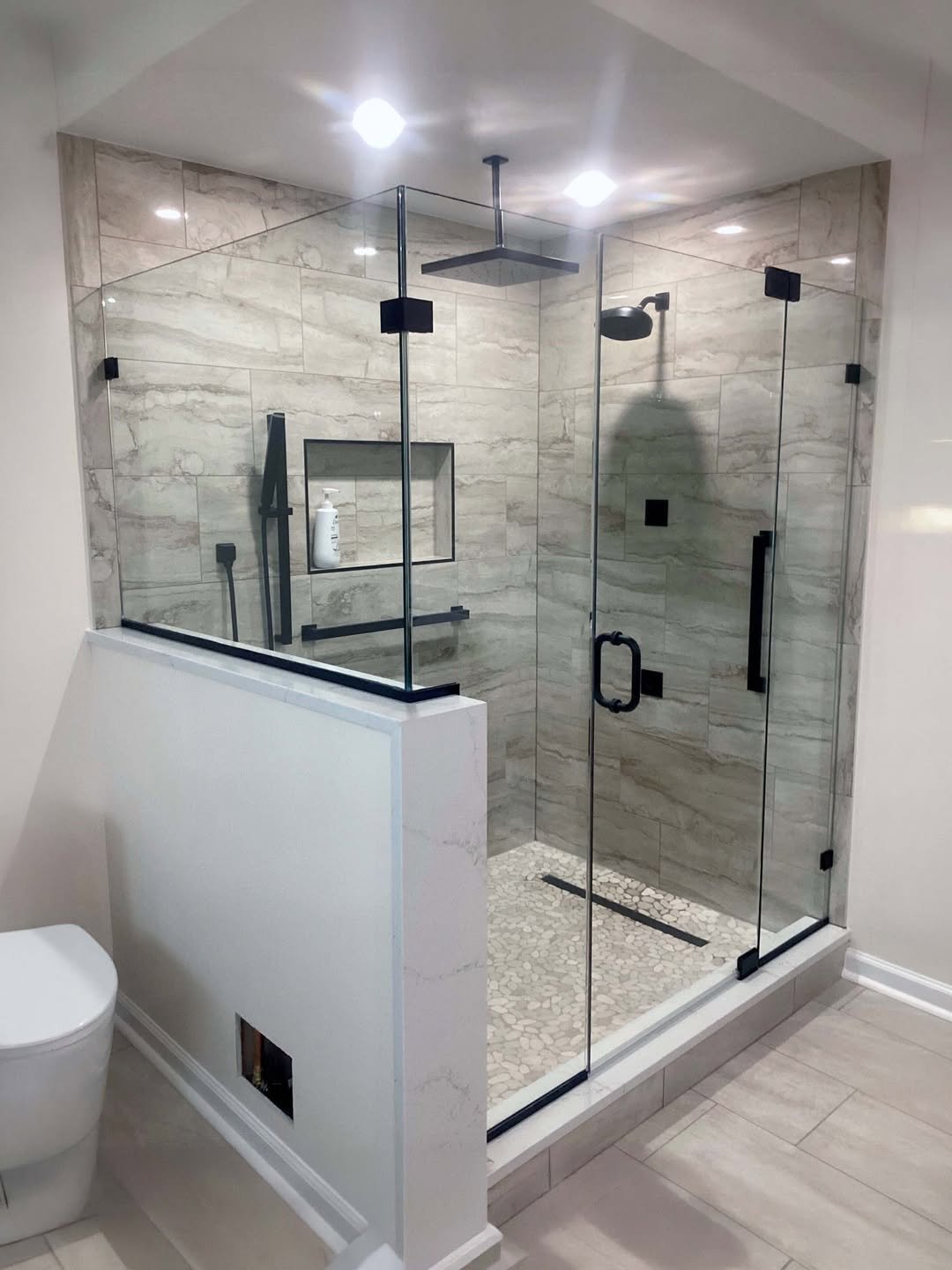
5. Hex Tile Texture Play
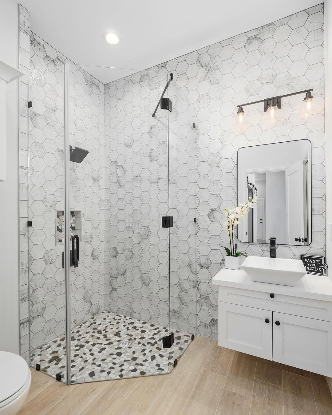
There’s something about hex tiles that instantly adds personality. The mix of tones on the walls paired with that pebble-style floor gives this shower a layered, tactile feel.
And with the black hardware? It sharpens everything just enough. Not too soft, not too bold—just right.
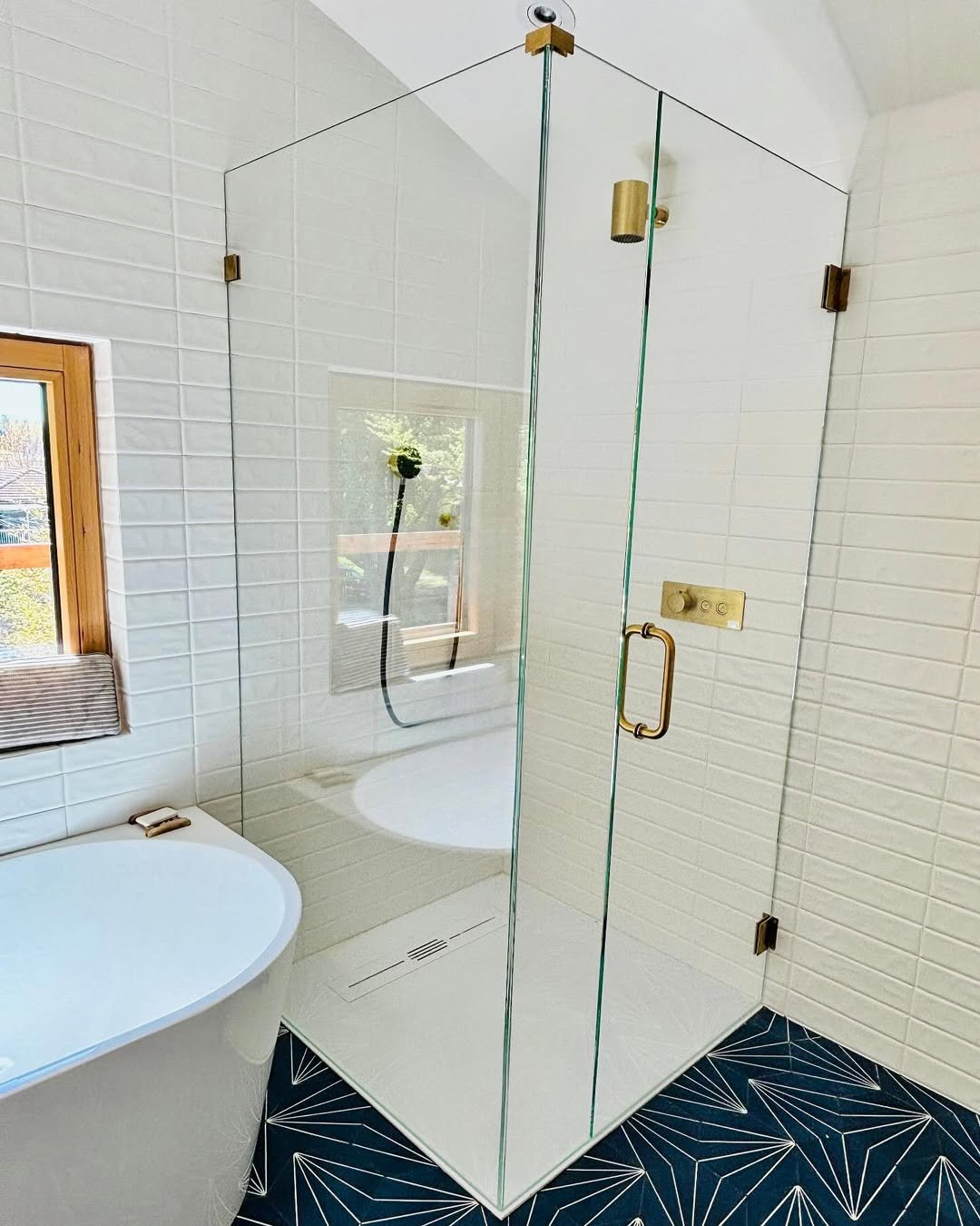
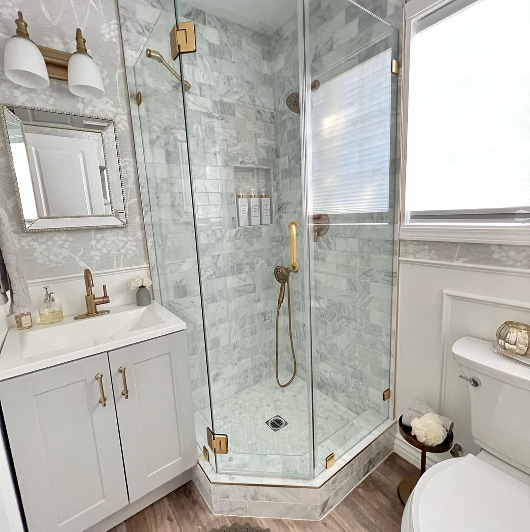
6. Sleek Marble & Gold Glow
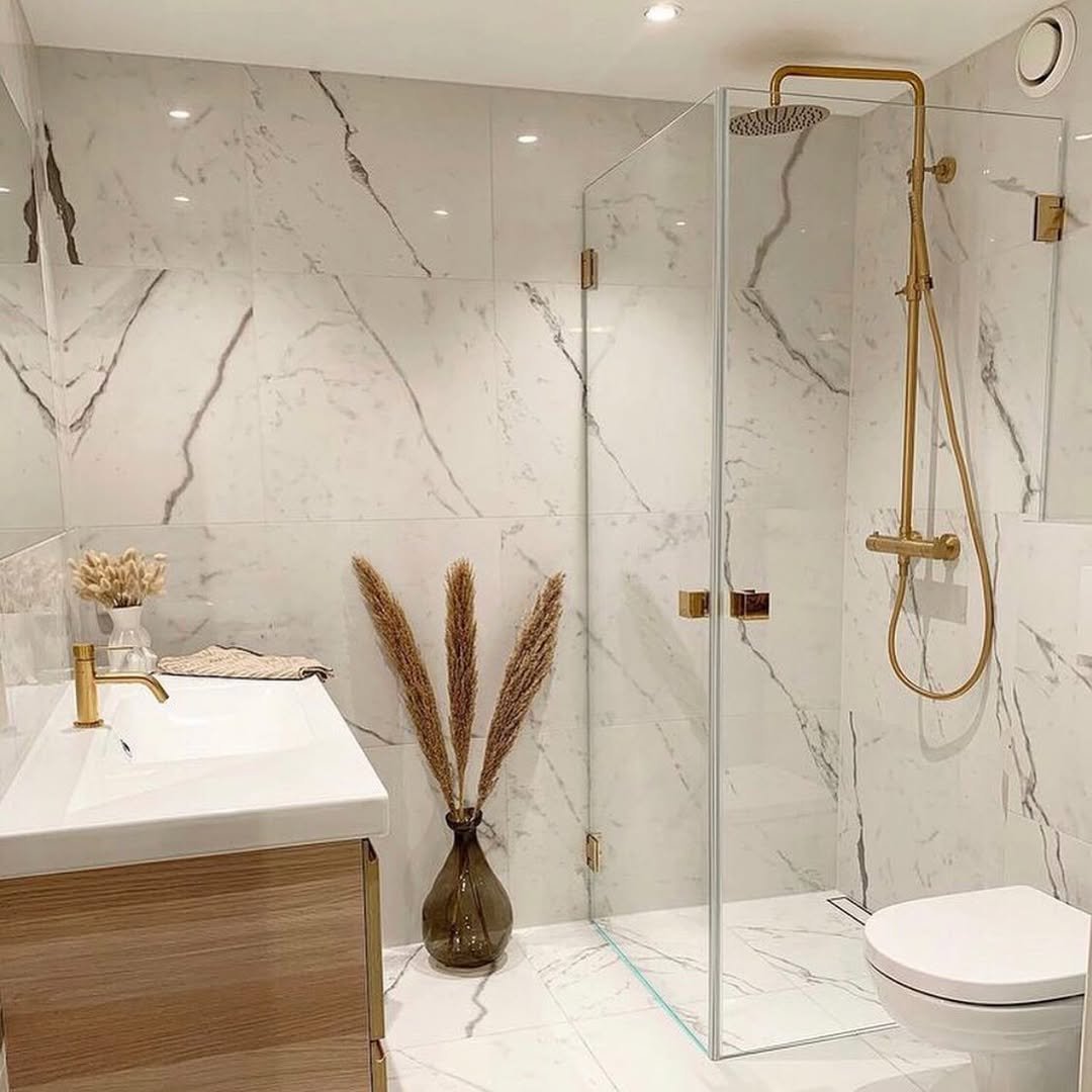
This one feels elevated the second you look at it. The marble walls paired with gold fixtures create that soft luxury moment without going over the top.
It’s clean, it’s bright, and it quietly says “yes, details matter.” A corner shower, but make it high-end.
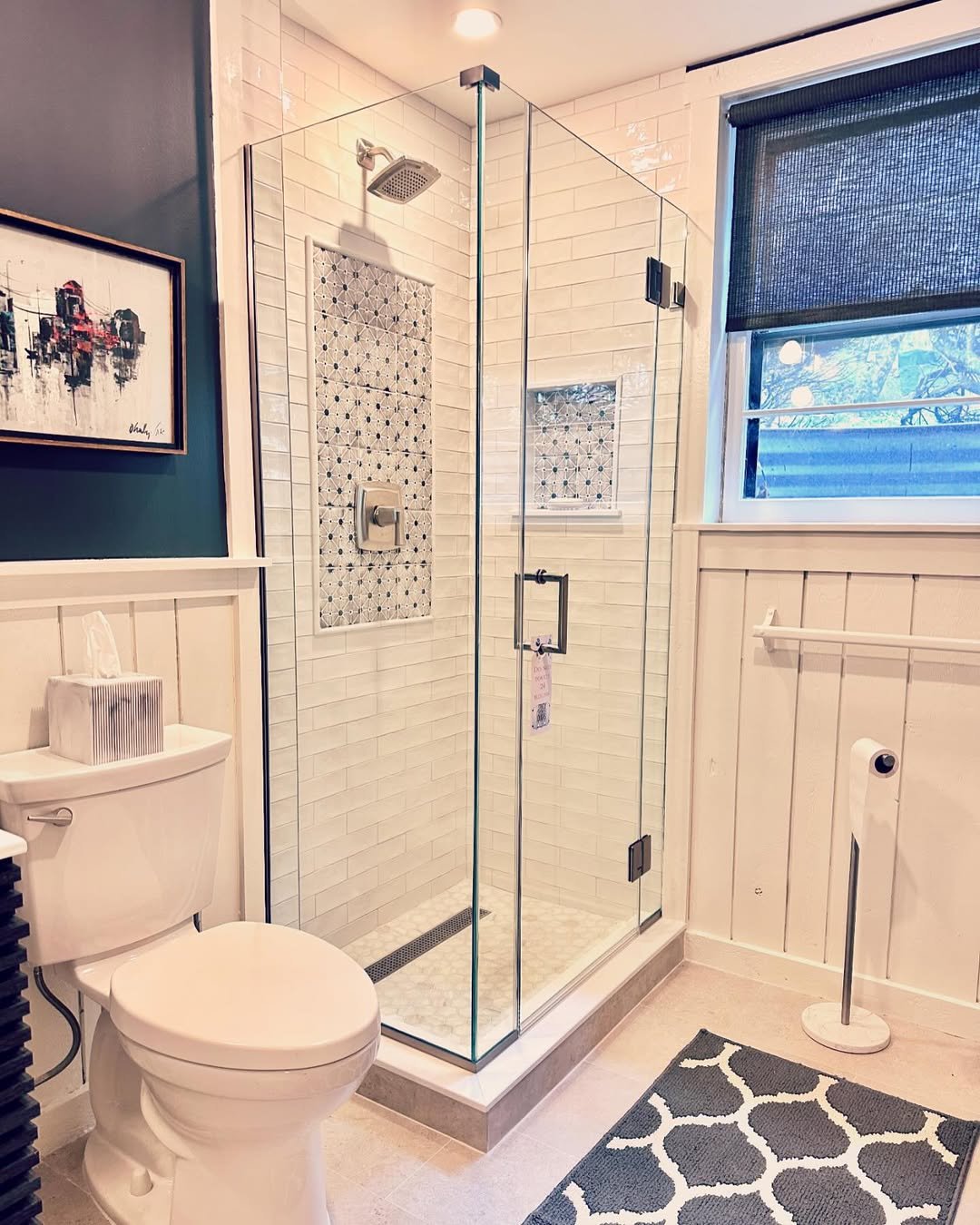
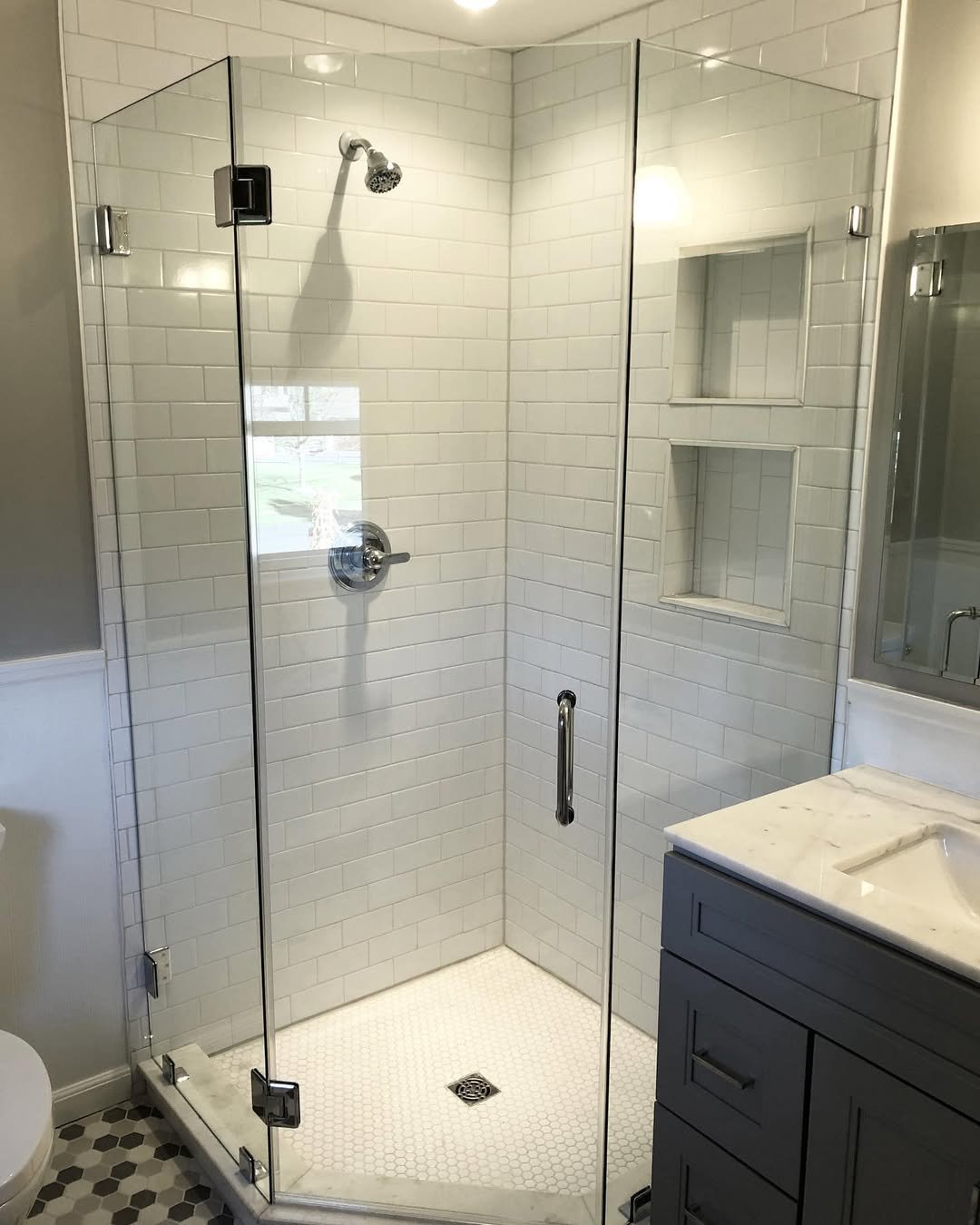
7. Classic White Done Right
You’ve seen white tile before—but this version hits different. The subtle pattern variation and glass enclosure keep it from feeling flat or predictable.
It’s one of those spaces that will still look good years from now. Timeless, but not boring.
8. Angled Glass Perfection
That angled corner cut? Such a smart move. It softens the layout while keeping everything visually clean and open.
And paired with those large marble-look tiles, it feels modern without being cold. Just smooth, effortless design.
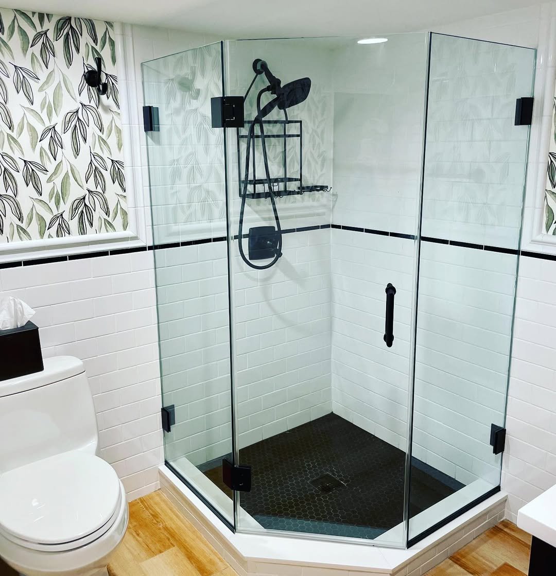
9. Dark Base Contrast
The black shower floor instantly grounds this space. It adds contrast and makes the white tile pop in a way that feels intentional, not random.
Plus, the mix of textures—tile, wallpaper, and matte fixtures—keeps your eye moving. It’s subtle, but there’s a lot going on (in a good way).
10. Soft Grey Classic
This one is simple—but it’s that kind of simple that works every single time. Soft grey tiles, clean glass, and a practical corner layout.
And those built-in niches? Always a win. Because a good shower isn’t just about looks—it’s about where your shampoo actually goes.
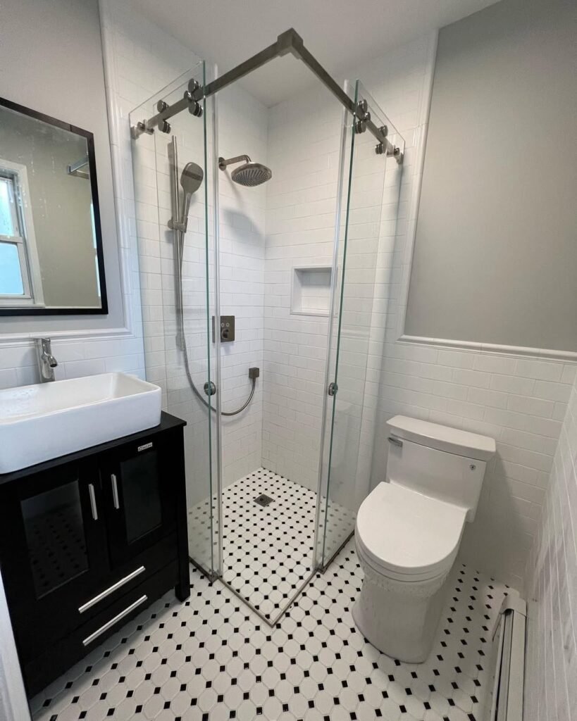
11. Classic Black & White Punch

This one is giving vintage charm with a crisp modern edge. The black hex floor paired with white subway tile is that forever combo—but the angled glass enclosure keeps it feeling fresh.
It’s proof you don’t need a huge space to make an impact. Just strong contrast, clean lines, and a layout that actually makes sense.
12. Graphic Floor Moment
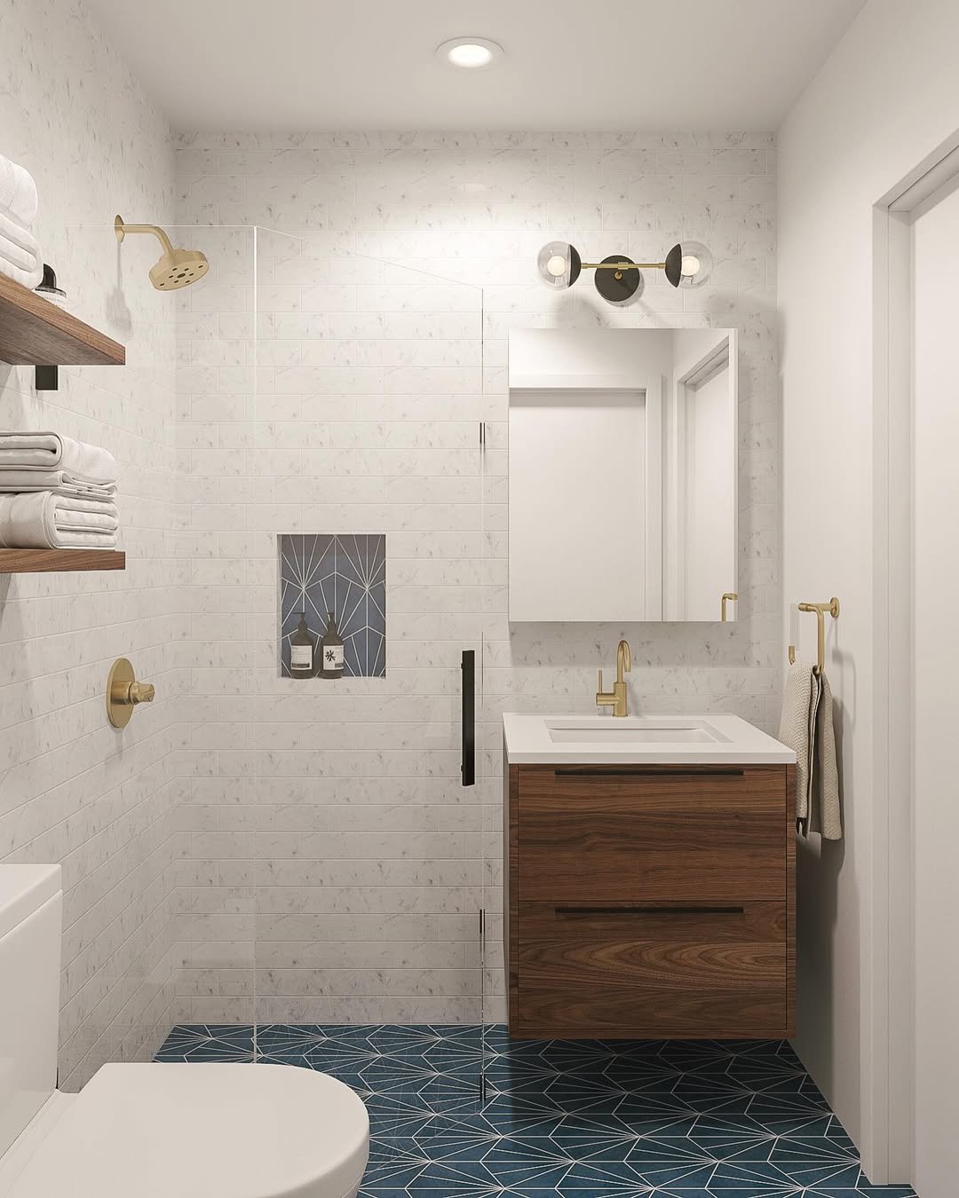
Okay, the floor is stealing the show here—and rightfully so. That deep blue geometric tile instantly lifts the entire space and gives it personality.
But what really works is how everything else stays calm. The white walls, warm wood vanity, and subtle brass details let that floor shine without chaos.
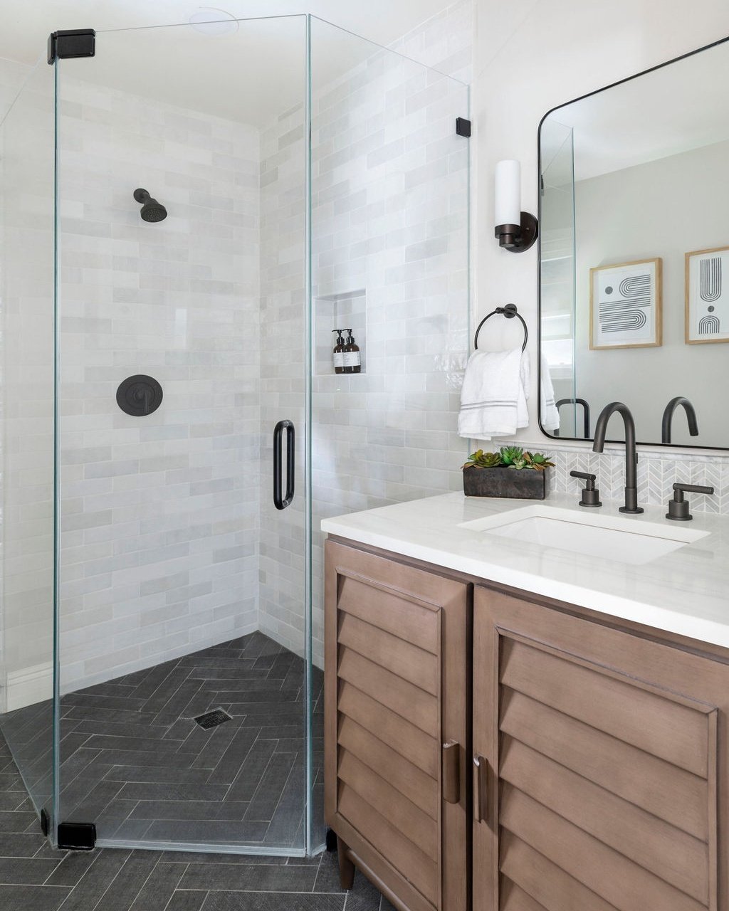
13. Minimal Glass, Maximum Calm
This one feels almost invisible in the best way. The frameless corner glass just disappears, letting the textures and finishes do the talking.
And that soft gold hardware? It adds just enough warmth to keep things from feeling too clinical. Clean, but never cold.
14. Curved Corner Comeback
The rounded glass enclosure is such a smart move for tighter bathrooms. It softens the space and makes everything feel less boxed in.
Paired with marble-look walls, it leans classic—but still super practical. A little traditional, a little modern… and very easy to live with.
15. Walk-In Corner Ease
No bulky doors, no extra fuss—just a clean walk-in corner shower that feels open and effortless. The subtle slope and layout make it work without needing visual clutter.
And those built-in niches? Quietly doing their job while keeping everything streamlined. It’s minimal, but it’s thoughtful minimal.
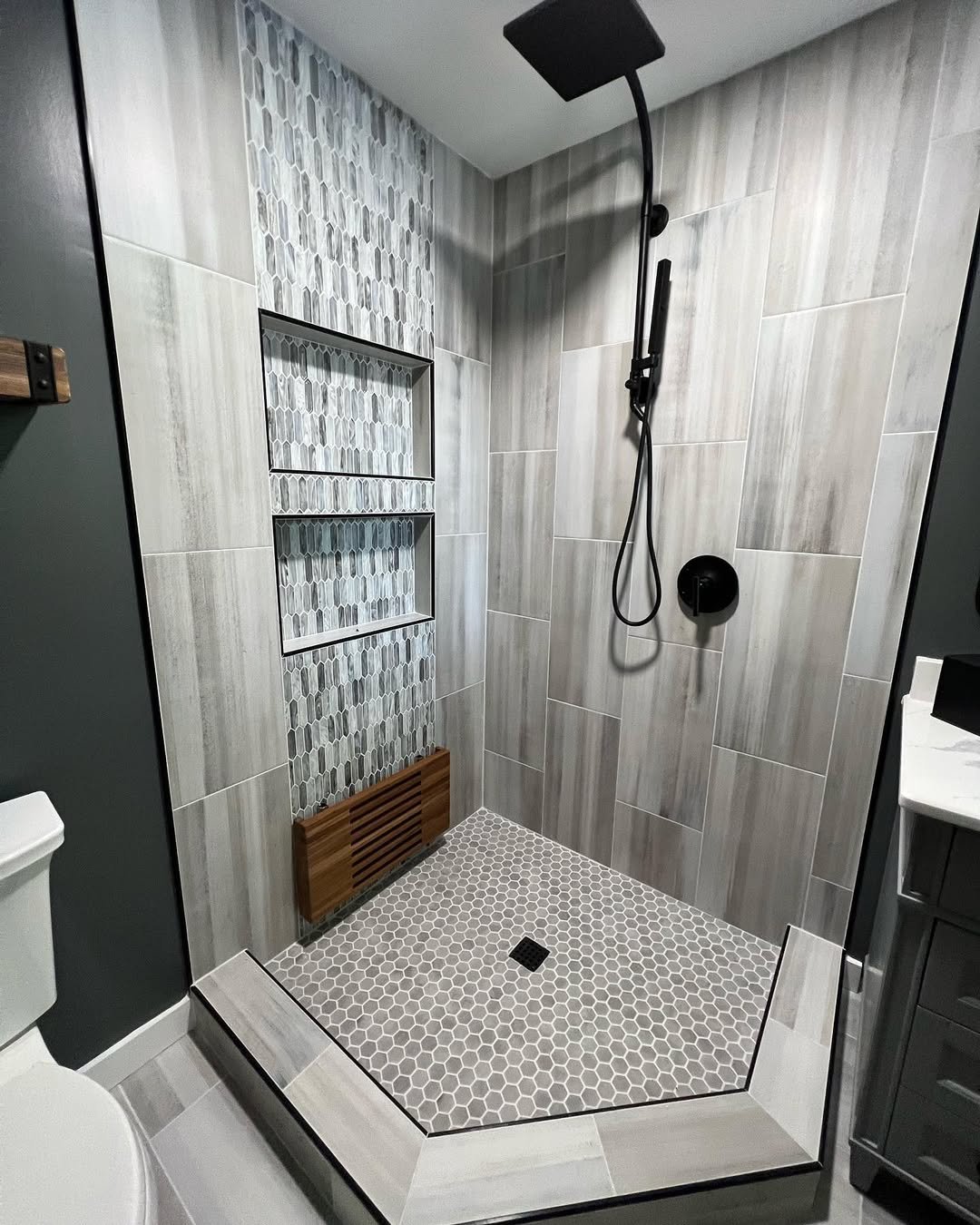
16. Textured Grey Retreat
This space leans into texture in a really satisfying way. The mix of elongated tiles and that patterned niche creates depth without overwhelming the eye.
Add in the matte black fixtures, and suddenly it feels a little moodier, a little more elevated. Like a modern spa—but with personality.
17. Pattern Meets Precision
The base shape here is already interesting, but that floor pattern takes it further. It adds movement and makes the whole corner feel more dynamic.
And the glass? Sharp, precise, and super clean. It’s one of those setups where everything lines up just right—and you can tell.
18. Light-Filled Simplicity
There’s something about natural light hitting glass that just works. This corner shower feels bright, open, and honestly bigger than it is.
The neutral palette keeps things easy on the eyes, while the layout does all the heavy lifting. Simple, but very intentional.
19. Soft Modern Blend
This one nails that balance between modern and cozy. The soft grey tile, warm wood vanity, and matte black fixtures all play nicely together.
And the corner glass enclosure keeps everything feeling open, not crowded. It’s the kind of design that just flows—nothing fighting for attention.
20. Farmhouse Corner Glow
This whole space has that relaxed farmhouse energy—but polished. The patterned tile accents and white paneling give it character without going overboard.
And I love how the corner shower tucks in so neatly. It feels intentional, almost like it was always meant to be right there.
21. Moody Luxe Grid
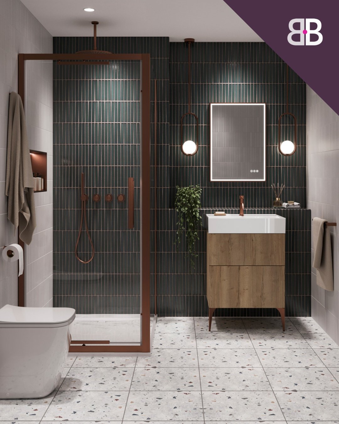
This one is a whole vibe. That deep green vertical tile wall instantly sets the tone—rich, dramatic, and just a little bit moody in the best way.
And then you’ve got that warm bronze framing and fixtures tying everything together. It feels high-end without trying too hard… like a boutique hotel you secretly wish was your own bathroom.
22. Clean Corner Classic
You really can’t go wrong with this look. Crisp white subway tile, simple corner glass, and everything laid out exactly how it should be.
It’s the kind of bathroom that just works every single day. No distractions, no overdesign—just clean, functional, and quietly timeless.
23. Gold Frame Glow-Up
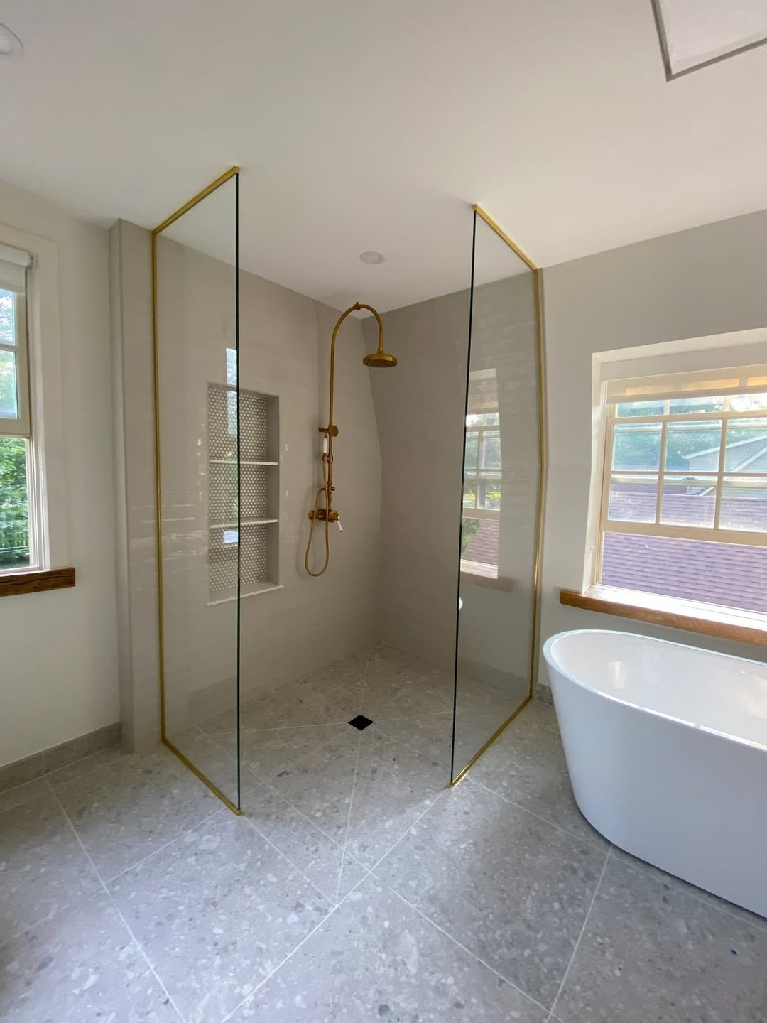
Now this is how you elevate a simple setup. The gold trim framing that glass enclosure instantly adds a layer of elegance without overwhelming the space.
Paired with the soft natural light and neutral palette, it feels airy but still polished. A little glam, a little calm—perfect balance.
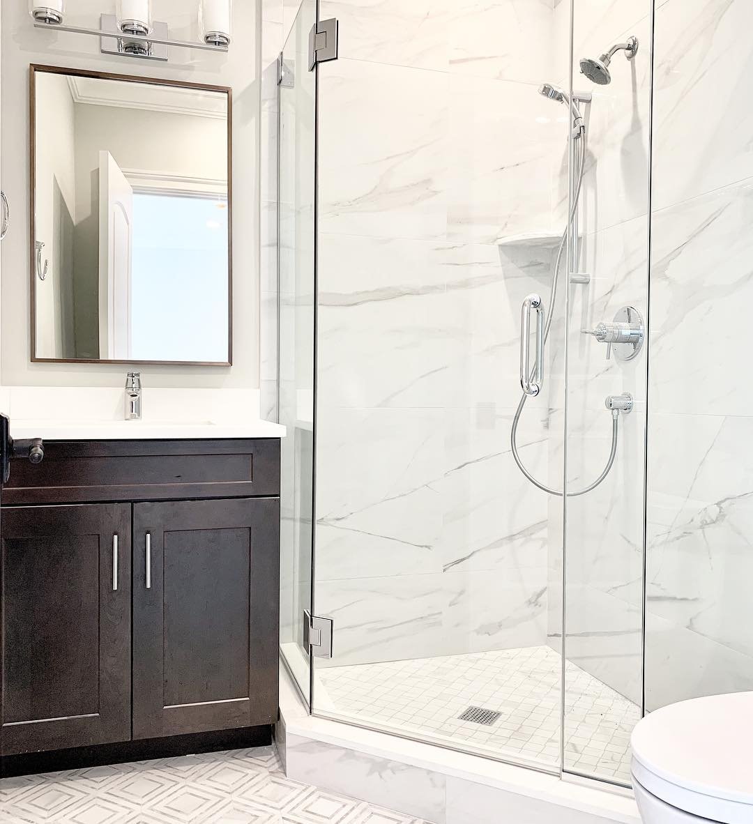
24. Marble Light Elegance
Everything here feels soft, bright, and just a bit luxurious. The marble tile wraps the space in that subtle texture that catches light so beautifully.
And those gold accents? They don’t scream for attention—they just quietly elevate everything. It’s giving classic elegance with a modern refresh.
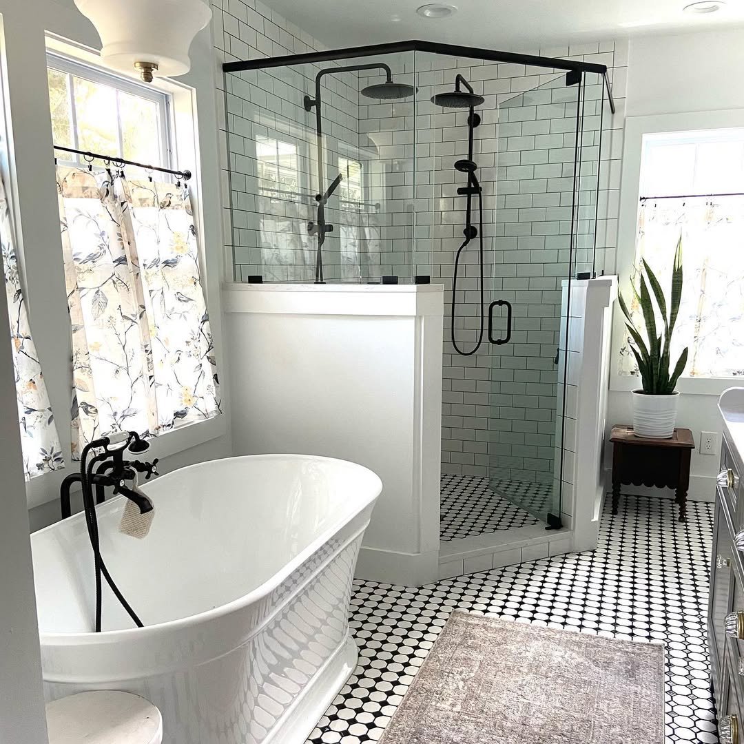
25. Sharp Lines, Soft Tones
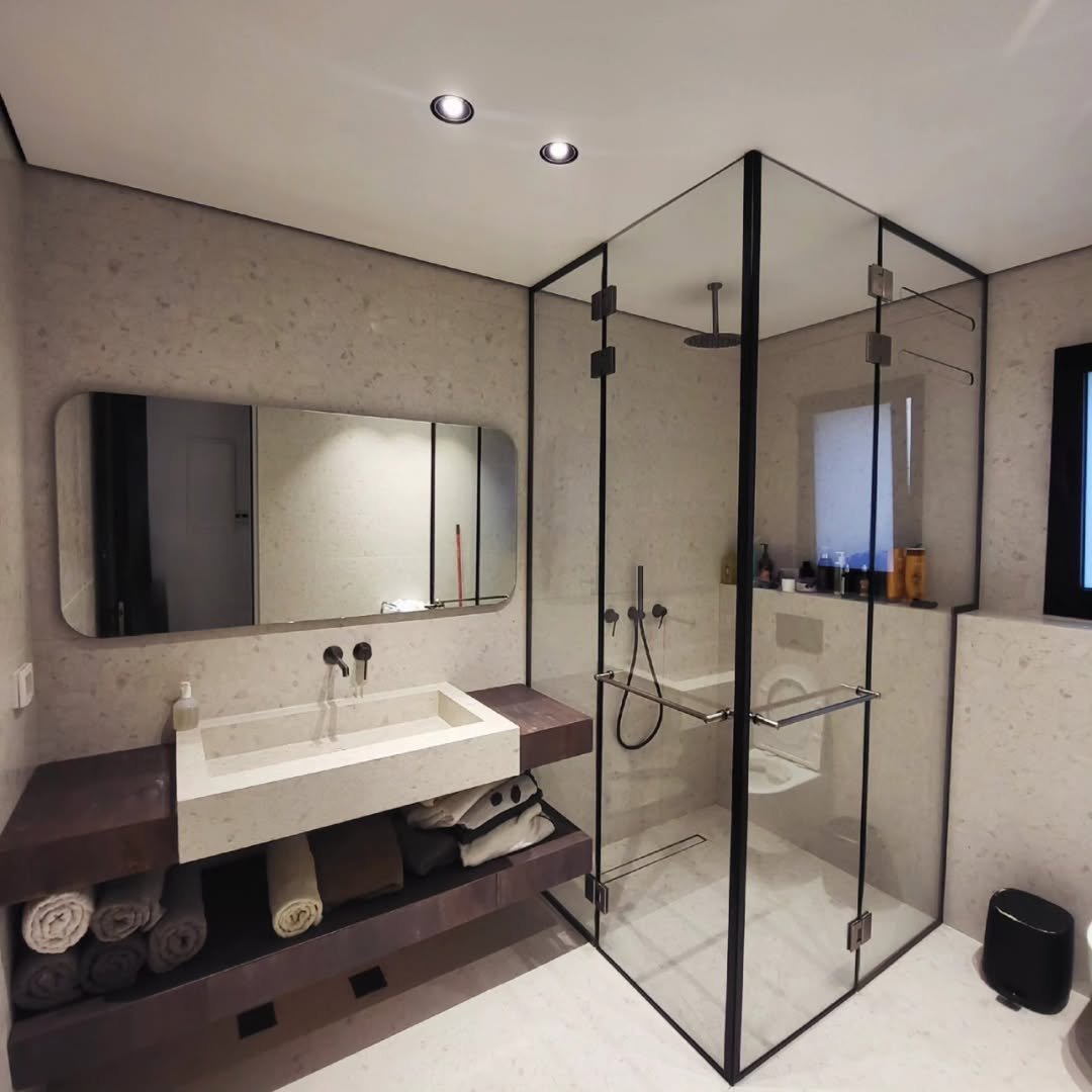
This one leans modern in the cleanest way possible. The black-framed glass creates structure, while the soft neutral tones keep it from feeling too harsh.
I love how grounded it feels—like everything has its place, nothing extra. It’s sleek, calm, and effortlessly put together.
