
Refreshing your bedroom can start with something as simple as the right color palette. These 28 bedroom color scheme ideas are harmonious, stylish, and effortlessly curated perfect for transforming basic walls, setting the mood, and creating a space that feels thoughtfully styled.
28 Bedroom Color Scheme Ideas That Turn Basic Walls Into Thoughtfully Styled Spaces in 2026
In 2026, bedroom color schemes are all about intentional design—think calming palettes, layered tones, and combinations that create a cohesive, elevated look. It’s no longer just about picking a color, but about crafting a mood that transforms your entire space.
Whether you love soft neutrals, rich moody hues, or fresh, airy shades, these ideas offer endless inspiration for every style. Dive in to discover color combinations that make your bedroom feel curated, balanced, and effortlessly beautiful.
1. Deep Navy Retreat
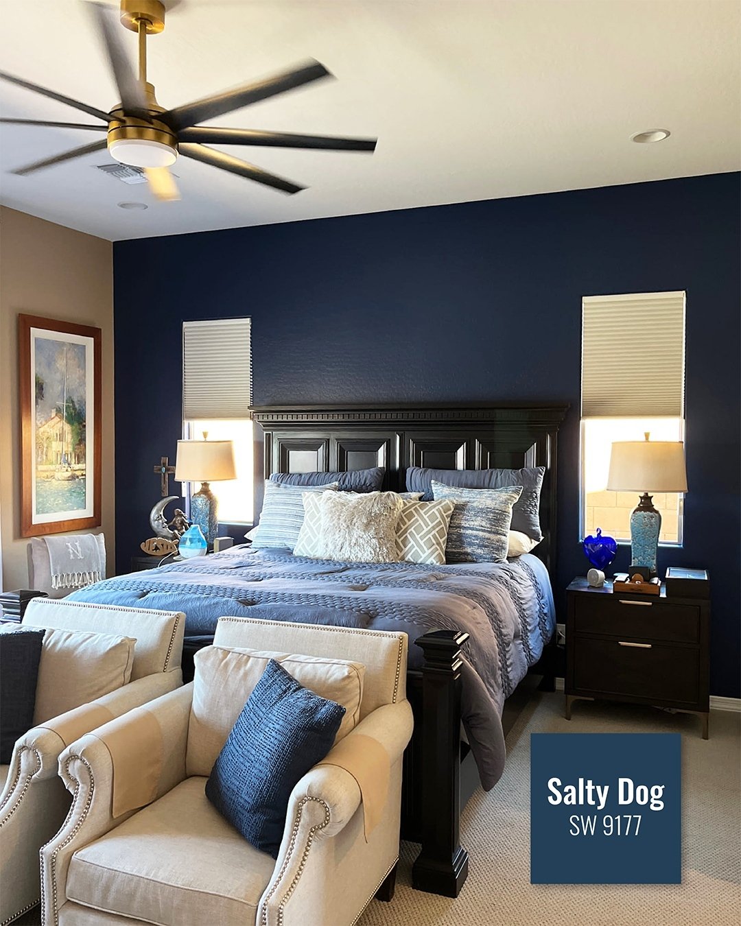
This space leans into that rich, enveloping navy in the most confident way. The “Salty Dog” tone wraps the room like a cocoon, grounding everything from the crisp bedding to the warm wood furniture. It feels tailored, almost like a perfectly fitted blazer translated into a bedroom.
What softens it is the balance, creamy neutrals, layered pillows, and that hint of brass overhead. If you’re drawn to darker walls but worry about heaviness, this is your blueprint: keep textiles light and let contrast do the work.
2. Candy Pastel Dream
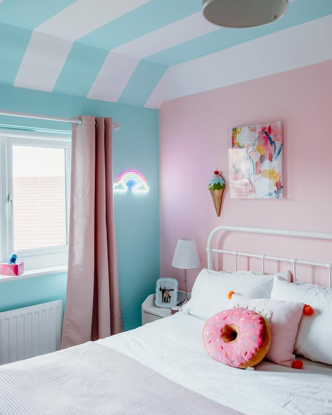
There’s a playful rhythm here that feels straight out of a daydream. The split of soft aqua and blush pink, paired with striped ceilings, creates a space that feels whimsical without tipping into chaos.
It’s the kind of room that feels like a slow Saturday morning, sunlight spilling in, something sweet on the bedside. The key is staying within a soft palette, even the bolder elements feel gentle, not loud.
3. Jewel-Toned Garden Room
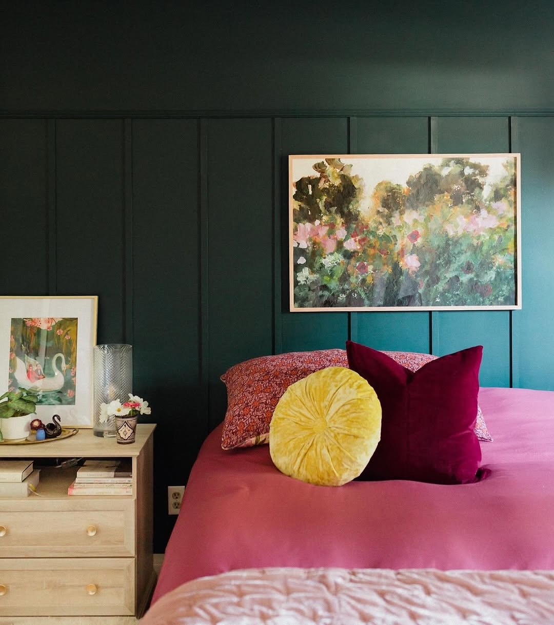
This room leans into color with intention. That deep teal backdrop sets the stage for warm berry tones and golden accents, almost like a painting brought to life.
It feels layered and expressive, yet still grounded. The trick here is contrast in texture, velvet pillows against matte walls, soft linens against structured paneling, so the richness never feels overwhelming.
4. Soft Mint Coastal Calm
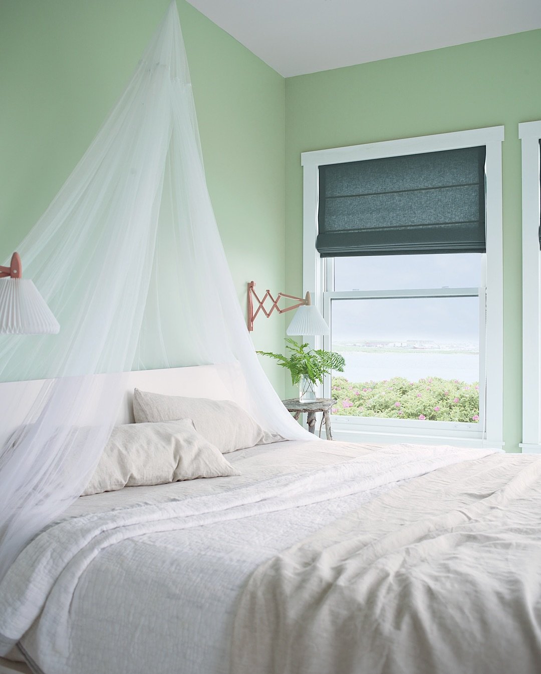
There’s a quiet ease to this room that feels like fresh air. The minty green walls paired with sheer white draping create a softness that almost floats.
It’s minimal, but not stark. The view, the light, the gentle tones all work together to create a space that feels like exhaling after a long day. Perfect if you want color that whispers instead of speaks.
5. Tailored Neutral Classic
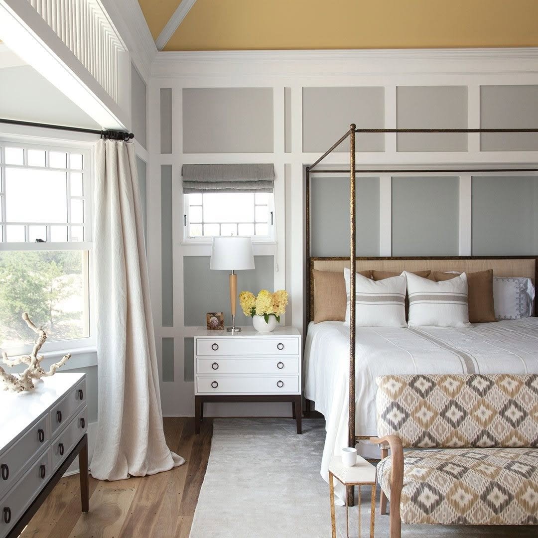
This palette is all about restraint. Warm whites, soft grays, and sandy tones come together in a way that feels polished but lived-in.
It’s the kind of room that ages well, never chasing trends. The structure of the wall paneling adds interest without needing bold color, proving that sometimes the quietest palettes feel the most elevated.
6. Blush and Gold Elegance
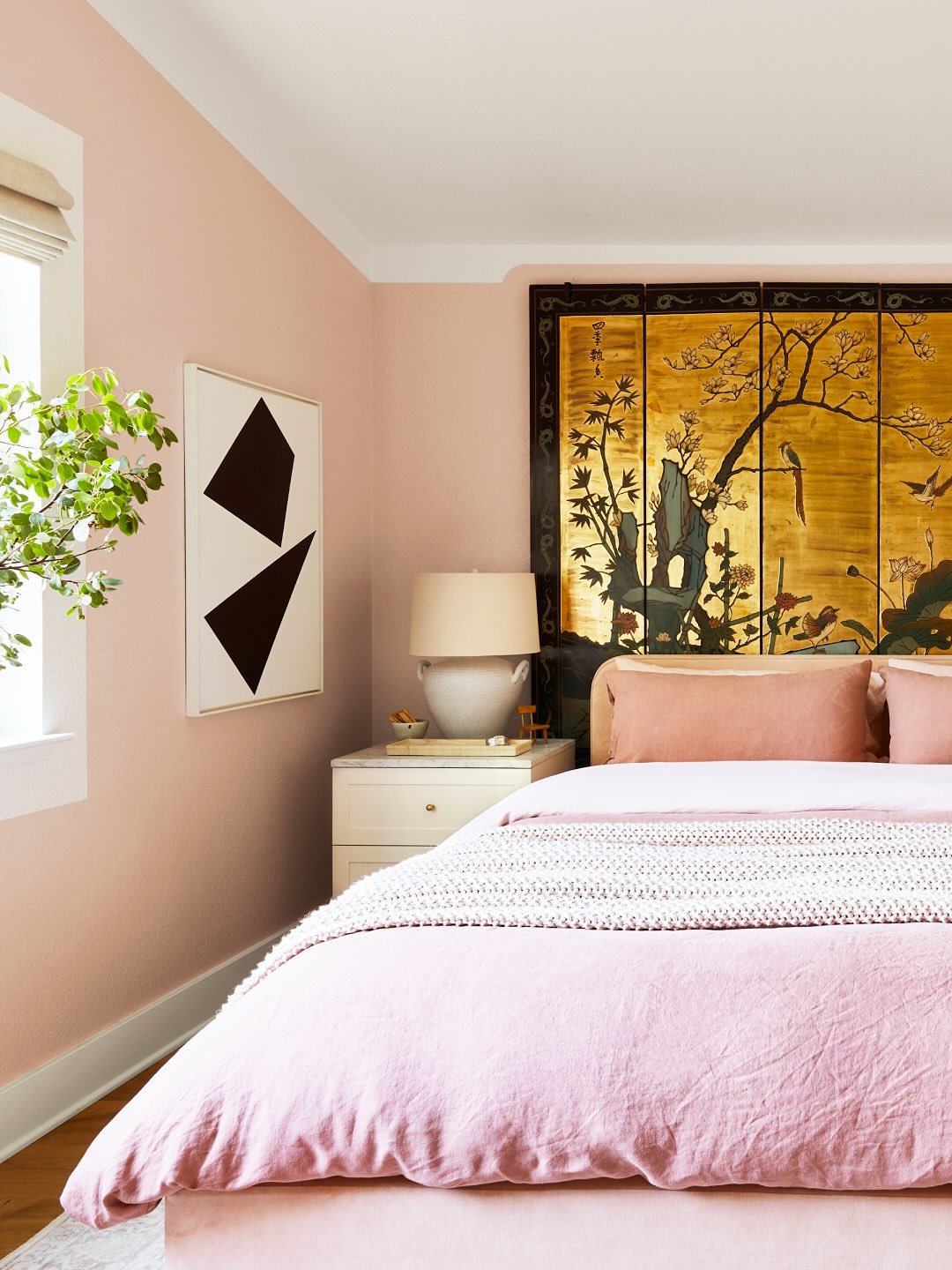
There’s something undeniably romantic about this soft blush wall paired with that striking gold-toned artwork. It feels curated, almost like stepping into a boutique hotel.
What keeps it from feeling overly sweet is the contrast, clean lines, minimal decor, and that touch of black in the artwork. A reminder that pink can feel grown-up when styled with intention.
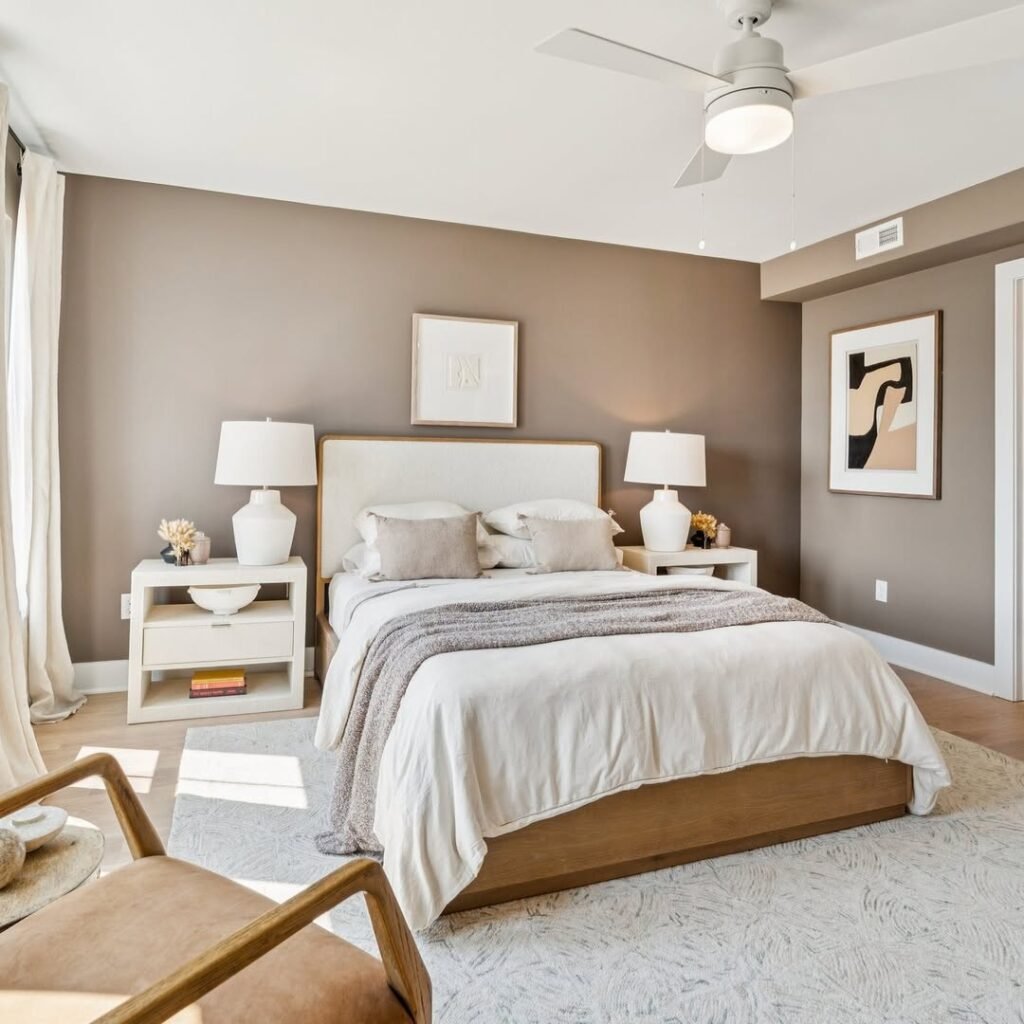
7. Earthy Mocha Cocoon
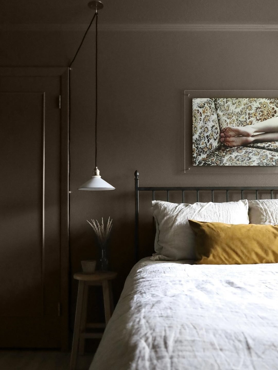
This room leans into warmth in the most grounding way. The mocha-toned walls wrap around the space, creating a cozy, almost hushed atmosphere.
Layered with soft whites and a touch of mustard, it feels like late evening light, calm, steady, and comforting. If you want your bedroom to feel like a retreat, this palette does it effortlessly.
8. Fresh Sage and Navy Balance
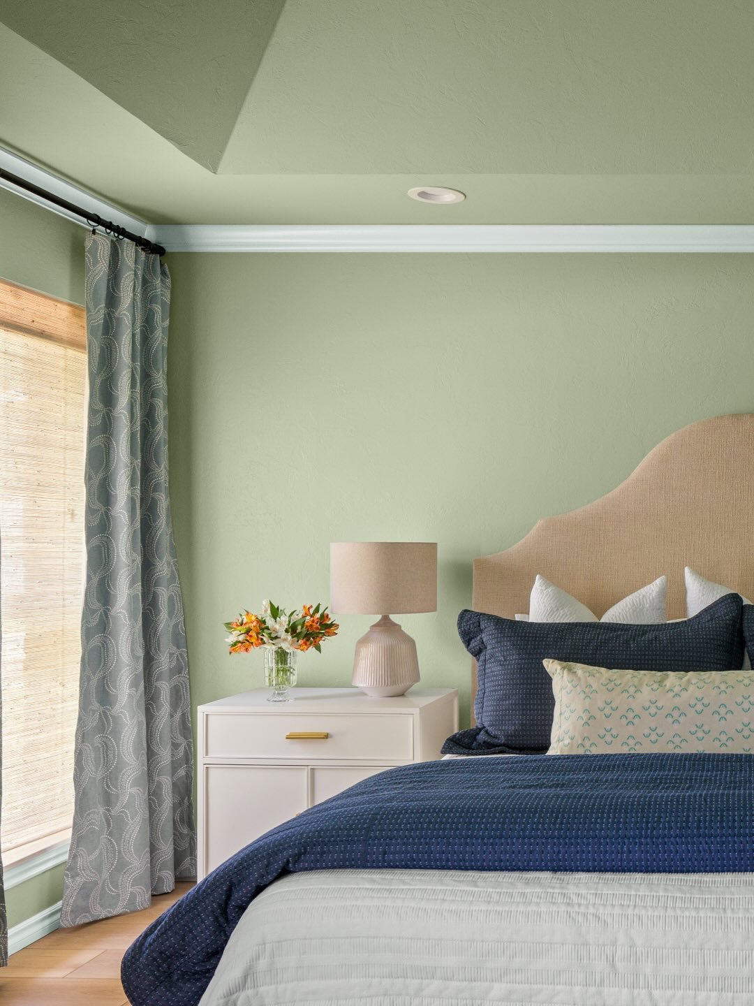
There’s a quiet sophistication in this pairing of sage green and deep navy. It feels fresh but anchored, like bringing the outdoors in with a tailored twist.
The mix of patterns and textures adds depth without clutter. Keep the base soft, then layer in darker accents through bedding or curtains to create that balanced, collected feel.
9. Vintage Blue Charm
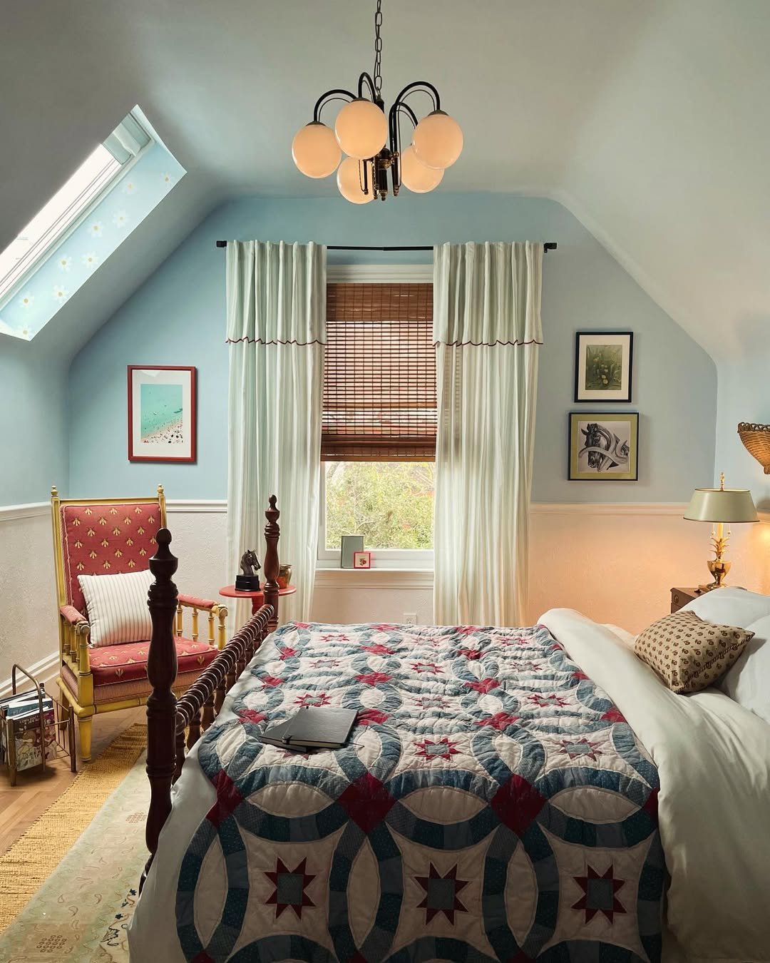
This space feels like a story. Soft blue walls meet a patchwork quilt and warm wood tones, creating a room that feels personal and nostalgic.
Nothing feels overly styled, and that’s the charm. It’s about pieces that mean something, layered over time, with color acting as the quiet thread tying it all together.
10. Graphic Green and Tan Play
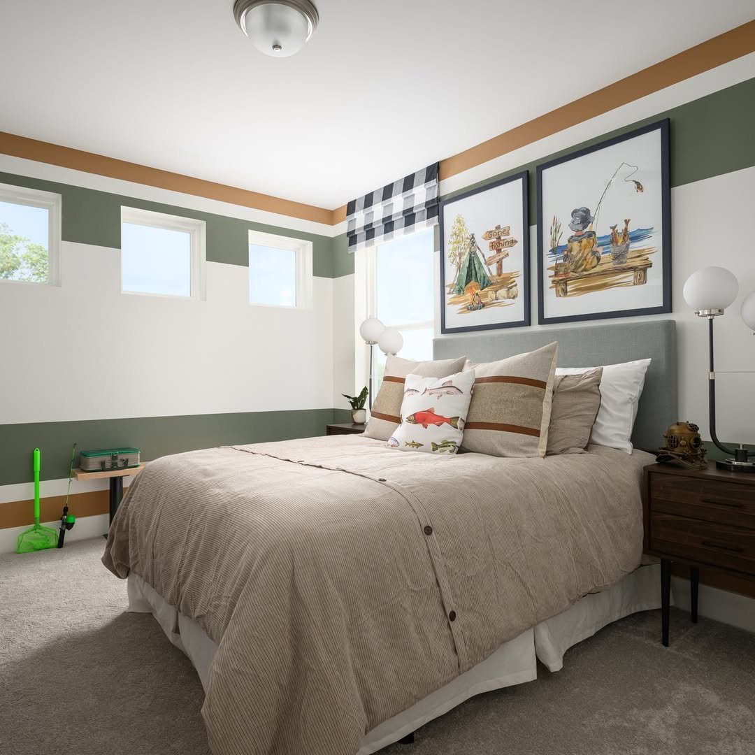
This room brings in a more structured, graphic approach to color. The green and tan stripes add movement, while the neutral bedding keeps things grounded.
It feels playful but controlled, perfect for a space that needs a bit of personality without losing its calm. Think of it as color with boundaries, just enough to keep things interesting.
11. Mauve Glam Layers
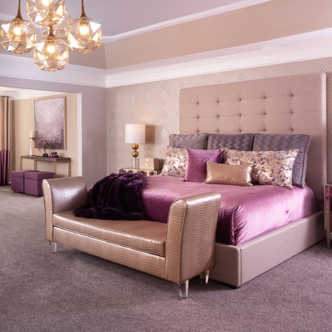
This room leans into softness with a little drama tucked underneath. Mauve, blush, and dusty plum build on each other in a way that feels plush and inviting, while those warm metallic accents catch the light just enough to elevate everything.
It’s giving dressed-up evenings at home, candles lit, nothing rushed. The trick here is layering tones within the same family so the space feels rich, not busy, and letting one or two glossy finishes carry the glam.
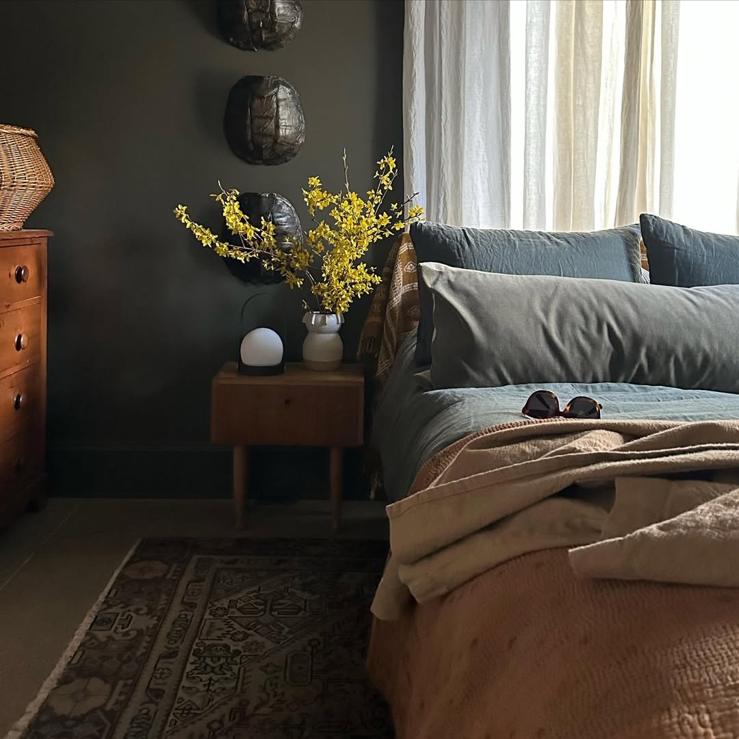
12. Charcoal Minimal Mood
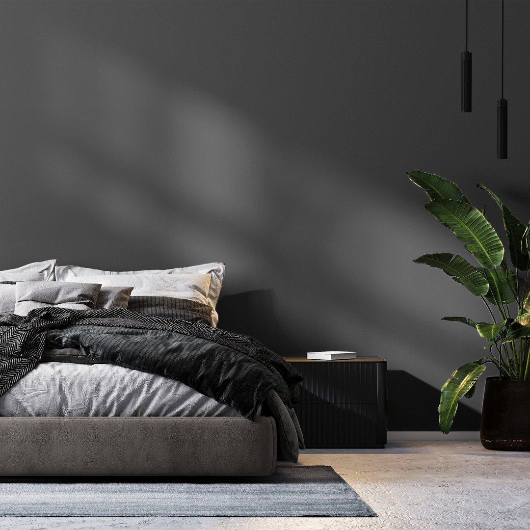
There’s a quiet confidence in this deep charcoal wall. It doesn’t try to compete, it just sets the tone, letting the soft bedding and natural light create that calm, shadowy contrast.
It feels modern, a little introspective, like a space made for slow mornings and late-night thinking. Add one living element, like that sculptural plant, and suddenly the whole room breathes.
13. Rustic Lodge Neutrals
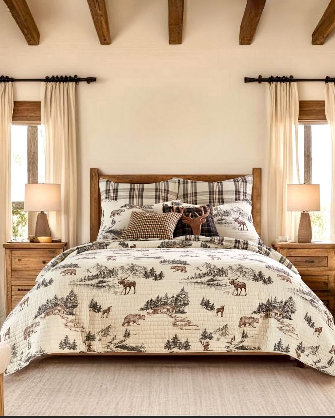
This palette tells a story the second you walk in. Warm woods, creamy whites, and those earthy brown patterns create a space that feels grounded and familiar, almost like a weekend cabin you never want to leave.
Nothing feels overly styled, and that’s the charm. Stick to natural materials and simple prints, and you get that cozy, collected look without trying too hard.
14. Playful Color Clash
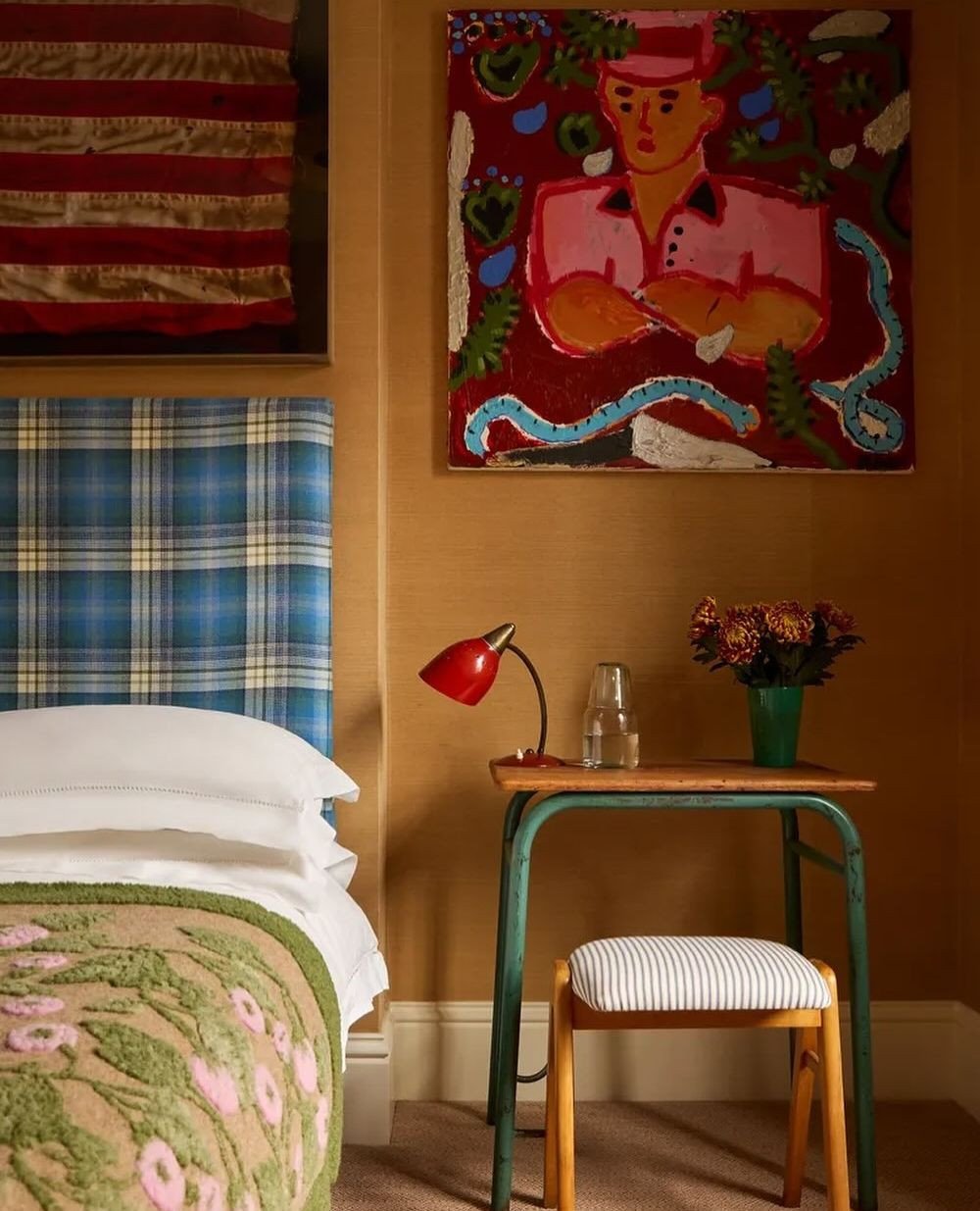
This one is for the color lovers who don’t want to play it safe. Mustard walls, bold red accents, and unexpected pops of blue and green come together in a way that feels curated rather than chaotic.
It’s artistic, a little rebellious, and full of personality. The secret is confidence, once you commit to bold tones, let them shine and keep your base furniture simple to ground the look.
15. Deep Olive Comfort
There’s something so grounding about this deep olive wall paired with soft neutrals and warm wood. It feels like stepping into a quiet, cozy corner of the world where everything slows down.
The muted green works almost like a neutral, especially when paired with linen textures and soft lighting. Perfect if you want color without losing that calm, restful feel.
16. Warm Taupe Simplicity

This is the kind of palette that never goes out of style. Soft taupe walls, creamy whites, and subtle wood tones create a space that feels clean, warm, and effortlessly put together.
It’s the foundation kind of room, easy to live in, easy to update. Layer in different textures like boucle, linen, or brushed cotton to keep it from feeling flat.
17. Candlelit Cozy Layers
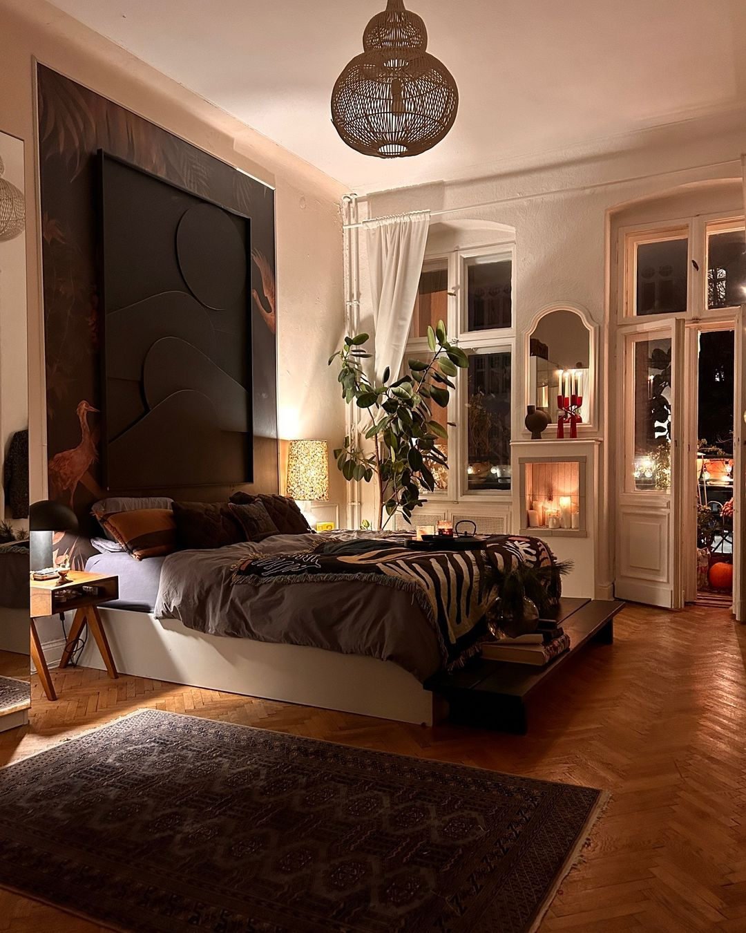
This space feels like golden hour stretched into an entire room. Warm lighting, deep browns, and soft textiles create that cocoon effect that makes you want to stay in just a little longer.
It’s intimate and relaxed, with just enough contrast to keep it interesting. Think low lighting, layered throws, and a mix of materials that feel soft to the touch.
18. Airy Neutral Haven
Light pours into this room and everything feels soft because of it. Creamy whites, pale woods, and subtle beige tones come together in a way that feels fresh but never stark.
It’s minimal, but still warm. The kind of space where every detail matters, from the texture of the rug to the shape of the bed frame, because nothing is competing for attention.
19. Desert Sand Layers
This palette leans into sun-warmed tones, sandy beige, soft tan, and that hint of muted blue that keeps it from feeling too flat. It’s relaxed but still styled, like a perfectly undone bed in a boutique stay.
There’s a softness here that comes from repetition. Keep your tones close, then add one contrasting accent, like that blue pillow, to give the eye a place to land.
20. Classic Heritage Elegance
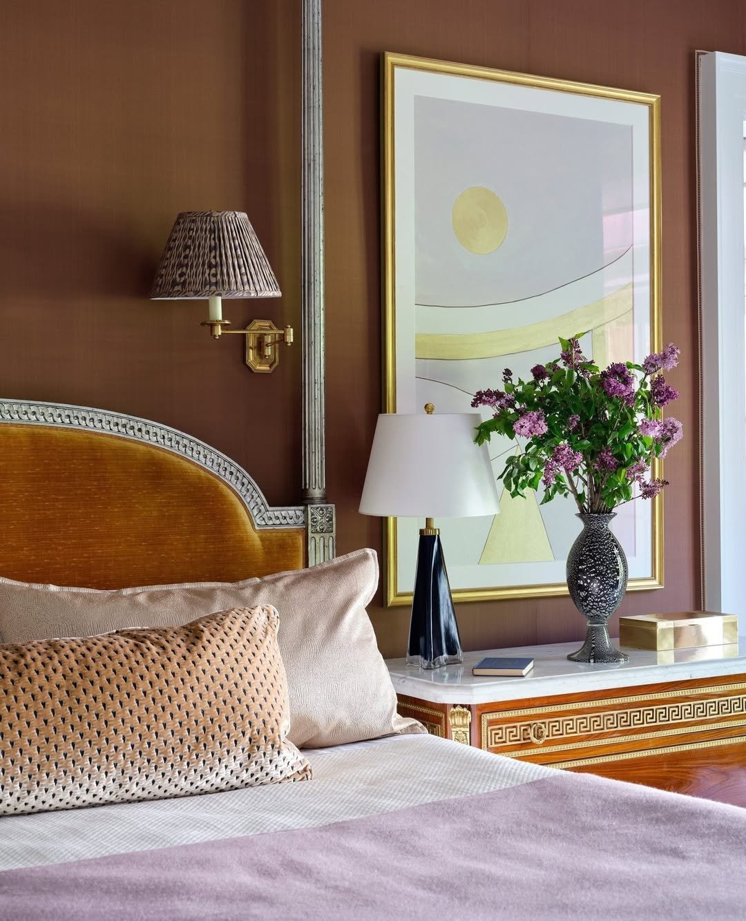
This room feels timeless in the best way. Rich brown walls, warm gold accents, and soft blush textiles create a palette that feels layered and quietly luxurious.
It’s refined without feeling stiff. A little traditional, a little romantic, and proof that deeper tones paired with polished details can make a bedroom feel instantly elevated.
21. Textural Statement Calm
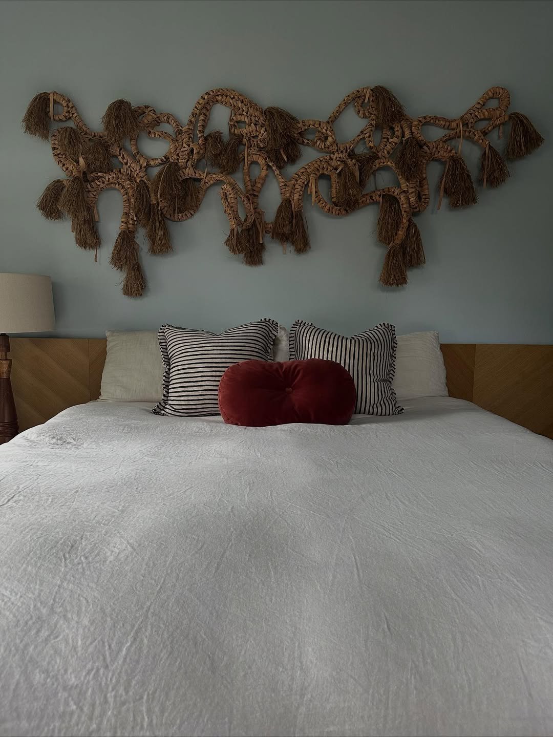
At first glance, it feels simple, almost quiet, but then your eye catches that sculptural wall piece and everything shifts. The woven texture adds movement against the soft blue wall, while the crisp white bedding keeps the whole space grounded.
It’s that balance of clean and collected that makes it work. Add one unexpected element with depth, something tactile, something imperfect, and suddenly a minimal room feels layered and alive.
22. Playful Arches & Blush Tones
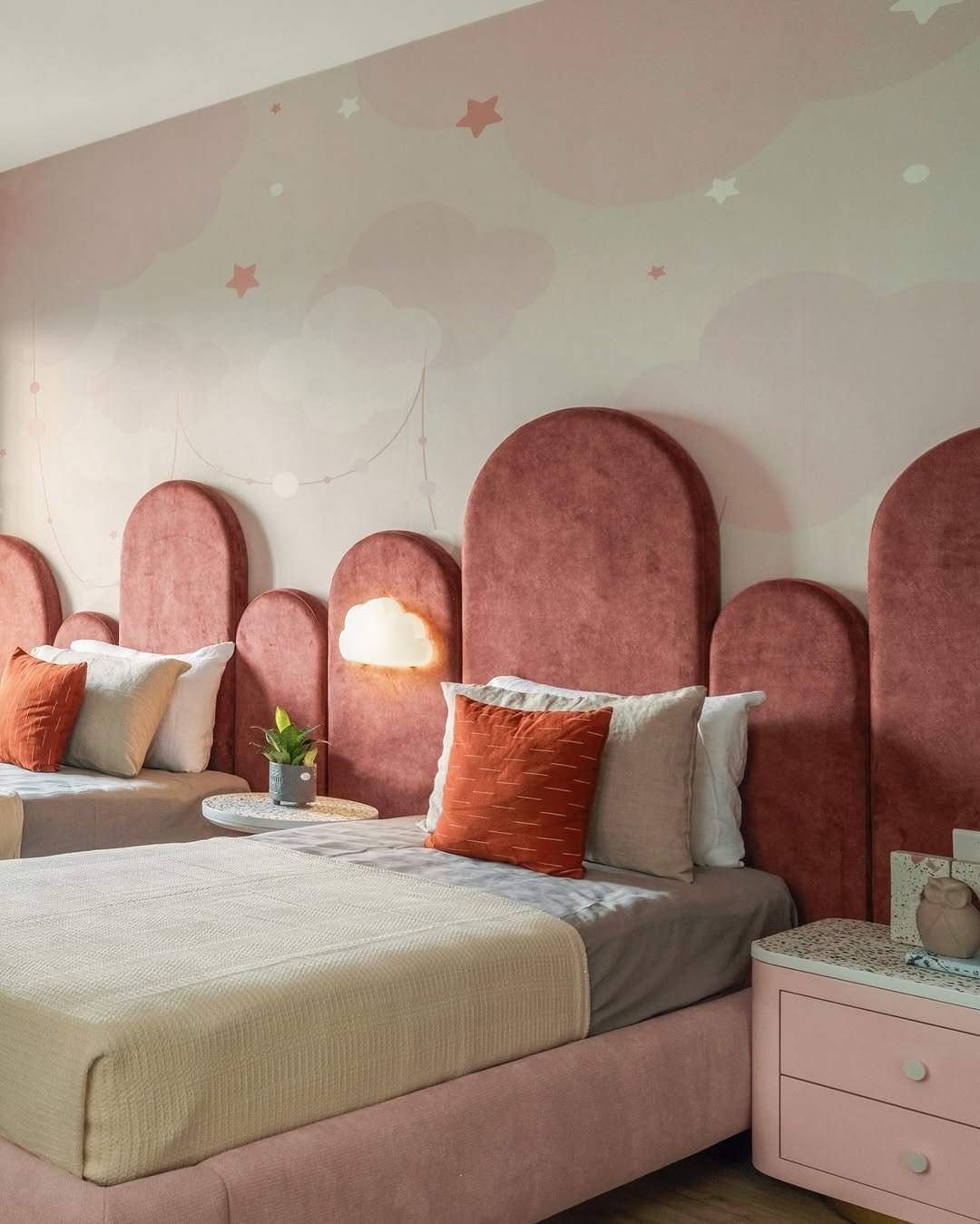
There’s a softness here that feels almost storybook. The rounded headboard panels, dusty rose tones, and those gentle cloud motifs create a space that feels dreamy without tipping into overly sweet.
It’s playful, but still refined. Keeping the palette tonal and adding just one or two whimsical details lets the room feel imaginative without losing that polished, grown-up edge.
23. Soft Peach Morning Light
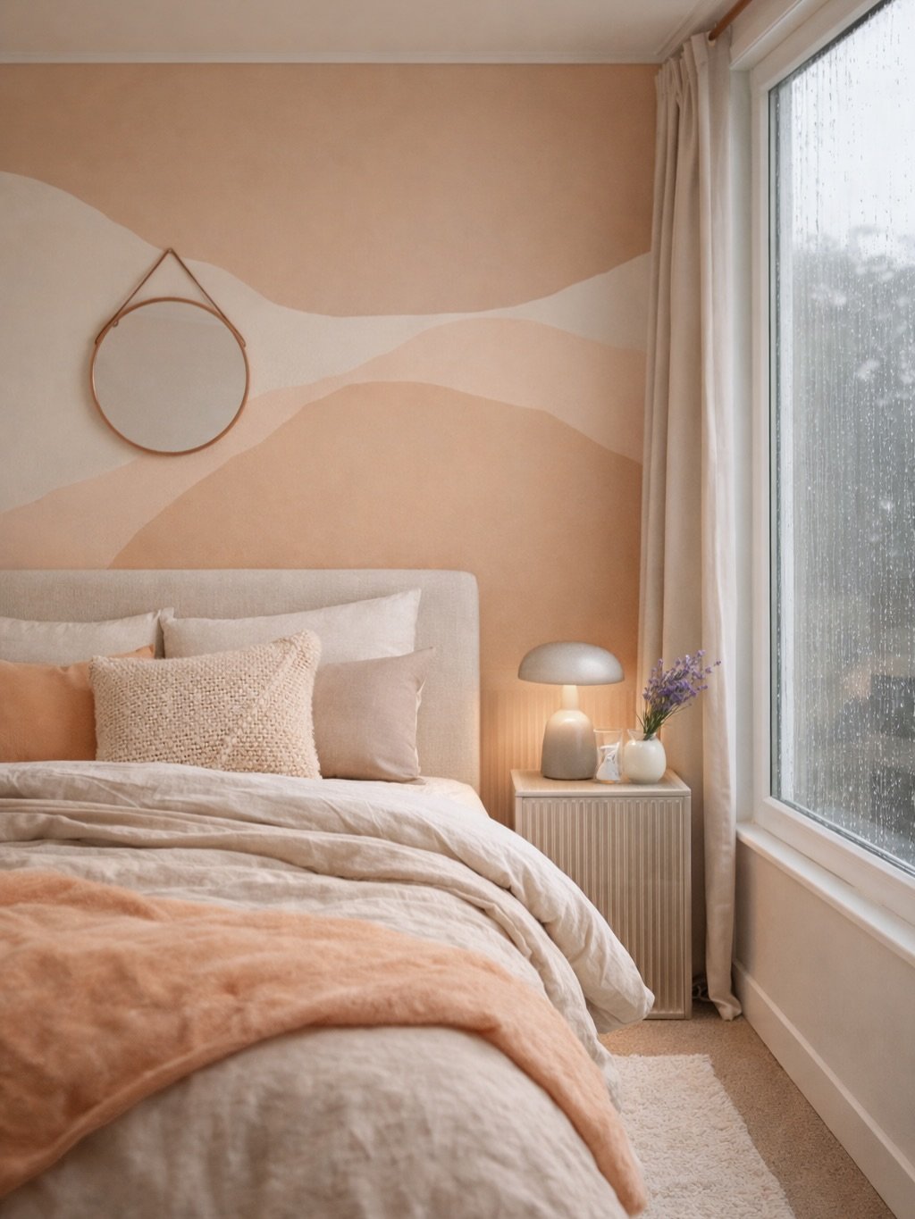
This room feels like waking up to filtered sunlight every day. Peachy walls, creamy linens, and that soft gradient mural create a gentle warmth that wraps around the space.
Nothing feels harsh or overly defined. It’s all about blending tones and letting light do the work, perfect for a bedroom that leans into slow mornings and quiet starts.
24. Powder Blue Panel Charm
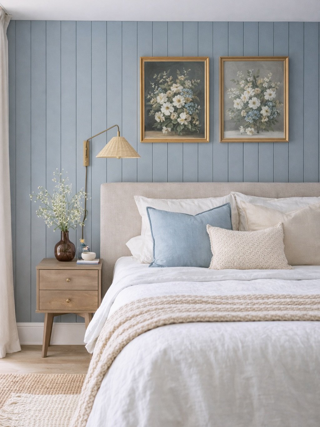
There’s something timeless about this soft blue paneling paired with delicate florals. It feels classic, but not in a heavy way, more like a fresh take on something familiar.
The beauty is in the restraint. A few curated details, warm wood, soft textiles, and suddenly the whole room feels pulled together without trying too hard.
25. Classic Taupe Elegance
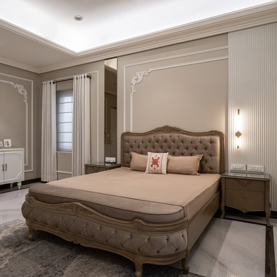
This space leans into tradition with a softer touch. The tufted bed, ornate molding, and warm taupe palette create a look that feels refined but still inviting.
It’s the kind of room that doesn’t chase trends. Instead, it builds on timeless elements, letting symmetry and subtle detailing carry the design.
26. Marble & Modern Luxe
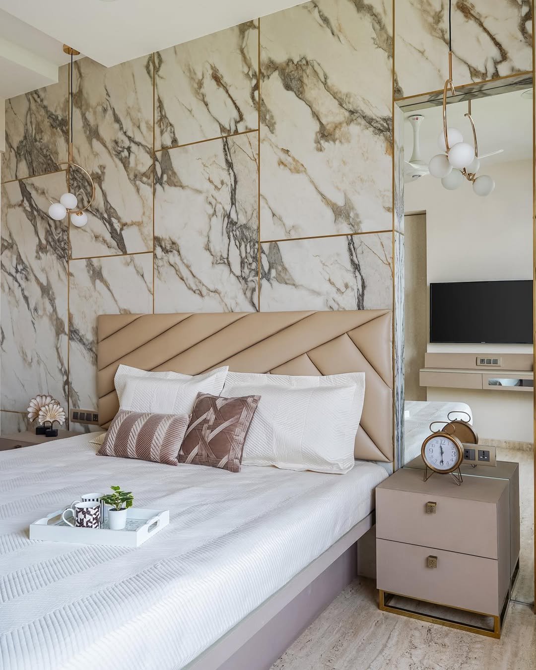
This one makes a statement the moment you walk in. That marble wall, framed with gold lines, adds structure and drama, while the neutral bedding keeps it from feeling too bold.
It’s polished, but still livable. Pair strong architectural elements with soft layers so the room feels balanced, not overpowering.
27. Sculpted Headboard Moment
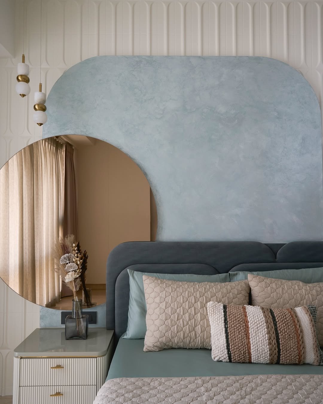
The curves here do all the talking. That oversized, sculptural headboard paired with soft blue tones creates a look that feels both modern and a little artistic.
It’s subtle, but memorable. Let one design feature take center stage, then keep everything else muted so it has space to breathe.
28. Warm Neutral Retreat
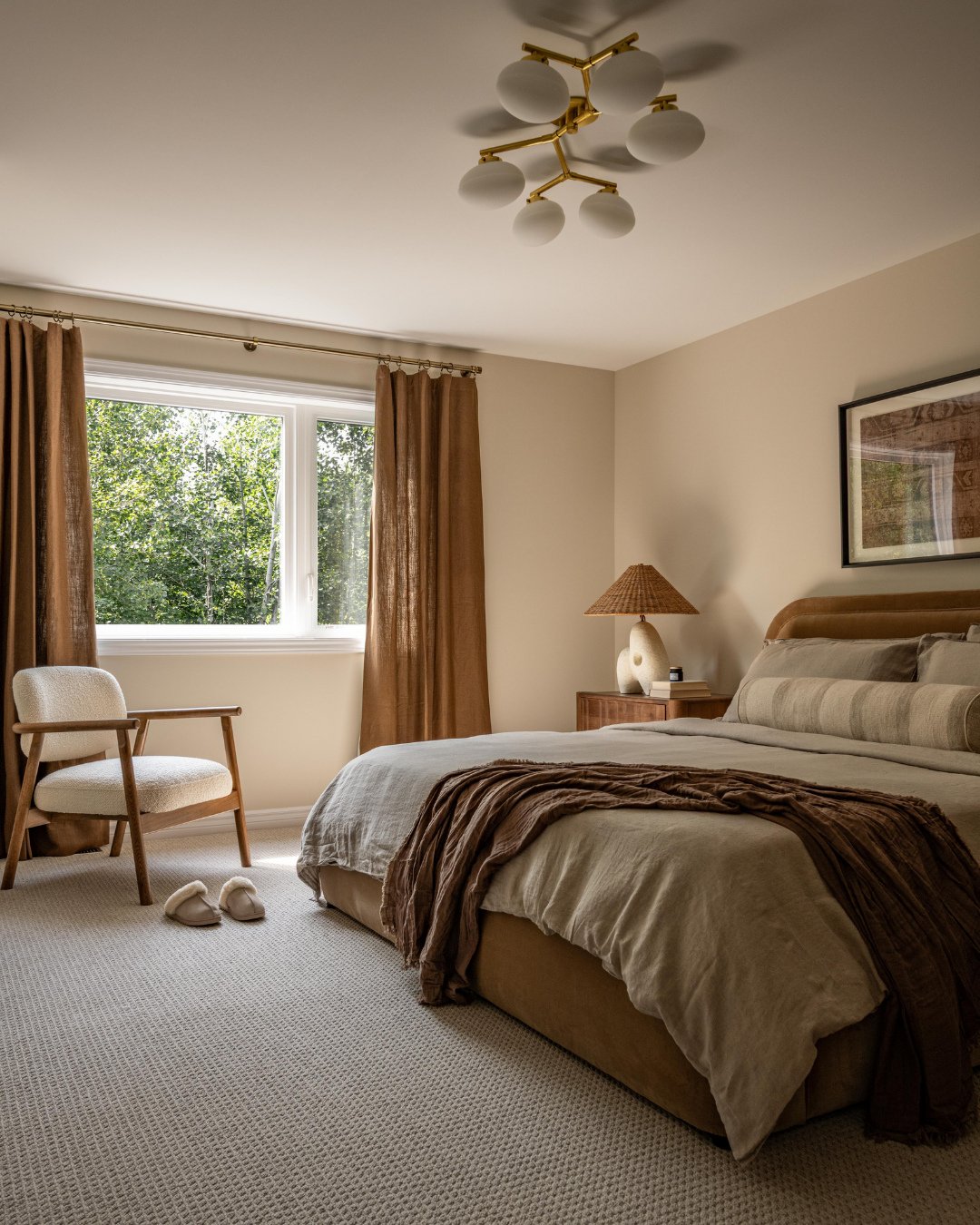
This is the kind of bedroom that instantly slows you down. Warm beige layers, soft brown textiles, and natural light create a space that feels grounded and easy.
Nothing feels forced, and that’s exactly the point. Stick to a tight palette, mix in a few organic textures, and you get a room that feels calm, comfortable, and quietly styled.
/
