

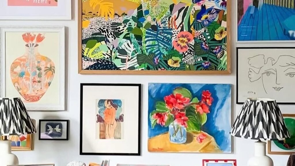
The wall by the stairs or above the sideboard usually stays empty because nobody knows where the first frame should go. These 6 wall art arrangement ideas show where real people started, and how the rest of the frames followed.
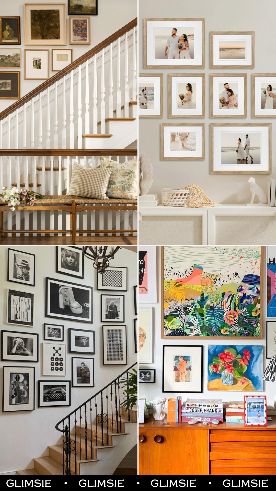
6 Wall Art Arrangement Ideas That Follow the Stairs, the Sideboard, or the Ledge
A wall of frames looks planned when the group follows something already in the room, like the slope of the stairs, the width of a sideboard, or the top of a ledge. Every wall here does that, and none of them needed a perfect grid.
Some lean into color and some stick to black and white, but you can copy any of them with frames you’ve already got. Start with the first one, where the stairs do most of the layout work for you.
Portraits That Climb With the Steps
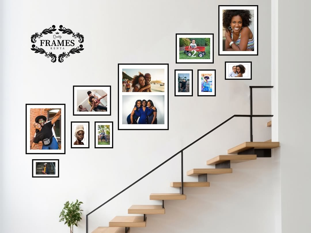
Start low on the left and let each small cluster sit a little higher than the last, so the frames rise at the same angle as the open stairs. Thin black frames with white mats make photos of different shapes read as one set, and the tall frame holding two stacked photos gives your eye a place to land in the middle.
The Fix for a Bare Sideboard Wall
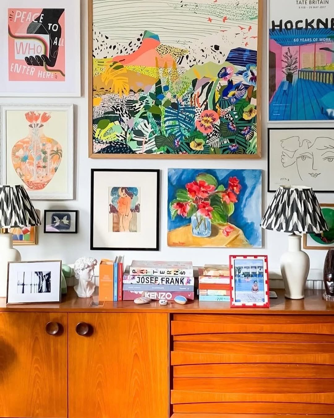
Coral, pink and blue repeat across the vase print, the flower painting and the posters, which is why this packed wall still reads as one group. To copy it, hang the biggest piece high in the middle and fill in around it with smaller prints that almost touch. The black and white lampshades keep all that color from taking over.
Lean Some Frames, Hang the Rest
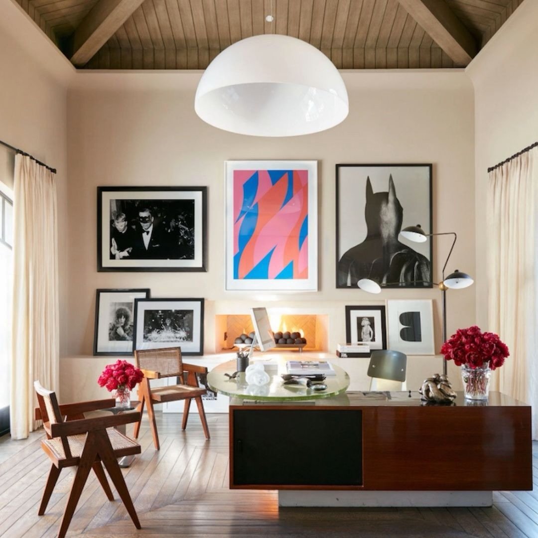
Three big pieces go in a row, with smaller frames resting on the ledge right below. Black and white photos hold the edges, so the pink and blue print in the middle is the only real color and gets noticed first. Leaning frames need no nails, so swapping one takes seconds. If there’s a fireplace under your wall too, these brick fireplace ideas are a good next stop.
Matching Frames Tame a Big Wall
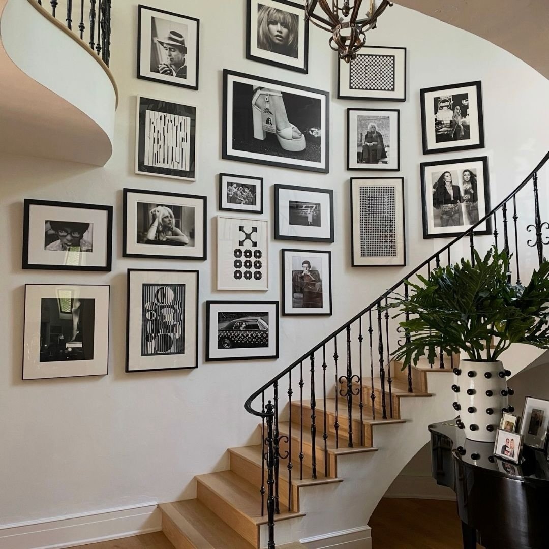
Two colors do all the work here, which is why more than a dozen frames still look calm. Most frames are black with a white mat, so portraits, car photos and dot-and-stripe prints all play nicely together. The biggest picture, the platform shoe, sits near the top middle, and smaller ones fill in as the wall curves. Worth a look if your stairs start in the front hall.
One Photo Shoot Fills a Whole Wall
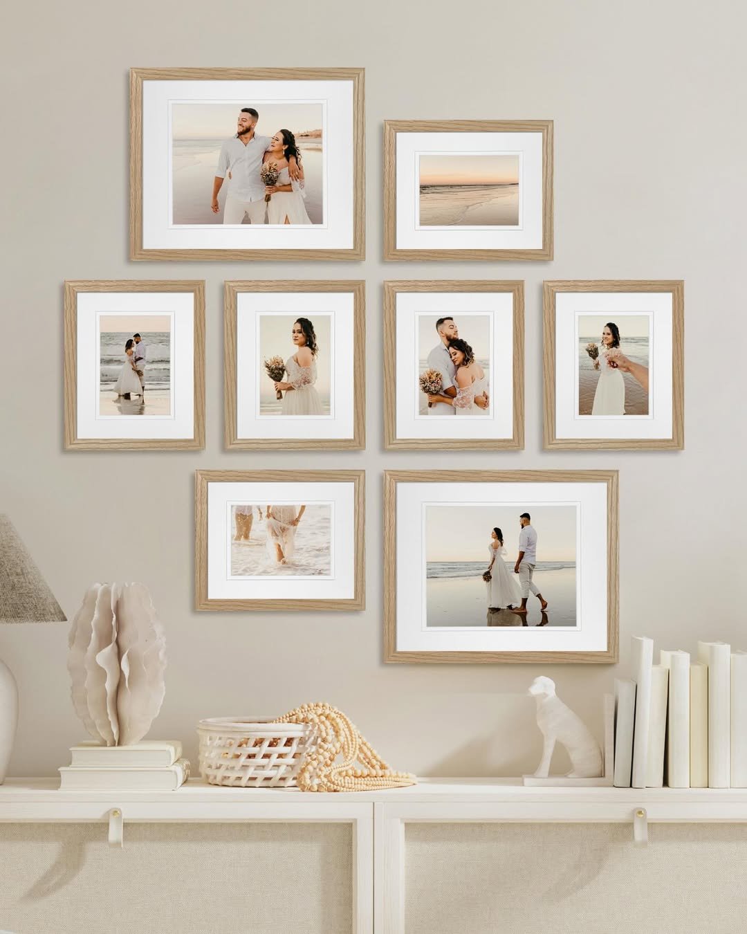
Eight light wood frames in a few sizes could look scattered, but the warm sunset tones in every photo tie them into one set. A quiet shot of just the waves sits next to the big laughing portrait, which gives your eyes a break. Keep the console soft and cream, like the books and sculpture here, so it all reads as one corner.
Mismatched Frames Work When Colors Match
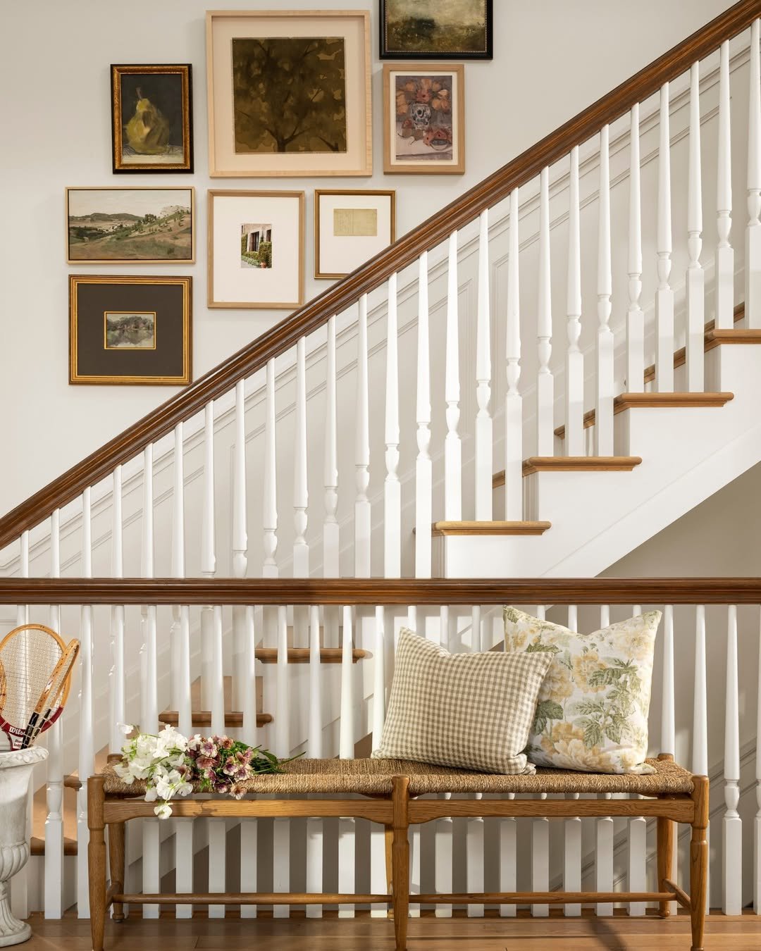
It should look messy: gold, black and plain wood frames all on one wall. It doesn’t, because every piece inside is some mix of olive, brown and muted rust. Pick the art by color family first, then let the frames be as mixed as you like. The group steps up along the handrail, and the bench below repeats the tan and green in its pillows.
