

Thinking about refreshing your bathroom without a full renovation? These 28 bathroom paint color ideas are fresh, transformative, and full of life perfect for making your walls look brand new while adding personality, brightness, and a beautifully updated feel.
28 Bathroom Paint Color Ideas That Instantly Refresh Your Walls With a 2026 Glow Up
In 2026, bathroom paint colors are doing more than just covering walls they’re redefining the entire mood of the space. From soft neutrals to bold, modern hues, the right color can make your bathroom feel cleaner, brighter, and completely renewed without a full renovation.
Whether you’re craving a subtle refresh or a dramatic change, these ideas are packed with inspiration to suit every style. Get ready to explore paint colors that breathe new life into your bathroom and make your walls look effortlessly brand new.
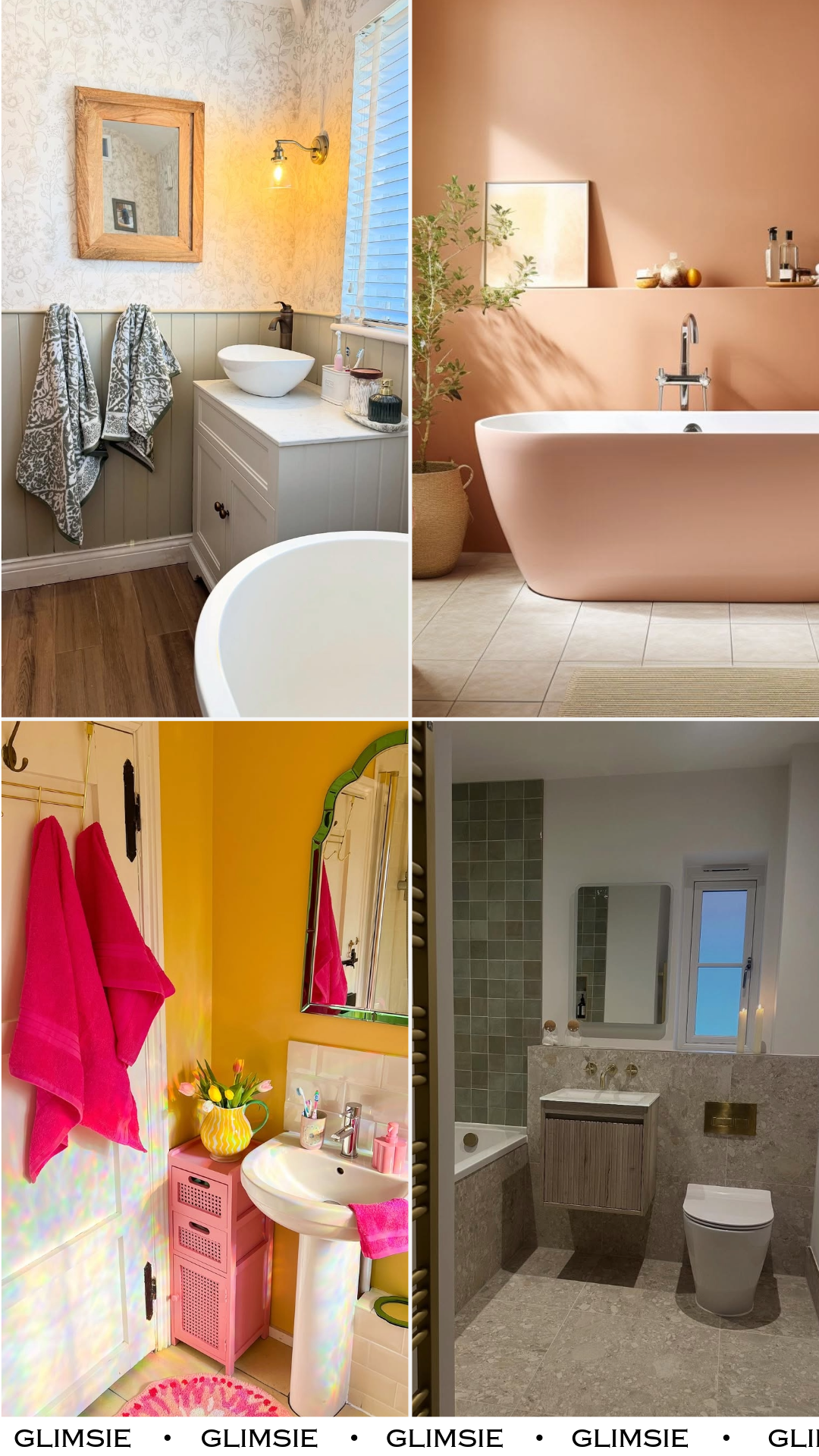
1. Soft Sage Cottage
This one feels like a quiet Sunday morning. That muted sage paneling paired with delicate floral wallpaper just wraps the whole space in this calm, lived-in charm. It’s soft without being boring, and the wood tones keep it grounded so it doesn’t float off into “too precious” territory.
And honestly, it’s the kind of color that grows on you. Not loud, not trendy—just effortlessly cozy. Like a space that doesn’t try too hard but somehow gets everything right.
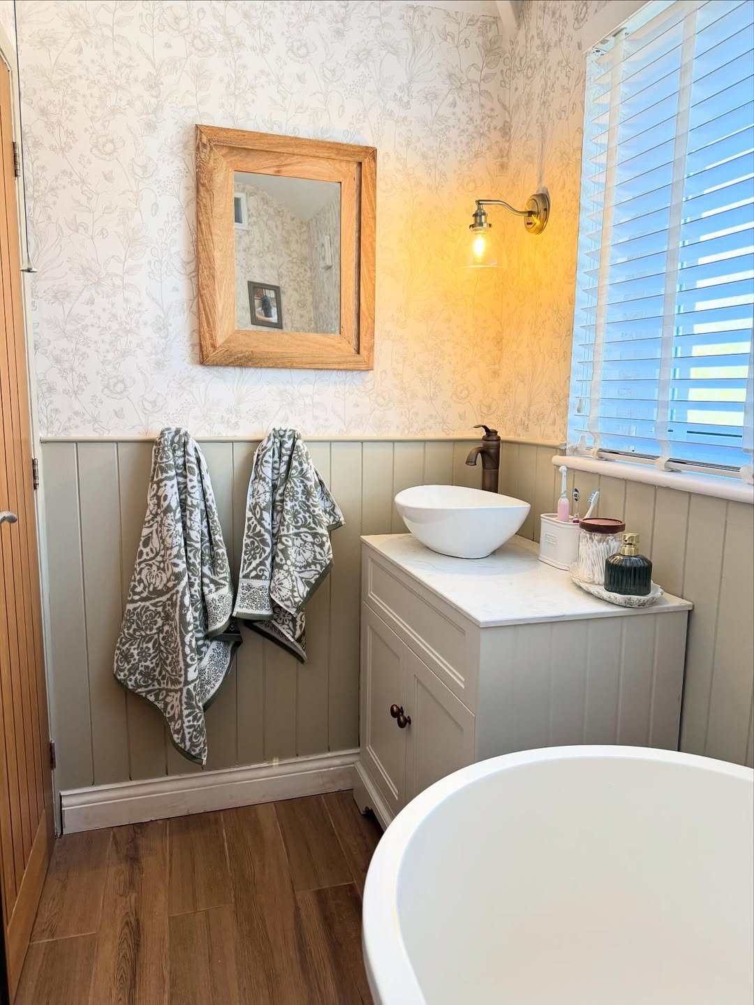
2. Peachy Glow Retreat
This warm peachy tone? It’s basically golden hour in bathroom form. The light hits it and suddenly everything feels softer, calmer, a little more intentional.
It’s minimal, but it doesn’t feel empty. The color carries the whole vibe—clean lines, simple styling, and that quiet spa-like energy that makes you want to stay a little longer.
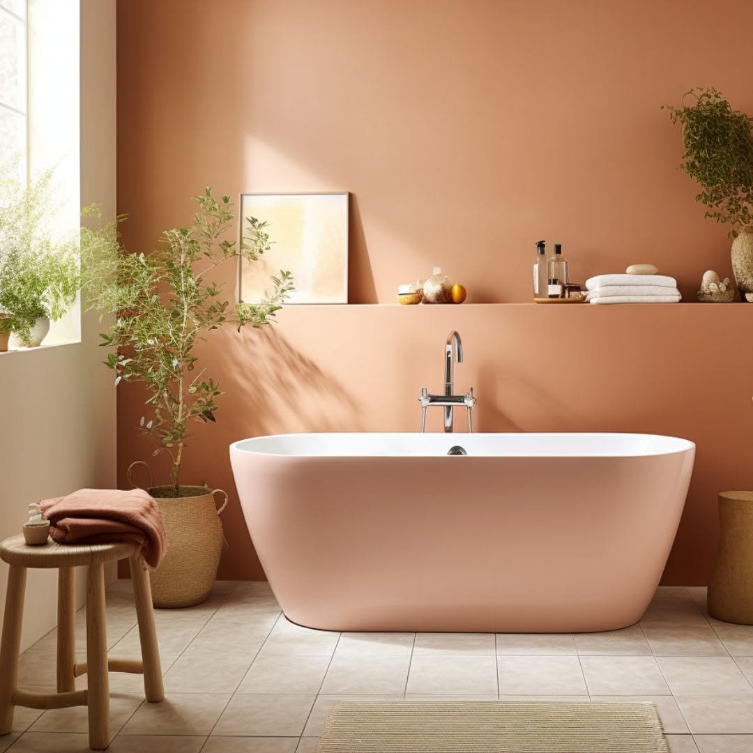
3. Playful Pop Yellow
This one’s pure joy. The bold yellow walls mixed with those punchy pink accents feel like stepping into a happy little moment you didn’t know you needed.
It’s not trying to be subtle—and that’s exactly why it works. It’s fun, a little cheeky, and proves that bathrooms don’t always have to play it safe.
4. Warm Neutral Layers
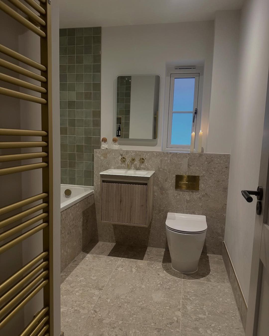
There’s something really satisfying about this palette. Soft beige tones, a hint of green tile, and those warm brass details—it all just blends so smoothly.
Nothing is fighting for attention here. It’s layered, balanced, and feels quietly elevated. The kind of space that feels calm the second you walk in.
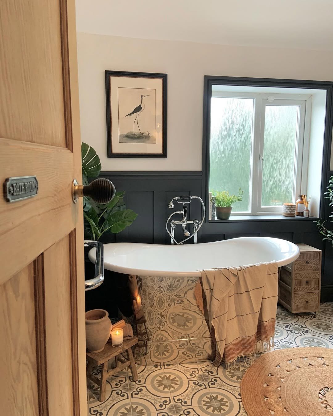
5. Classic Olive & Cream
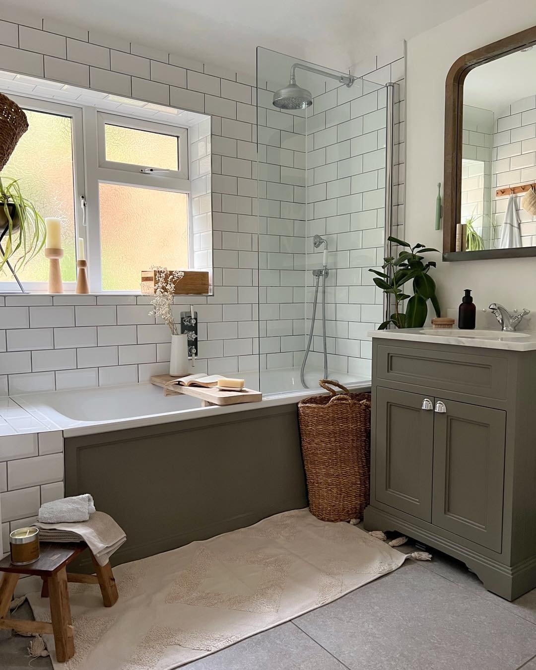
This one leans into that timeless, slightly rustic charm. Olive green paired with crisp white tiles is such a reliable combo—but here, it feels fresh again.
It’s practical, cozy, and just a little bit nostalgic. Like something you’ve seen before—but better styled this time.
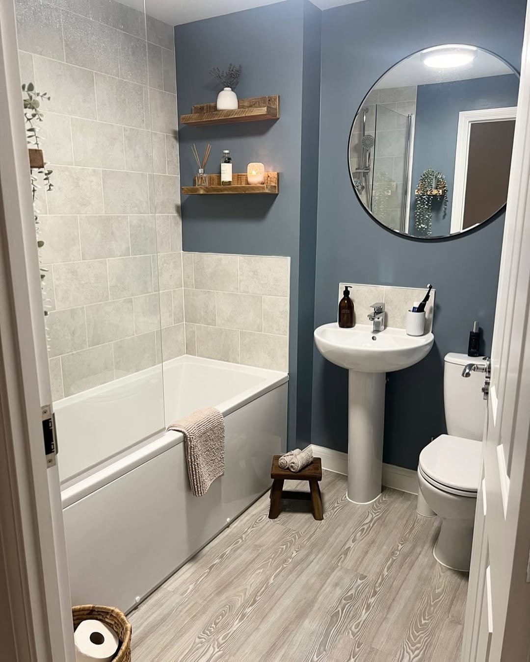
6. Dusty Blue Attic Calm
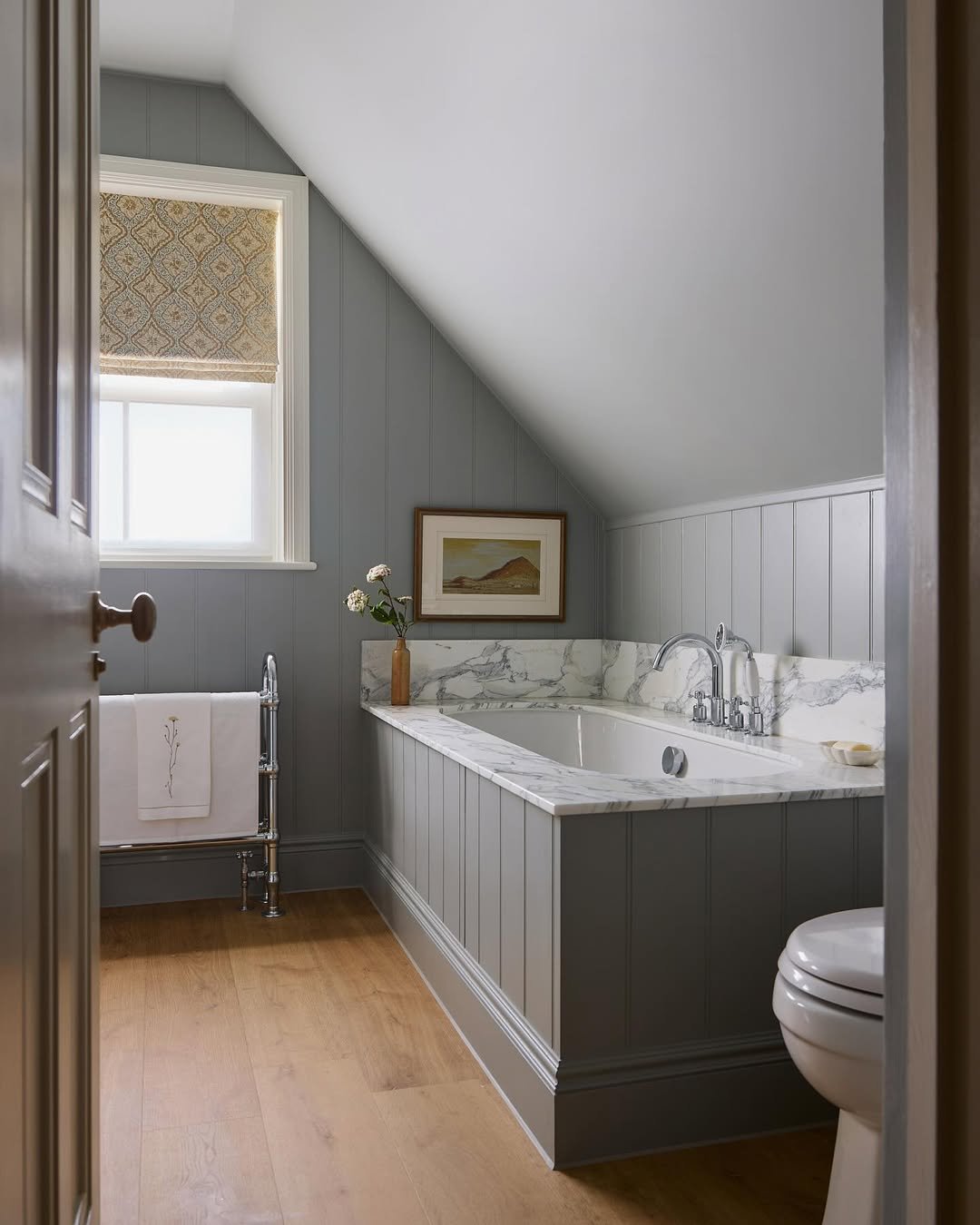
That muted blue under the sloped ceiling? It’s doing a lot of work—in the best way. It softens the angles, makes the space feel bigger, and adds just enough color without overwhelming it.
It’s calm, airy, and a little bit storybook. The kind of bathroom that feels tucked away from everything else.
7. Sky Blue & Brass Combo
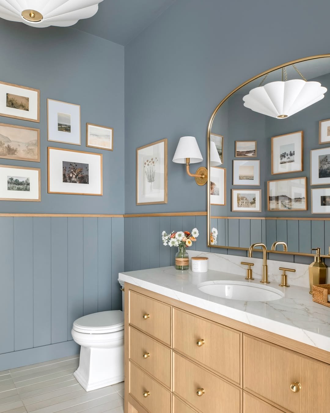
This one feels fresh but still polished. The soft blue walls bring in that light, airy vibe, while the brass fixtures add just enough warmth to keep it from feeling cold.
And those gallery frames? Such a nice touch. It’s clean, styled, but still very livable—like a space that evolves with you.
8. Crisp White Simplicity
Sometimes you just can’t beat a good white bathroom—and this one proves it. Bright, clean, and full of light, it lets the textures and shapes do the talking.
It’s simple, but not boring. More like a blank canvas that always feels fresh, no matter how many times you step into it.
9. Bold Black Contrast
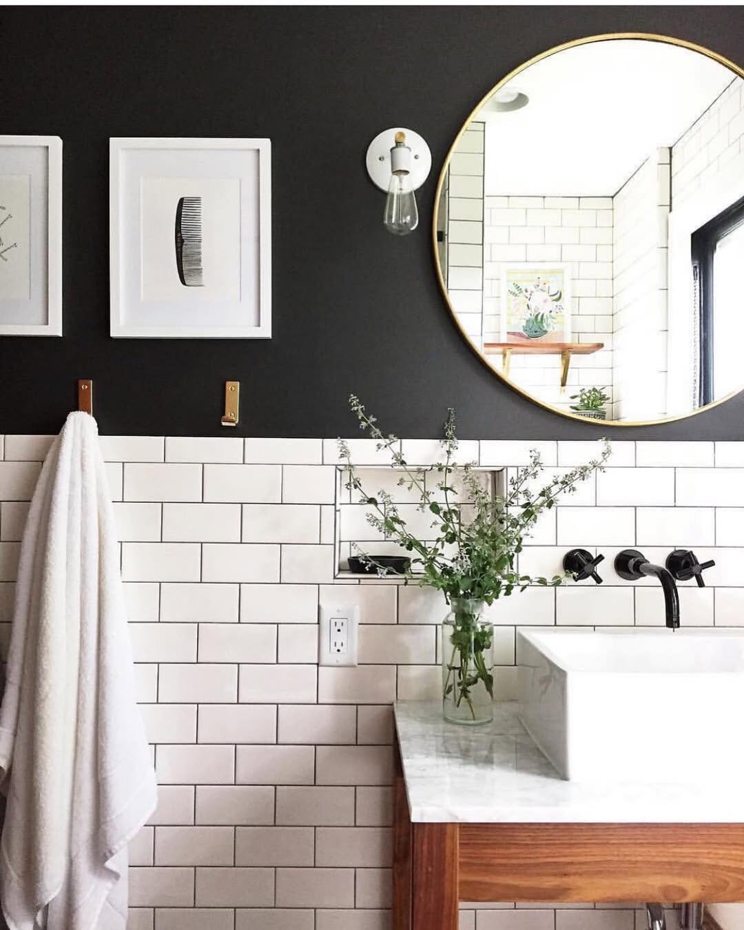
This is contrast done right. The deep black upper wall against those classic white tiles instantly adds depth and a bit of edge.
It feels modern, slightly graphic, and very intentional. Like a space that knows exactly what it’s doing—and doesn’t need to over-explain it.
10. Warm Mocha Minimal
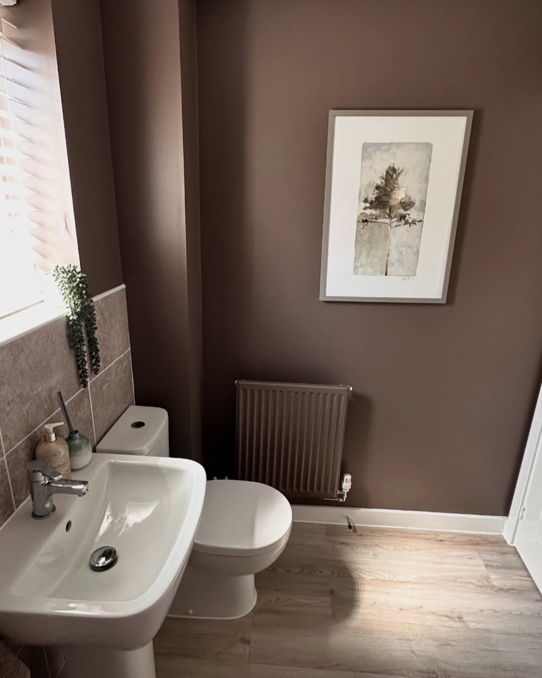
This rich brown tone brings a completely different mood—cozy, grounded, and a little unexpected for a bathroom. It softens the space while still feeling strong.
It’s simple styling, but the color carries everything. And honestly, it feels kind of comforting… like a warm cup of coffee, but in room form.
11. Classic Blue Tile Moment
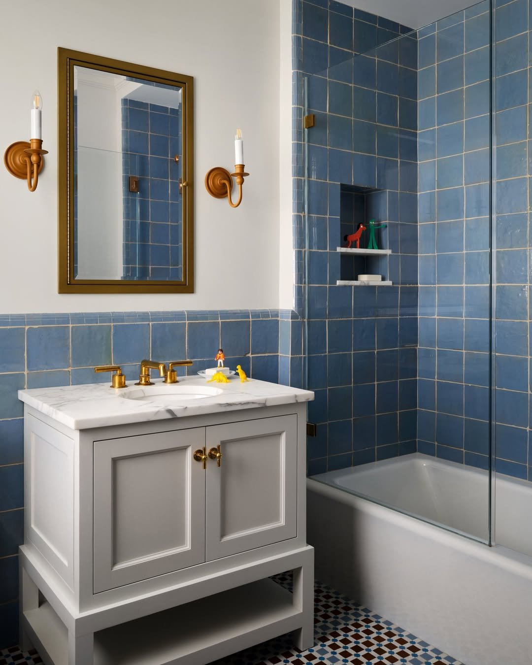
This one feels like a timeless classic with a little twist. The dusty blue tiles wrap the space so beautifully, and paired with those warm brass fixtures—it’s giving heritage, but polished.
And I love how it balances playfulness with structure. The color is bold, but the overall vibe stays refined. It’s like tradition, just with better styling.
12. Moody Olive Vintage
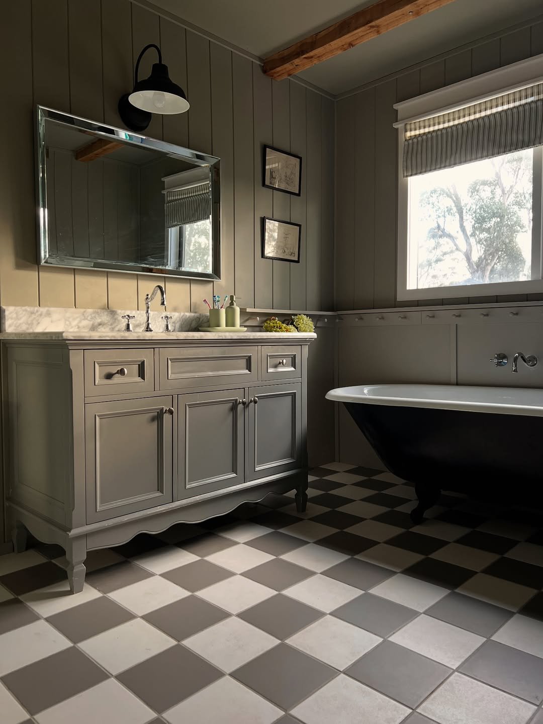
There’s something a little cinematic about this one. That deep olive paneling with the checkerboard floor and clawfoot tub—it feels like a quiet countryside escape.
It’s cozy, a bit dramatic, and full of character. The kind of space that feels even better with low lighting and a long soak.
13. Dark Panel Contrast
This is contrast done in a really grounded way. The crisp white upper walls against that deep charcoal paneling create such a strong visual line without feeling harsh.
It’s clean but still full of personality. Like a modern update that still respects the home’s original bones.
14. Soft Sage Spa
That muted green tone is doing exactly what it should—calming everything down. Paired with soft textures and warm wood accents, it instantly feels like a mini spa.
It’s relaxed, easy, and super livable. The kind of color that makes even everyday routines feel a bit more intentional.
15. Dusty Blue Minimal
This shade of blue hits that sweet spot—not too bright, not too dark. It adds just enough color to keep things interesting without overwhelming the space.
And with those simple shelves and clean lines, it feels effortlessly styled. Nothing extra, just well thought out.
16. Deep Teal Drama
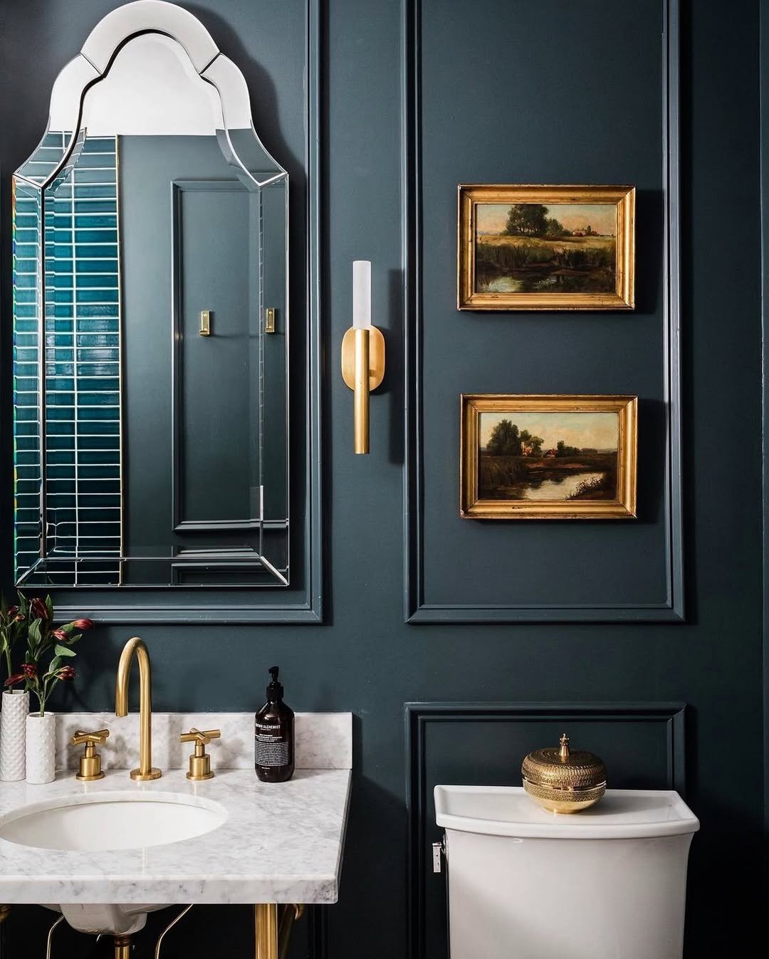
This one leans all the way into drama—and it works. That rich teal paired with brass details and classic molding feels bold but incredibly put together.
It’s moody, elegant, and just a little bit luxe. Like a space that knows it looks good and doesn’t need to prove it.
17. Forest Green Fresh
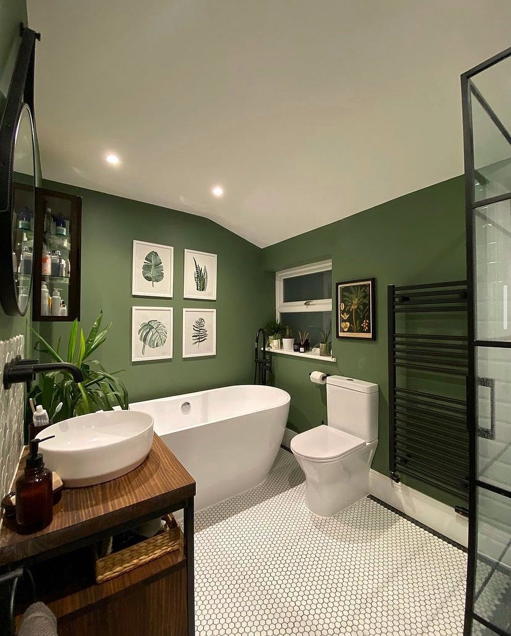
There’s something really grounding about this shade. The deep green walls paired with crisp white fixtures make everything pop without feeling too sharp.
It’s fresh, a little earthy, and full of life. Like bringing the outdoors in—but in a more polished, design-forward way.
18. Warm Neutral Glow
This soft neutral palette is all about warmth. Creamy tones, light wood, and that natural light bouncing around—it just feels calm and easy.
It’s subtle, but not forgettable. More like a quiet kind of beautiful that you appreciate more the longer you look.
19. Light Sage Refresh
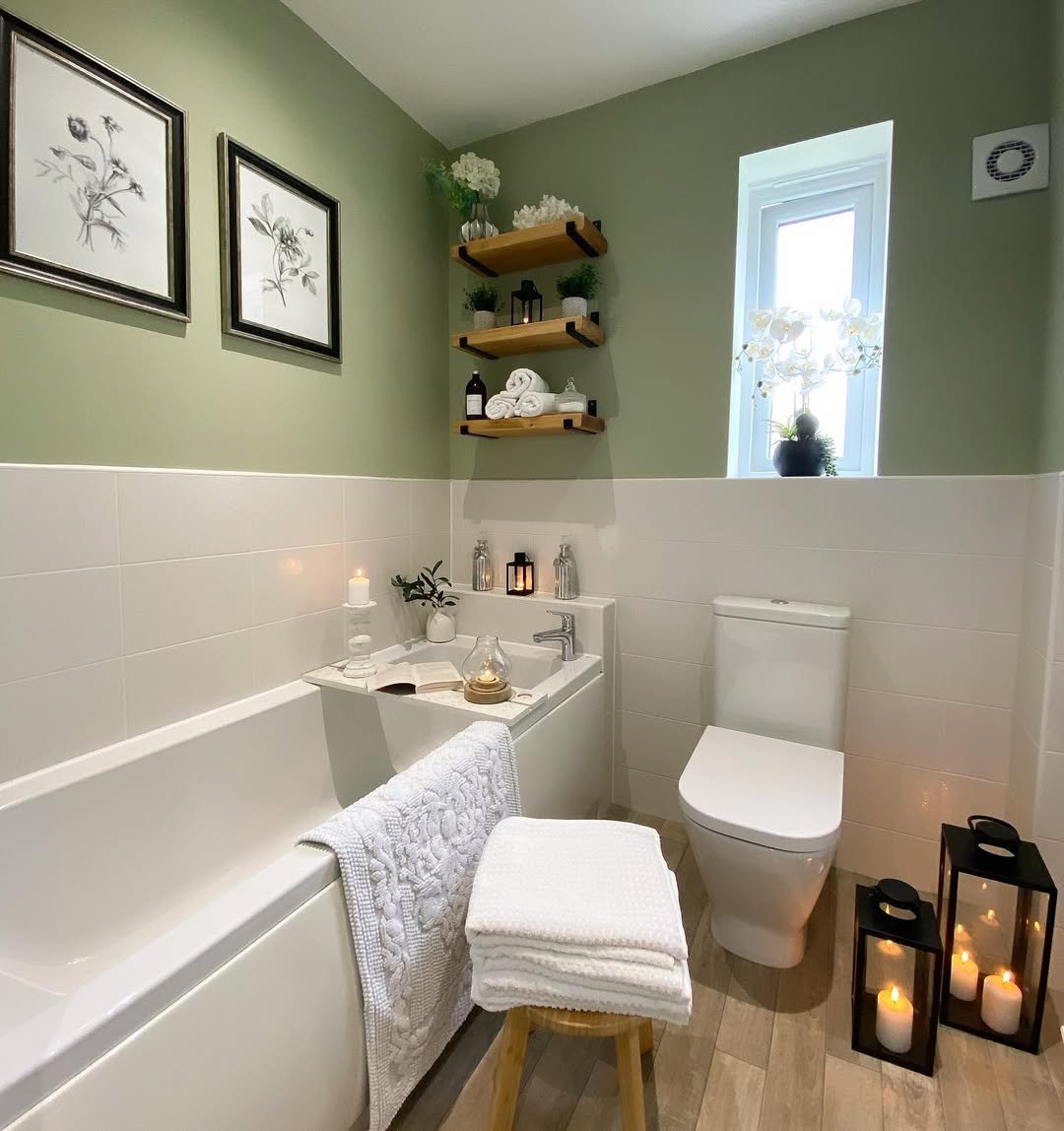
This gentle green shade is such a safe win. It brightens the space while still keeping things soft and relaxed.
And paired with white tiles and cozy details, it feels fresh without trying too hard. The kind of update that instantly makes a bathroom feel newer.
20. Soft Mint Modern
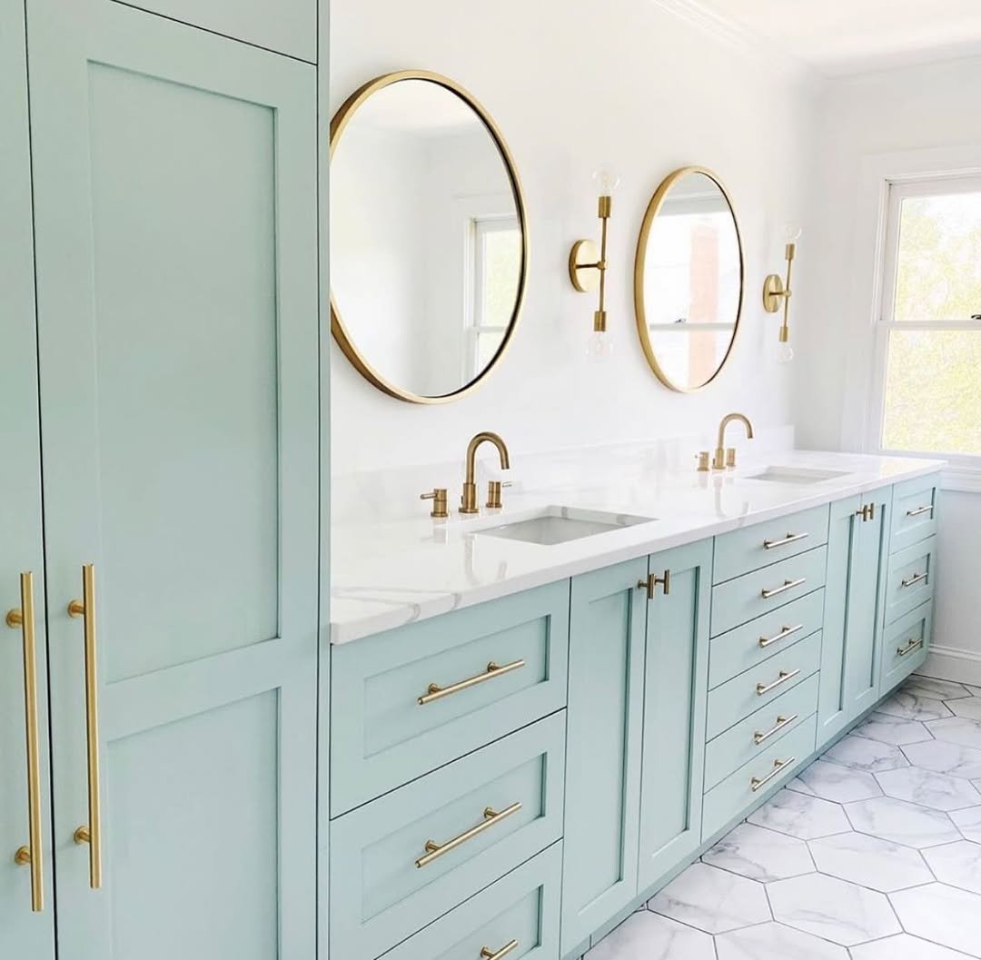
This pastel mint tone brings in a clean, almost airy vibe. It’s light, slightly playful, and pairs so well with those sleek gold accents.
It feels modern, fresh, and just a little bit elevated. Like a space that’s simple—but styled with intention down to the last detail.
21. Fresh Green Corner
This little setup feels like a breath of fresh air. The soft green walls paired with crisp white tiles and that simple ladder shelf—it’s clean, calming, and just really easy on the eyes.
And I love how the plants do most of the talking here. It’s styled, but not overdone. Just a quiet, refreshing space that feels naturally put together.
22. Bright Mint Pop
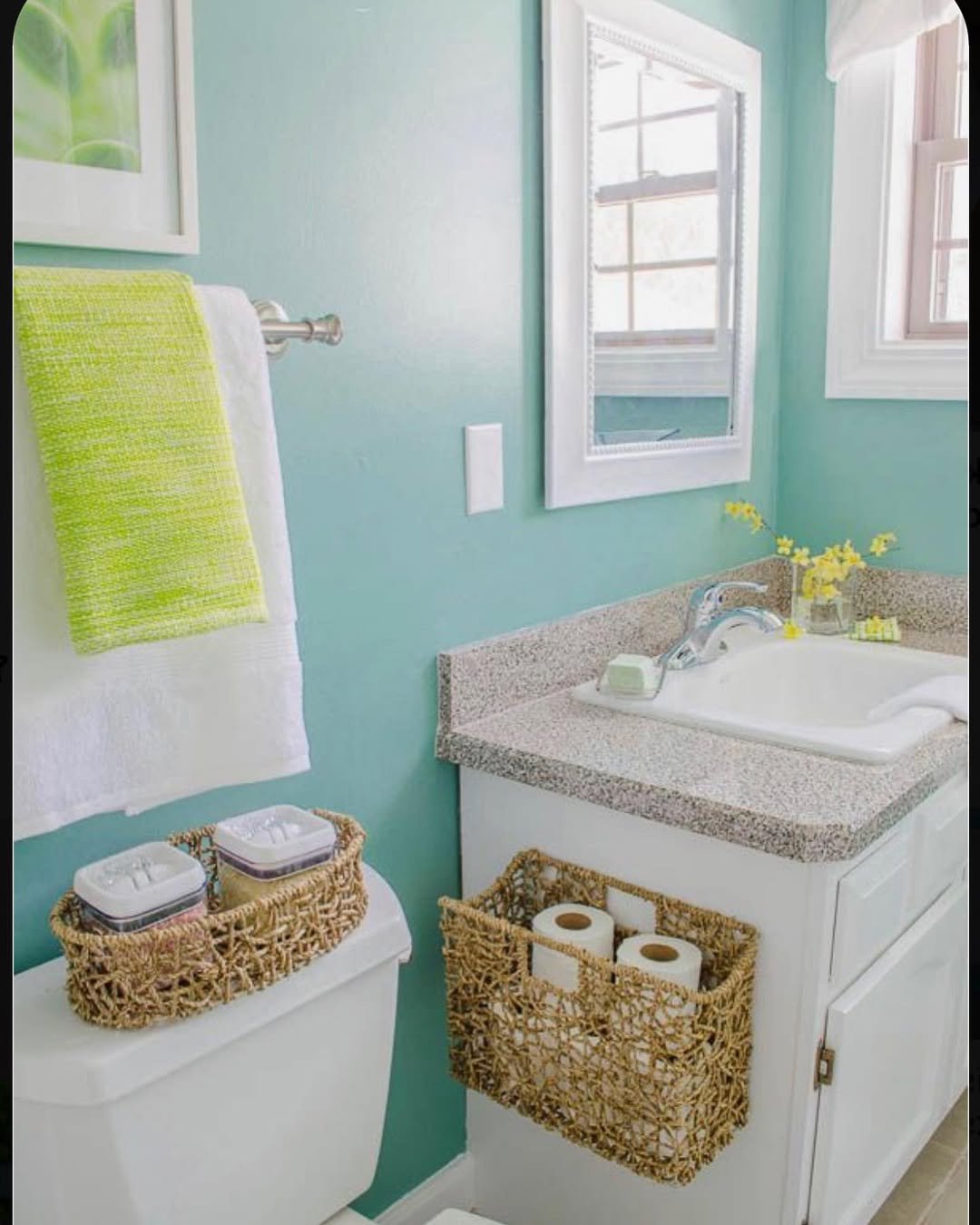
This one leans playful in the best way. That minty wall color instantly lifts the whole room, especially with those woven baskets adding texture and warmth.
It’s cheerful without being loud. Like a space that wakes you up gently instead of shouting for attention.
23. Blush & Marble Elegance
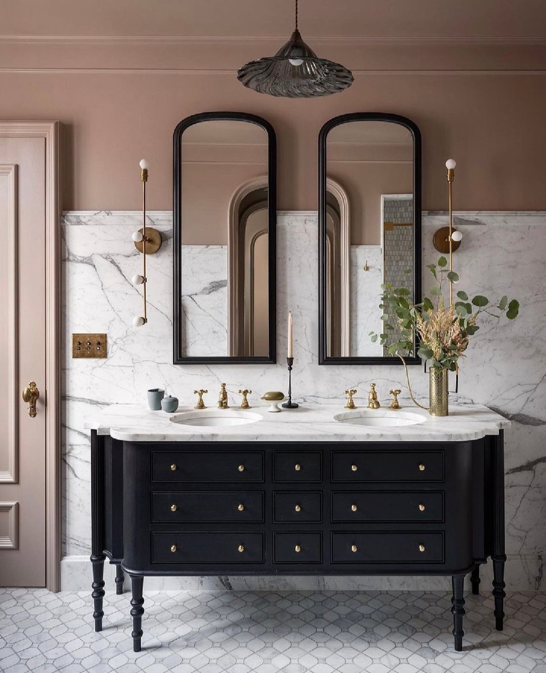
This is soft luxury done right. The blush-toned walls against that dramatic marble backdrop feel polished but still inviting.
And those black-framed mirrors? They ground the whole look perfectly. It’s refined, but not stiff—more like effortless elegance.
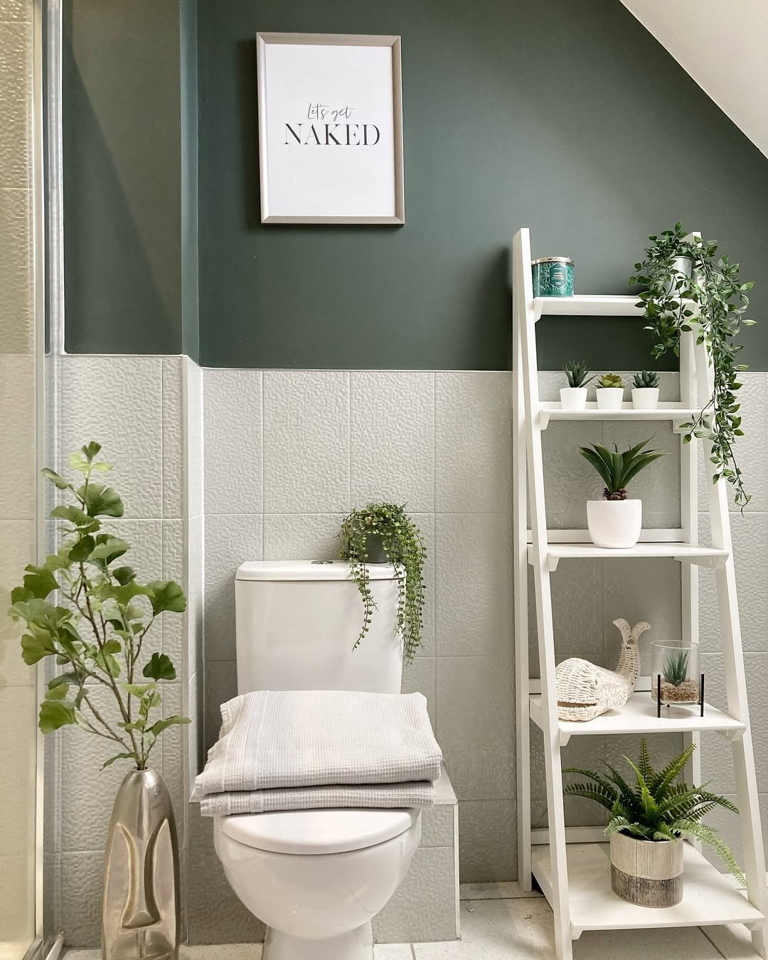
24. Deep Green Utility Chic
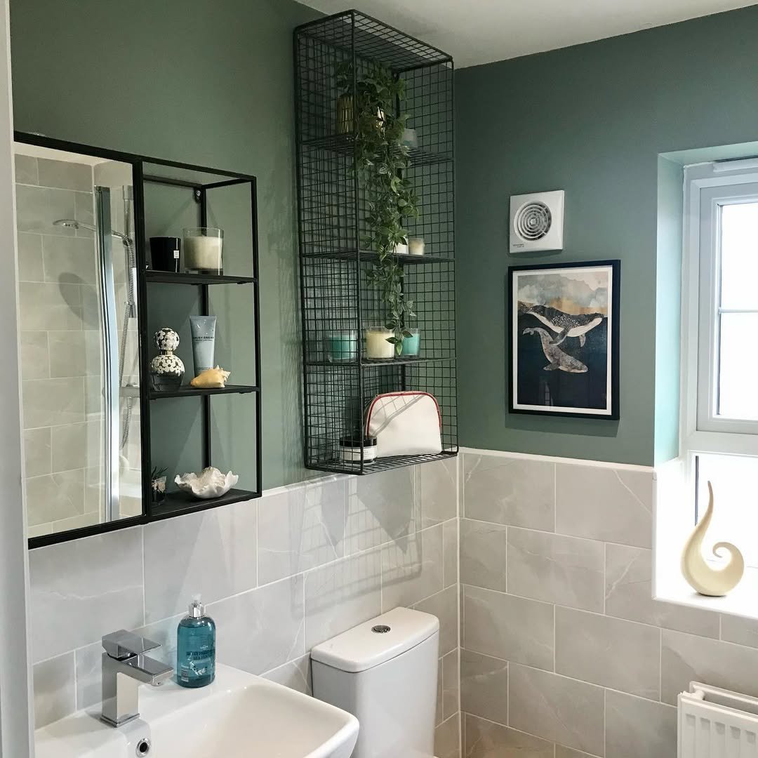
There’s something really cool about this one. The rich green walls paired with industrial-style shelving give it a slightly edgy, modern feel.
But it still stays practical and livable. It’s one of those designs that looks styled but works hard behind the scenes too.
25. Bold Red Statement
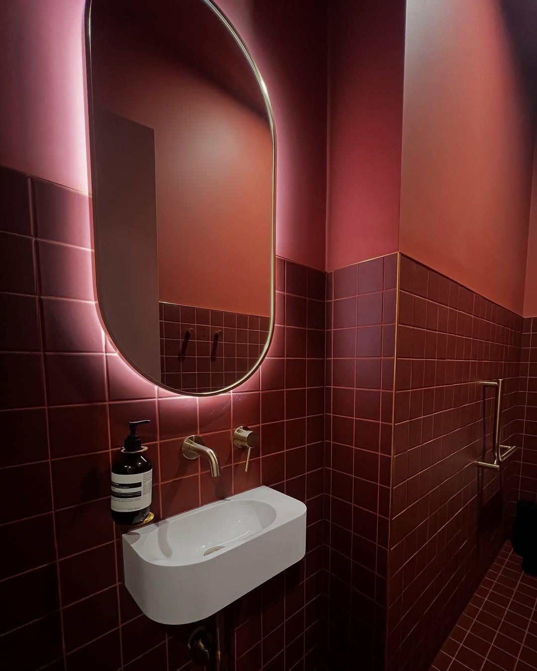
This one doesn’t hold back—and honestly, it shouldn’t. The deep red tiles and soft backlit mirror create a moody, almost boutique-hotel vibe.
It’s dramatic, confident, and a little unexpected. The kind of space you remember instantly.
26. Dark & Defined
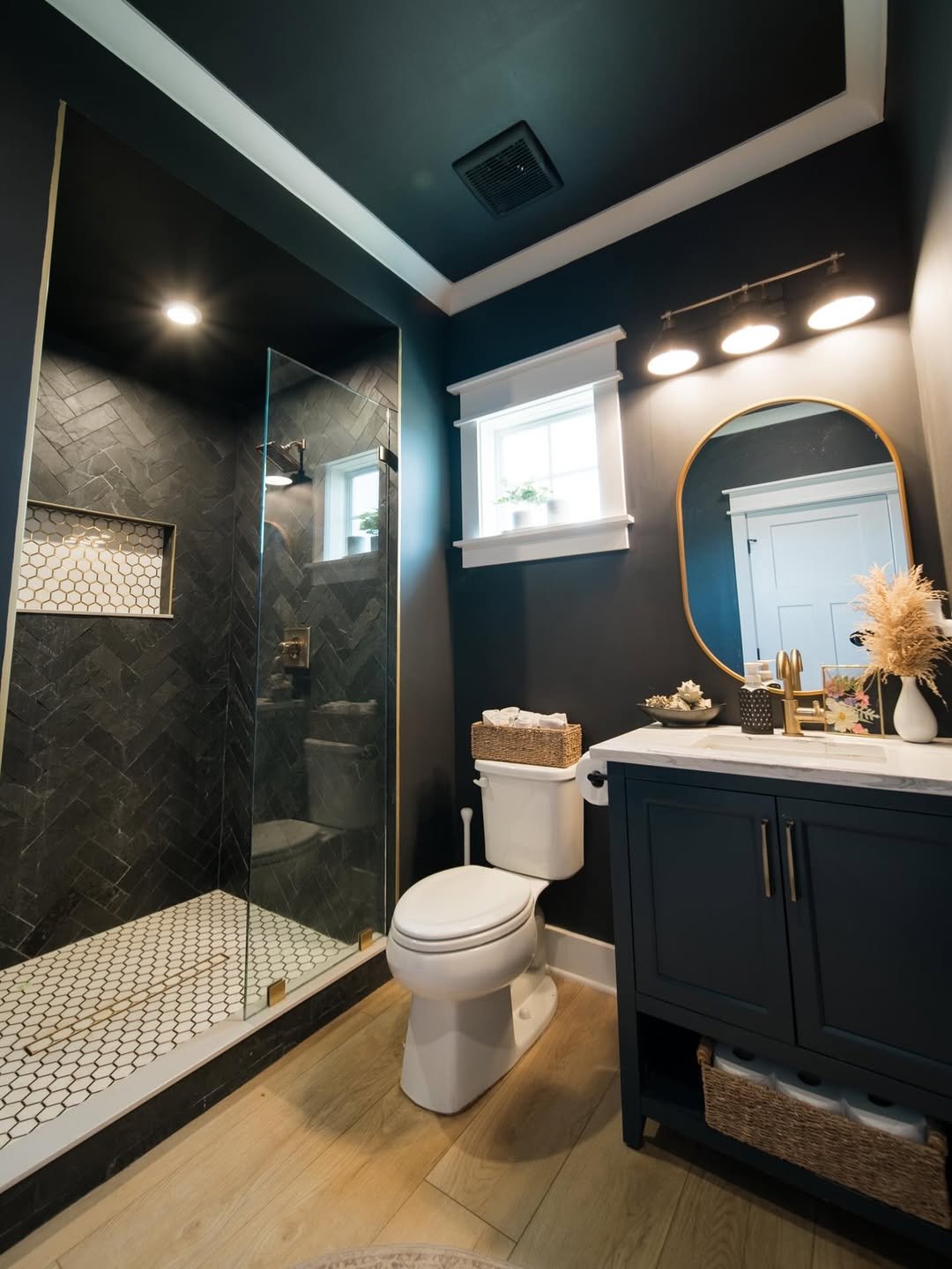
This is where moody meets modern. The dark walls, sleek vanity, and warm lighting come together in a way that feels both cozy and elevated.
And I love how the lighting softens everything. It’s bold, but still welcoming—not too heavy, just right.
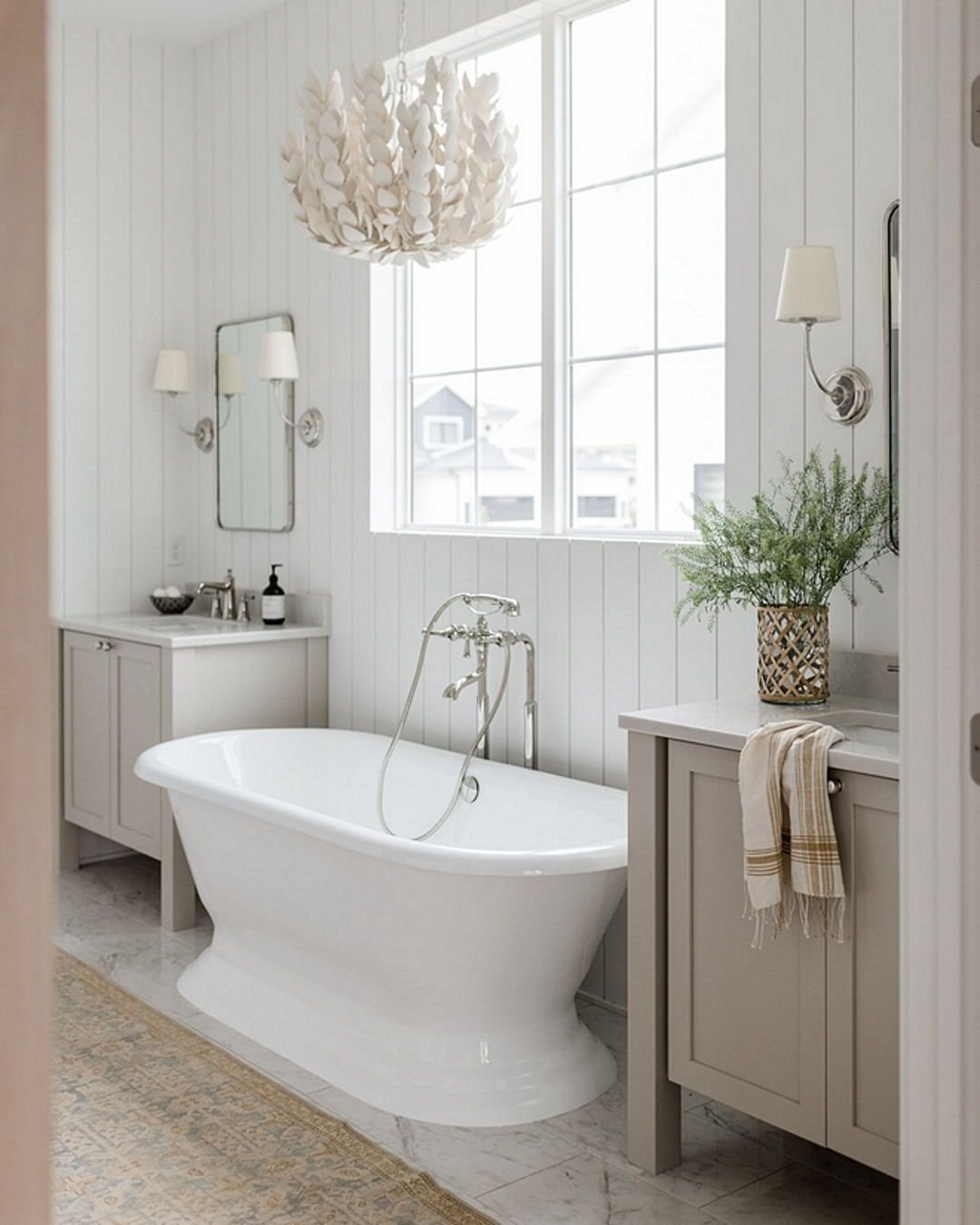
27. Classic Cottage Calm
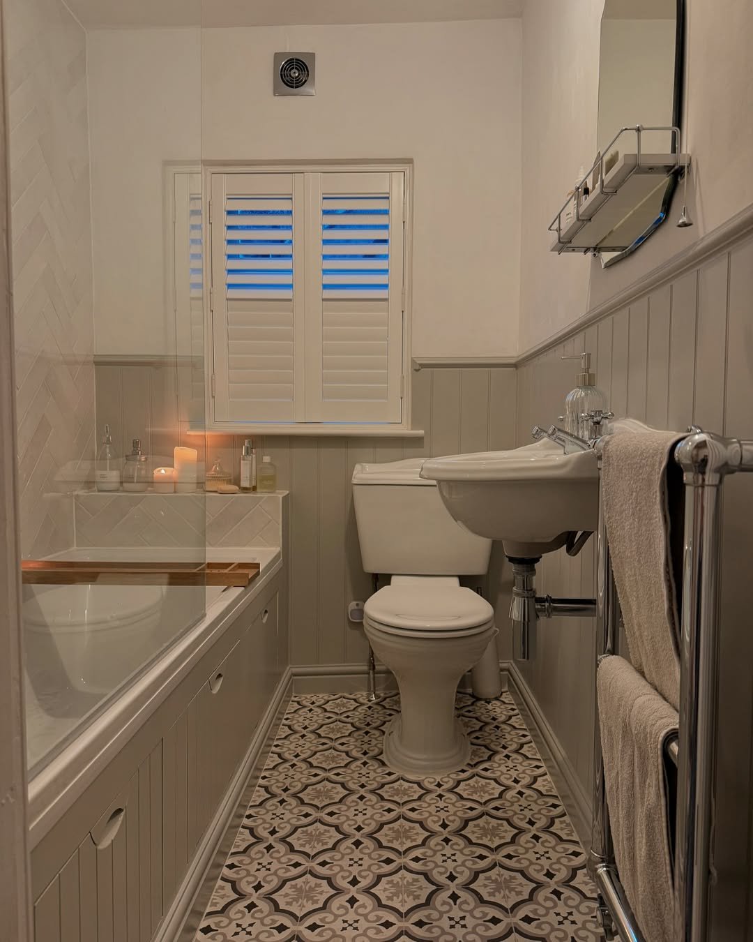
This one brings that soft, traditional charm. Neutral tones, paneling, and patterned flooring all come together in a way that feels timeless.
It’s warm, familiar, and super comforting. Like a space that’s been loved for years—and will be for many more.
28. Soft Taupe Sophistication
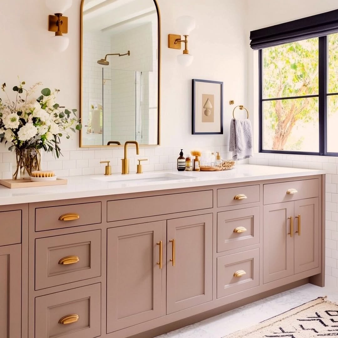
This shade of taupe is doing all the heavy lifting here. It’s subtle but rich, especially paired with those gold accents and clean white surfaces.
And the overall look? Polished, calm, and quietly luxurious. Nothing flashy—just really, really well done.
