

Looking to make your bathroom floors or walls stand out in a bold way? These 26 bathroom tile pattern ideas are graphic, high contrast, and visually dynamic perfect for defining striking interiors while adding movement, depth, and unforgettable style to your space.
26 Bathroom Tile Pattern Ideas That Create Bold, High Contrast Statements in 2026
Bathroom tile patterns are taking a dramatic turn in 2026, embracing high contrast layouts that instantly energize any space. From graphic geometrics to unexpected pairings, these designs go beyond basic tiling to create movement, depth, and undeniable visual impact.
In this list, you’ll discover striking pattern ideas that balance boldness with sophistication, helping you transform walls and floors into standout features. Scroll on for inspiration that pushes boundaries while keeping your bathroom polished, modern, and full of personality.
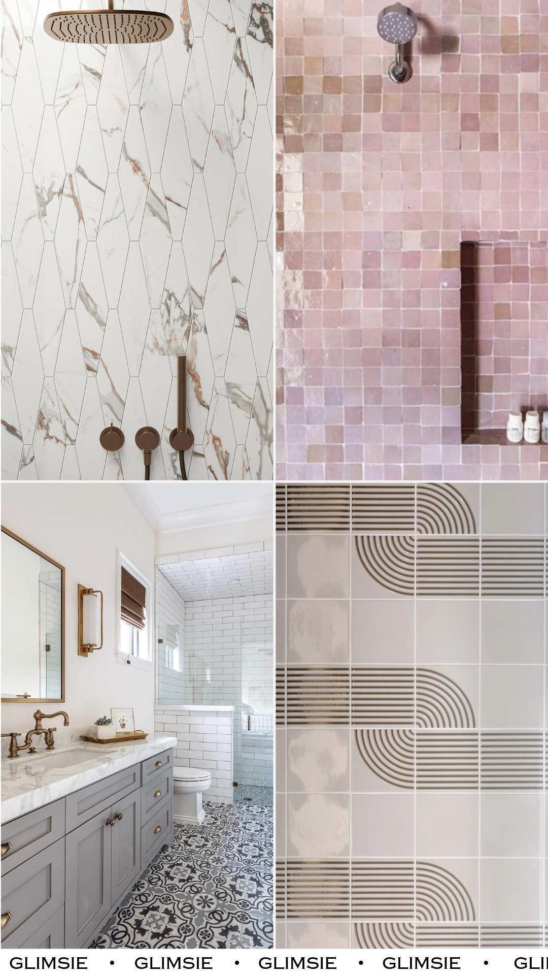
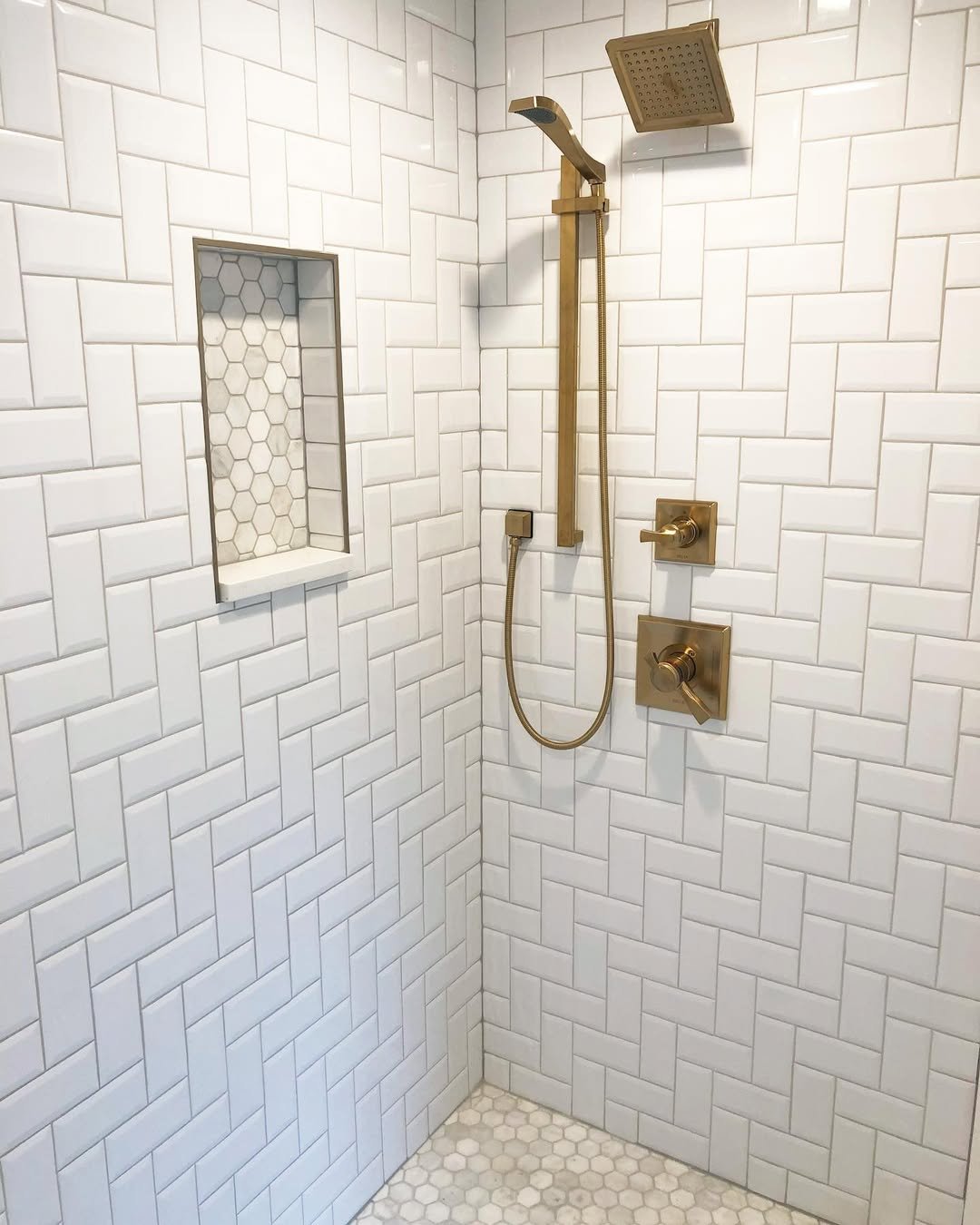
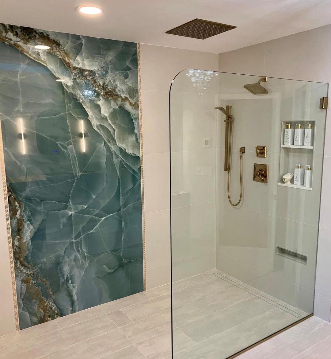
1. Sculpted Marble Geometry
This isn’t just tile—it’s basically wall art pretending to be practical. The elongated geometric shapes paired with soft marble veining create this flowing, almost rhythmic pattern that instantly elevates the whole shower.
And what really seals it is the warm bronze fixtures cutting through all that white. It feels luxe, but not loud. Like a quiet flex that says, “yeah, I know what I’m doing.”
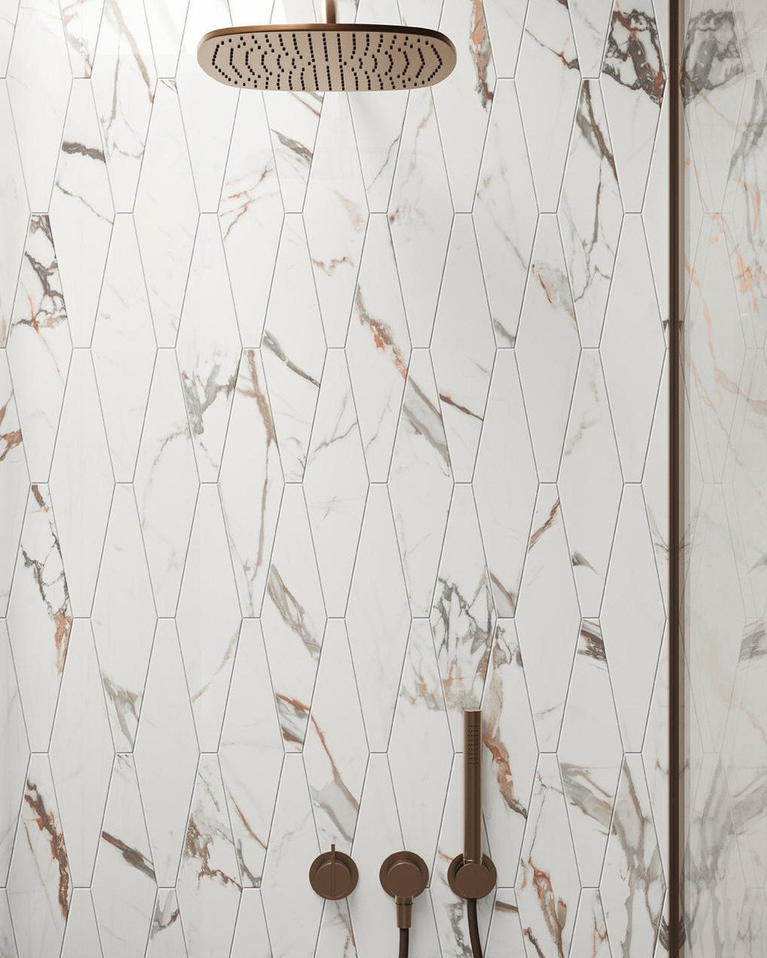
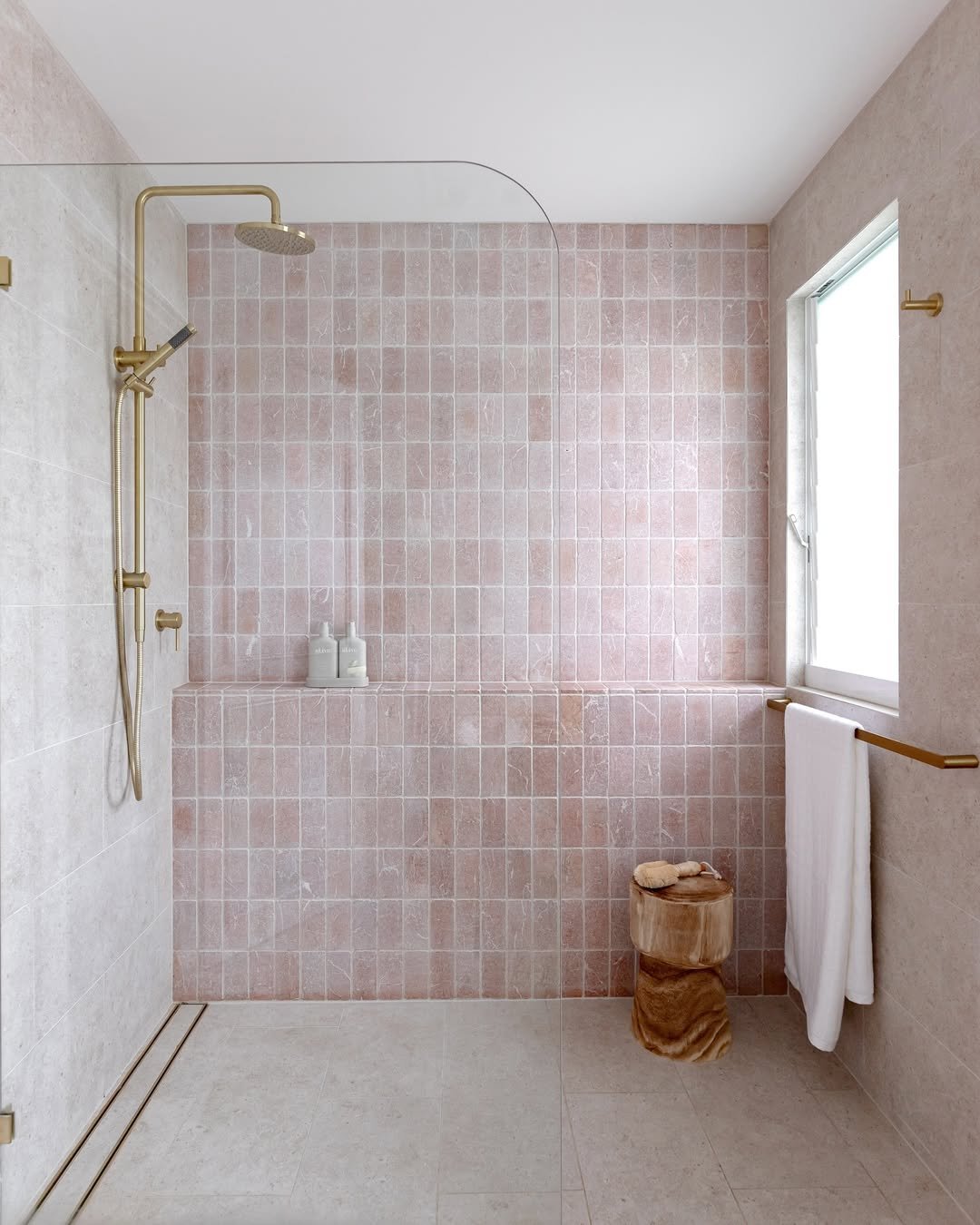
2. Soft Blush Grid Moment
There’s something about pink tile that just softens everything. The small square grid keeps it structured, but the tonal variation adds that handmade, slightly imperfect charm.
It’s playful without being childish. Think spa vibes, but with personality. And that built-in niche? Clean, simple, and actually useful.
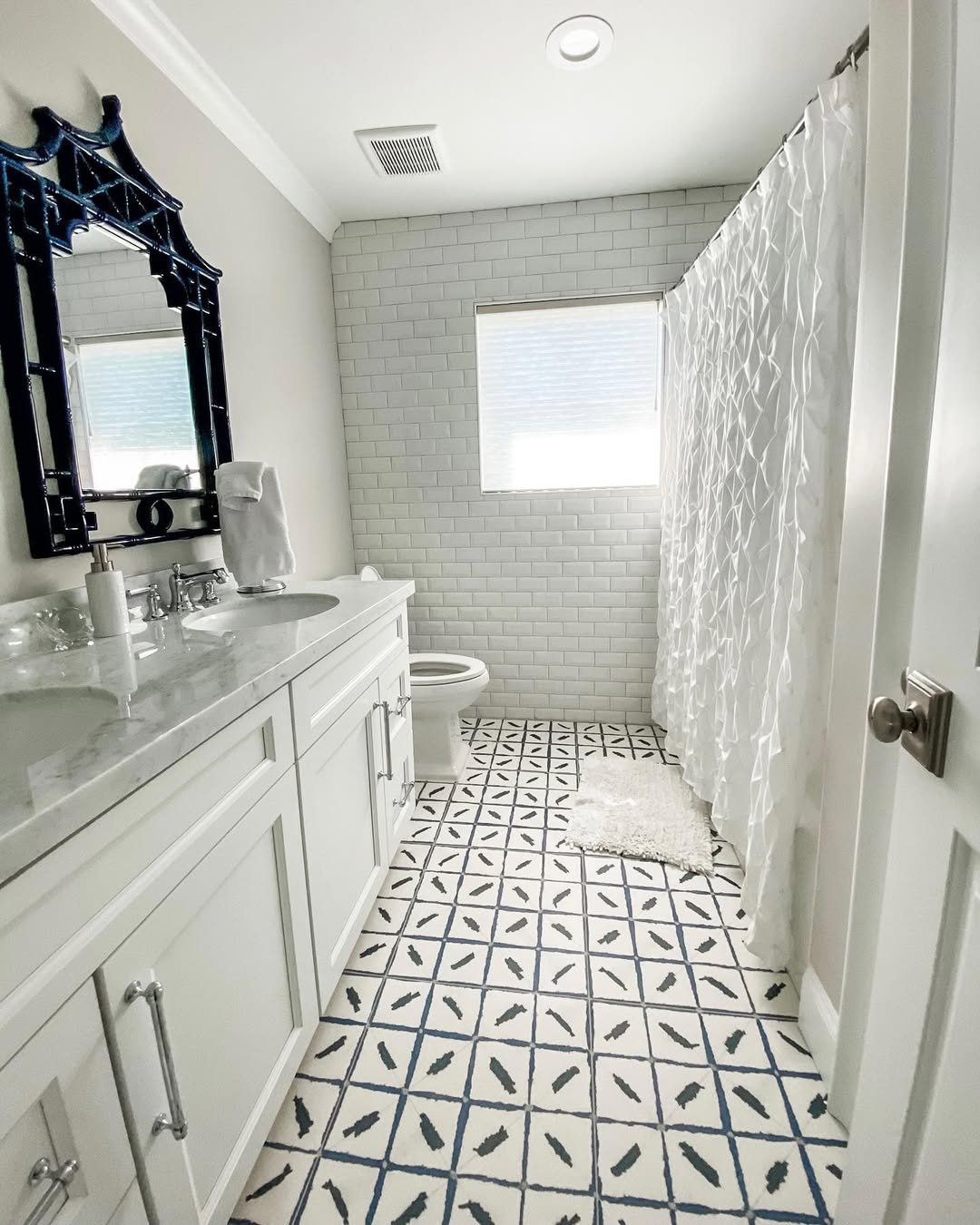
3. Patterned Floor Drama
Okay, this one is all about the floor stealing the show. That intricate black-and-white pattern pulls your eye in instantly and gives the whole bathroom a strong identity.
What’s smart here is how the rest of the space stays calm—simple subway tiles and neutral tones—so the floor gets its moment without competition.
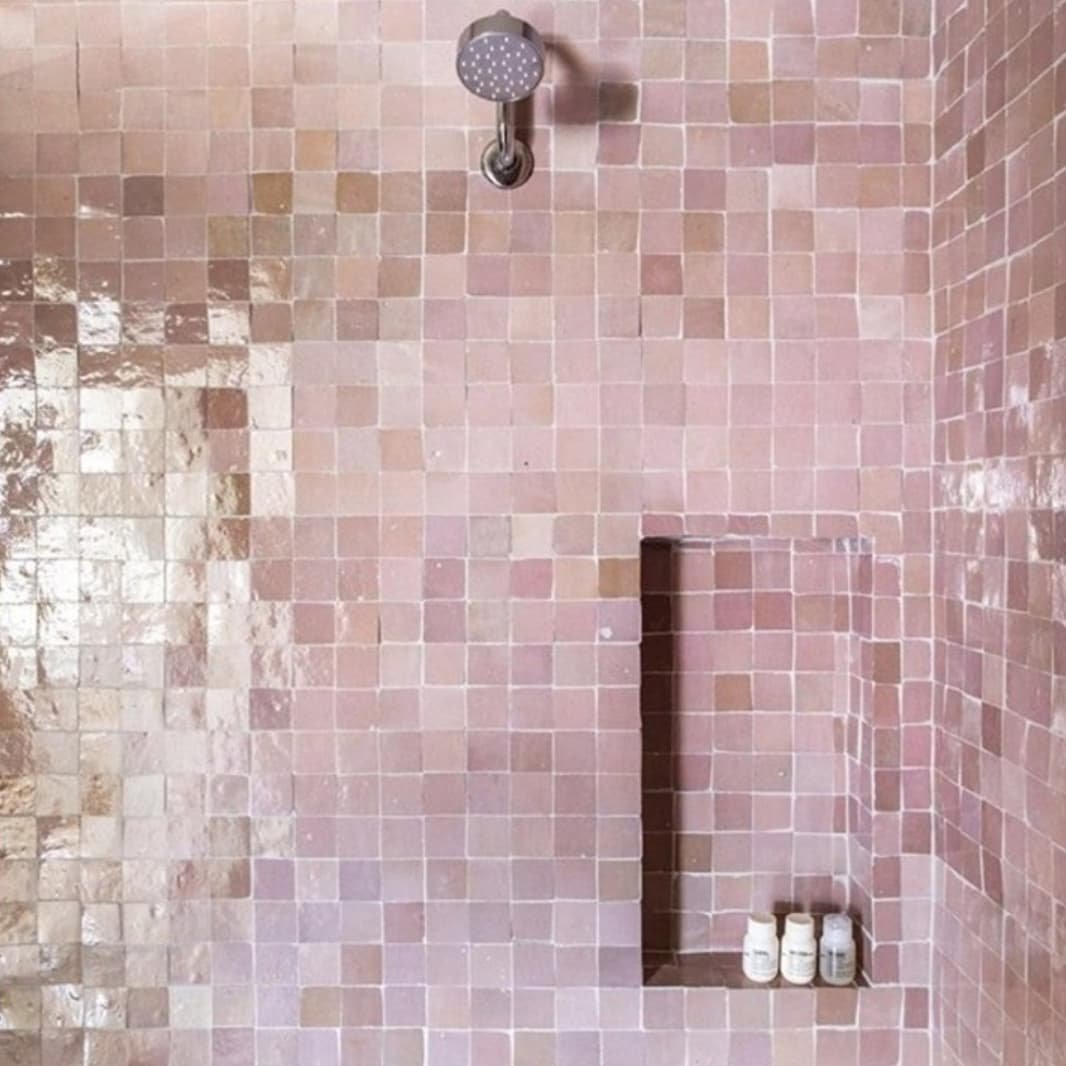
4. Subtle Meets Statement
At first glance, it feels classic. But then you notice the patterned floor quietly doing its thing—adding texture without overwhelming the space.
It’s that perfect middle ground. You get personality, but still keep the clean, timeless vibe. A safe choice… but make it interesting.
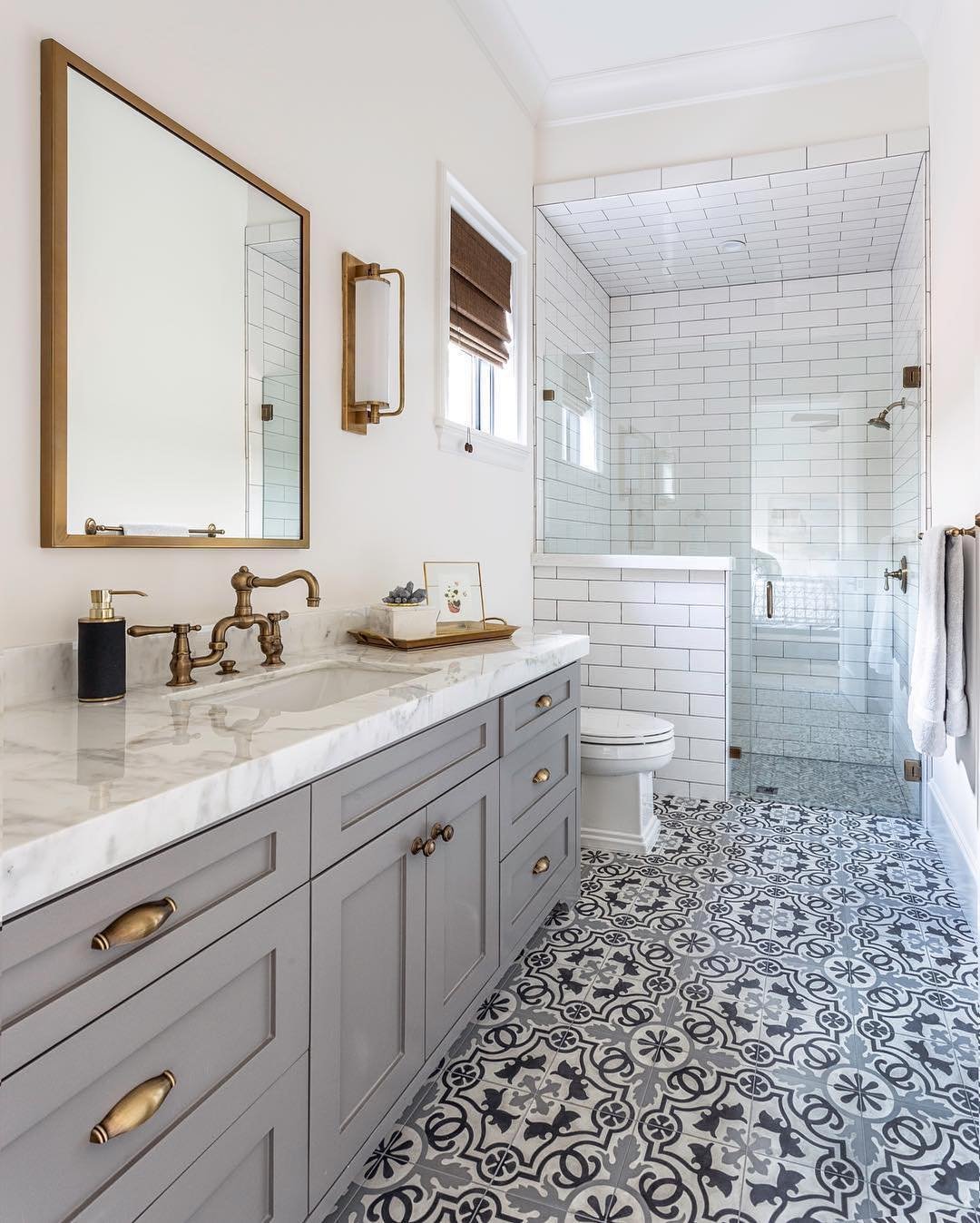
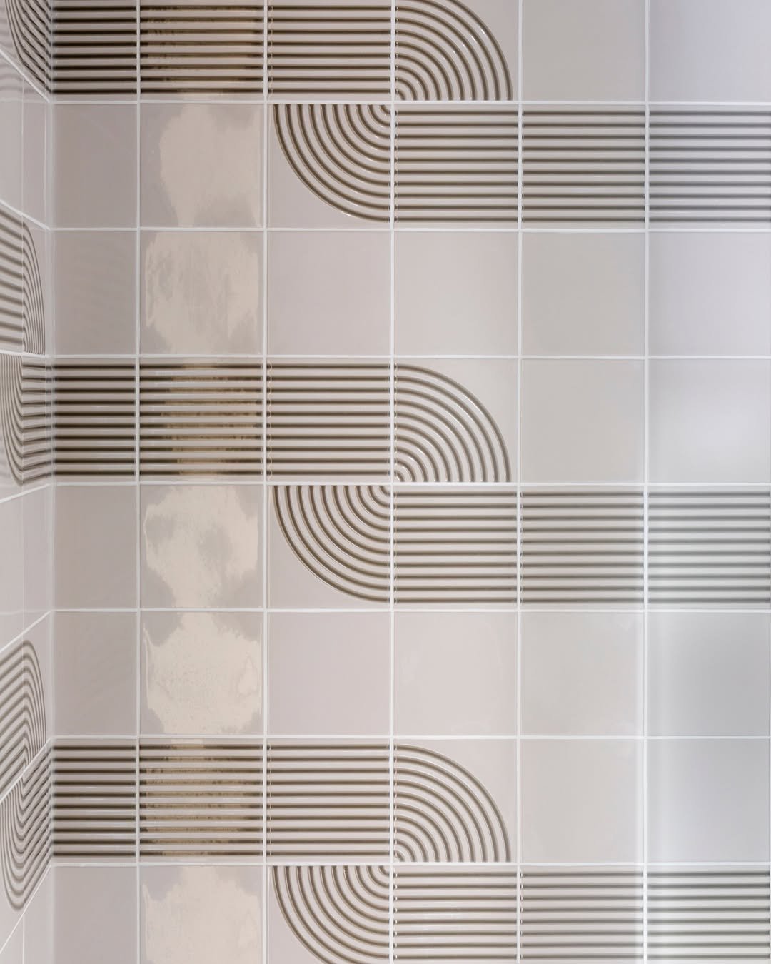
5. Graphic Tile Lines
This pattern is such a vibe. The curved line details layered over a grid create this retro-meets-modern look that feels fresh but still grounded.
It’s subtle from afar, but the closer you look, the more it pulls you in. Definitely one of those designs that rewards attention.
6. Clean Grid Simplicity
Sometimes the simplest patterns just hit the hardest. That classic grid layout with crisp white tiles and dark fixtures? Always works.
It’s minimal, but not boring. The contrast gives it just enough edge, and honestly—it’s the kind of look that won’t feel outdated anytime soon.
7. Checkerboard with a Twist
This floor pattern feels familiar, but the detailing gives it more depth than your standard checkerboard. It’s bold, but still elegant.
And paired with the clean white shower tiles, it creates that perfect push-pull between classic and statement. Very “I know my design references.”
8. Soft Patterned Tile Floor
This one leans a little more relaxed. The repeating pattern is there, but it’s softer, less contrast-heavy, which makes the whole space feel easygoing.
It’s the kind of tile you won’t get tired of. Subtle enough to live with daily, but still adds that extra layer of visual interest.
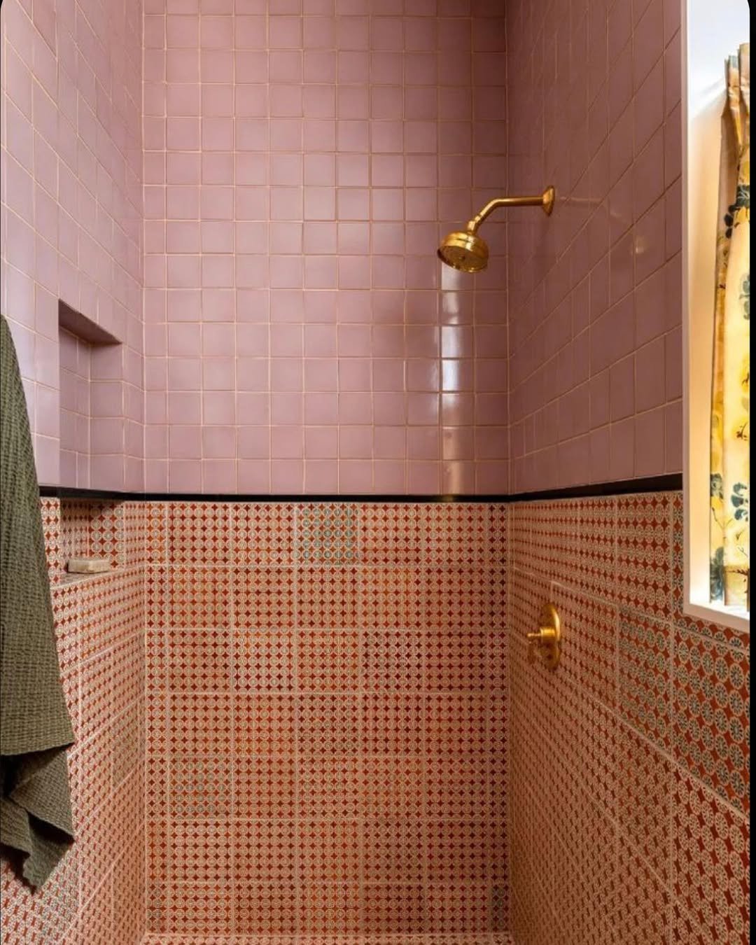
9. Glossy Pink Meets Vintage Pattern
This combo is bold—and honestly, it works. Glossy pink walls paired with a detailed patterned base create a super unique, slightly retro look.
It feels curated, not random. Like every choice was intentional, but still fun. Definitely not for minimalists—but perfect if you want personality.
10. High-Contrast Modern Classic
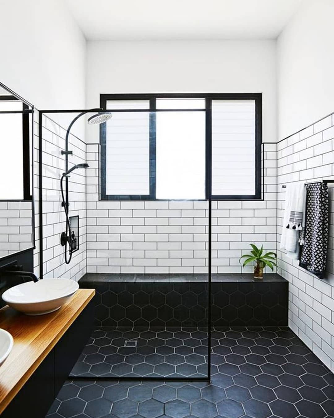
Black hex tiles on the floor, white subway on the walls—it’s a combo that just doesn’t miss. Clean, graphic, and super balanced.
And the glass divider keeps everything feeling open, so the contrast doesn’t feel heavy. It’s modern, timeless, and honestly a little addictive to look at.
11. Soft Checkerboard Charm
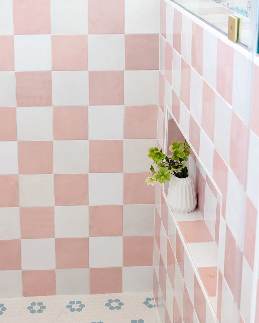
This is checkerboard, but make it soft and sweet. The blush pink paired with crisp white tones feels fresh, playful, and just a little nostalgic—in the best way possible.
It’s giving vintage energy without going full retro diner. And that tiny ledge detail? Such a small move, but it makes the whole setup feel styled, not staged.
12. Seamless Marble Calm

This is where tile disappears… in a good way. Large-format marble tiles create that uninterrupted, flowy look that makes the whole space feel bigger and calmer.
It’s minimal, but not cold. The soft veining adds just enough movement so your eyes don’t get bored—kind of like quiet luxury doing its thing.
13. Vertical Stripe Illusion
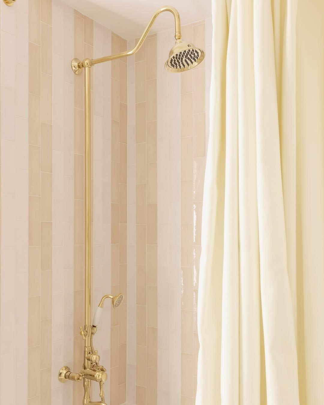
Vertical tile layouts don’t get enough credit. These soft beige stripes subtly draw the eye upward, making the space feel taller without trying too hard.
And paired with those warm brass fixtures? It’s clean, tailored, and just a little bit fancy. Like a well-fitted blazer for your bathroom.
14. Ombre Hexagon Fade
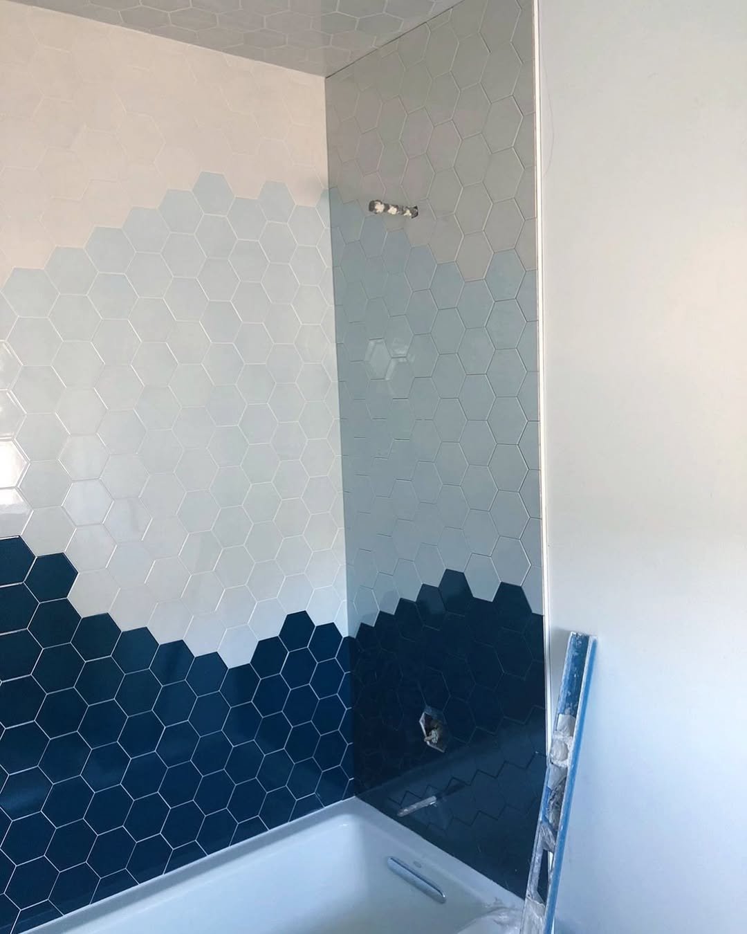
This gradient moment is seriously cool. The hex tiles shift from light to dark in a way that feels organic—almost like watercolor, but structured.
It’s bold without being chaotic. And honestly, it turns a basic shower wall into something you actually want to stare at.
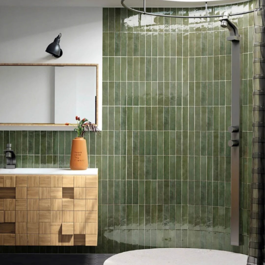
15. Glossy Green Texture Play
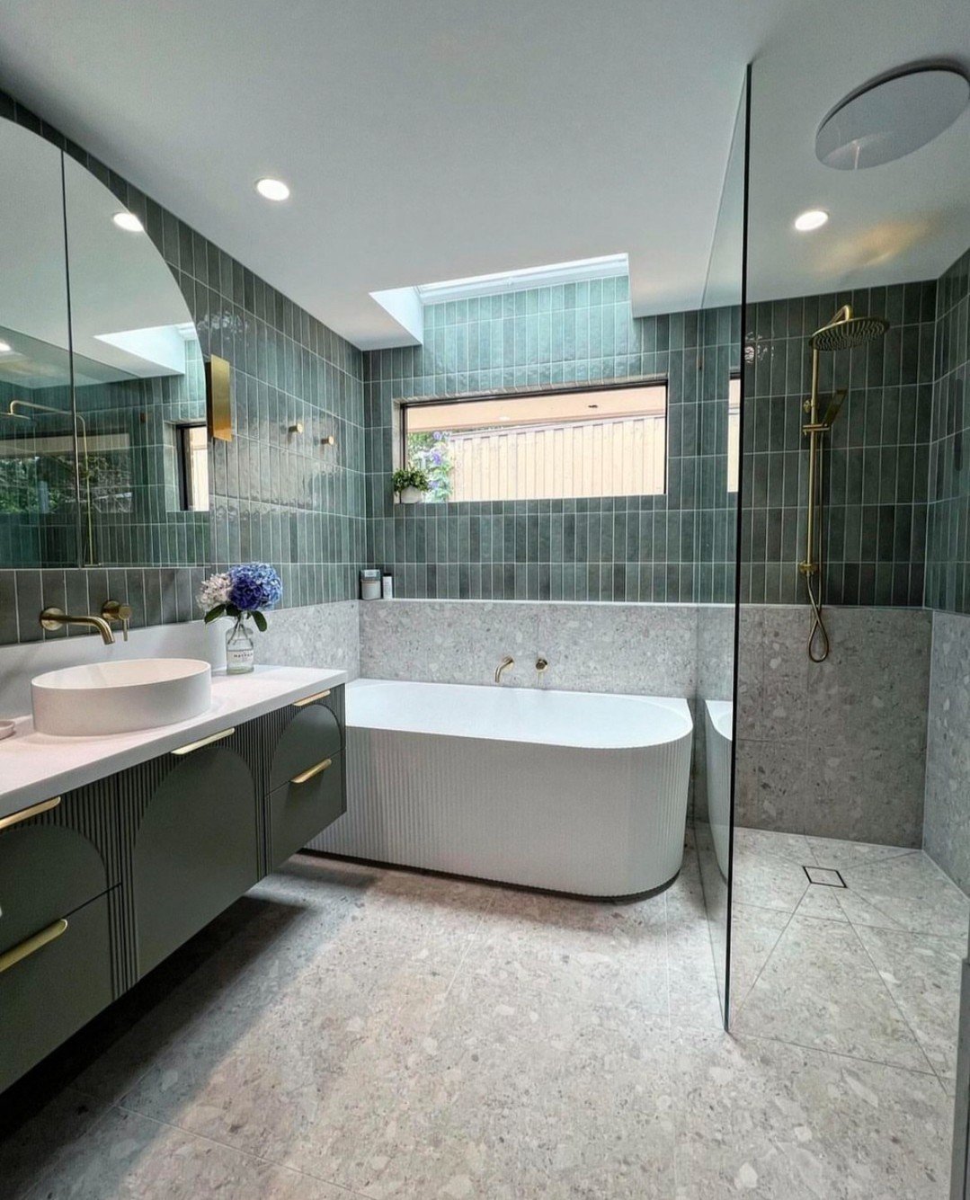
These vertically stacked green tiles bring all the spa energy. The slight variation in tone and the glossy finish make the walls feel alive, not flat.
It’s calm, but not boring. The kind of space that makes you want to take longer showers than necessary (no judgment).
16. Muted Pink Grid Balance
This one is all about restraint. The soft pink tiles in a clean grid layout keep things structured while still bringing warmth into the space.
It’s subtle, but it works hard. Paired with those brass details and minimal styling, it feels intentional—never overdone.
17. Tropical Meets Tile
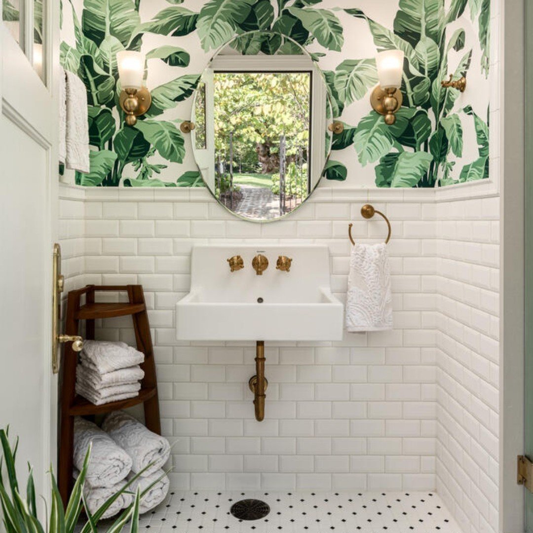
Now this is how you mix patterns. Classic white subway tile on the bottom, bold leafy wallpaper on top—it’s unexpected, but somehow perfectly balanced.
The tile grounds the space, while the wallpaper brings the personality. It’s giving boutique hotel vibes in the best way.
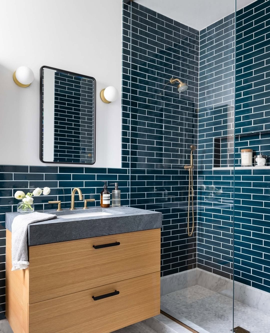
18. Bold Blue Wraparound
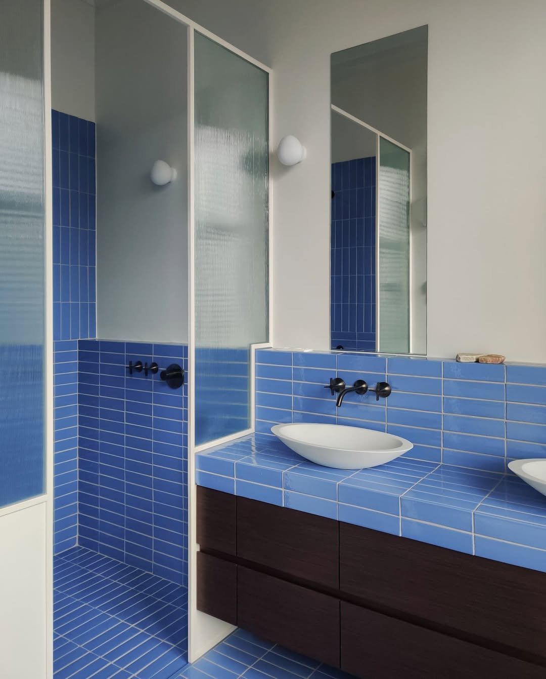
This deep blue tile wraps the vanity and shower in one continuous move, and honestly—it’s kind of addictive to look at.
The horizontal lines stretch the space visually, while the color adds drama. Clean, modern, and just a little bit daring.
19. Basketweave Classic
A classic pattern, but it still hits. The basketweave layout adds texture without needing bold color or contrast—it’s all in the detail.
It’s timeless, but not boring. Especially with those warm brass fixtures layered in—it feels elevated, not basic.
20. Retro Floral Statement
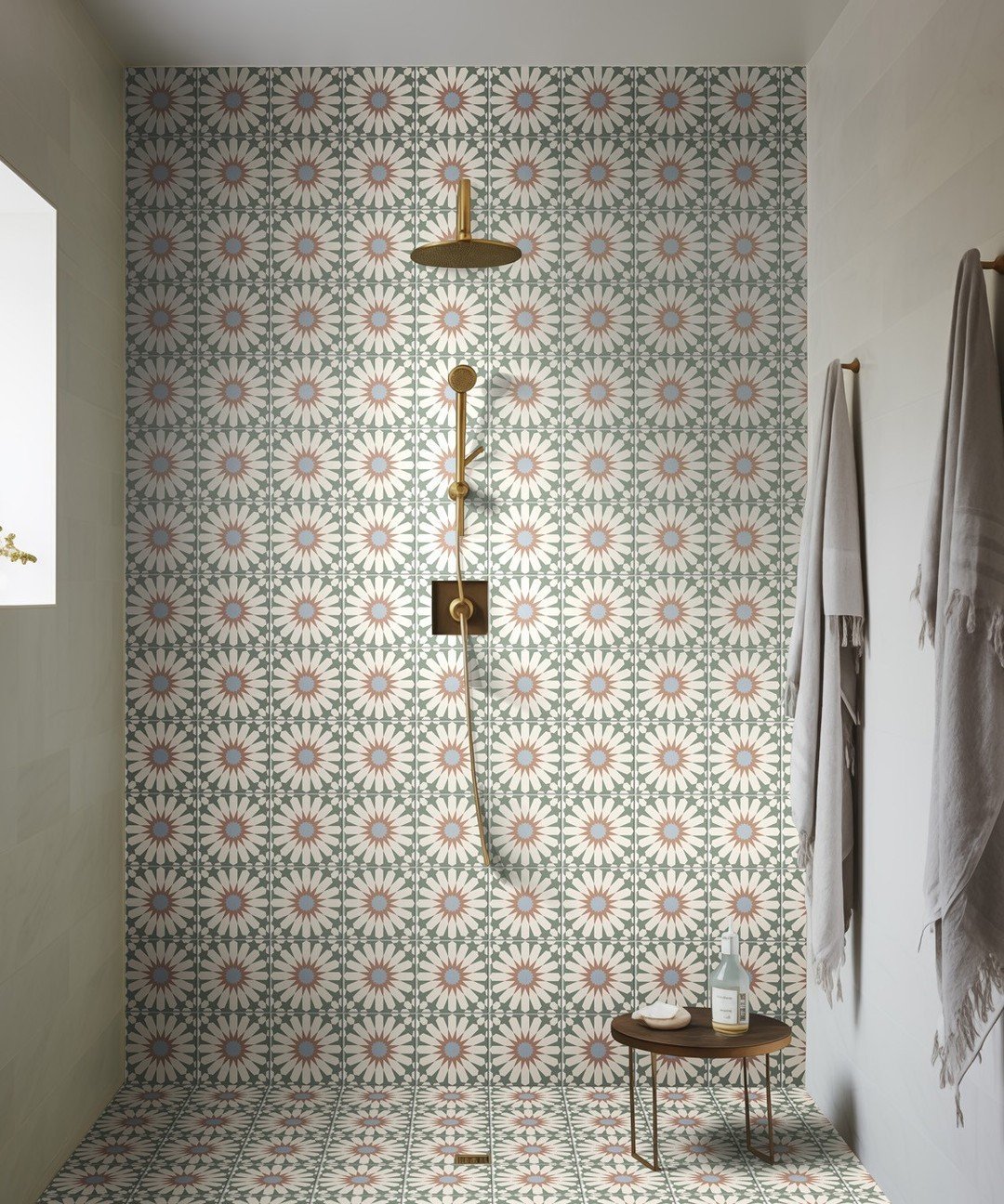
This is for when you want your tile to be the moment. The repeating floral pattern is bold, playful, and unapologetically eye-catching.
And somehow, it still feels balanced. The clean walls on the sides let the pattern breathe, so it doesn’t overwhelm—just shines.
21. Classic Subway + Basketweave Combo
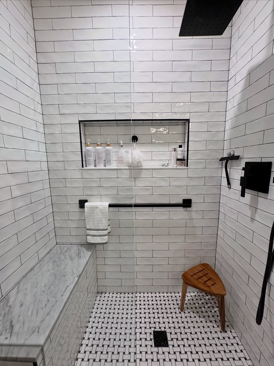
This is one of those combos that just never misses. Clean white subway tiles on the walls paired with a basketweave floor—it’s structured, timeless, and quietly detailed.
What makes it hit harder is the contrast. The walls keep things simple, while the floor does the talking. It’s like a classic outfit with one standout piece—you notice it, but it doesn’t try too hard.
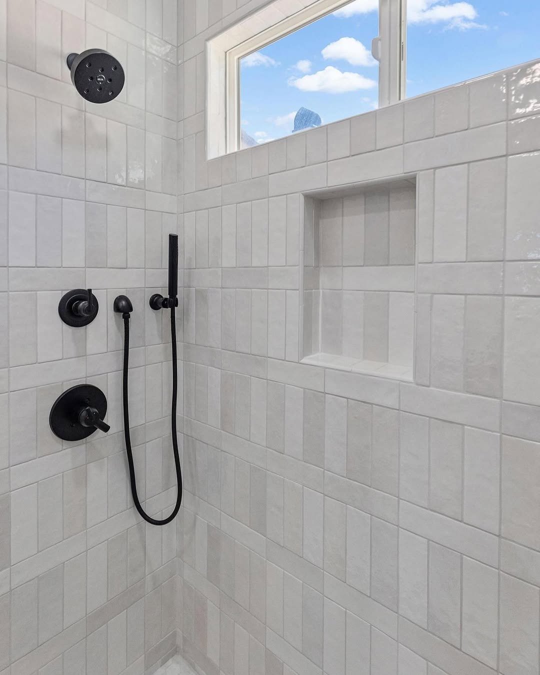
22. Handmade Texture Grid
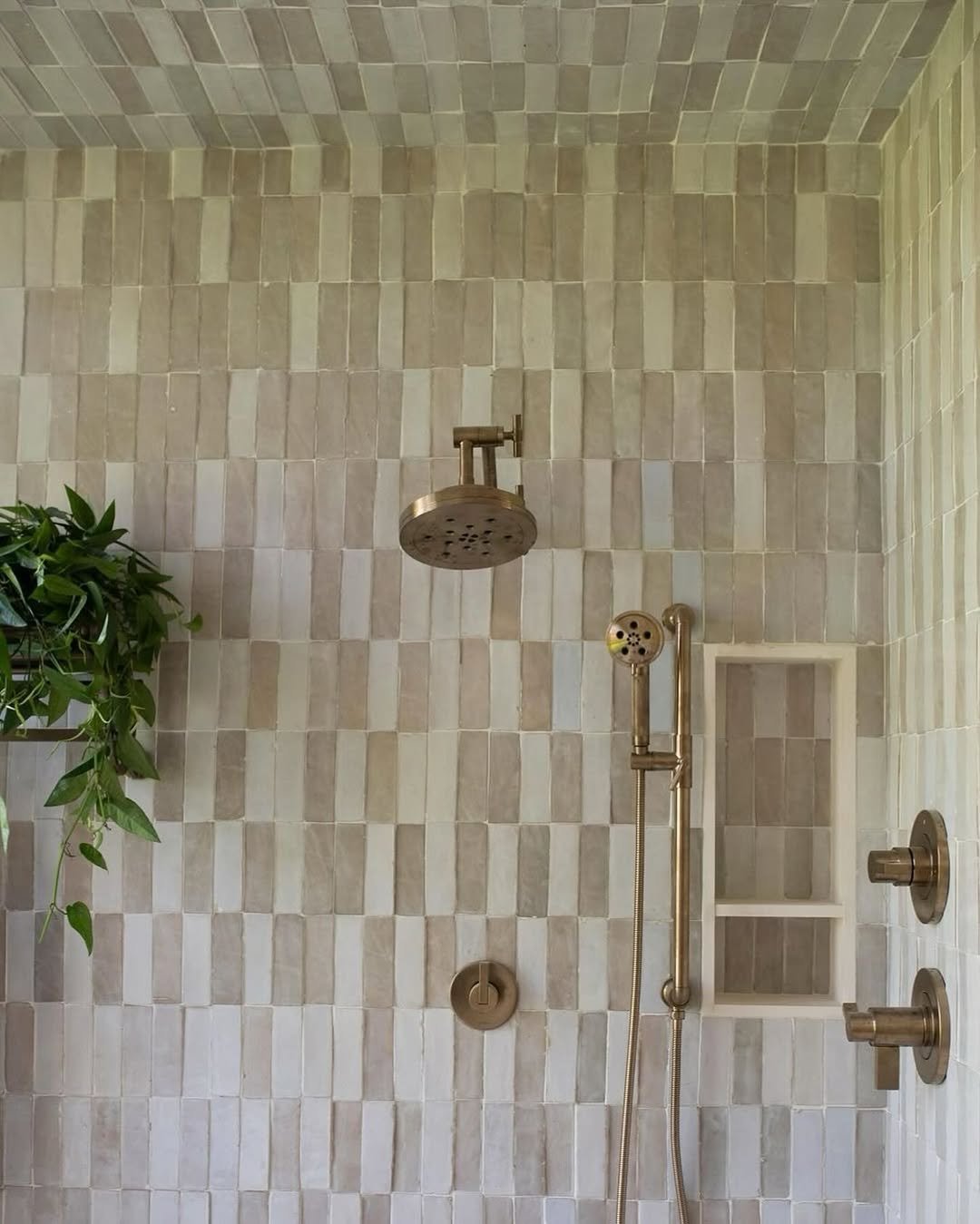
There’s something about slightly imperfect tiles that feels instantly warmer. These hand-finished squares bring subtle variation in tone and texture, making the whole space feel lived-in and relaxed.
It’s minimal, but not flat. The uneven edges and soft color shifts give it that “effortlessly styled” look—like it wasn’t overly planned, just naturally came together.
23. Soft Blue Linear Calm
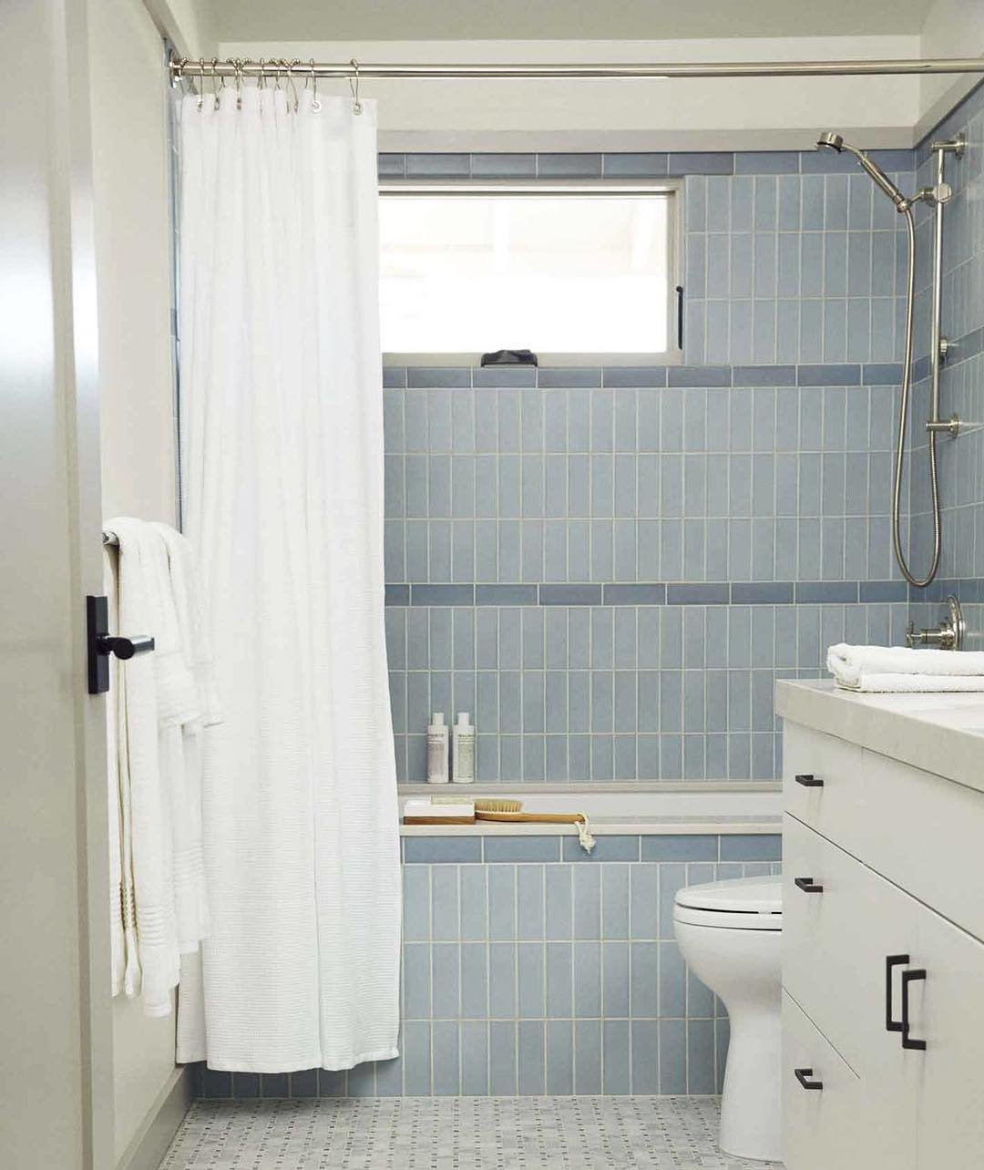
This layout leans into repetition in the best way. The vertical blue tiles create a calming rhythm that makes the space feel organized and airy at the same time.
And that horizontal band detail? Such a smart break in the pattern. It adds interest without interrupting the flow—kind of like a pause in a really good song.
24. Herringbone Wood Look Drama
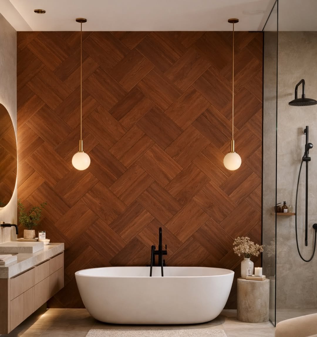
Okay, this one’s a statement. The herringbone layout with wood-look tiles brings warmth and depth, but still keeps things bathroom-appropriate.
It’s bold, but grounded. The pattern pulls you in immediately, while the rich tones make the whole space feel cozy, almost like a spa retreat with a designer twist.
25. Green Diamond Stripe Moment
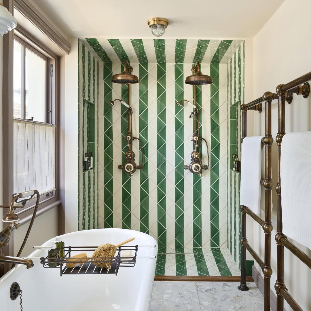
This pattern is doing a lot—and somehow, it works beautifully. The elongated diamond tiles create a striped illusion that feels both graphic and elegant.
It’s playful, but polished. The green and white combo keeps it fresh, while the vertical flow subtly stretches the space upward. Honestly, it’s a whole moment.
26. Clean Offset Brick Pattern
Sometimes simple just wins. This offset brick layout keeps things crisp and familiar, but the slight variation in tile tone adds that extra layer of interest.
It’s the kind of design that ages well. Not trendy, not boring—just solid, reliable, and always looking good without needing to shout about it.
