
The fastest way to change how a room feels isn’t a furniture haul. It’s color, committed to fully and chosen with intention. These 24 living room color palette ideas range from soft and sun-washed to deep and dramatic, and every one of them shifts the entire mood of a space before you’ve moved a single thing.
24 Living Room Color Palettes That Shift the Whole Mood Without a Single New Purchase
Color is the cheapest, boldest lever you have. A palette decides whether a room reads calm or charged, airy or grounded, classic or current, long before any piece of furniture gets a say. The walls set the tone, and everything else simply agrees with it.
What follows is a range worth saving. Powdery mint and warm neutrals, jewel-toned drama and moody charcoal, soft Scandi cream and confident teal. Different energies, same lesson: pick a mood, then let the whole room commit to it.
Minty Library Calm
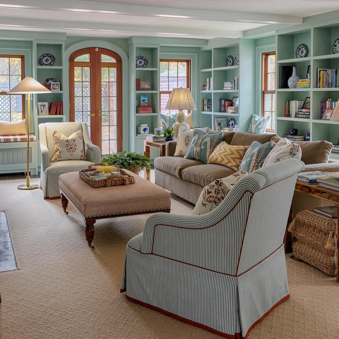
Soft seafoam built-ins wrapping an entire room, stacked with books and blue-and-white china, the kind of green that reads fresh at noon and almost grey by dusk. Ticking-stripe slipcovers and a brown velvet sectional keep it from going precious, while ikat pillows pull in coral and ochre for warmth. It’s a palette that earns its calm through contrast, never coldness. The perfect setting for a slow Sunday with coffee and a paperback.
Plum and Berry Drama
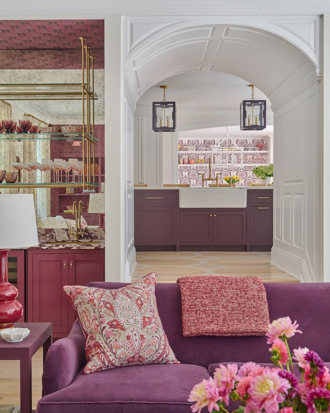
Aubergine cabinetry, oxblood lacquer, a velvet sofa in deep mulberry, this is color drenching with no apology. The trick is the white archway and trim framing it all, giving the eye somewhere to breathe between the rich tones. Brass hardware and dahlias in dusty pink keep the whole thing feeling lush rather than heavy. Worth a look if you’re drawn to that opulent direction, where warm, saturated tones do the emotional work.
Whisper Cream Serenity
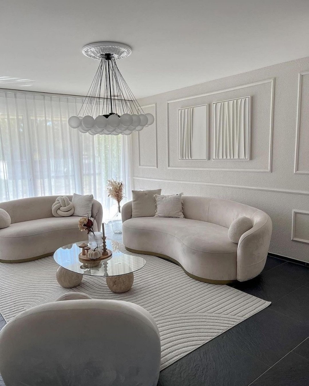
Walls, sofas, rug, all settled into the same soft chalk-and-cream register, with only charcoal flooring grounding the lightness. Curved boucle seating and a frosted-glass bubble chandelier keep everything rounded and quiet, nothing sharp to interrupt the hush. The palette works because it isn’t truly monochrome: ivory plays against oatmeal against the faintest greige. A room made for light, and the way it moves across a wall through the afternoon.
Teal and Heron Blue
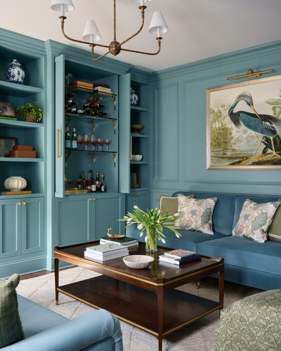
Saturated teal panelling head to toe, the kind of confident color commitment that turns a small room into a jewel box. A blue velvet sofa nearly dissolves into the walls, while botanical pillows and an Audubon heron print layer in soft greens and parchment. Dark wood and brass keep it anchored and grown-up. This kind of considered green-and-blue palette rewards going all in rather than testing the water.
Warm Oat and Honey
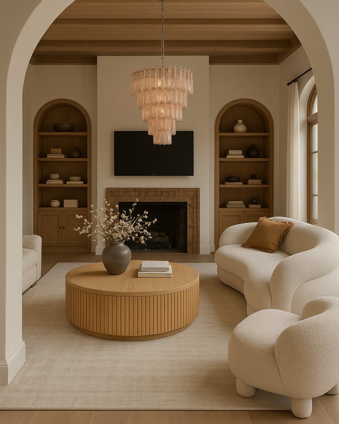
Limewashed cream walls, honeyed oak built-ins, a fluted wood coffee table glowing under a tiered glass chandelier. Boucle seating in the softest ivory adds a single rust pillow for warmth, and the whole palette feels like late sun through linen. Nothing here shouts; it’s tonal layering done with patience. Spaces like this make light and airy styling feel intentional rather than empty.
Sage and Soft Grey
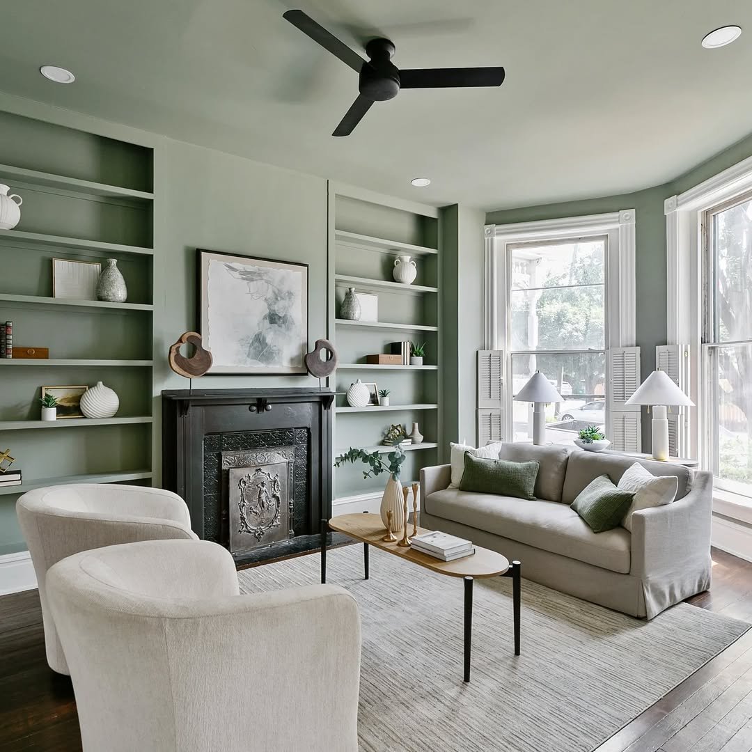
Sage green wraps the walls, ceiling, and open shelving in one continuous wash, that color-drenched move that makes a bay-window room feel cohesive instead of busy. A pale linen sofa and cream swivel chairs keep it grounded, while green pillows echo the walls without overstating it. The black cast-iron fireplace adds just enough weight. Calm, current, and easy to live in.
Dusty Blue and Plum
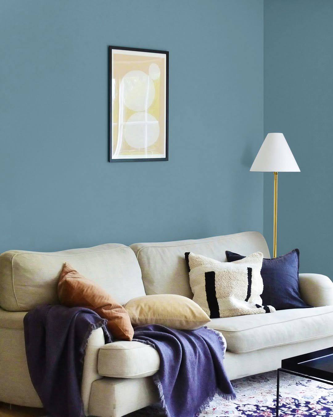
A single deep slate-blue wall does all the work here, the kind of dusty, grounded hue that flatters cream upholstery and turns a corner into a moment. Layered throws in eggplant and rust warm it up, while brass and black accents keep it from drifting too sweet. Proof that one committed wall color can reset a whole room. The smartest entry point if full color drenching feels like a leap.
Sage, Cognac, and Cream
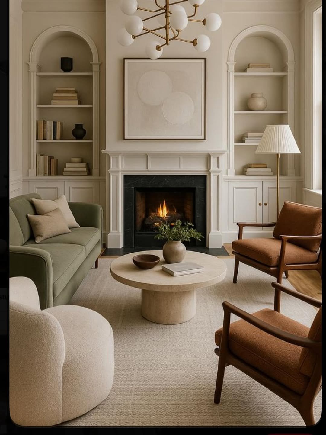
Creamy plaster walls and arched built-ins set the stage for a quiet color story: muted sage sofa, cognac leather chairs, a black marble fireplace pulling it all into focus. The greens and browns feel pulled from a forest floor, warm and grounded, lit by a live flame. Tonal but never flat. This earthier, warm-neutral direction is where the palette feels most at home.
Moody Blue and Charcoal
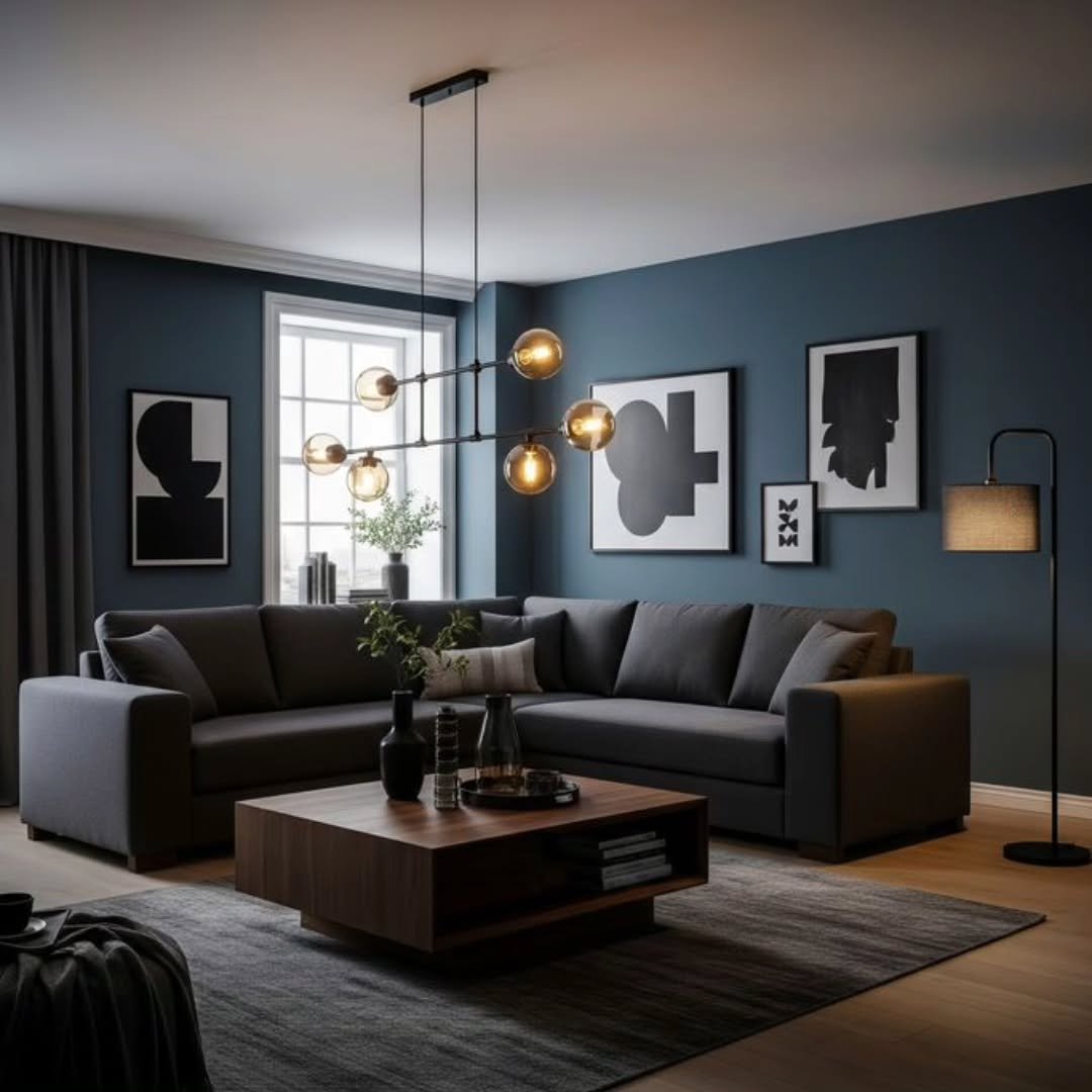
Deep petrol-blue walls meet a charcoal sectional and walnut tones, a palette that leans dark without ever feeling gloomy. Black-and-white graphic art keeps the energy modern, while warm wood flooring and a linen-shade lamp soften the cool. It’s a confident scheme for an evening room, made for low light and good conversation. Drama with the volume kept just right.
All-Black Forest Retreat
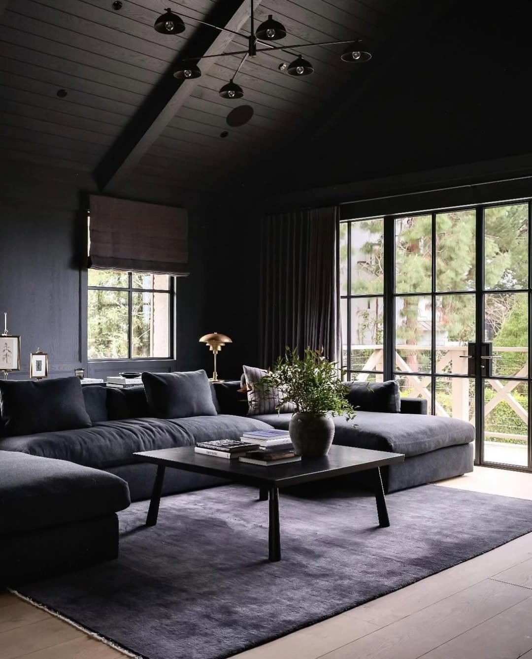
Walls, ceiling, and sectional sink into the same inky near-black, with floor-to-ceiling windows pulling in green from the trees outside as the only contrast. Pale oak floors and a brass lamp keep it from closing in, while a stone vase of olive branches adds life. This is the boldest end of the palette spectrum, and it works because the view becomes the art. Cocooning, cinematic, quietly luxurious.
Soft Blue and Cream
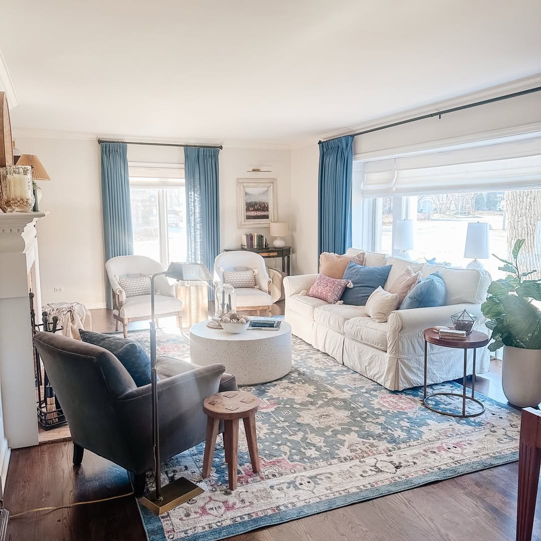
Cornflower drapes against warm white walls, a cream slipcovered sofa scattered with blush and dusty-blue pillows, a vintage rug pulling rose and faded denim across the floor. It’s the gentlest kind of color story, where blue does the lifting and pink keeps it tender. Light pours through wide windows and softens everything it touches. Made for unhurried afternoons when nothing is asking for your attention.
Black, White, and Graphic
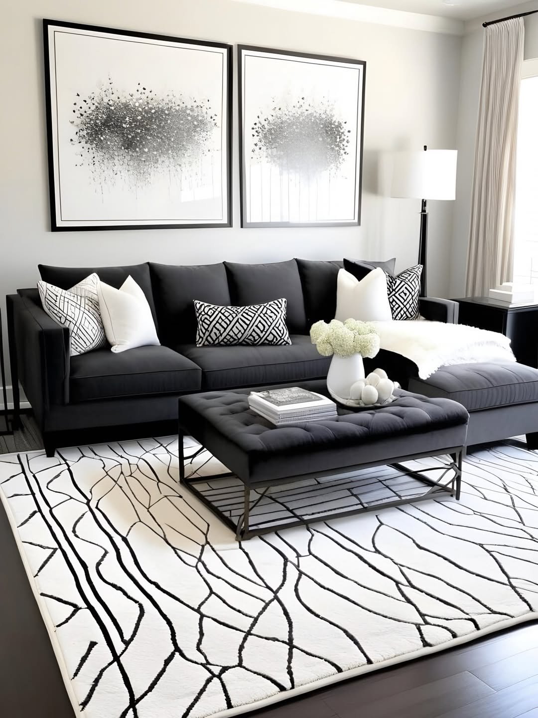
Charcoal sectional, crisp white walls, a rug scribbled with inky black lines, this is high contrast handled with a steady hand. Geometric pillows in black-and-white pattern keep the eye moving, while white hydrangeas soften the edges. Nothing competes, because the palette is disciplined down to two notes plus shadow. A confident, modern scheme that reads bigger than its footprint.
Olive and Mahogany
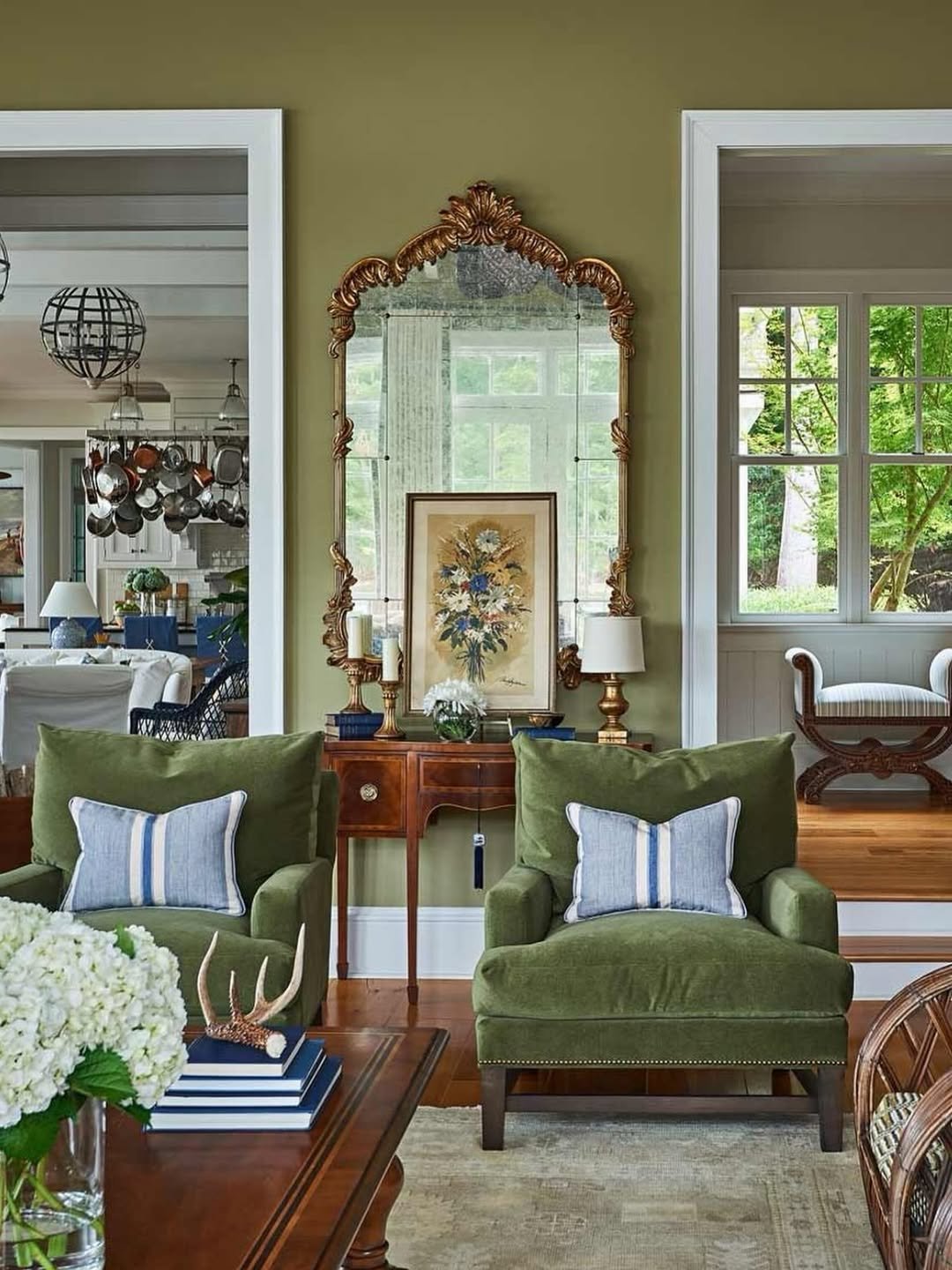
Warm olive walls wrapping a room of rich mahogany and moss-green velvet chairs, the kind of green that feels pulled from an old library. Crisp white trim cuts the depth, while blue-striped pillows and a gilt mirror add lift and light. Traditional, layered, quietly grown-up. The look of a room that’s been collected rather than bought in a weekend.
Greige and Warm Wood
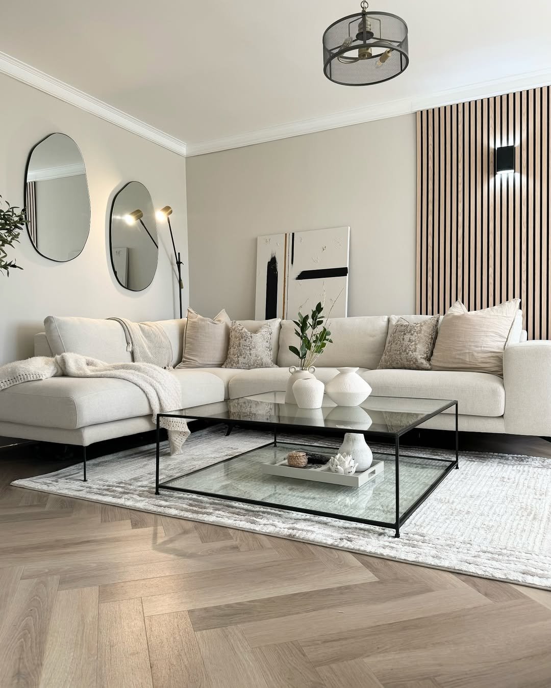
Soft greige walls, an oatmeal sectional, oak slat panelling glowing in the corner, this is warm minimalism with just enough texture to stay interesting. Herringbone floors and black-framed mirrors add line and structure, while sculptural white vases keep it tactile. Restrained, never cold. The kind of light, layered neutral palette that reads calm without tipping into stark.
Navy and Caramel Leather
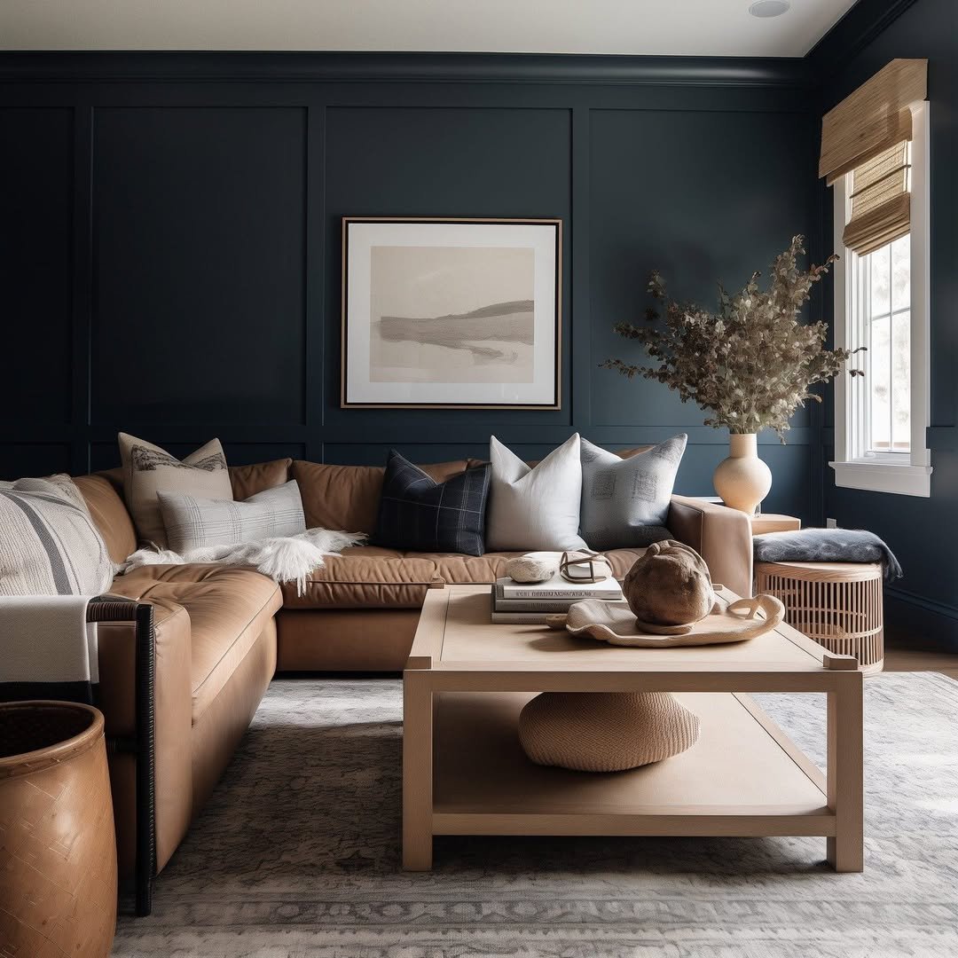
Deep inky navy panelling behind a caramel leather sectional, a pairing that feels equal parts cozy and confident. Woven shades and a pale oak coffee table warm the dark walls, while plaid and grey pillows layer in texture without breaking the mood. It’s masculine without being heavy. A grounded, moody palette like this is where dark walls earn their keep.
Dark Academia Greens

Inky walls, olive velvet sofa, amber and oxblood seating glowing under a warm chandelier, this is moody maximalism with a wine-cellar soul. Patterned wallpaper and dark wood pull the whole room into shadow, while the lamplight keeps it intimate rather than gloomy. Saturated, atmospheric, made for evening. Deeper, jewel-toned palettes like this reward going rich rather than restrained.
Teal, Lime, and Orange
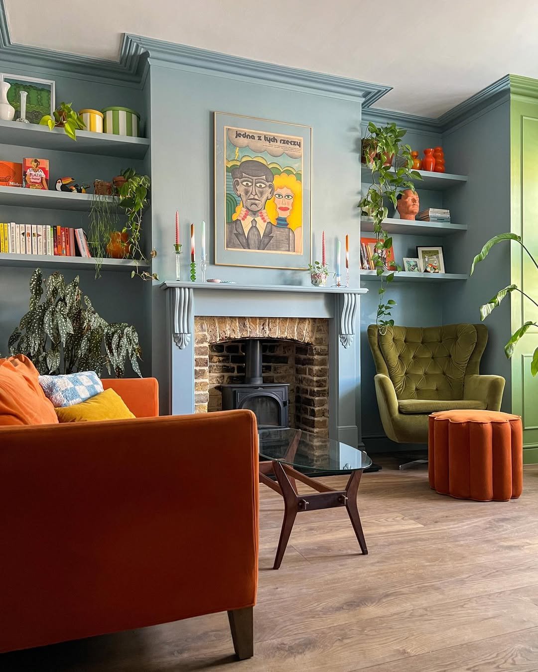
Dusty teal built-ins meeting a slice of acid-lime door frame, with a burnt-orange sofa and matching scalloped pouf bringing the heat. It shouldn’t work, all that saturation in one room, but the green grounds it and the orange makes it sing. Vintage art and trailing plants keep it playful and personal. A palette for people who find beige exhausting.
Red, White, and Blue
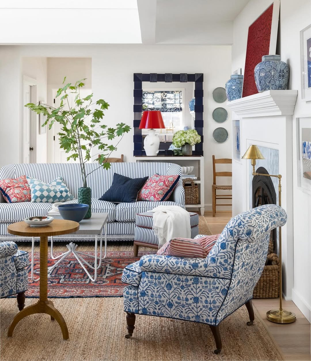
Crisp white walls, ticking-stripe sofa, blue block-print armchair, and a pop of red lampshade tying it all together, classic Americana done with a designer’s restraint. Ginger jars and a jute rug add texture, while the layered patterns stay in the same tight palette. Fresh, nautical, never costumey. Proof that a confident three-color scheme can feel both timeless and current.
Powder Blue Color Drench
Walls, ceiling trim, and built-in shelving all bathed in the same powder blue, that full-commitment color drenching that turns architecture into atmosphere. Pops of orange and lime keep it lively, while plants and vintage finds layer in warmth and story. Bold but soft, saturated but calm. This kind of all-in blue palette is where wraparound color truly pays off.
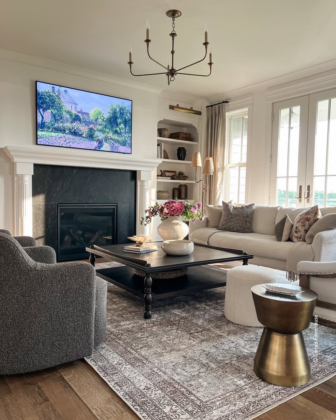
Greige and Black Marble
Warm white walls and an oatmeal sofa anchored by a black soapstone fireplace and dark wood coffee table, this is neutral with a backbone. Grey boucle swivels and a faded antique rug keep it soft, while brass and fresh dahlias add a glint of warmth. The contrast does the styling for you. A grounded palette that reads elevated without trying.
Golden Beige Glow
Warm sand walls bathed in lamplight, a camel sofa piled with tonal pillows in oat, taupe, and cocoa, this is beige with the heat turned up. Brass sconces and a fireplace keep everything amber, while greenery adds the one cool note. Layered, soft, deeply cozy. The kind of warm neutral layering that makes a room feel lit from within after dark.
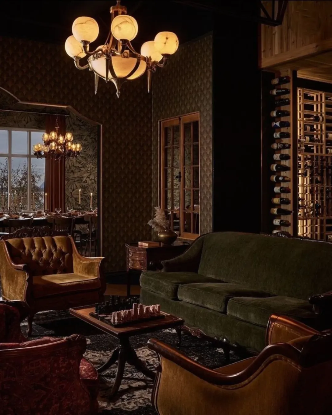
Teal and Magenta
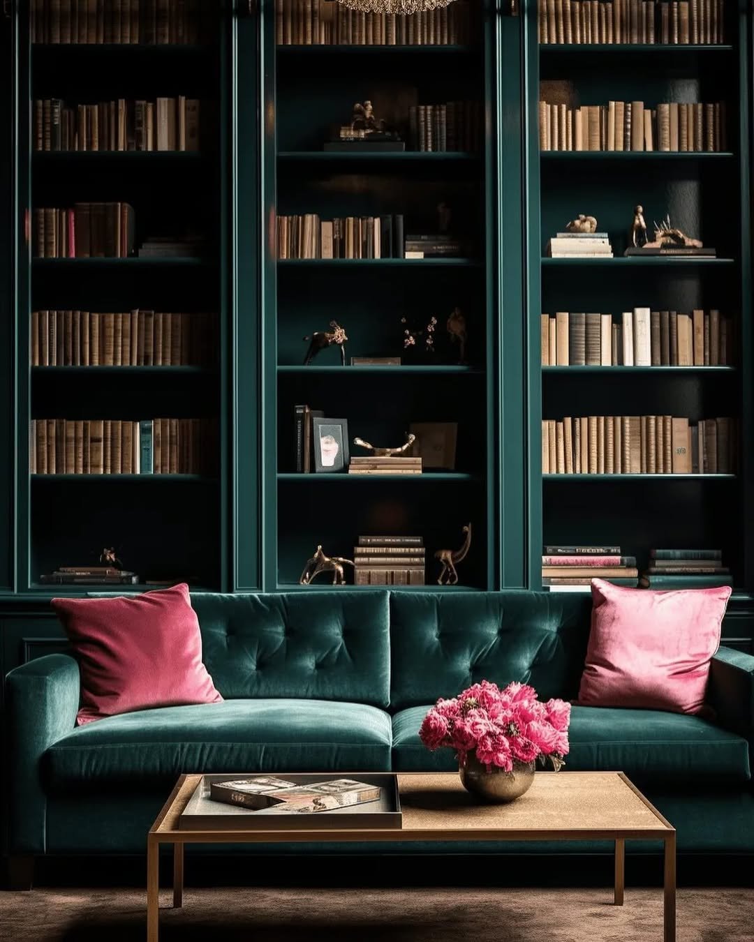
Deep teal built-ins running floor to ceiling, packed with worn leather spines, fronting a matching teal velvet sofa. Then the twist: hot magenta pillows and peonies cutting through all that moody green like a held note. Brass and low light keep it dramatic. A jewel-box palette for people who want their library to feel like a secret.
Olive Velvet and Plaster
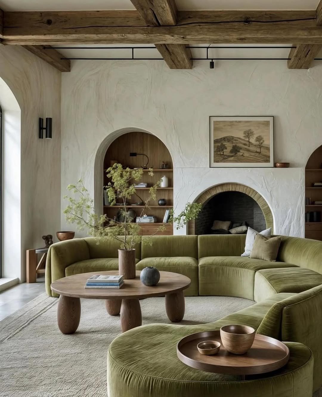
Raw plaster walls and reclaimed beams wrapping a sculptural olive velvet sectional, the green pulled straight from the landscape outside. Arched niches in warm wood and a chunky stone coffee table keep it earthy and tactile, while the curve of the sofa softens all that rustic structure. Mediterranean calm with real weight. A palette built on texture as much as color.
Navy and Marble Glam
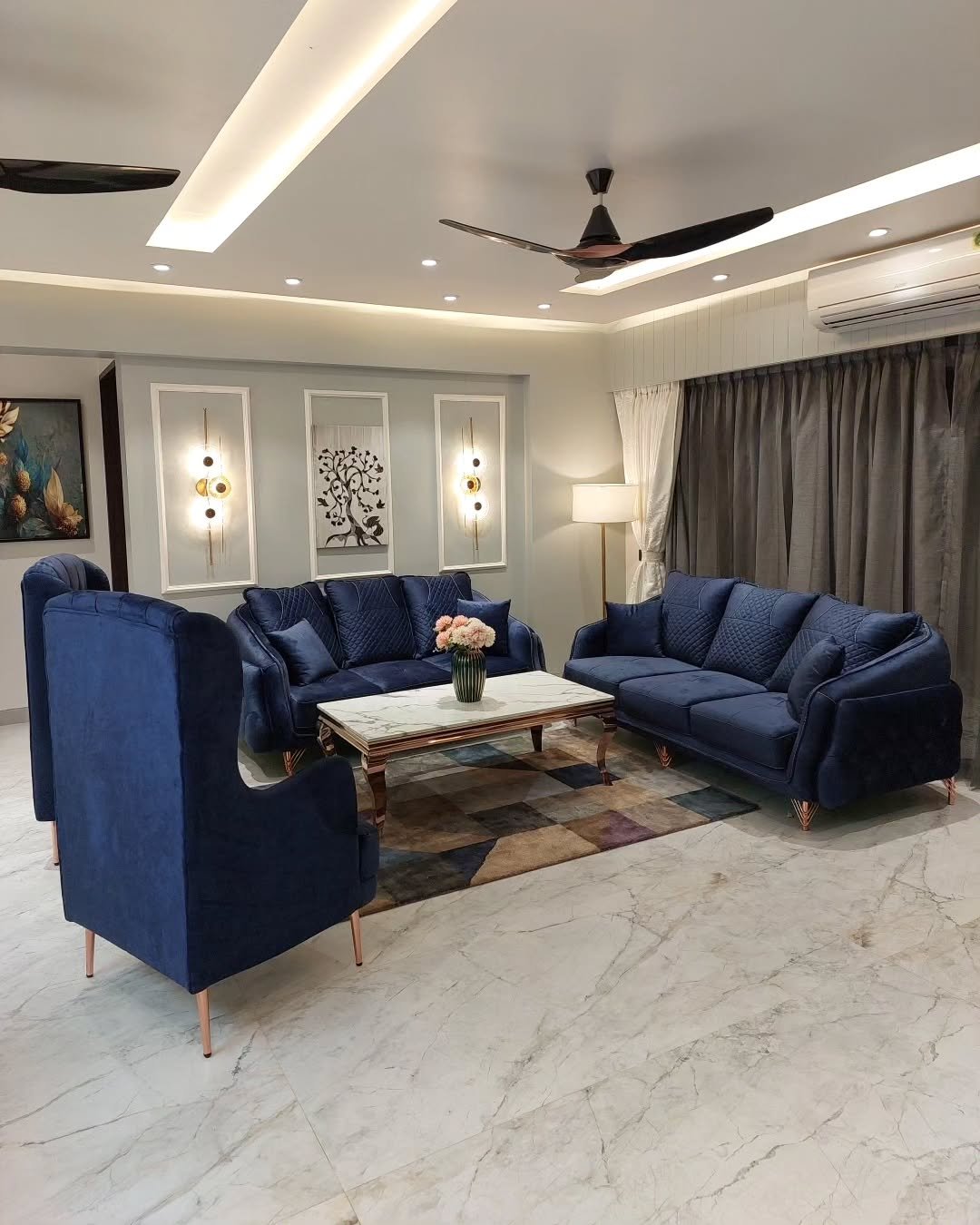
Cool grey walls, glossy marble floors, and a full suite of deep navy velvet seating, this is color used for drama and polish in equal measure. Rose-gold legs and a marble-topped table add shine, while a jewel-toned rug grounds the whole arrangement. Formal, rich, made for entertaining. A confident navy palette that proves dark seating can still feel light-filled.
