

Color is the difference between a dining room that hosts and one that holds you. The right palette turns even a quick Tuesday dinner into something that feels considered, and the wrong one keeps people sliding out of their chairs the moment dessert ends. These 26 dining room color ideas lean into mood, light, and the kind of quiet confidence that makes a room worth sitting in.
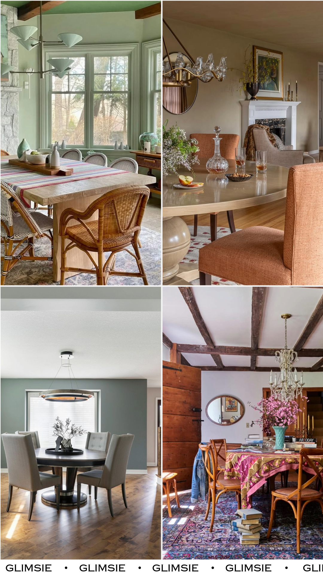
26 Dining Room Color Ideas That Set the Mood Before the First Course
Color in a dining room does more work than people give it credit for. It shapes how candlelight reads at 7pm, how morning coffee feels at 9am, and how the room sounds when it’s full of conversation. The palette is doing half the hosting whether you notice it or not.
What follows is a mix of the moody, the cheerful, the saturated, and the calm. Each one shows how a single color choice can shift a dining room from generic to genuinely yours, and most pull off the trick without a single dramatic renovation.
1. Sage and Stone
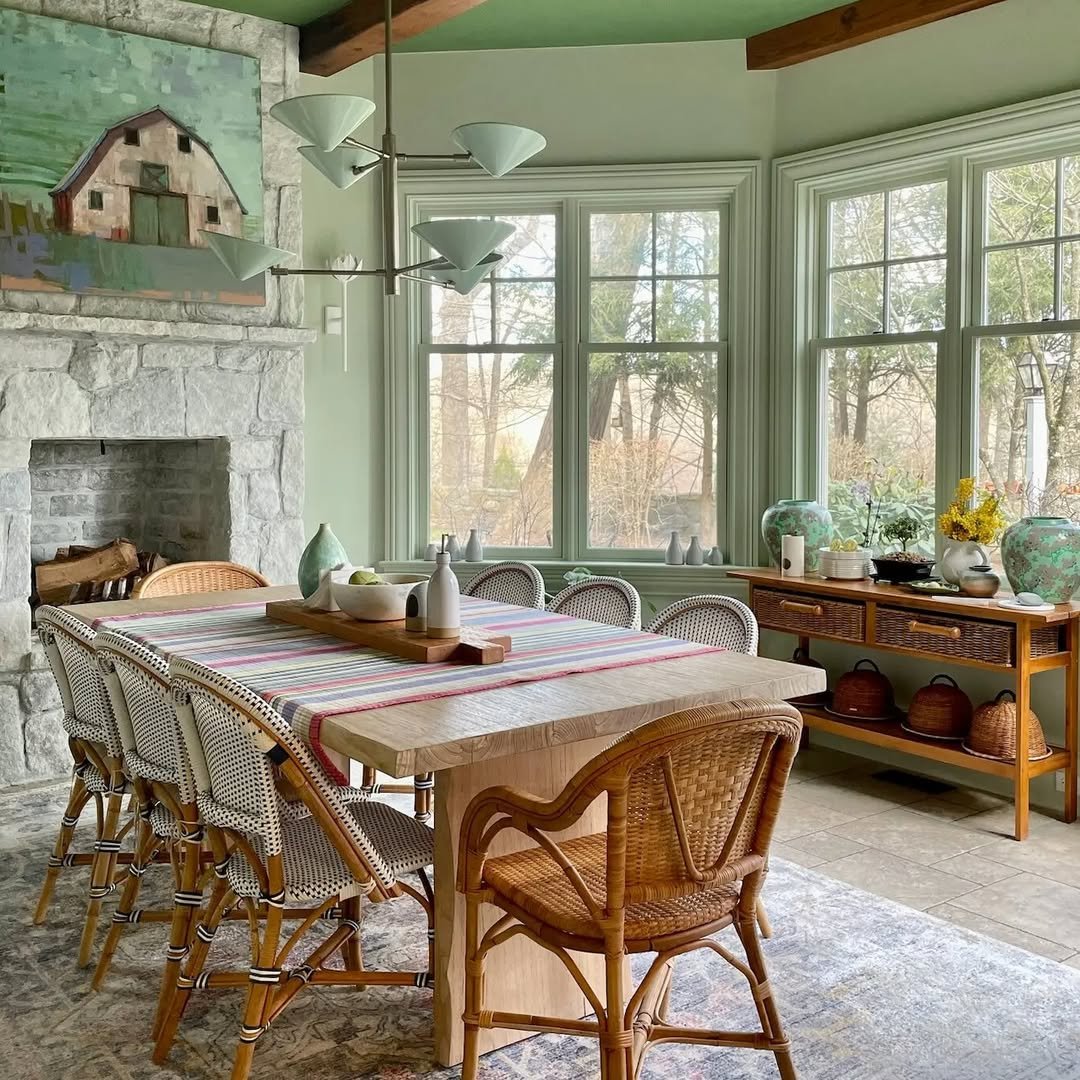
Pale sage walls meeting a fieldstone fireplace and a soft green ceiling, the whole room reading like a cool spring morning that decided to stay indoors. The painted ceiling is the move here, pulling the eye up and wrapping the bistro chairs and striped runner in a herbal kind of light. Sunday lunches in this room would feel slower on purpose. Sage sits beautifully alongside the kind of green wall treatments worth exploring if you want the calm without the commitment of full saturation.
2. Warm Greige Envelope
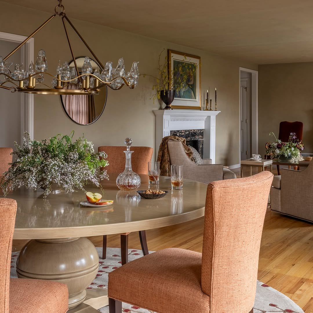
Greige walls, greige ceiling, terracotta chairs pulled close to a round table that catches every flicker of the chandelier. The palette is doing something clever, going almost monochrome on the architecture so the rust upholstery and brass fixture can do the talking. Candlelight on these walls turns golden, not gray. For a dinner party that’s meant to end with the last bottle of wine, this is the temperature you want.
3. Moody Sage Drench
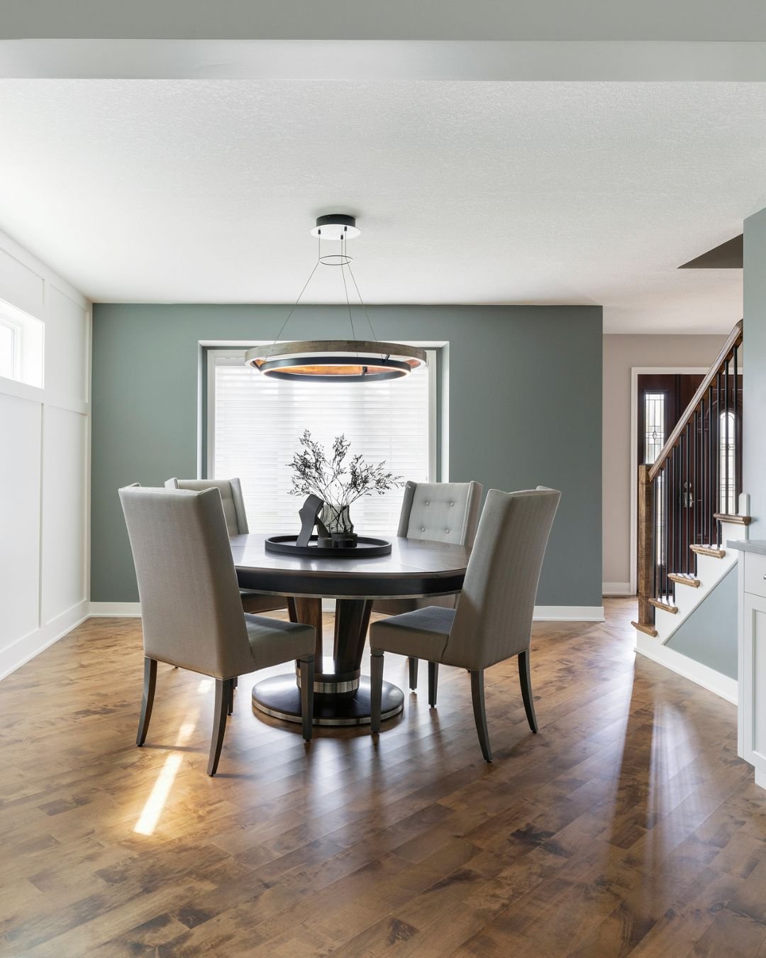
A deep, dusty sage drenched across the walls until it almost reads as the architecture itself, balanced by warm wood floors and pale upholstered chairs. The white wainscoting on one wall stops it from feeling too heavy, and the dark wood table grounds the whole composition. Color drenching like this works because there’s nowhere for the eye to snag on a mismatched trim. A room that knows exactly what it is.
4. Earthy White and Wood
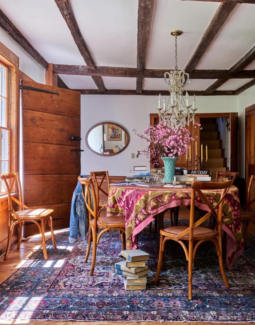
Soft white walls against beamed ceilings, a magenta and ochre patterned tablecloth thrown across the table like an afterthought that took twenty minutes to perfect. The color here is restraint, letting the wood doors, vintage rug, and pink florals run the show. White in a room with this much warm material doesn’t feel cold, it feels like canvas. The kind of dining room you build a Saturday around.
5. Postmodern Pastel Pop
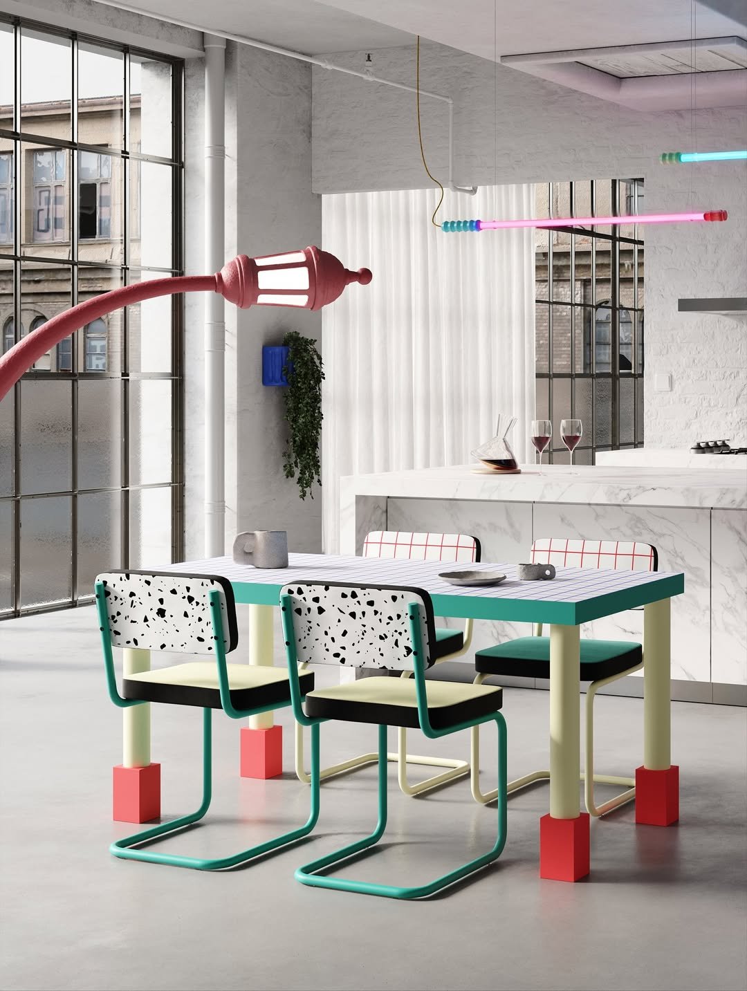
Mint green table edges, terrazzo seatbacks, a coral floor block, and a curl of pink streetlamp curving overhead. Memphis-era color play at its most unrepentant, set against a soft industrial backdrop of marble and concrete so the palette stays the loudest thing in the room. This is dining as art installation, and it works because every shade has a reason to be there. Pure dopamine for anyone tired of beige.
6. Charcoal Wainscot Half
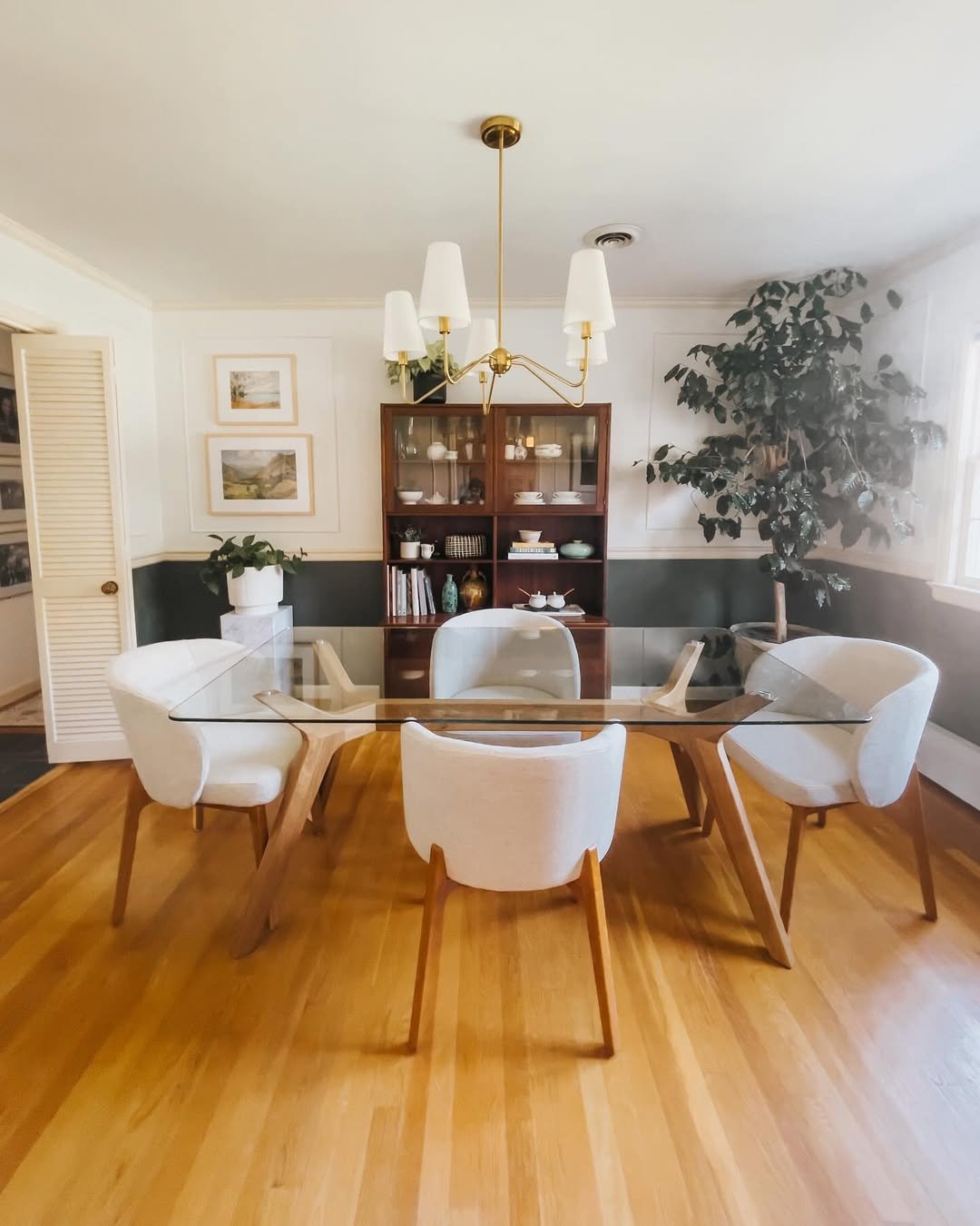
Crisp white above, a deep forest-charcoal panel below, splitting the room at the perfect height to make the ceiling feel taller. The dark band anchors the glass table and pale chairs, while warm wood floors keep it from tipping cold. Two-tone walls are a quiet design trick, and this kind of considered approach is the same logic that makes adjacent living spaces feel layered without trying too hard. A dining room that reads put-together even on a weekday.
7. William Morris Maximalist
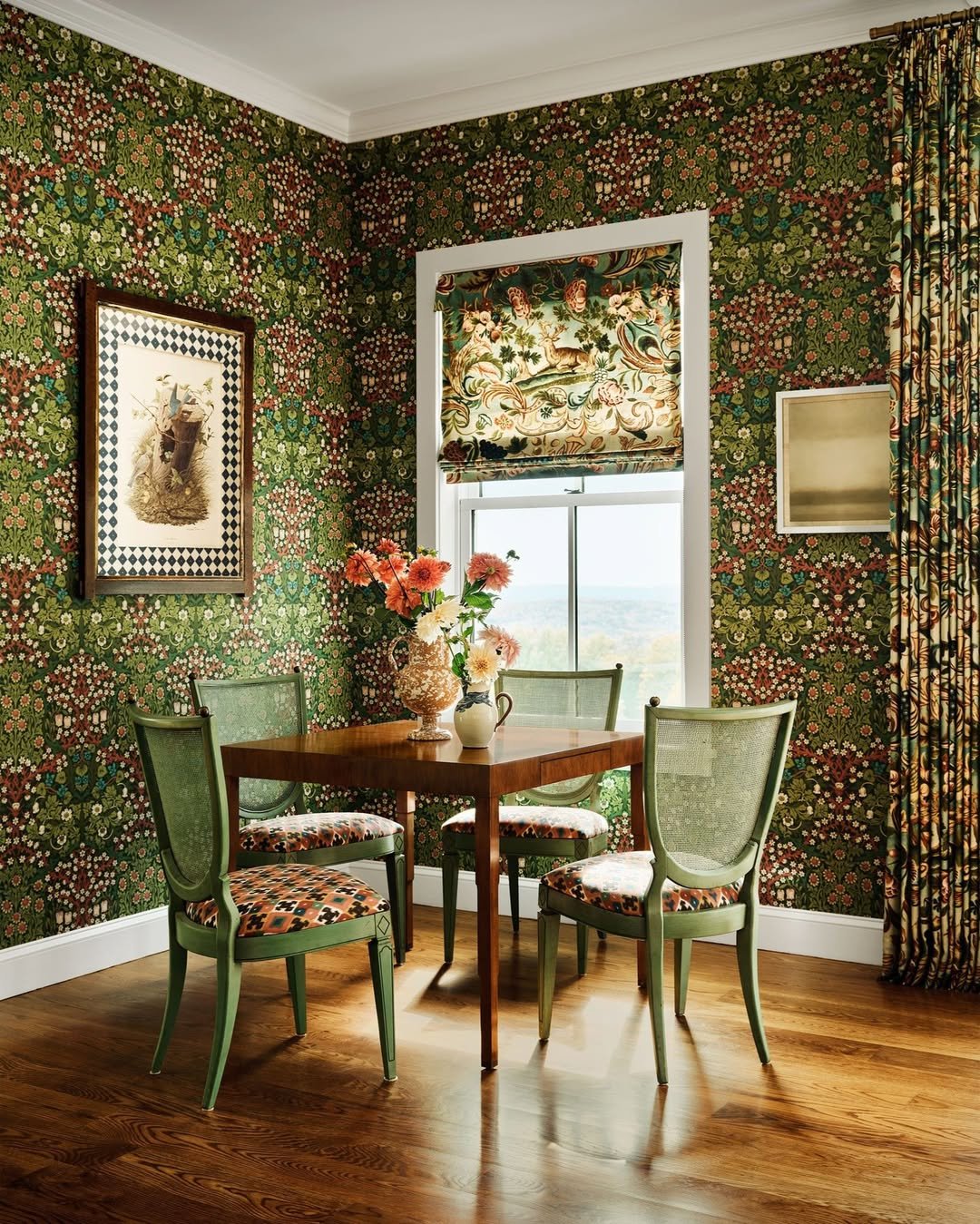
Walls drenched in dense floral wallpaper, sage-painted chairs, a matching curtain pulled to one side, and a small wooden table that disappears into the pattern. Color here is texture, layering, story. The window almost becomes another piece of art because the wallpaper frames it like a print. Maximalism done with this kind of editorial control is the opposite of chaotic, it’s a room that knows exactly which note to keep ringing.
8. Mauve and Brass Glow
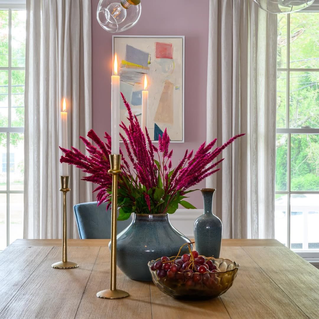
A soft, dusty mauve on the wall behind sheer curtains, a teal vessel exploding with magenta plumes, brass candlesticks reaching tall. Pink walls get a bad reputation, but this shade is grown-up, almost dusky, and the cool ceramic and warm brass keep it from veering sweet. Late afternoon light on this wall would be the moment to put dinner on. Mauve and jewel tones share territory with the moodier corners of bedroom palettes if you’re drawn to that kind of romantic depth.
9. Candy-Coated Color Block
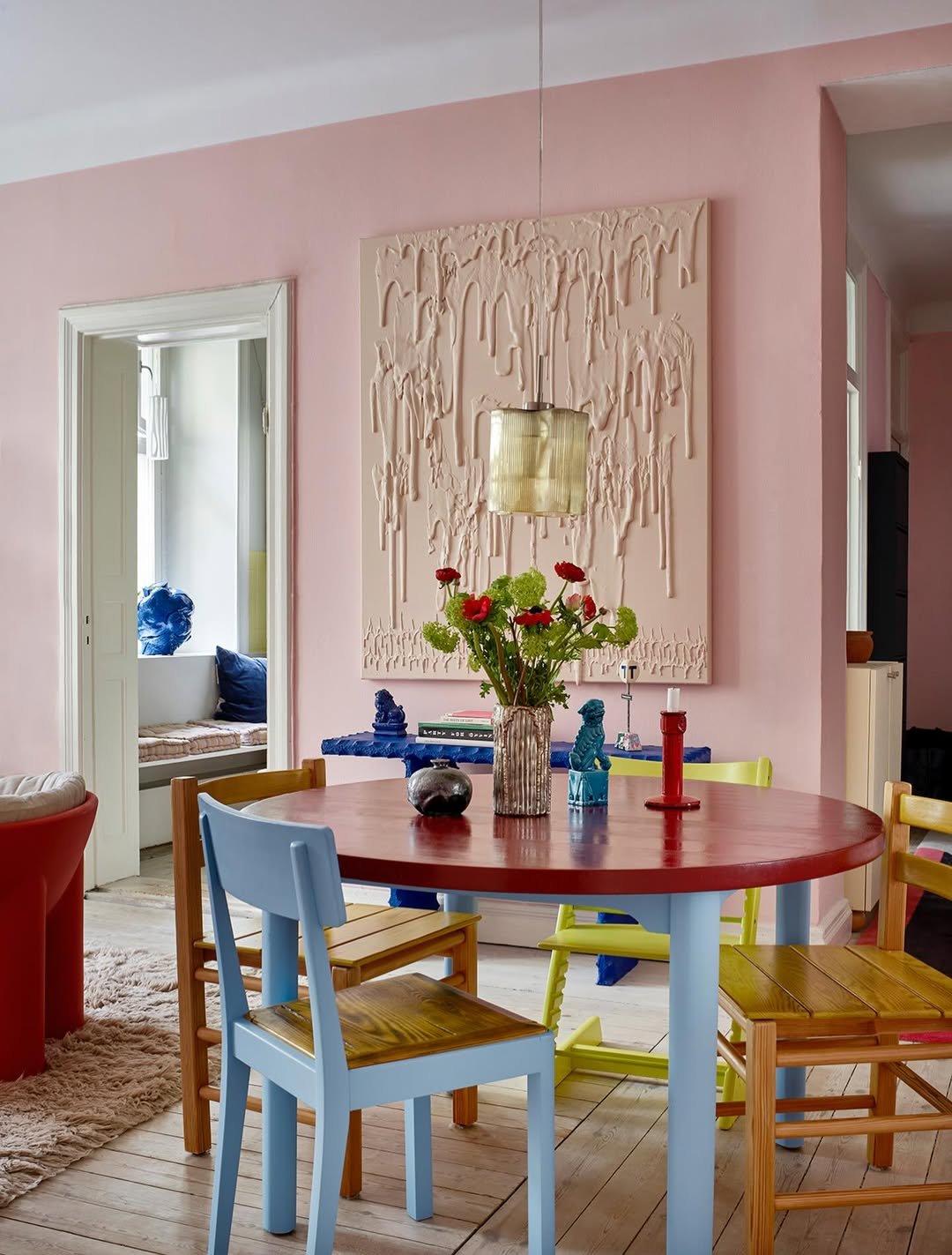
Bubblegum pink walls, a cobalt sideboard, a red and blue table base, mismatched yellow and powder-blue chairs scattered around it. Every color is fully saturated, none of them apologizing. The whitewashed floors give the eye somewhere to rest, but the rest of the room is committed to joy. A dining space for someone who treats meals as a creative act, not a logistical one.
10. Blush and Mahogany Heritage
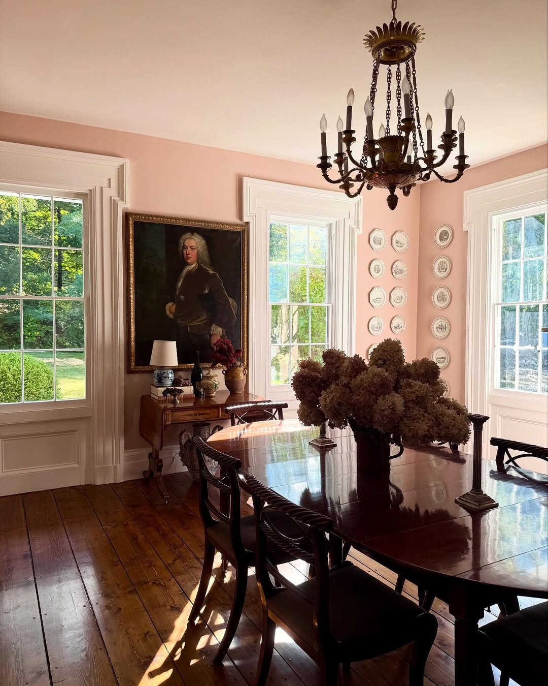
A pale, dusty blush coating the walls of a Federal-style room, white trim sharp around the windows, a deep mahogany table reflecting the chandelier overhead. The pink is doing something specific here, softening the formality of the antique furniture and the dark wood floors until the whole space feels lived in instead of curated. Dried hydrangeas in browns and ivories pull the palette together. Period rooms benefit from color that respects them without being precious, and blush handles that perfectly.
11. Deep Teal Drama
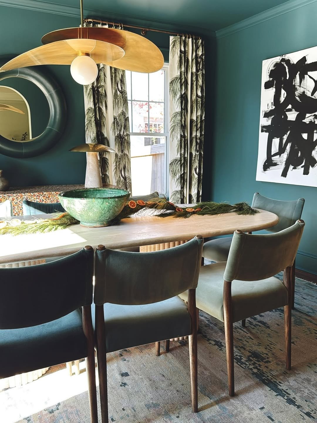
Saturated teal walls wrapping the room like a velvet curtain, brass pendant overhead, leather chairs in matching jewel tones pulled up to a pale oak table. The black ink artwork punches through the green with operatic confidence, and the round mirror catches just enough light to keep things from going moody-dark. Teal is one of those colors that makes a room feel like an event the second you walk in. Anyone drawn to this depth would also find moody jewel-toned palettes worth exploring for other rooms in the house.
12. Hunter Green Traditional
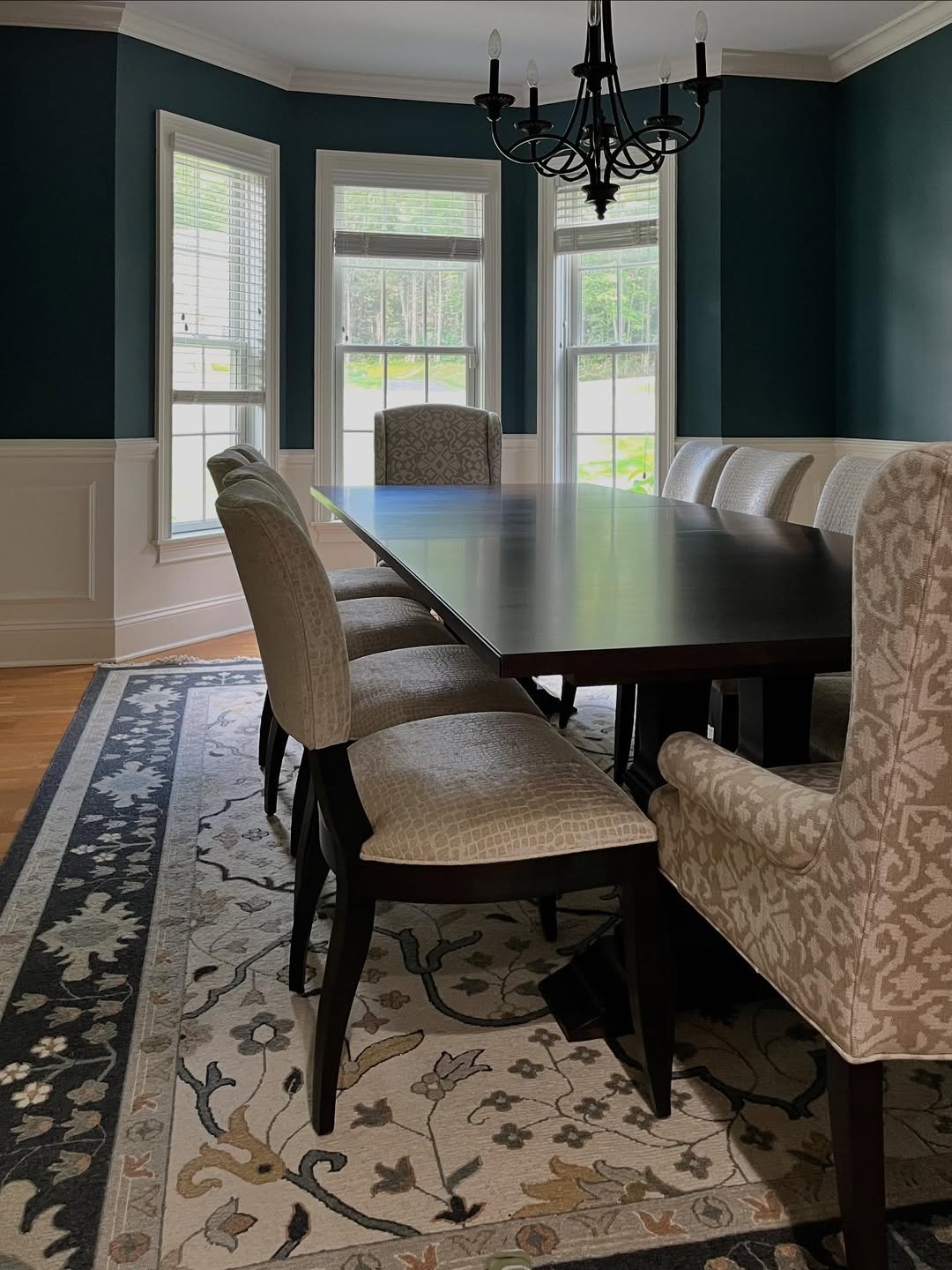
Hunter green above, crisp white wainscoting below, a classic combination that has been quietly outlasting trends for a century. The dark wood table and ikat-patterned head chairs anchor the room in heritage without tipping into stuffy, and the bay window keeps everything bathed in natural light. Green this deep needs that crisp wainscoting break to breathe. A Thanksgiving dining room if there ever was one.
13. Soft Pine Calm
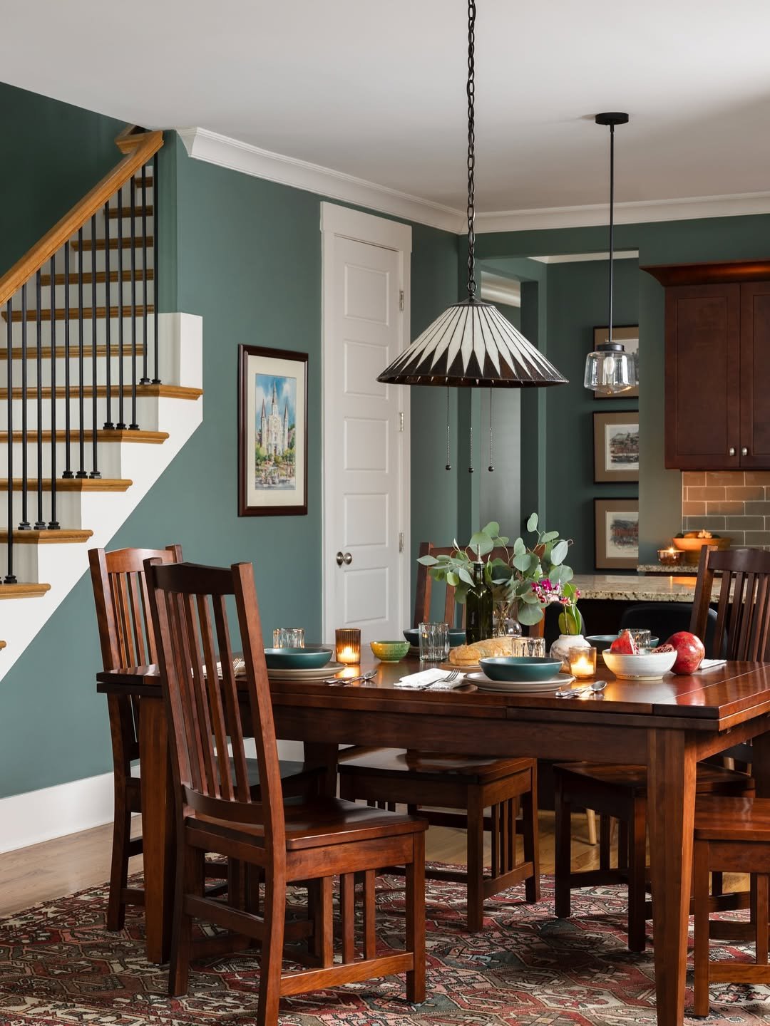
A muted, almost pine-shadow green stretching from the kitchen archway to the open dining space, paired with rich cherry wood furniture and a stained-glass pendant. This is the green that reads as neutral by 11am, then deepens into something almost forested by candlelight. The open layout lets the color flow without becoming overwhelming. Good for anyone who wants color, just not the kind that announces itself.
14. Whispered Sage
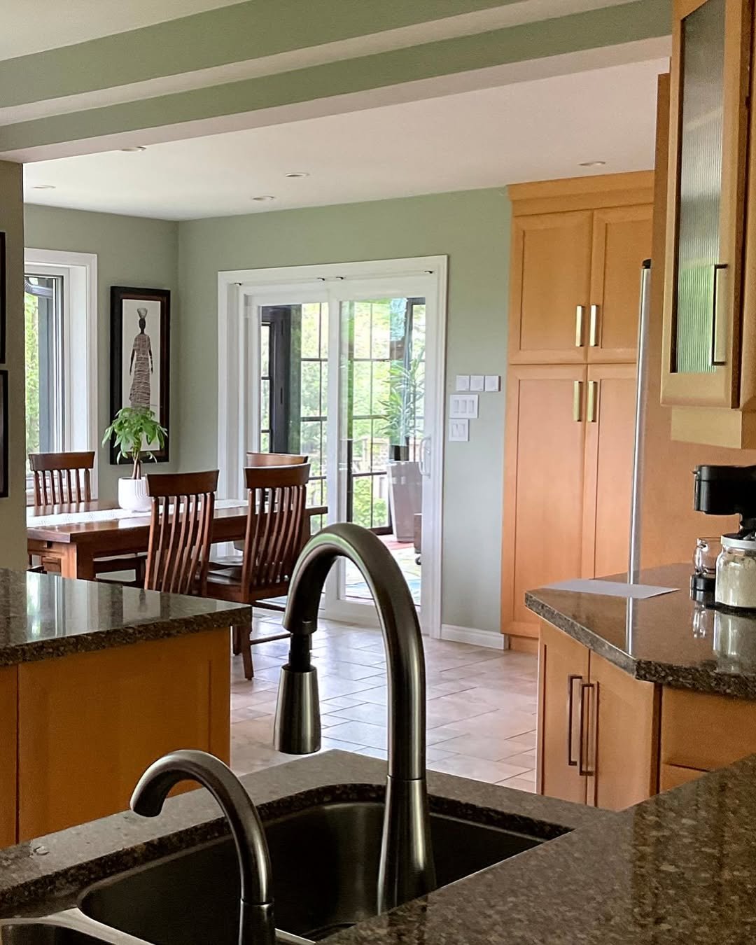
Barely-there sage walls, warm honey cabinets in the foreground, a glimpse of wooden dining chairs around a craftsman-style table. The sage here is the lightest possible whisper, more atmosphere than statement, designed to let the wood tones do the heavy lifting. Pale greens like this pair beautifully with golden wood, both bringing out warmth in each other. A weekday-friendly palette that still has personality.
15. Powder Blue Coastal
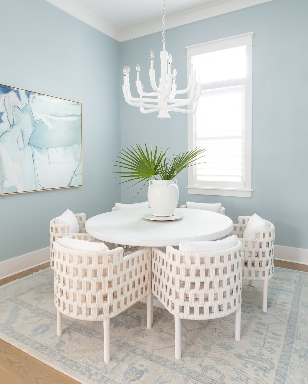
Powder blue walls, a chalky white woven chandelier, rope chairs gathered around a round white table, palm fronds in a chunky ivory vase. The whole composition reads like a long exhale, the kind of breakfast nook you’d want in a beach house but secretly install in the suburbs. Pale blue does for dining rooms what linen does for a summer dress. The look connects naturally to a coastal home decor approach if you want to carry the palette beyond one room.
16. Periwinkle Maximalist
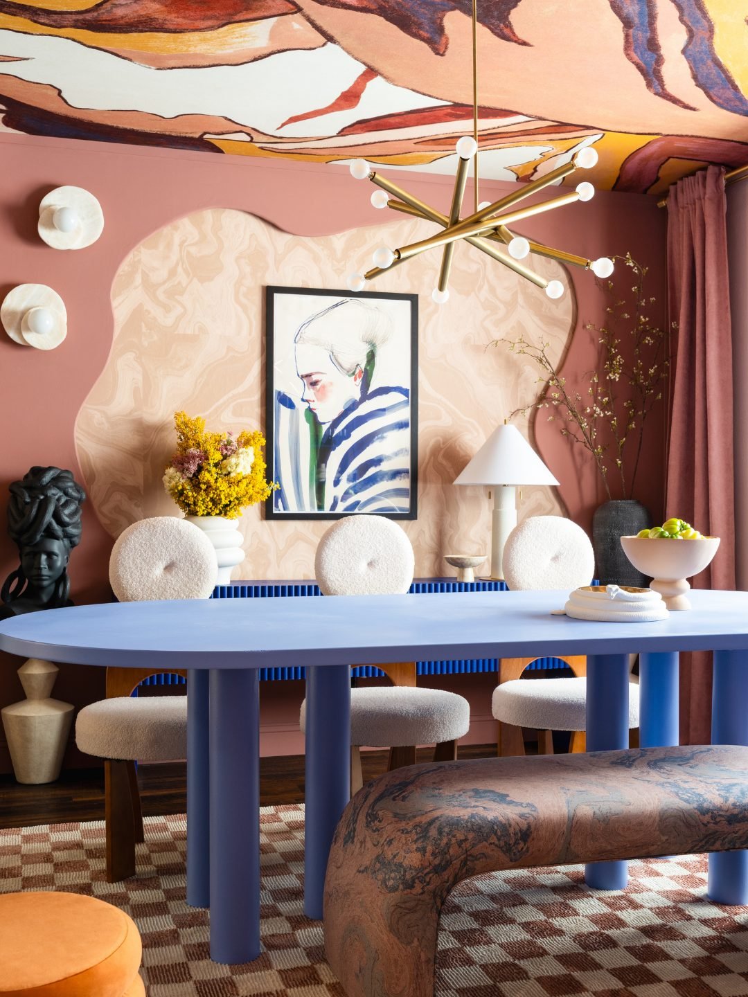
A cobalt-periwinkle oval table the color of a swimming pool at dusk, terracotta walls behind it, a swirling painted ceiling overhead that looks like clouds caught mid-thought. Bouclé chairs, a marbled bench, a checkerboard rug, every element competing for attention and somehow making the room feel orchestrated rather than chaotic. This is dining as design statement. For the host who’d rather be remembered than reserved.
17. Pink Chinoiserie Garden
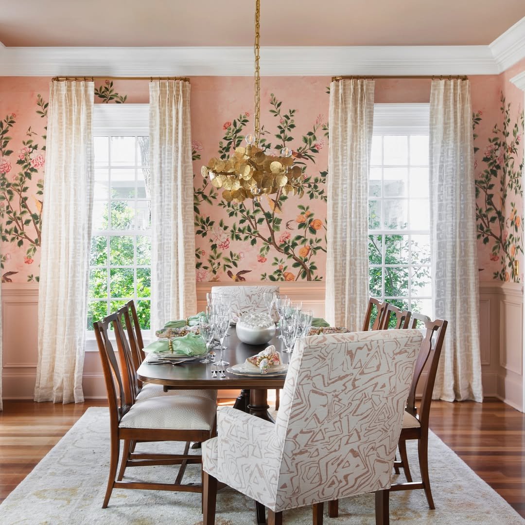
Hand-painted pink chinoiserie wallpaper climbing every wall, blossoms and birds and trailing vines pulling the eye in every direction, a pink ceiling sealing it all in. White wainscoting grounds the lower half so the pattern reads as art rather than overload. Dining rooms built around a single piece of wallpaper this strong don’t need much else to do the work. A room you’d dress for.
18. Cinnamon Grasscloth Glow
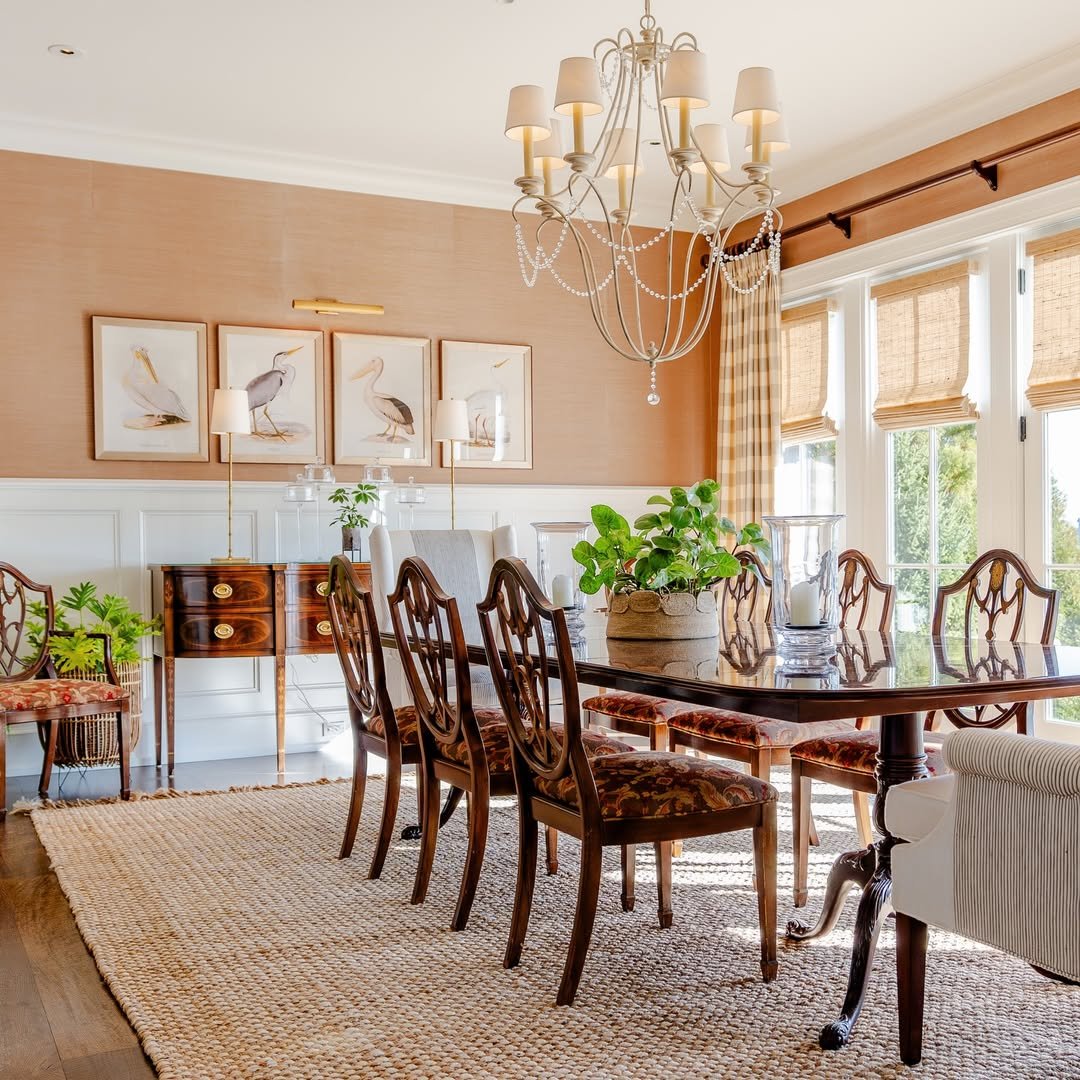
Warm cinnamon-toned grasscloth on the upper walls, white wainscoting and ceiling, antique mahogany furniture catching the afternoon light. The texture of the grasscloth is doing as much as the color, adding a subtle hand-woven depth that flat paint never could. Earth tones in a dining room age beautifully, and this one already looks like it has stories. Paired well with an earthy tone fall decor approach when the seasons shift.
19. Charcoal and Brass
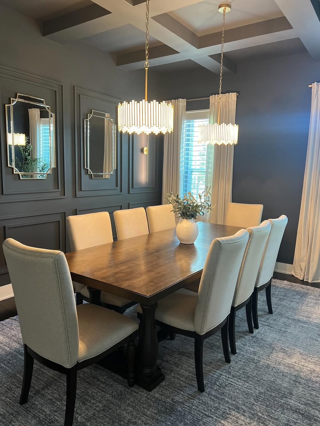
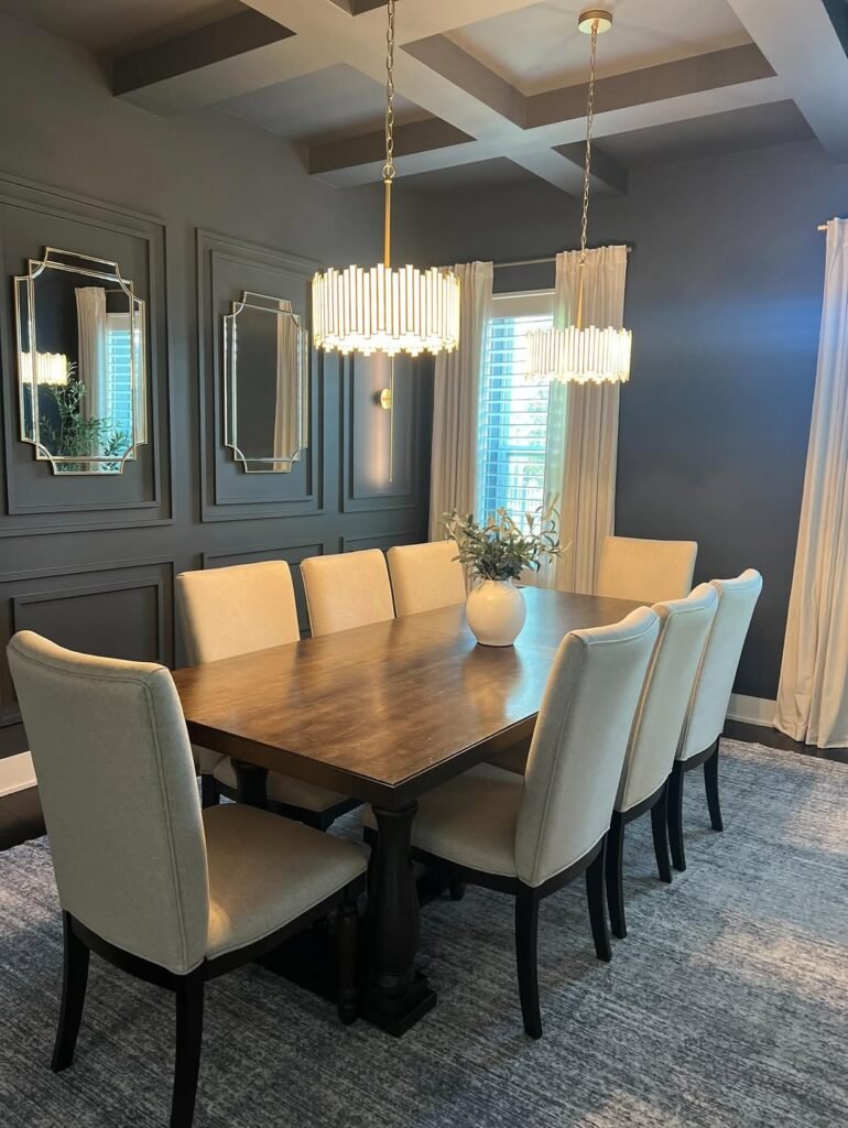
Charcoal gray walls with applied molding panels, a coffered ceiling in matching gray, cylindrical brass pendants throwing warm light onto a long wood table. The dark walls let the gold lighting and beveled mirrors glow, while pale ivory chairs keep things from feeling like a cave. Gray is having a long, quiet renaissance in formal dining rooms for exactly this reason. A room that takes itself seriously without being humorless.
20. Slate Blue Classic
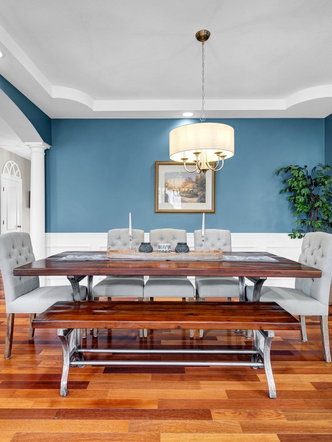
True slate blue above the wainscoting, white below, a hardwood table with bench seating that lands somewhere between farmhouse and traditional. The tray ceiling gives the room architectural lift, and the blue stays grown-up because of the crisp white trim doing the boundary work. Slate blue is the dining room color that ages well, never veering trendy and never feeling cold. Family meals would feel anchored here.
21. Winter White Warmth
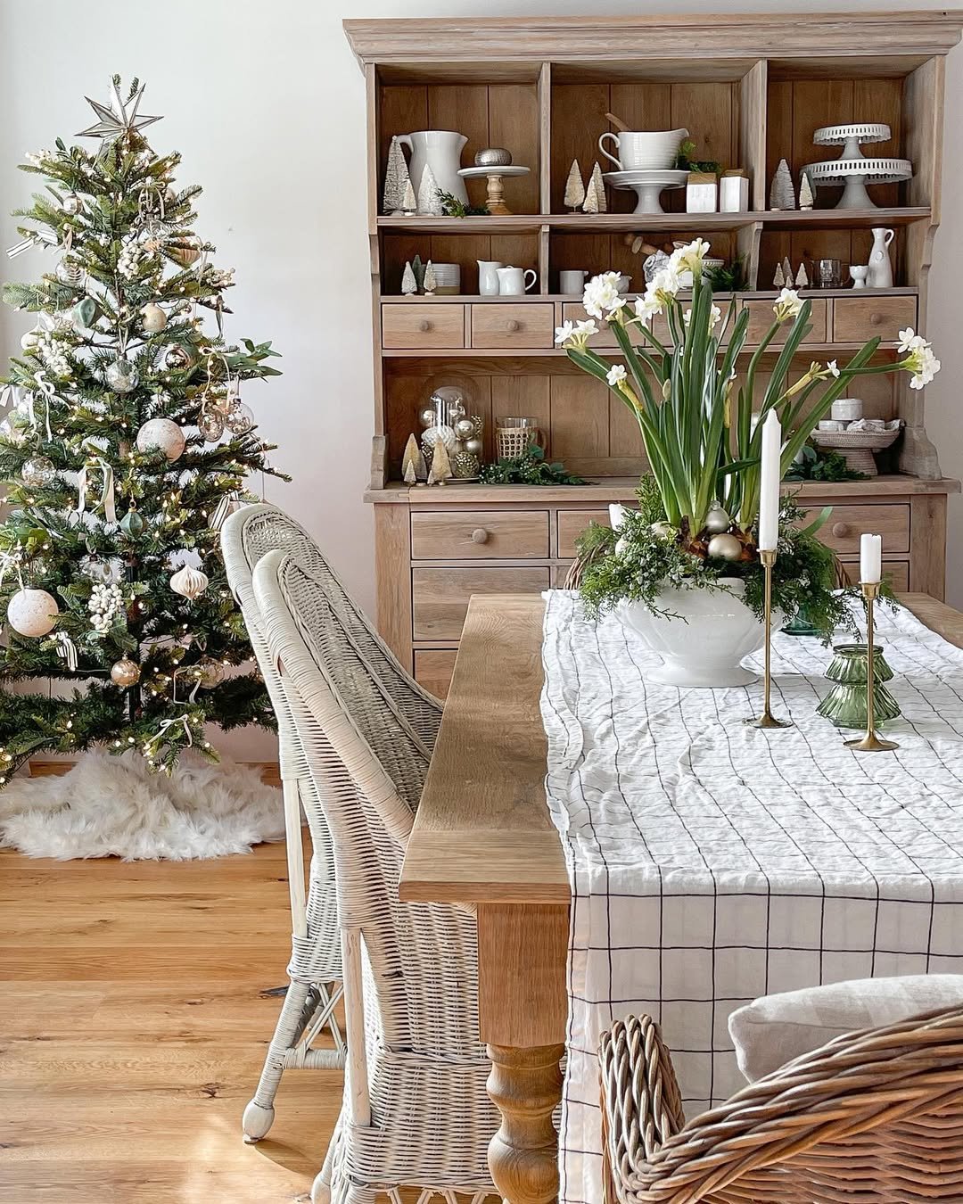
Soft white walls, a pale oak farmhouse table, woven wicker chairs, a limewashed hutch stacked with ironstone, all of it backdropped by a quietly glowing Christmas tree. White as a dining room color reads cold in the wrong hands and dreamy in the right ones, and this one nails it through layered natural textures. The trick is texture variety, not paint variety. A room that lets the seasons decorate themselves.
22. Burgundy Mid-Century
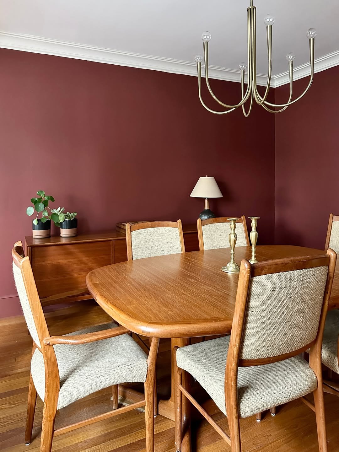
Deep burgundy walls wrapping a vintage teak dining set, brass chandelier curving overhead like a jellyfish, oatmeal upholstery softening the saturation. This is one of those colors that looks heavy in the can and breathtaking on the wall, especially against warm wood tones that pick up its red undertones. Burgundy is having its moment, and dinner parties here would feel like the 1970s in the best possible way. Worth knowing for anyone drawn to warm beige-adjacent palettes with depth elsewhere in the house.
23. Smoky Teal Built-Ins
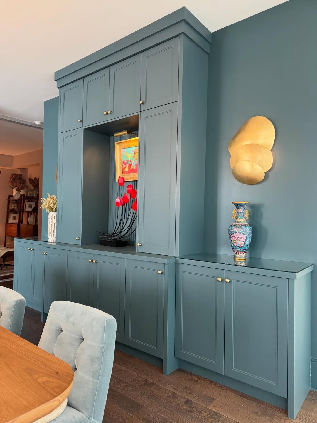
Walls and built-in cabinetry painted in the same smoky teal, brass sconce, a colorful vase tucked into a niche for one perfect pop of contrast. Painting walls and millwork the same color is the move that makes a dining room feel custom rather than collected, and this teal has just enough gray in it to read sophisticated instead of nautical. The brass and wood floors keep it warm. A dining space built for slow Sundays.
24. Sage and Cream Mix
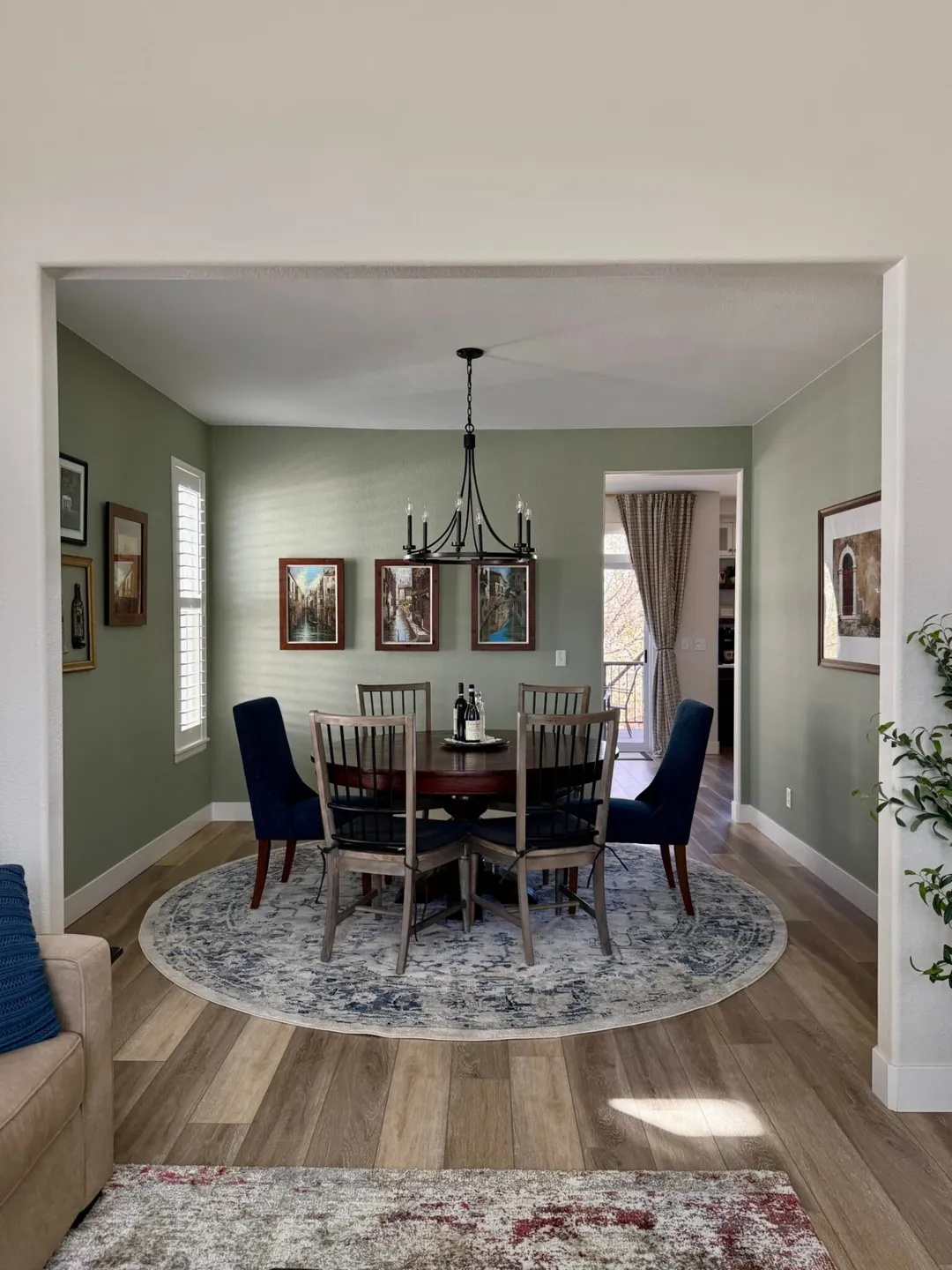
A grown-up sage on the dining walls flowing into cream in the adjoining rooms, navy upholstered chairs adding a quiet jolt, a black iron chandelier grounding the whole composition. The genius here is the cream ceiling pulled down past the doorway, which lets the sage feel like its own room without closing it off. Sage with navy is a combination that always works, full stop. The connection to a light and airy home decor palette keeps everything feeling open.
25. Warm White Gallery
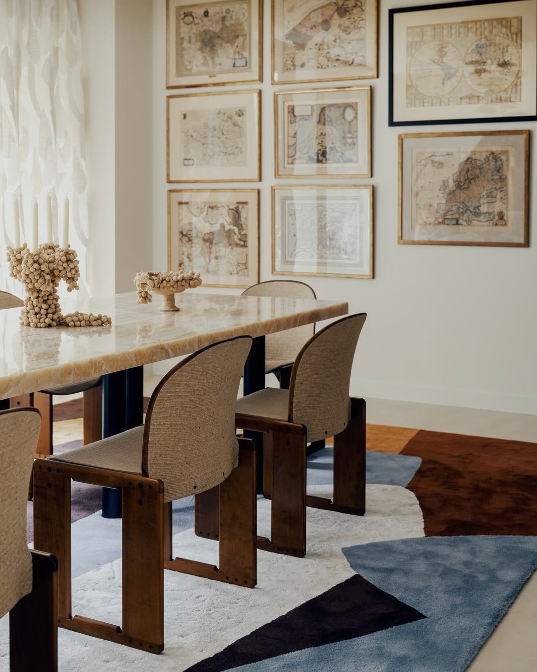
Warm white walls letting a salon style gallery of antique maps do all the color work, a travertine table catching afternoon light, sculptural wood chairs adding warmth from below. White used this confidently isn’t an absence of color, it’s a frame for everything else in the room to sing. The graphic rug underneath introduces just enough contrast. A dining room that ages with whatever you choose to hang.
26. Oxblood Library Drench
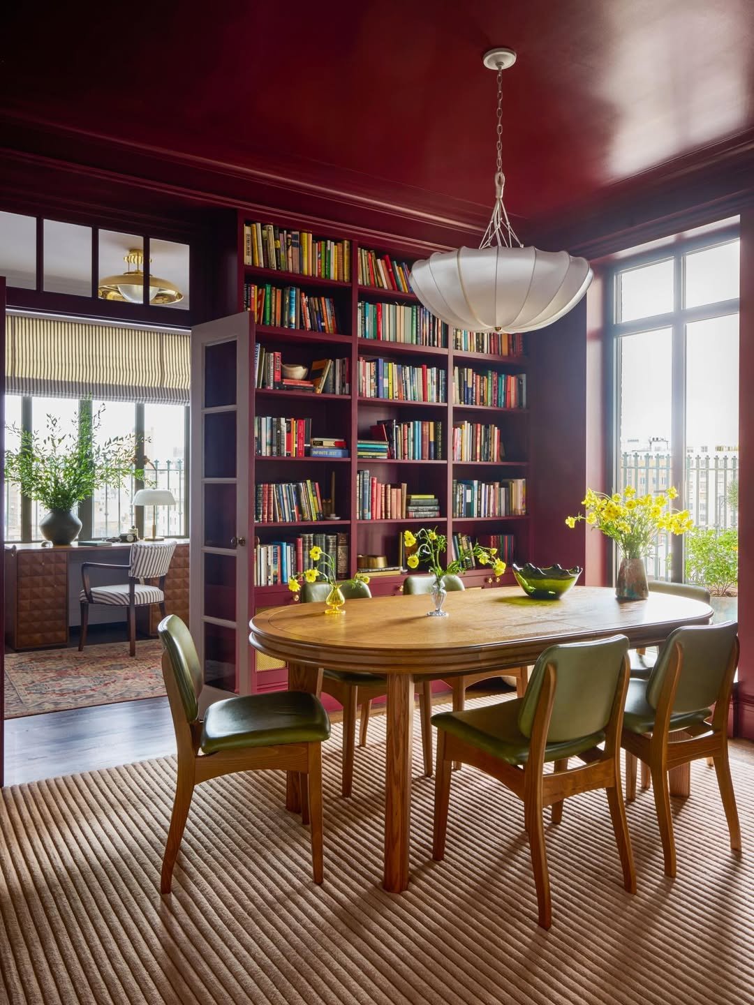
Glossy oxblood from floor to ceiling, bookshelves built into the same red so the spines become the only competing color, olive leather chairs pulled around a warm oak table. This is color drenching at its most theatrical, and the high-gloss finish on the ceiling reflects the daylight from the windows like a jewel box. Wine red dining rooms are an old world move that never stops working. End the meal here and no one’s leaving before the second pot of coffee.
