

Most fall chalkboards get walked right past. The ones that actually stop people share one small trick: a tiny doodle sitting right next to the words. These 11 fall chalkboard ideas show exactly what that looks like.
11 Fall Chalkboard Ideas From Cafés and Diners Worth Stopping For
Every board here leans on the same small move. A hand-drawn doodle, a pumpkin, a steaming cup, a leaf, sits right next to the drink name. It’s such a small detail, but it’s the thing that actually makes you slow down and read.
These are real boards from real cafés and diners, not staged shots for a photo shoot. Scroll through and see which doodle style you’d want to try on your own board this fall.
Cozy Coffee Shop Menu
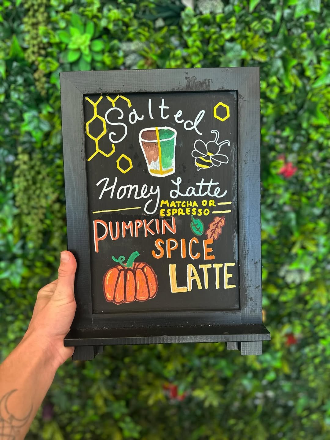
Six drinks get six different tiny icons, a cinnamon roll, a leaf, an apple, a pumpkin, so your eye never has to guess which name goes with what. The colors help too, rust and olive instead of plain orange, so even a chai sounds worth trying. Give each item its own small picture and the whole board reads faster.
Pumpkin Spice Counter Moment
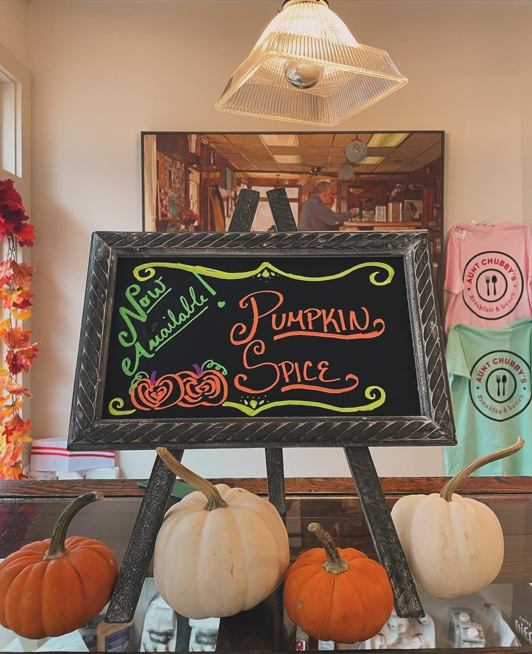
This little tabletop sign is proof that even the smallest chalkboard can steal attention. The neon-style orange lettering against the matte black background practically glows, especially surrounded by those tiny pumpkins.
It feels cheerful in a nostalgic diner kind of way. Like the kind of place where someone remembers your order and calls everyone “hon.”
Sidewalk Café Fall Board
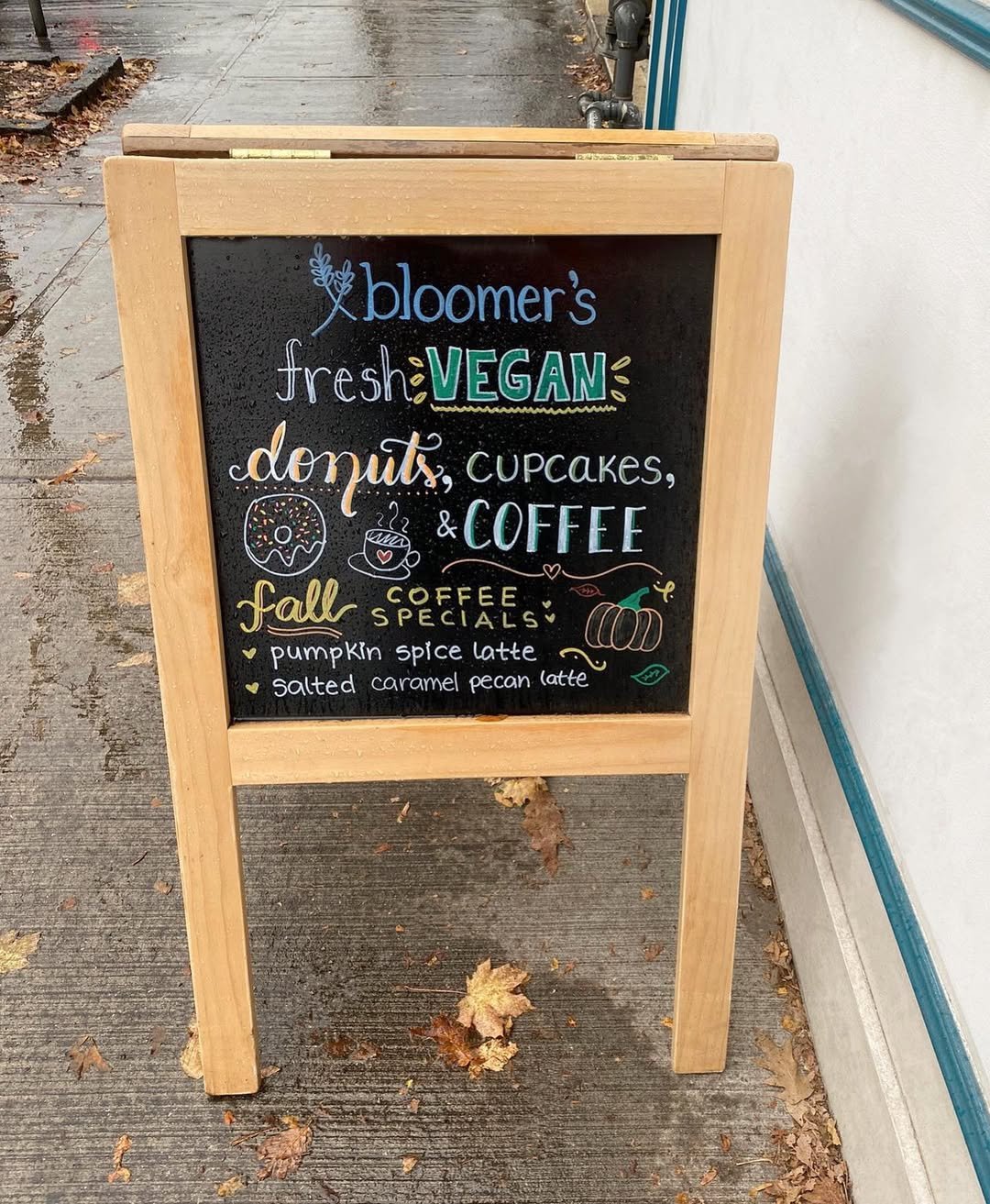
This sidewalk sign feels like the exact kind of thing that convinces you to stop for a latte you absolutely weren’t planning to buy. The handwritten fonts, tiny pumpkin doodles, and casual layout make it feel welcoming instead of overly designed.
And paired with the rainy sidewalk and scattered leaves? It basically captures peak fall café season in one little corner.
Cozy Café Autumn Menu
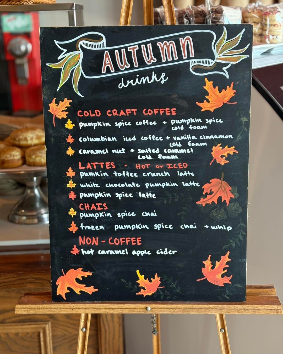
This board has peak small-town café energy. The hand-drawn leaves floating around the menu and the ribbon banner at the top make it feel warm before you even read a single drink special.
And honestly, the slightly imperfect handwritten menu is what makes it work. It feels personal, like someone updates it every morning while the pastries are still cooling behind the counter.
Chalkboard Fall Specials Men
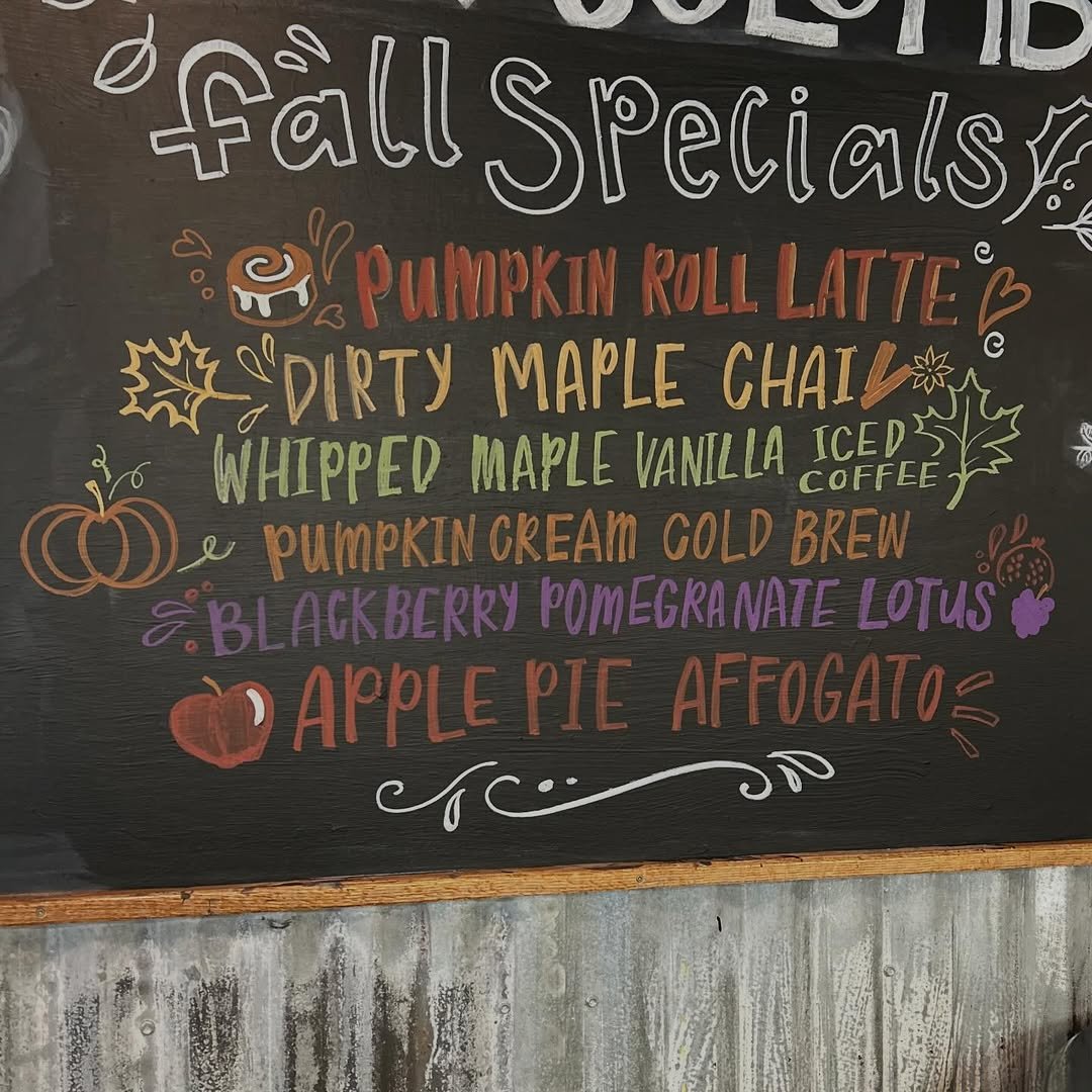
This menu board feels straight out of the cozy café everyone wishes they had nearby. The layered autumn shades, tiny pumpkin doodles, and handwritten drink names make even the maple chai sound extra comforting.
And the color palette really carries the whole thing. Rust orange, soft olive, plum, and cream against the black background feels very “wrapped in a knit blanket with nowhere to be.”
Rustic Diner Fall Board
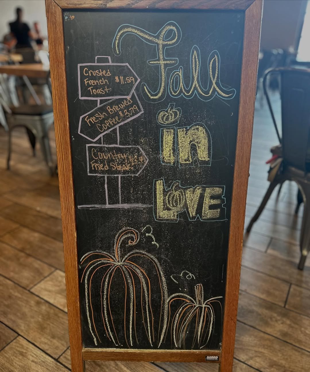
This chalkboard has that charming roadside café feel where the coffee is always hot and someone’s grandma probably makes the biscuits. The hand-drawn pumpkins and signpost-style menu details make it feel personal and welcoming.
And I love how unfussy it is. No complicated illustrations, no overworked styling, just simple chalk art that captures the cozy spirit of fall in the sweetest way.
Pumpkin Spice Latte Corner
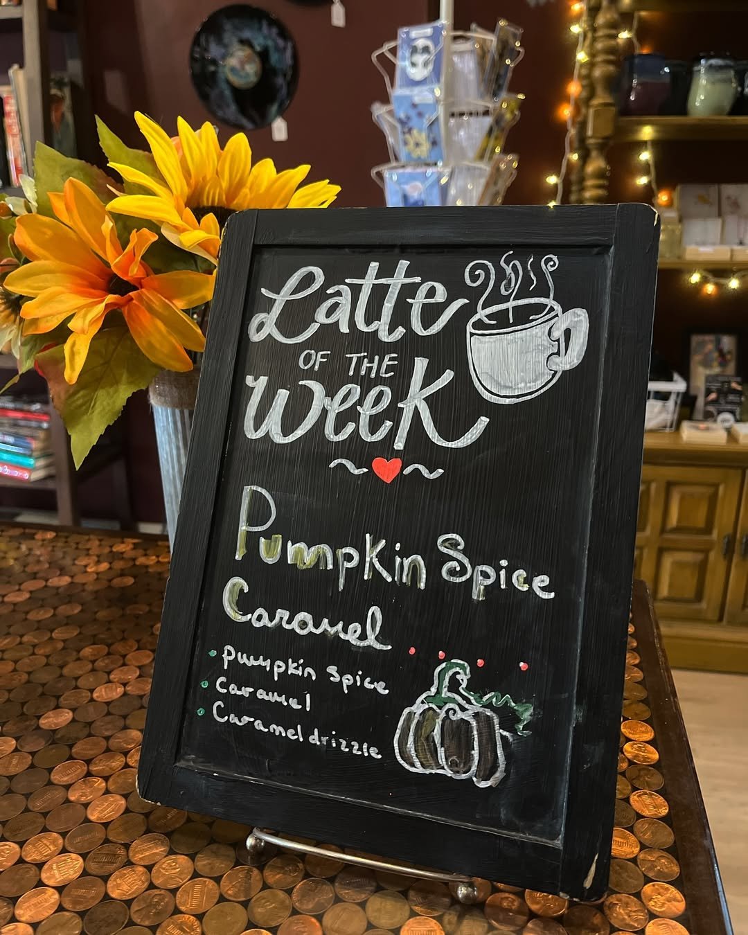
Everything about this little setup feels warm and nostalgic. The chalk lettering, the tiny pumpkin sketch, the giant sunflowers glowing beside the board, it all gives cozy bookstore café energy.
I also love how handmade it feels. Nothing overly perfect, just a comforting little sign that makes a pumpkin spice caramel latte sound exactly right for the moment.
Fall Favorites Café Board
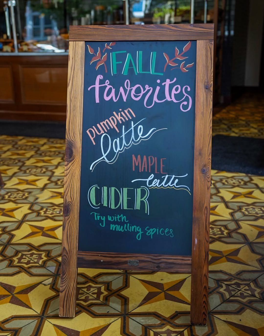
This one feels polished in that quiet European café way. The warm wood frame, tiled floors, and layered typography give the whole board a timeless autumn mood without needing tons of illustrations.
And the color palette is so good here. Muted pink, forest green, cinnamon brown, creamy white. It feels like a chunky knit sweater translated into chalk lettering.
Rustic Fall Drinks Menu
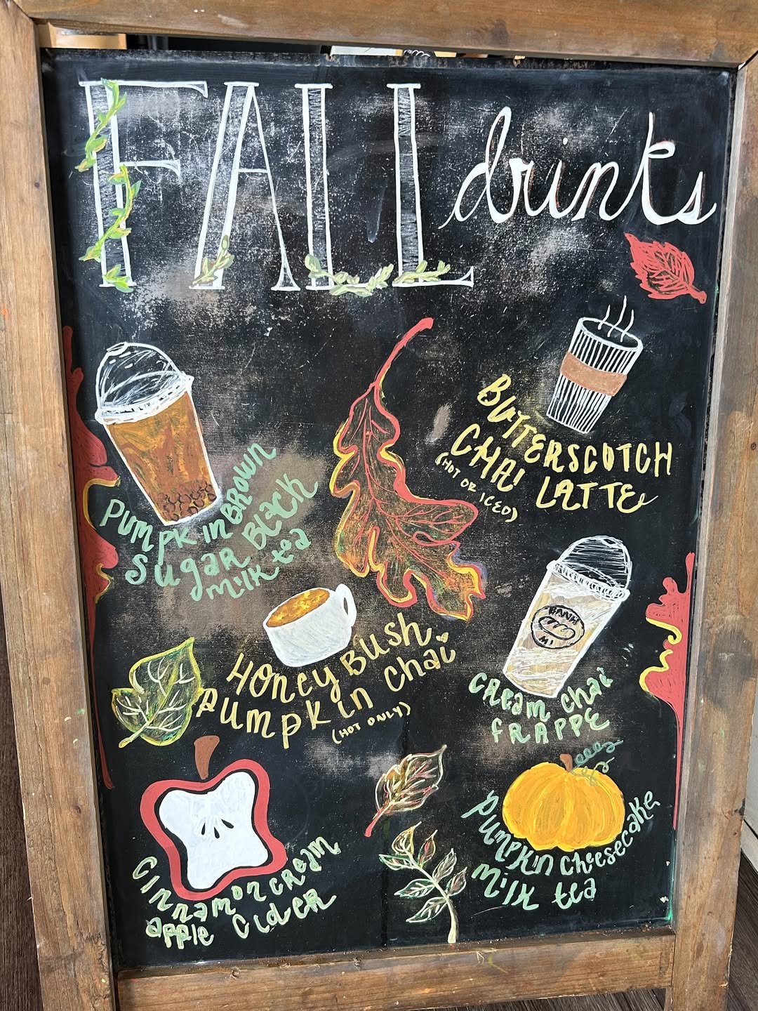
This board feels wonderfully chaotic in the best coffee-shop way. Every corner is packed with leaves, doodles, drink sketches, and seasonal flavors, like someone kept adding little details every time inspiration hit.
And honestly, that’s what makes it charming. It doesn’t feel staged or corporate, it feels real. Like the kind of neighborhood café where the menu changes depending on the weather outside.
Minimal Fall Specials Board
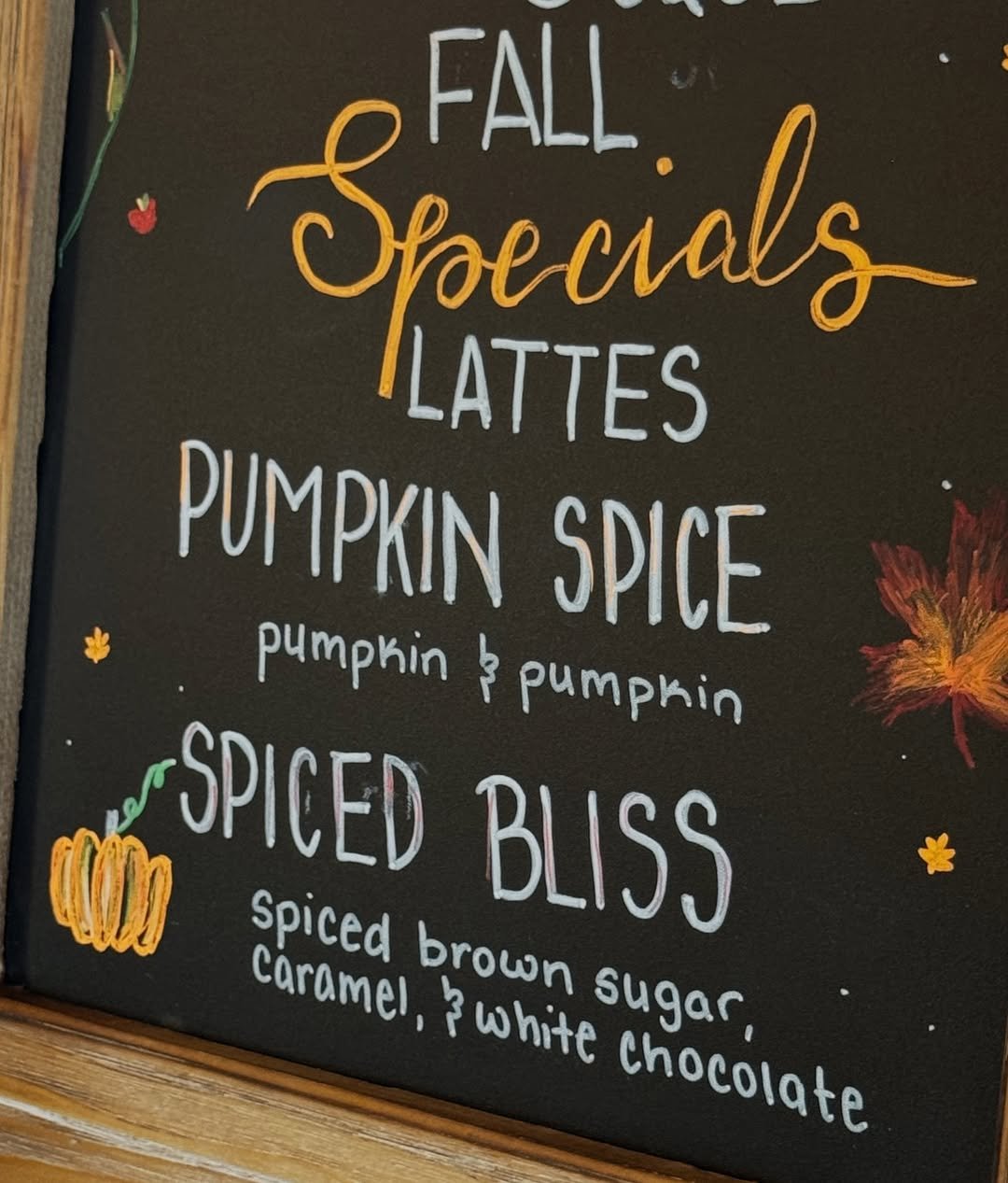
There’s something refreshing about how clean this one feels. Just bold lettering, tiny autumn accents, and enough empty space to let everything breathe.
The oversized “Spiced Bliss” typography steals the show too. It feels playful and modern without trying too hard, which is surprisingly hard to pull off with seasonal chalk art.
Pumpkin Porch Coffee Sign
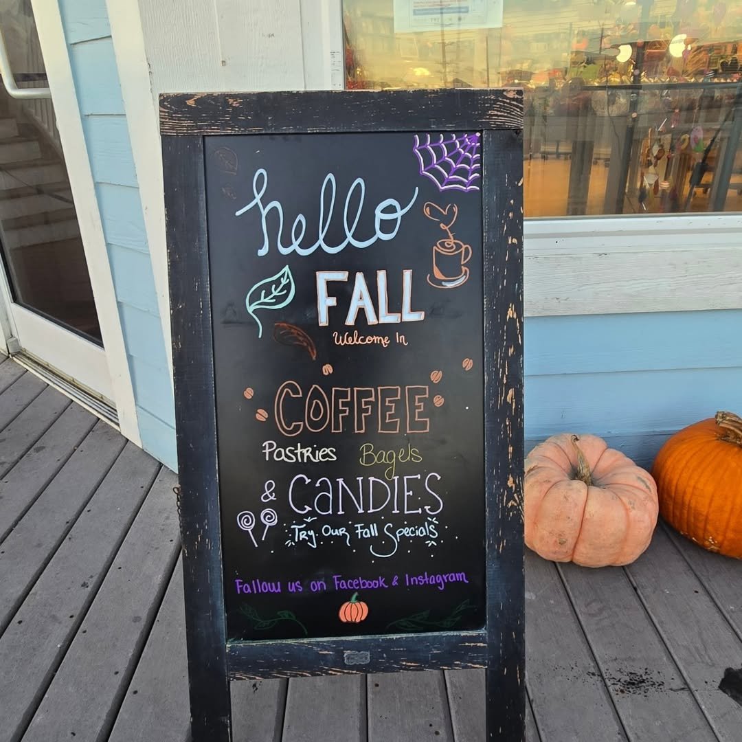
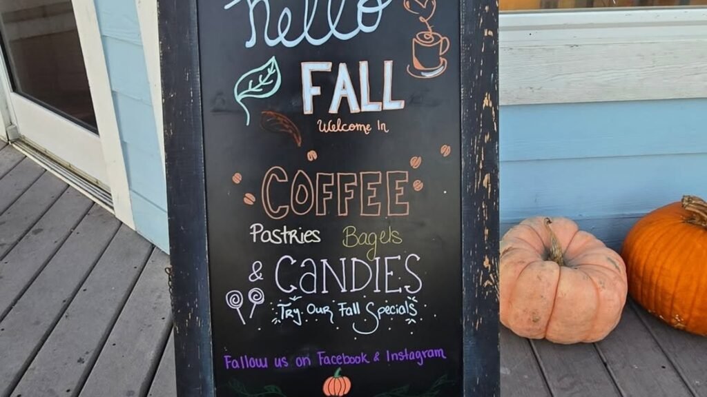
Coffee, pastries, bagels, and candy all get listed on one board, and the small heart above the coffee cup doodle keeps it feeling warm instead of like a straight-up menu. If pumpkin styling is your thing beyond the porch, these pumpkin neutral decor ideas go further into it.
